A Textarea is a form element that provides all the same features as the Text Input, but accepts multi-line text.
Usage
When to use
- As a form element that provides users with a way to read, input, or edit data in a multi-line field.
When not to use
- If needing a single-line input, consider TextInput.
- If needing to allow the user to make a selection from a predetermined list of options, consider Checkbox, Radio button, Select.
Required and optional
For complex forms, indicate required fields. This is the most explicit and transparent method and ensures users don’t have to make assumptions. Read more about best practices for marking required fields in forms.
For shorter, simpler forms (e.g., login/signup and feedback requests), indicate optional fields instead.
Marking required fields in forms
Character Count
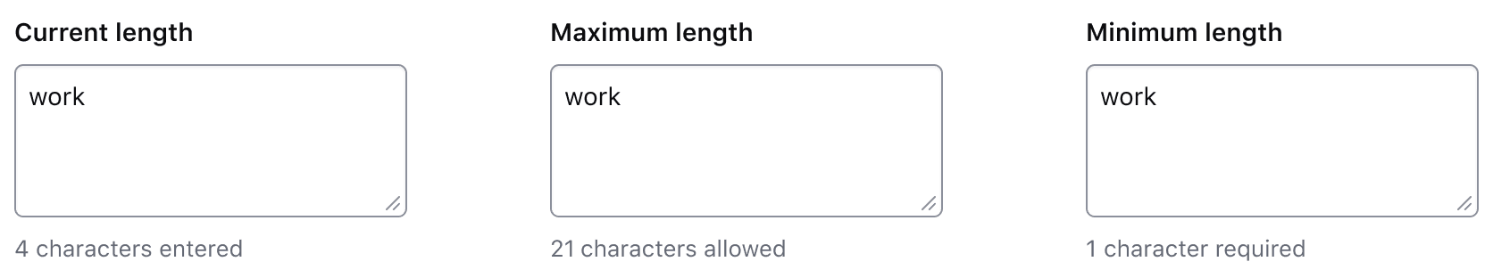
Use a character count to communicate the current length of the value in a textarea and whether it meets or exceeds the length requirements passed to the component. The component accepts multiple arguments to set length requirements and exposes several computed values to support custom messages. Visit the primitive code documentation for more details.
Default messages
Depending on which property (or properties) are passed to the component, a different default message will be displayed by the component to communicate the relationship between the current length of the textarea value (currentLength) and the maximum length (maxLength), minimum length (minLength), or both.
Test and interact with the default messaging examples in the primitive code documentation.
The default messages provide a consistent messaging pattern for the component by clearly communicating length requirements to the user while displaying their progress towards meeting the requirements.
Usage in Figma
For representative consistency, the Figma component mirrors the default messages that are rendered in the Ember component and are labelled as such; currentLength (the default variant), maxLength, minLength, and custom.
In all variants except the custom variant, we recommend only overriding the numerical value (e.g., "{numerical value} characters is allowed"). Overriding the text in these variants will require a custom implementation on the engineering side, instead, the custom variant should be used.
Custom messages
A custom message in the character count is supported and can be used when a product or application-specific message or term is required, e.g., "registry" or "workspace".
Avoid presenting duplicate information between the helper text and the character count. Helper text should be used to provide persistent requirements while character count represents more of a progress indicator towards a length requirement.
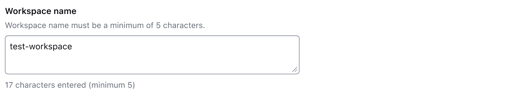
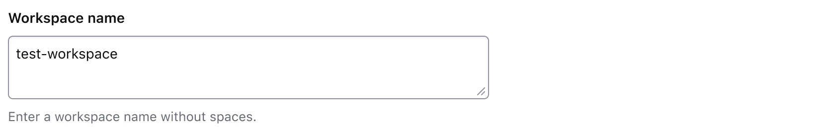
Don’t use the character count to display static details about the field. Use helper text to provide extra details about the information being requested and the character count to communicate the user’s progress toward meeting the requirements.
Error validation
For error validation recommendations, refer to the Form patterns documentation.
How to use this component
There are two ways to use the Textarea component:
Form::Textarea::Base- the base component: the<Textarea>Ember component.Form::Textarea::Field- the field parent component: the<Textarea>Ember component, with label, helper text and error messaging (in a wrapping container).
We recommend using the Field component because it provides built-in accessibility functionality. Use the Base component if needing to achieve custom layouts or have special use cases not covered by the Field component.
Form::Textarea::Field
The basic invocation requires a Label. This creates:
- a
<label>element with aforattribute automatically associated with the textareaIDattribute. - a
<textarea>control with an automatically generatedIDattribute.
<Hds::Form::Textarea::Field name="demo-description" as |F|>
  <F.Label>Short description</F.Label>
</Hds::Form::Textarea::Field>
Textarea value
Pass a @value argument to pre-populate the textarea.
<Hds::Form::Textarea::Field @value="This is my description" name="demo-description" as |F|>
  <F.Label>Short description</F.Label>
</Hds::Form::Textarea::Field>
Helper text
You can add extra information to the field using helper text. When helper text is added, the component automatically adds an aria-describedby attribute to the textarea control, associating it with the automatically generated ID of the helper text element.
<Hds::Form::Textarea::Field @value="This is my description" name="demo-description" as |F|>
  <F.Label>Short description</F.Label>
  <F.HelperText>Add a short description about the workspace you are creating.</F.HelperText>
</Hds::Form::Textarea::Field>
Extra content in label and helper text
The Label and HelperText contextual components used in the Field component yield their content. This means you can also pass structured content.
<Hds::Form::Textarea::Field name="demo-description" as |F|>
  <F.Label>Short description <Hds::Badge @size="small" @text="Beta" /></F.Label>
  <F.HelperText>This is an experimental feature (<Hds::Link::Inline @href="#">read more</Hds::Link::Inline>).</F.HelperText>
</Hds::Form::Textarea::Field>
Required vs. optional
Use the @isRequired and @isOptional arguments to add a visual indication that the field is "required" or "optional".
<Hds::Form as |FORM|>
  <FORM.Section>
    <Hds::Form::Textarea::Field @isRequired={{true}} name="demo-description" as |F|>
      <F.Label>Short description</F.Label>
      <F.HelperText>Add a short description about the workspace you are creating.</F.HelperText>
    </Hds::Form::Textarea::Field>

    <Hds::Form::Textarea::Field @isOptional={{true}} name="demo-description" as |F|>
      <F.Label>Short description</F.Label>
      <F.HelperText>Add a short description about the workspace you are creating.</F.HelperText>
    </Hds::Form::Textarea::Field>
  </FORM.Section>
</Hds::Form>
Character count
If the user input needs to be limited to a certain number of characters, use @maxLength on a CharacterCount contextual component to guide the user in meeting the length requirements. This property does not restrict the users from entering characters over the limit. To define the maximum string length that the user can enter, set maxlength attribute on the associated input field.
<Hds::Form::Textarea::Field @value={{this.value}} name="demo-description" {{on "input" this.updateValue}} as |F|>
  <F.Label>Short description</F.Label>
  <F.CharacterCount @maxLength={{200}} />
</Hds::Form::Textarea::Field>
If the user input is required to have a certain number of characters, use @minLength on a CharacterCount contextual component to guide the user in meeting the length requirements.
<Hds::Form::Textarea::Field @value={{this.value}} name="demo-description" {{on "input" this.updateValue}} as |F|>
  <F.Label>Short description</F.Label>
  <F.CharacterCount @minLength={{100}} />
</Hds::Form::Textarea::Field>
When the user input needs to be in a certain range, use both @minLength and @maxLength on a CharacterCount contextual component to guide the user in meeting the length requirements.
<Hds::Form::Textarea::Field @value={{this.value}} name="demo-description" {{on "input" this.updateValue}} as |F|>
  <F.Label>Short description</F.Label>
  <F.CharacterCount @minLength={{100}} @maxLength={{200}} />
</Hds::Form::Textarea::Field>
Custom message
For custom messages, you can use the following arguments to build a relevant message: currentLength (the current number of characters in the associated form control), maxLength (the maximum number of characters allowed in the associated form control), minLength (the minimum number of characters required in the associated form control), remaining (the difference between maxLength and currentLength), and shortfall (the difference between currentLength and minLength).
<Hds::Form::Textarea::Field @value={{this.value}} name="demo-description" {{on "input" this.updateValue}} as |F|>
  <F.Label>Short description</F.Label>
  <F.CharacterCount @maxLength={{200}} as |CC|>
    {{CC.remaining}}
    characters remaining
  </F.CharacterCount>
</Hds::Form::Textarea::Field>
Validation based on length
You can raise an error based on the number of characters entered into a field using a custom validation function.
<Hds::Form::Textarea::Field
  @value={{this.value}}
  @isInvalid={{this.fieldIsInvalid}}
  name="demo-description"
  {{on "input" this.updateValue}}
  as |F|
>
  <F.Label>Short description</F.Label>
  <F.CharacterCount @minLength={{this.minLength}} />
  {{#if this.fieldIsInvalid}}
    <F.Error>Length should be at least 100 characters</F.Error>
  {{/if}}
</Hds::Form::Textarea::Field>
Validation
To indicate a field is invalid, use the @isInvalid argument and provide an error message using the Error contextual component.
<Hds::Form::Textarea::Field @value="A" @isInvalid={{true}} name="demo-description" as |F|>
  <F.Label>Short description</F.Label>
  <F.Error>Error: the description text is too short.</F.Error>
</Hds::Form::Textarea::Field>
Add more than one error message using the more specific Message contextual component.
<Hds::Form::Textarea::Field @value="<a>" @isInvalid={{true}} name="demo-description" as |F|>
<F.Label>Short description</F.Label>
<F.Error as |E|>
<E.Message>Length should be at least 12 characters</E.Message>
<E.Message>Can not contain HTML</E.Message>
</F.Error>
</Hds::Form::Textarea::Field>Custom control ID
If needing a custom ID for the control instead of the one automatically generated by the component, pass the @id argument to the field.
In this case all the internal references (id/for/aria-describedby) between the different parts of the field are still automatically generated and will use the custom ID provided.
<Hds::Form::Textarea::Field @id="my-control" name="demo-description" as |F|>
  <F.Label>Short description</F.Label>
  <F.HelperText>Add a short description about the workspace you are creating.</F.HelperText>
</Hds::Form::Textarea::Field>
Additional aria-describedby
Pass an @extraAriaDescribedBy argument to the field to connect one or more extra elements describing the field to the control. This provides extra ID values to the aria-describedby attribute of the control, in addition to those automatically generated by the component.
<Hds::Form::Textarea::Field @extraAriaDescribedBy="my-extra-element-ID" name="demo-description" as |F|>
  <F.Label>Short description</F.Label>
  <F.HelperText>Add a short description about the workspace you are creating.</F.HelperText>
</Hds::Form::Textarea::Field>
HTML native attributes
This component supports use of ...attributes. This means you can use all the standard HTML attributes of the <textarea> element. This can be useful in case you want to add specific native behaviors to the field, that are not exposed directly by the component (e.g., providing a name for the control, or adding min, max, minlength, maxlength, or pattern attributes to it).
<Hds::Form::Textarea::Field
  name="demo-description"
  placeholder="Workspace description"
  minlength="4"
  maxlength="1024"
  as |F|
>
  <F.Label>Short description</F.Label>
</Hds::Form::Textarea::Field>
Events handling
Because this component supports use of ...attributes, you can use all the usual Ember techniques for event handling (e.g., input, blur, change), validation, etc.
<Hds::Form::Textarea::Field
  placeholder="Workspace description"
  name="demo-description"
  {{on "blur" this.yourOnBlurFunction}}
  as |F|
>
  <F.Label>Workspace description</F.Label>
</Hds::Form::Textarea::Field>
Custom width
By default, the textarea control width is set to fill the parent container.
Pass a custom width for the control using the @width argument.
<Hds::Form::Textarea::Field @width="200px" name="demo-description" as |F|>
  <F.Label>Short description</F.Label>
</Hds::Form::Textarea::Field>
Form::Textarea::Base
The Base component is intended for rare cases where the Field component can’t be used and a custom implementation is needed. Most of the details for the Field component also apply to the Base component, but see the Component API for more details.
The Base component creates a <textarea> control with an automatically generated ID attribute.
<Hds::Form::Textarea::Base
  @value="My workspace"
  aria-label="Short description"
  placeholder="Workspace description"
  required={{true}}
  name="demo-description"
  {{on "blur" this.yourOnBlurFunction}}
/>
Component API
The Textarea component is based on the Ember Textarea built-in component.
This component has two different variants with their own APIs:
Form::Textarea::Base- the base component: the<Textarea>Ember component.Form::Textarea::Field- the field parent component: the<Textarea>Ember component, with label, helper text, and error messaging (in a wrapping container).
Form::Textarea::Base
The "base" component under the hood uses the Ember Textarea built-in component. Refer to the Textarea API documentation for more details.
In addition we provide:
value
string
isInvalid
boolean
- false (default)
width
string
<textarea> fills the parent container. If a @width parameter is provided, the control will have a fixed width.
height
string
<textarea> has a height determined by the browser to accommodate 4 lines of text. If a @height parameter is provided, the control will have a fixed height.
…attributes
...attributes.
The attributes will be applied to the
<textarea> element. This means you can use all the standard HTML attributes of the <textarea> element and all the usual Ember techniques for event handling, validation, etc.
Examples of HTML attributes:
id, name, placeholder, disabled, required, readonly. See the whole list of HTML attributes. Examples of Ember modifiers: {{on "input" [do something]}}, {{on "change" [do something]}}, {{on "blur" [do something]}}.
Form::Textarea::Field
id
string
By default, the ID is automatically generated by the component. Use this argument to pass a custom ID.
value
string
isInvalid
boolean
- false (default)
isRequired
boolean
- false (default)
Required indicator next to the label text and sets the required attribute on the control when user input is required.
isOptional
boolean
- false (default)
Optional indicator next to the label text when user input is optional.
extraAriaDescribedBy
string
aria-describedby HTML attribute.
By default, the
aria-describedby attribute is automatically generated by the component, using the IDs of the helper text and errors (if present). Use this argument to pass an extra ID.
…attributes
...attributes.
The attributes will be applied to the
<textarea> element. This means you can use all the standard HTML attributes of the <textarea> element and all the usual Ember techniques for event handling, validation, etc.
Examples of HTML attributes:
name, placeholder, disabled, required, readonly. See the whole list of HTML attributes. Examples of Ember modifiers: {{on "input" [do something]}}, {{on "change" [do something]}}, {{on "blur" [do something]}}.
Contextual components
Label, HelperText, CharacterCount, and Error content are passed to the field as yielded components.
<[F].Label>
yielded component
<label> element. The content can be a simple string or a more complex/structured string, in which case it inherits the text style. For details about its API, check the Form::Label component.
The
for attribute of the label is automatically generated using the controlId value of the control.
<[F].HelperText>
yielded component
Form::HelperText component.
The
id attribute of the element is automatically generated using the controlId value of the control.
<[F].CharacterCount>
yielded component
Form::CharacterCount component.
The
id attribute of the element is automatically generated using the controlId value of the control.
<[F].Error>
yielded component
Form::Error component.
The
id attribute of the Error element is automatically generated.
<[E].Message>
yielded component
Error.Message.
Anatomy
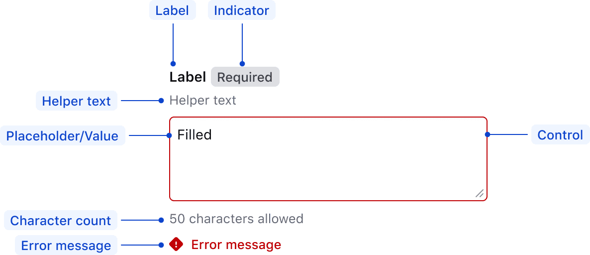
| Element | Usage |
|---|---|
| Label | Required |
| Indicator | Optional |
| Helper text | Optional |
| Placeholder/Value | Optional |
| Control | Required |
| Error message | Triggered by system |
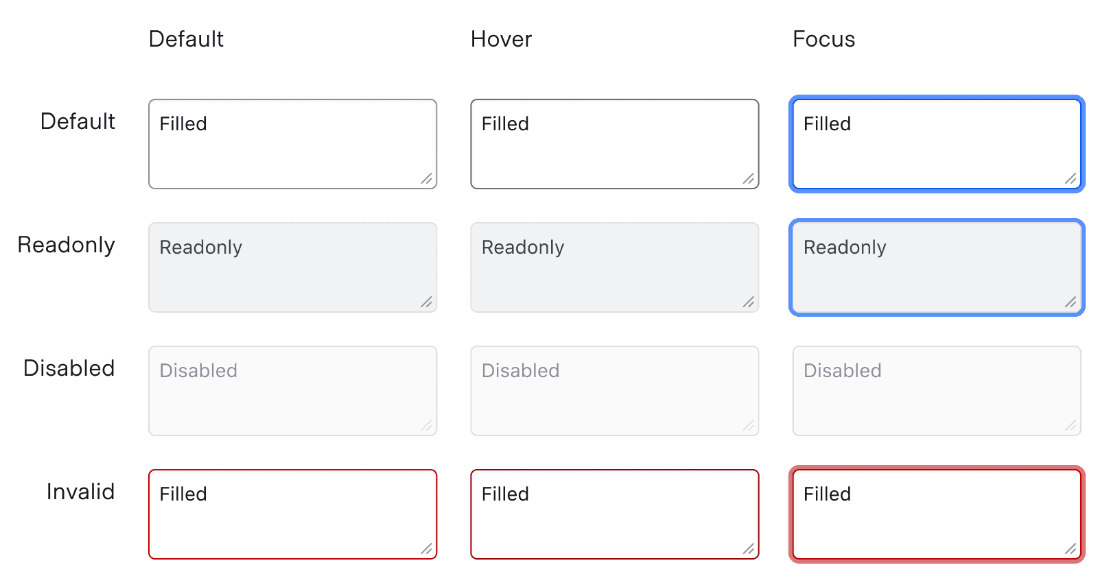
States
For general content recommendations, refer to our Primitives documentation.
Conformance rating
Form::Textarea::Field
Form::Textarea::Field is conformant when used as directed. For this reason, we recommend using Form::Textarea::Field by default.
Form::Textarea::Base
Form::Textarea::Base is not conformant until it has an accessible name.
Known issues
If a link is used within a label, helper text, or error text, it will not be presented as a link to the user with a screen reader; only the text content is read out. As such, care should be used when considering this feature.
Applicable WCAG Success Criteria
This section is for reference only, some descriptions have been truncated for brevity. This component intends to conform to the following WCAG Success Criteria:
-
1.3.1
Info and Relationships (Level A):
Information, structure, and relationships conveyed through presentation can be programmatically determined or are available in text. -
1.3.2
Meaningful Sequence (Level A):
When the sequence in which content is presented affects its meaning, a correct reading sequence can be programmatically determined. -
1.3.4
Orientation (Level AA):
Content does not restrict its view and operation to a single display orientation, such as portrait or landscape. -
1.3.5
Identify Input Purpose (Level AA):
The purpose of each input field collecting information about the user can be programmatically determined when the input field serves a purpose identified in the Input Purposes for User Interface Components section; and the content is implemented using technologies with support for identifying the expected meaning for form input data. -
1.4.1
Use of Color (Level A):
Color is not used as the only visual means of conveying information, indicating an action, prompting a response, or distinguishing a visual element. -
1.4.10
Reflow (Level AA):
Content can be presented without loss of information or functionality, and without requiring scrolling in two dimensions. -
1.4.11
Non-text Contrast (Level AA):
The visual presentation of the following have a contrast ratio of at least 3:1 against adjacent color(s): user interface components; graphical objects. -
1.4.12
Text Spacing (Level AA):
No loss of content or functionality occurs by setting all of the following and by changing no other style property: line height set to 1.5; spacing following paragraphs set to at least 2x the font size; letter-spacing set at least 0.12x of the font size, word spacing set to at least 0.16 times the font size. -
1.4.3
Minimum Contrast (Level AA):
The visual presentation of text and images of text has a contrast ratio of at least 4.5:1 -
1.4.4
Resize Text (Level AA):
Except for captions and images of text, text can be resized without assistive technology up to 200 percent without loss of content or functionality. -
2.4.6
Headings and Labels (Level AA):
Headings and labels describe topic or purpose. -
2.4.7
Focus Visible (Level AA):
Any keyboard operable user interface has a mode of operation where the keyboard focus indicator is visible. -
3.2.1
On Focus (Level A):
When any user interface component receives focus, it does not initiate a change of context. -
3.2.2
On Input (Level A):
Changing the setting of any user interface component does not automatically cause a change of context unless the user has been advised of the behavior before using the component. -
3.2.4
Consistent Identification (Level AA):
Components that have the same functionality within a set of Web pages are identified consistently. -
3.3.2
Labels or Instructions (Level A):
Labels or instructions are provided when content requires user input. -
4.1.2
Name, Role, Value (Level A):
For all user interface components, the name and role can be programmatically determined; states, properties, and values that can be set by the user can be programmatically set; and notification of changes to these items is available to user agents, including assistive technologies.
Support
If any accessibility issues have been found within this component, let us know by submitting an issue.
6.2.0
Fixed element typing to HTMLTextAreaElement for stricter and more accurate Glint checks.
6.1.1
Fixed TextareaField signature element to be HTMLInputElement instead of HTMLElement.
6.1.0
Converted component to gts format.
4.21.0
Added @id and @ariaDescribedBy arguments to Form::Textarea::Base.
4.18.1
Fix issue with bottom margin on charcount so that a top margin is instead added to the error message, if one exists, following it