Use Tags to indicate an object’s categorization, e.g., for filtering. For static metadata, status, or to indicate a new feature, use a Badge.
Usage
When to use
- To indicate an object’s categorization, e.g., for filtering.
When not to use
- For static metadata, status, or to display a new feature, consider Badge.
- For collection enumeration or version number, consider Badge Count.
Layout
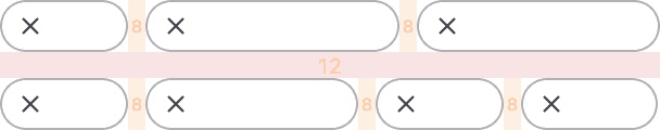
The Tag component can be used in several different layouts, but we commonly see them in a list or a group. They will fill the parent container and then wrap, as necessary.
Spacing
As a best practice, use a vertical spacing of 12px and horizontal spacing of 8px between Tags.
Leading vs. trailing icon
 The leading dismiss icon allows mouse users to clear multiple Tags quickly because they do not need to move their mouse.
 When the dismiss icon is trailing, the mouse user must adjust positioning of their mouse to clear the Tags, which results in slower task completion.
How to use this component
When no @href or @route argument is provided, a plain text Tag will render.
Link color
There are two available colors for a link: primary and secondary. The default is primary.
<Hds::Tag
  @color="primary"
  @text="My link tag"
  @route="show"
  @model="components/tag"
  @onDismiss={{this.yourOnDismissFunction}}
/>
<Hds::Tag
  @color="secondary"
  @text="My link tag"
  @route="show"
  @model="components/tag"
  @onDismiss={{this.yourOnDismissFunction}}
/>
Dismiss
In most cases, the Tag should be dismissable. If you don’t provide a callback function to the onDismiss argument the dismiss button will not be rendered.
<Hds::Tag @color="primary" @text="My link tag" @route="show" @model="components/tag" />
Truncation
If the Tag’s content causes it to exceed its max width of about 20 characters, the text will be truncated, and a Tooltip will be rendered including the full text. The default Tooltip placement is top, but this can be customized using the @tooltipPlacement argument.
<Hds::Tag @text="This is a very long text that should go on multiple lines" @tooltipPlacement="right" />
Component API
Tag
color
enum
- primary (default)
- secondary
@route or @href are set.
text
string
@route or @href are set. If no text value is defined an error will be thrown.
ariaLabel
string
Dismiss. Note that the total value of the aria-label attribute is @ariaLabel + @text.
href
<a> element.
isHrefExternal
boolean
<a> link is external. When left undefined or explicitly set to true it adds the target="_blank" and rel="noopener noreferrer" attributes to the <a> tag (for security reasons).
route/models/model/query/current-when/replace
<LinkTo>/<LinkToExternal> components.
isRouteExternal
boolean
- false (default)
<LinkToExternal> for the @route.
tooltipPlacement
enum
- top (default)
- right
- bottom
- left
onDismiss
function
…attributes
...attributes.
Anatomy
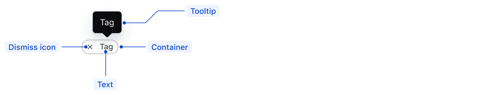
| Element | Usage |
|---|---|
| Text | Required |
| Tooltip | Required when text is truncated |
| Dismiss icon | Required for isDismissible |
| Container | Required |
States
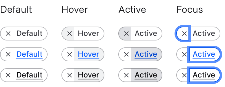
When content within the tag is not user-generated, it should be concise and consistent with the category name.
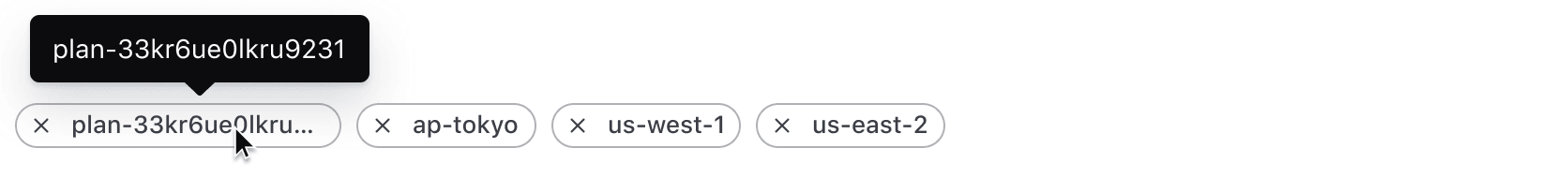
Long tags
Tags can display about 20 characters maximum before the text becomes automatically truncated. When truncated, the full text will display in a Tooltip that appears when the user hovers or focuses the Tag. This Tooltip displays above the Tag by default; however, the placement can be customized.
Conformance rating
When used as recommended, there should not be any accessibility issues with this component.
Best practices
- A screen reader will read dismissible tags from left to right, e.g., “dismiss [text]”.
- Link tags and dismissible tags must be standalone elements and should not be nested inside other interactive elements because they cannot be properly accessed by a screen reader.
Applicable WCAG Success Criteria
This section is for reference only. This component intends to conform to the following WCAG Success Criteria:
-
1.4.1
Use of Color (Level A):
Color is not used as the only visual means of conveying information, indicating an action, prompting a response, or distinguishing a visual element. -
1.4.11
Non-text Contrast (Level AA):
The visual presentation of the following have a contrast ratio of at least 3:1 against adjacent color(s): user interface components; graphical objects. -
1.4.12
Text Spacing (Level AA):
No loss of content or functionality occurs by setting all of the following and by changing no other style property: line height set to 1.5; spacing following paragraphs set to at least 2x the font size; letter-spacing set at least 0.12x of the font size, word spacing set to at least 0.16 times the font size. -
1.4.13
Content on Hover or Focus (Level AA):
Where receiving and then removing pointer hover or keyboard focus triggers additional content to become visible and then hidden, the following are true: dismissible, hoverable, persistent (see link). -
1.4.3
Minimum Contrast (Level AA):
The visual presentation of text and images of text has a contrast ratio of at least 4.5:1 -
1.4.4
Resize Text (Level AA):
Except for captions and images of text, text can be resized without assistive technology up to 200 percent without loss of content or functionality. -
2.1.1
Keyboard (Level A):
All functionality of the content is operable through a keyboard interface. -
2.4.7
Focus Visible (Level AA):
Any keyboard operable user interface has a mode of operation where the keyboard focus indicator is visible. -
3.2.1
On Focus (Level A):
When any user interface component receives focus, it does not initiate a change of context. -
4.1.2
Name, Role, Value (Level A):
For all user interface components, the name and role can be programmatically determined; states, properties, and values that can be set by the user can be programmatically set; and notification of changes to these items is available to user agents, including assistive technologies.
Support
If any accessibility issues have been found within this component, let us know by submitting an issue.
6.2.0
Fixed a runtime error when ResizeObserver is undefined (e.g. SSR).
6.1.0
Removed usage of hdsLinkToModels and hdsLinkToQuery helpers, instead forward the arguments to HdsInteractive.
Converted component to gts format.
4.21.1
Fixed a performance issue when many tags are present on a page caused by the ResizeObserver
4.19.0
Updated structure to prevent inheritance overrides for font styles
4.17.1
Truncated any text that is longer than about 20 characters, and added a tooltip with the full text when truncation occurs
Added @tooltipPlacement argument