A form is a container that houses various inputs and controls, displaying and collecting data. These guidelines outline best practices for form design in HashiCorp products. Our Form Layout component makes implementing these practices simple and consistent across our products.
Spacing
Spacing between sections, fields, text, and other form elements should follow a decreasing scale on an 8px grid. This creates a consistent visual hierarchy between elements.
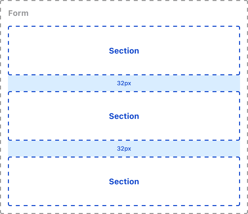
Sections
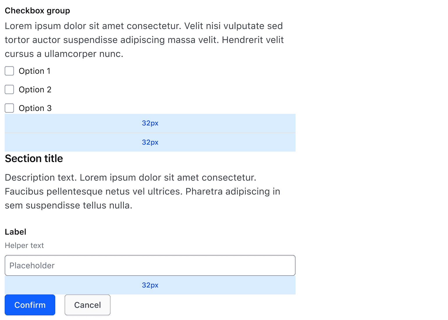
A section occupies the largest hierarchy within the form. Sections organize text and fields (inputs, checkboxes, toggles, etc.) into logical groups. A form consisting of more than one section should use a 32px gap between sections.
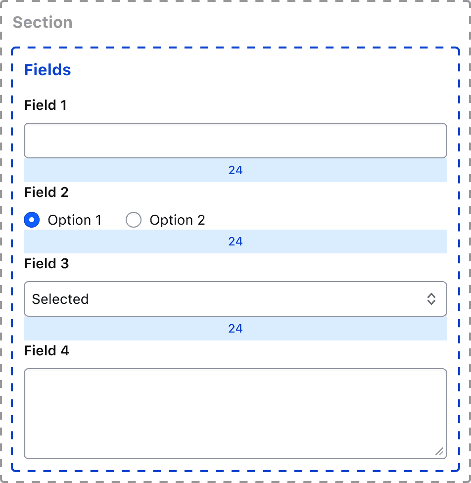
Fields
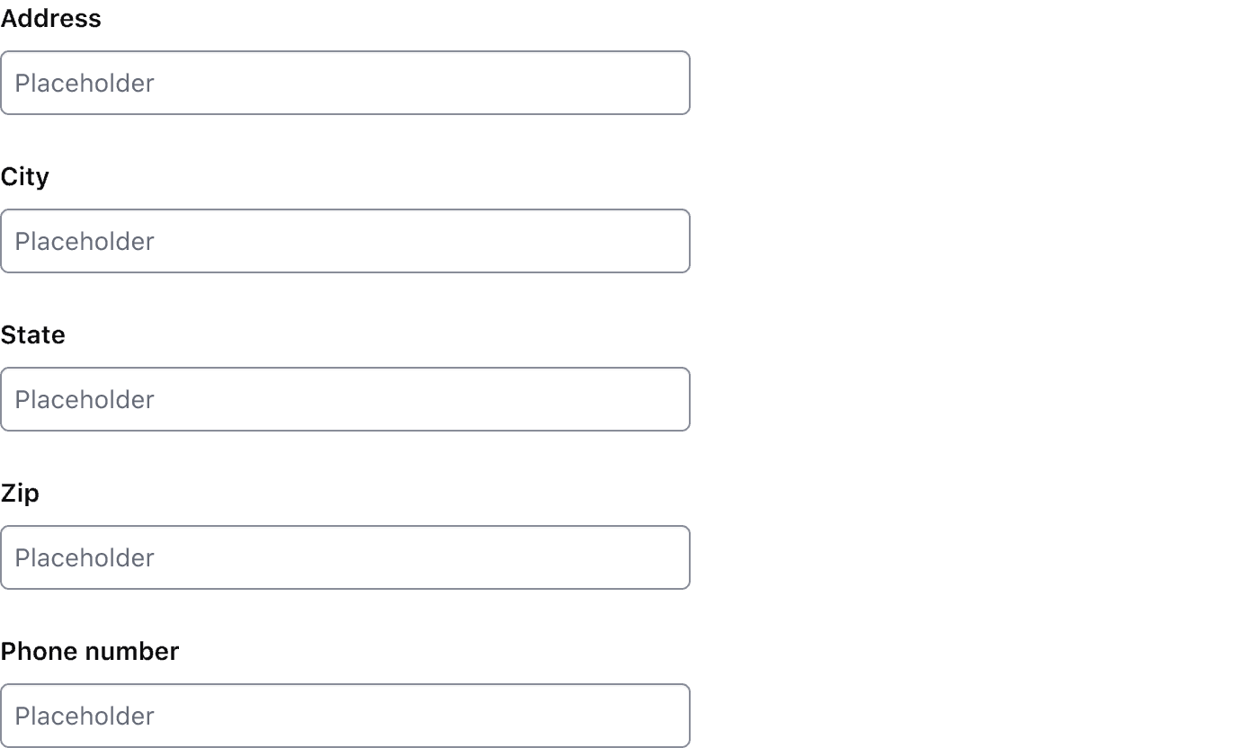
A field describes a form control and label pairing. When displaying multiple fields within a section, there should be a 24px gap between each field.
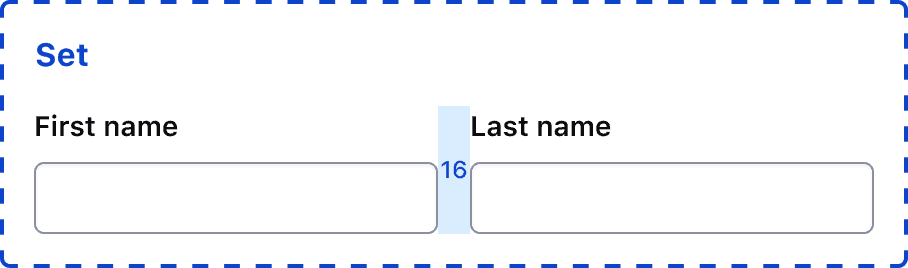
Field group
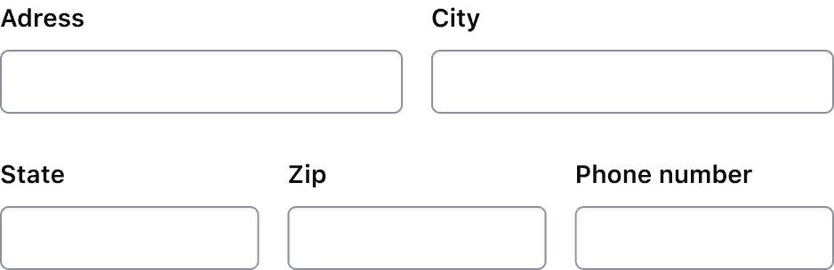
If fields are collecting related information or information that is part of the same object, they may be organized in a field group. Field groups are organized in rows with a 16px gap between fields.
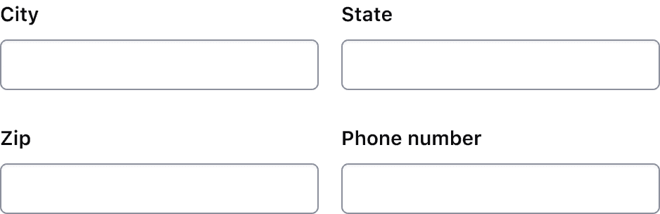
Common sets of field groups can include:
- Credit card information: card number, expiration date, security code
- Multi-line address field
- First and last name
Alignment
Fields organized in a horizontal field group should be aligned to the baseline of each element to account for fields with helper text.

Button Sets
Organize buttons based on the Button Set guidelines, e.g., using a 16px horizontal gap between buttons. For more specifications and examples, refer to the documentation for button organization.

Layout
Single-column
We recommend using a single-column layout for forms to streamline data entry. Forms across our products should use a maximum width which can be achieved by using the Form Layout component or by using a size or unit relative to the page, viewport, or container size, e.g., viewport width unit (vw), percentage width (50%), or a character unit (ch).
Multi-column
While forms should typically follow a single column layout, you can use the Section Multi Field Group to place multiple fields in a row, as needed.
Use a consistent number of columns throughout the form.
Don't organize a set of fields in two columns and another set in three columns.
Don't exceed more than three fields in a field group. In most scenarios, it's best to limit the number of columns in a form or section to two.

If using multiple inputs in a row, stack fields vertically at the md breakpoint. This behavior is automatically applied in the Form Layout.
Width
The width of a form and the fields it contains are largely dependent on the form’s context. Adhering to these high-level guidelines can make a complex form approachable and introduce consistency in the UX application.
Field width
Generally, a field’s width should account for the estimated width of the content it accepts. This gives the user an accurate sense of the character length and type of content the field accepts, which is important in setting user expectations.
Responsive properties
As the viewport shrinks, the form should expand relative to the viewport width, eventually occupying the entire width of the content area. Field groups should stack vertically as the viewport shrinks.
Form headers
In sections consisting of multiple blocks of text, use an 8px vertical gap between elements.

Text elements within a form should use logical sizing to reinforce hierarchy within sections and the form itself. While specifics regarding type hierarchy should be determined at the application level, the Form Layout component establishes a default heading style for form-level and section-level text as a starting point.
Form organization
Need-based organization
Fields within a form generally fall into three need-based categories that can determine the order and organization of within a form: technical and application needs, user needs, and business needs.
Technical and application needs
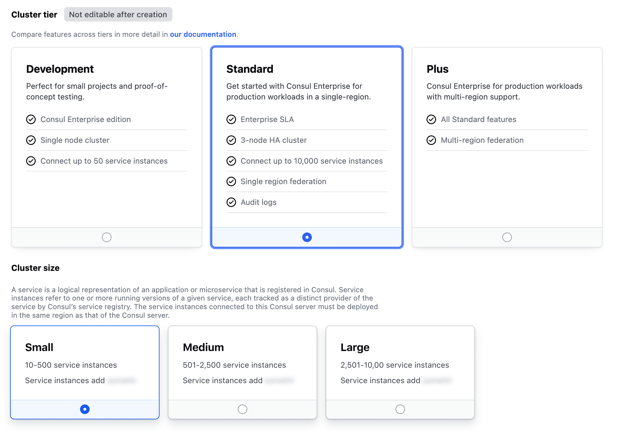
Sometimes the values or options for a given field depend on information or selection from a previous field.
Generally, fields that are dependencies for other fields benefit from being organized closer to the start of a form. For example, selecting a cluster tier reveals options for cluster sizes that are only available for the previously selected tier.
User needs
Users benefit from logical organization and progressive organization, organizing fields from easiest to hardest.
This can help increase form completion by:
- giving the user a sense of accomplishment early on through “quick wins”
- reducing the probability of the user abandoning a form when they’ve already completed the “easier” segments.
Business needs
Organizing fields based on their importance (high to low) to completing the form can help minimize abandonment, a crucial aspect of meeting business goals and metrics.
Logical organization
Organize fields logically; consider how users fill in information based on the context.
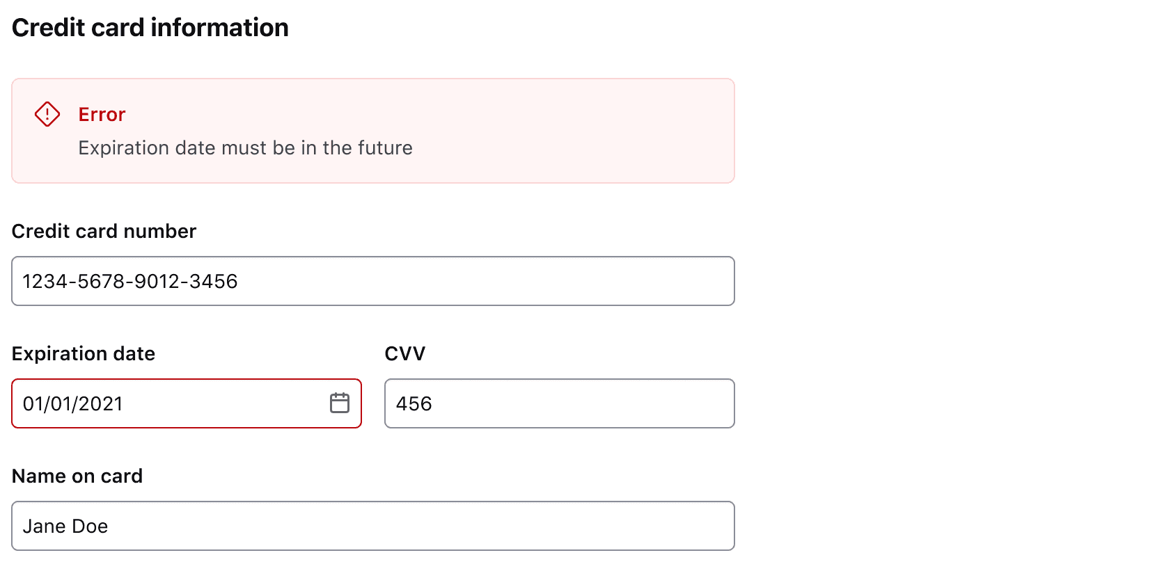
For example, when filling out a payment form, organize the fields in the same order as they appear on a credit card or payment method: name, card number, expiration date, security code.
Visual organization
Once a logical organization has been established,
- categorize elements and fields into sections,
- introduce typographic elements to establish hierarchy,
- and, if necessary, use separators to differentiate sections clearly.
Each one of these methods will help the user better parse and understand the relationships between each section and the fields contained within.
Form complexity
Since longer forms can result in a lower completion rate, we recommend looking for ways to reduce the overall number of fields whenever possible.
Multiple sections
Using sections based on the relationship between fields can make a longer form seem less complex. Introducing typographic elements and dividers can further aid the hierarchy of the form and differentiate sections from one another.
Using separators
Separators introduce more visual hierarchy and differentiation in longer, complex forms.
Use separators to break up different types of content and categories within a form. Only use separators between sections, not between fields.
Don’t use separators at the end of the last section between the fields and the button set or actions.
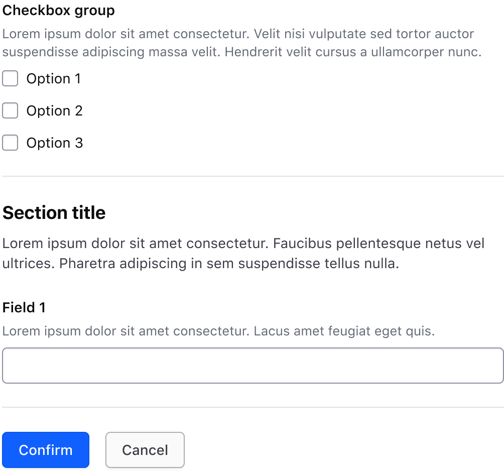
Instead, use the section spacing value of 32px.
Multiple steps or pages
Consider breaking the form into multiple steps or pages for exceedingly long and complex forms (e.g., creating a cluster). For multi-step forms, use a Stepper to indicate status and the user’s location within the form.
Required and optional
For complex forms, indicate required fields. This is the most explicit and transparent method for indicating input needs to users.
For shorter, simpler forms, indicate optional fields instead.
Don't mix required and optional labels, stick to one or the other. Using one method can imply that fields without a label are the inverse of whatever method you choose, though expecting the user to carry this knowledge through a complex form can cause unnecessary validation errors when required fields aren't labeled.
Copying an input value
If a user needs to copy the value within an input, consider pairing it with a CopyButton with the input control. This can reduce the friction of manually copying a value to a single targeted action.
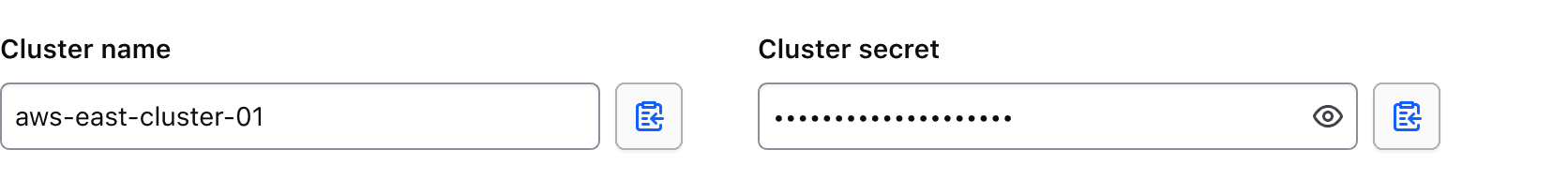
Visit the CopyButton guidelines for more details on this specific composition.
Anatomy
Elements and content within a form are variable but can be broken down into sections that correspond with different types of content.
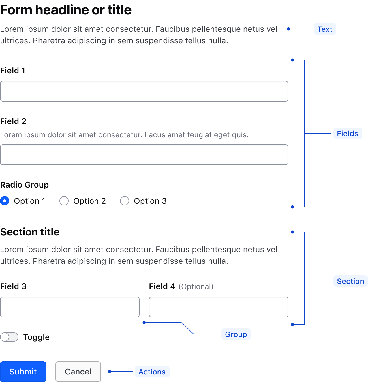
| Type | Description |
|---|---|
| Form | The exterior container that wraps other form elements and sections. The form (<form>) handles the logic and submission actions for the collected data. |
| Section | Consists of multiple content types (text, fields) and groups content |
| Text | Titles, headlines, descriptions, and supporting content that further describe the content of the form or specific sections within a form. Typically text elements are wrapped in a <legend>. |
| Fields | An array of one or more fields which can be any input type; text input, toggle, radio, textarea, or any other Helios Form component. |
| Group | Layout mechanism to group like elements together |
| Actions | Responsible for submitting the form or giving the user a method to cancel, clear the form, or "go back." Refer to the button organization for more details. |
Form validation ensures required fields are not empty, field input is correctly formatted, and the data being submitted matches the requirements for the application. A successful validation strategy relies on three key concepts:
- Clear language: Error messages should be human-readable and easy to understand.
- Placement: Error messages should be noticeable and display in close proximity to where the error was triggered.
- Timing: Error messages should display as soon as possible after an error occurs.
Clear validation language
Error messages should clearly, but briefly communicate the issue for each impacted input. Using plain language to state the problem and suggested solution helps reduce friction when users are resolving errors in their inputs.
Placement by validation type
The location and styling of error messages may impact the cognitive load on the user. Carefully consider which type of validation would be most appropriate for a form based on:
- The complexity of the data being collected
- The number of inputs in the form and the length of time expected for a user to complete the form
- Whether interrupting the user’s flow to prompt them to fix errors will cause undue friction
- What patterns for errors are used elsewhere in the platform that the user may be expecting
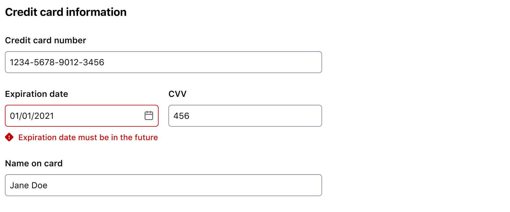
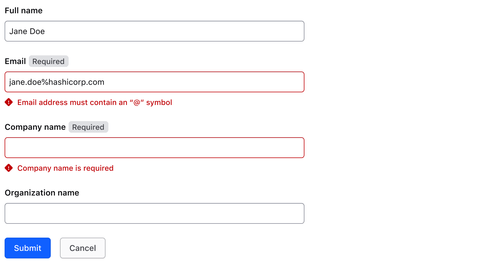
Field-level validation
The best time to inform a user of an input error is as soon as it’s detected. Using inline client-side validation at the field level informs the user of an error where and when it happens. Inline validation enables users to correct errors without waiting until the data is submitted. For example, a user creating a password will need to know what requirements haven’t been met when seeing the error message.
Use the built-in invalid input state and the accompanying Error contextual component to display field-level errors.
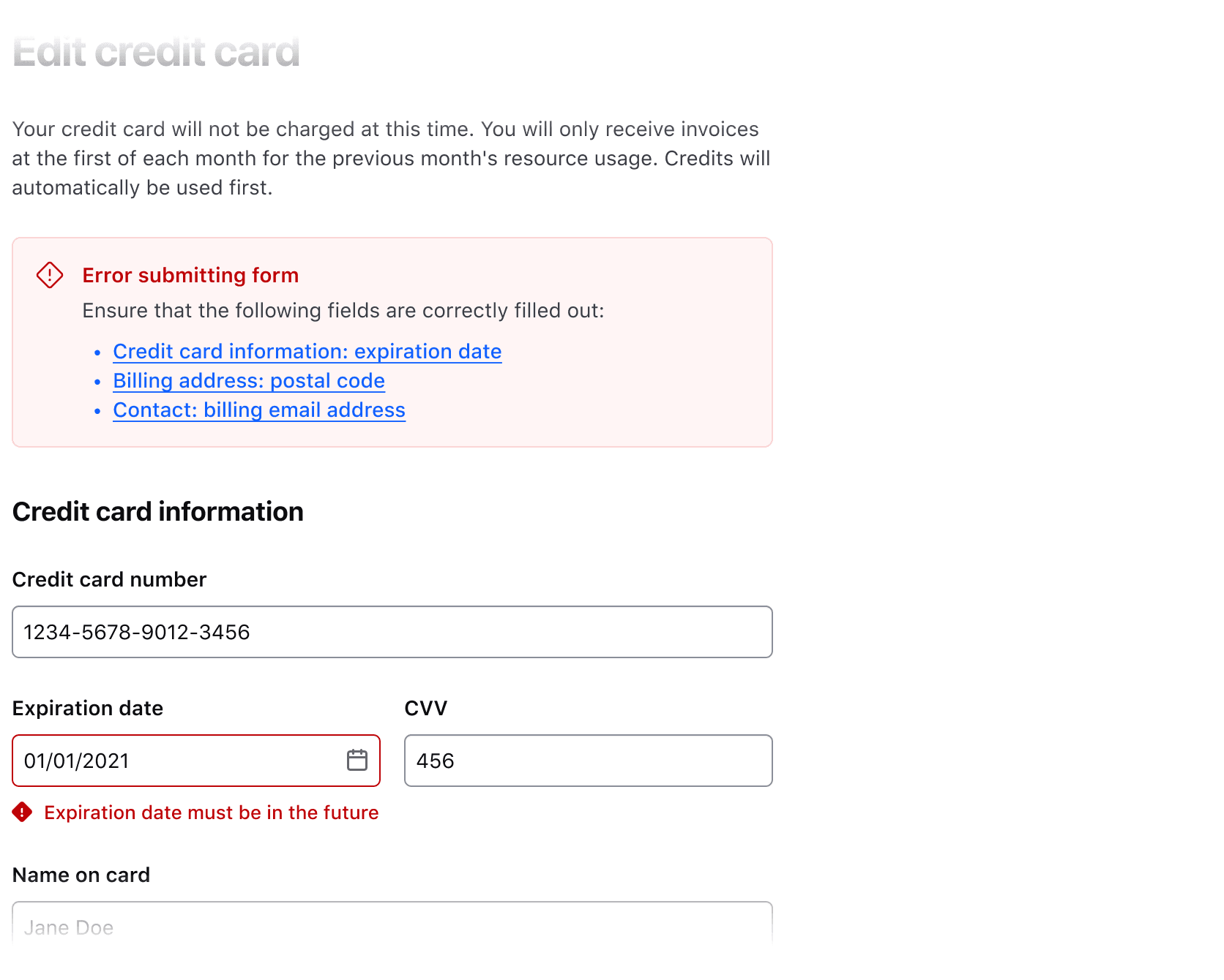
Form-level validation
Form-level validation should be used for server-side errors that cannot be checked before data submission or that require additional checks after data submission. This error type should appear at the top of the form and use a Critical Inline Alert. Using an Alert makes the message a focal point so users can easily see what error(s) occurred during the submission.
For form-level validation that identifies multiple input-level errors, the alert should contain a message listing all errors with links to each invalid field. We recommend using an introductory sentence to give context before listing the items, e.g., “Please correct the following errors and resubmit the form.”
Use form-level validation for overarching form submission errors or for a list of server-side validation errors that link to their respective errored fields.
Never use form-level alerts for field-specific, inline validations.
Combining field and form-level validation
We recommend always using inline validation to provide immediate feedback, but for complex forms that require both client-side and server-side checks, a combined approach is best.
Timing validation messages
Validation on focus change
Client-side validation occurs when a user leaves the field via an onblur event. This immediate feedback communicates errors as they happen.
Because this method minimizes interruption, use it whenever possible so users can resolve errors while still in the context of the form. This can limit the amount of context switching necessary to complete the form successfully and reduce the cognitive load on the user.
Validation on submission
Validating a form on submission can occur on the client or server-side and can be used to display errors after the form has been submitted. This method can applied to in many use cases, including:
- Validating that each required field in a form is filled.
- Validating that the input data matches the formatting expectations of the application and the server.
Delayed validation
Delayed validation occurs on the client-side and refers to validating the field after a lapse in keystrokes or a specific interval of time, e.g., 500ms or 0.5 seconds. Once the user has stopped typing into the field or after the interval of time has expired, the field is validated without an onblur event occurring.
This method can be invasive and result in unintended validation errors by assuming the user is done filling out a field. We don’t recommend implementing delayed validation for most forms.
Consider a user entering their credit card information; they may repeatedly reference a physical card when inputting the card number, which can cause extended delays between keystrokes and result in a validation error being displayed preemptively.
Validation interaction
If a validation error occurs in a field outside of the viewport, scroll the user to the error. If there are multiple fields in error, scroll the user to the first (or topmost) error in the form. Form-level validation errors should be scrolled to first and take precedence over individual fields in error. This commonly occurs in long, complex forms when a form-level error occurs.