The Super Select component provides a way to select among a group of options and can be considered an enhanced version of the Select component. It supports rich content within option items, as well as custom content before and after the option items. The Super Select is built on top of ember-power-select.
Usage
When to use
- When the list of options is large and search is required to help filter the list.
- When complex, structured content is required to be displayed within the options.
When not to use
- To display a list of links (or buttons) in a menu, consider the Dropdown component instead.
- When a simple select is needed for a form, consider the Select form component.
- As a means to filter an array of objects within a data set; e.g., when presented in a tabular format or list. Instead, consider other filtering patterns.
Components
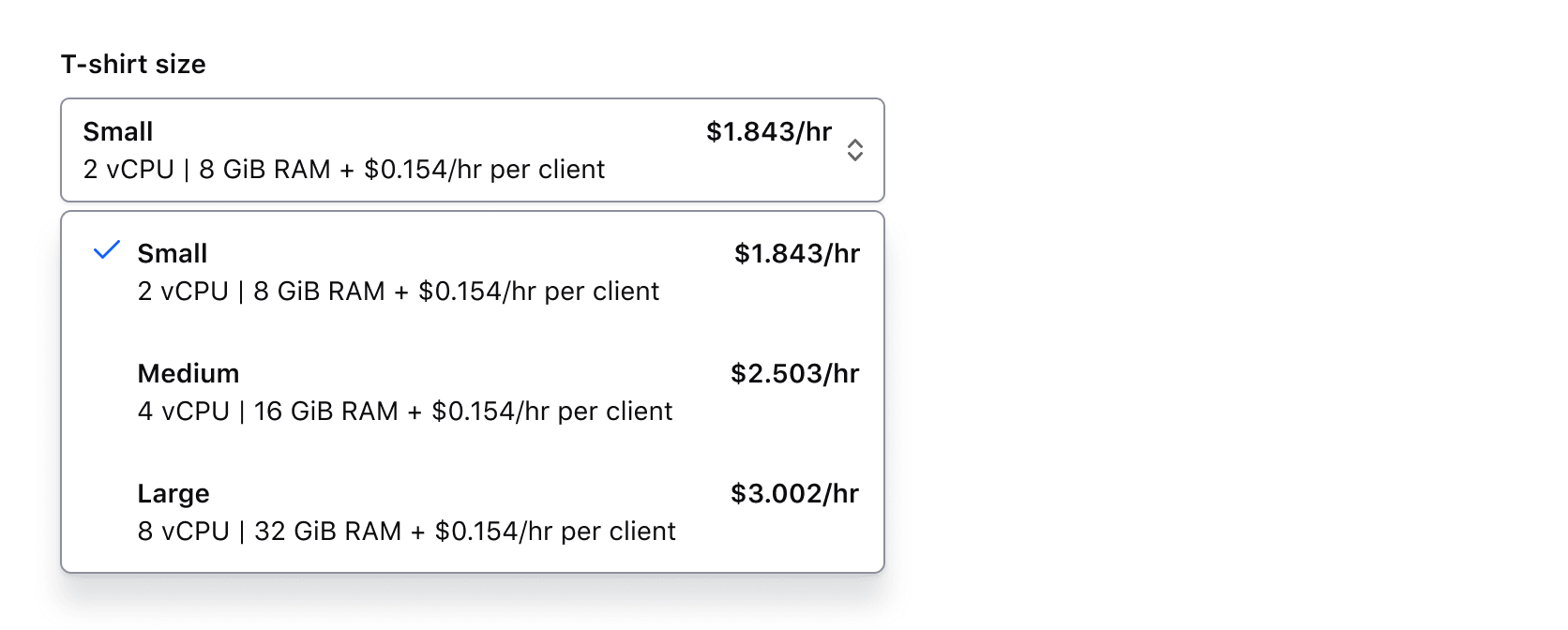
Single
Selection is limited to a single option item.
Multiple
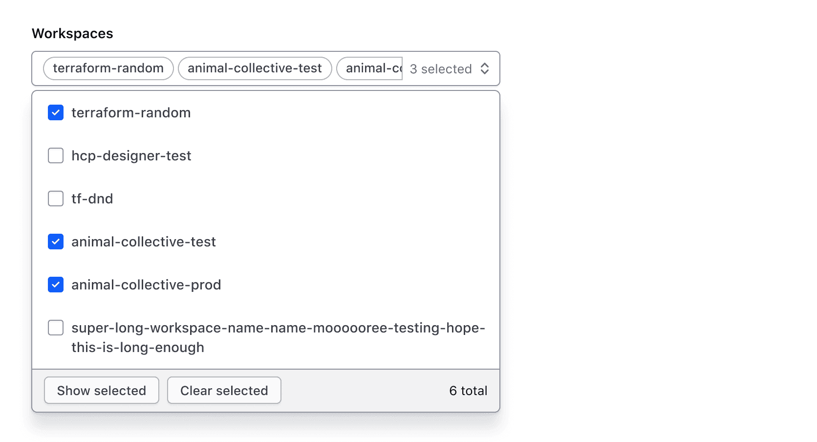
Multiple options can be selected.
Trigger value states
Empty
The trigger is empty by default, indicating that nothing is selected.
Placeholder text
Placeholder text can be added to the trigger to provide the user additional context. However, this information should not be required for them to carry out a task.

Filled
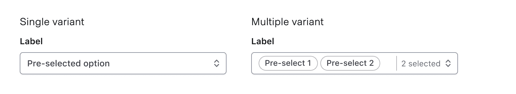
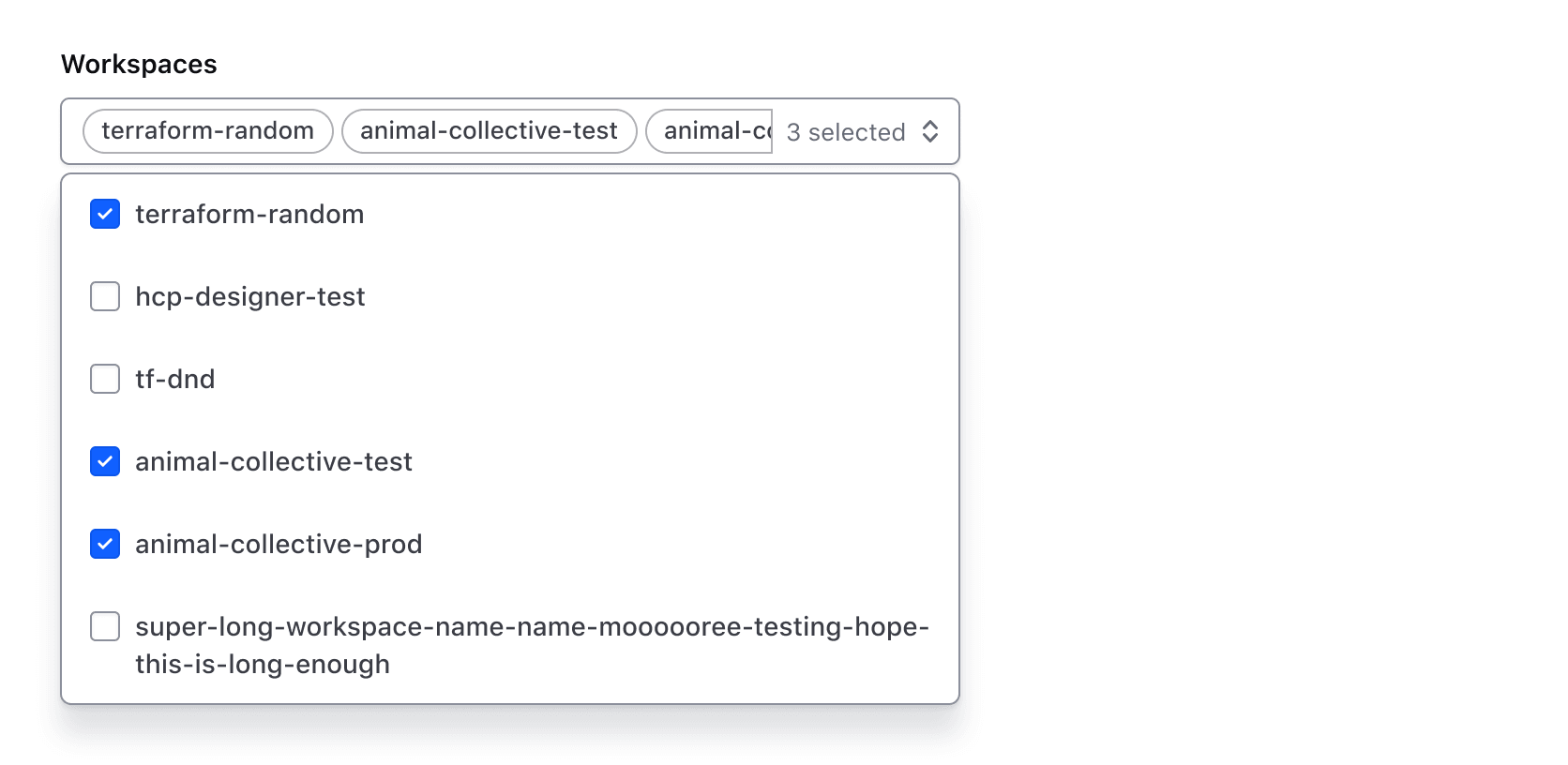
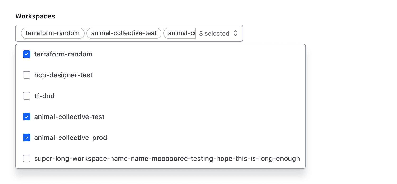
When one or more values are selected, the trigger is populated with the selected value(s). One or more values can be pre-selected before user interaction as needed. It is important to note that the selected values in the trigger are displayed in the order chosen by the user.
In the SuperSelect Multiple component, a count of the number of selected items displays when one or more selections have been made.
Before and after options
The before and after options are areas above and below the list, independent from the list of options. Predefined components (like search) or generic content can occupy these spaces.
BeforeOptions
BeforeOptions allows for either a search field or generic content to be displayed before the options list.
Search
If enabled, search allows the user to filter results based on a query.
Generic content
If enabled, generic content will occupy this space.
We recommend against placing heavy UI elements in custom content as it can draw attention away from the list options and will only be visible when the menu is open. Consider placing such content outside the list relative to the trigger for better visibility.
AfterOptions
AfterOptions allows for either a standardized footer or generic content to be displayed after the options list. The footer has additional functionality in the Multiple component compared to the Single.
Footer
By default, the footer displays below the options list and contains content and/or buttons which provide additional context or functions related to the options.
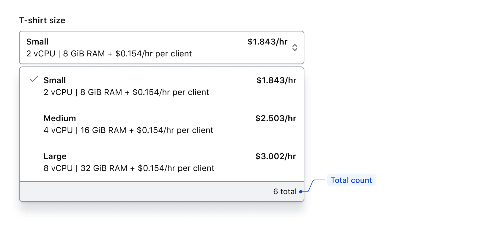
Single
The footer for the Single component includes a total count, which is customizable to fit the context. However, we recommend using "{xx} total" to maintain consistency across products.
Multiple
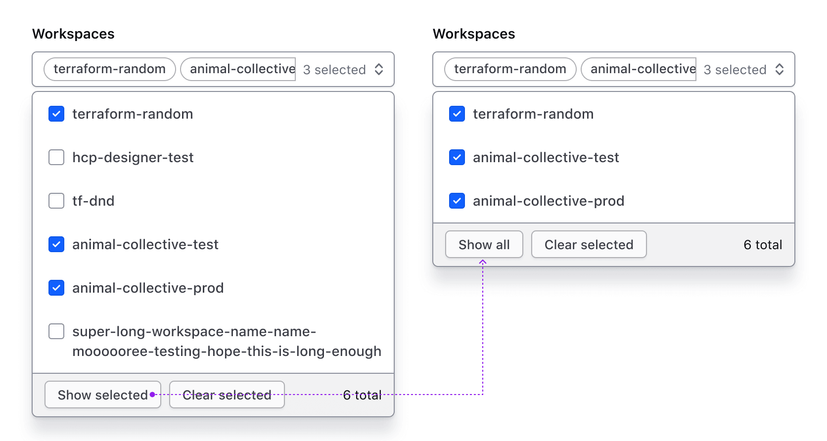
The footer for the Multiple component includes a total count and list modifier buttons. While the count text can be customized, we recommend using "{xx} total" to drive consistency across products.
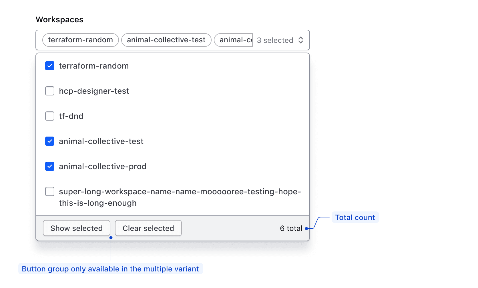
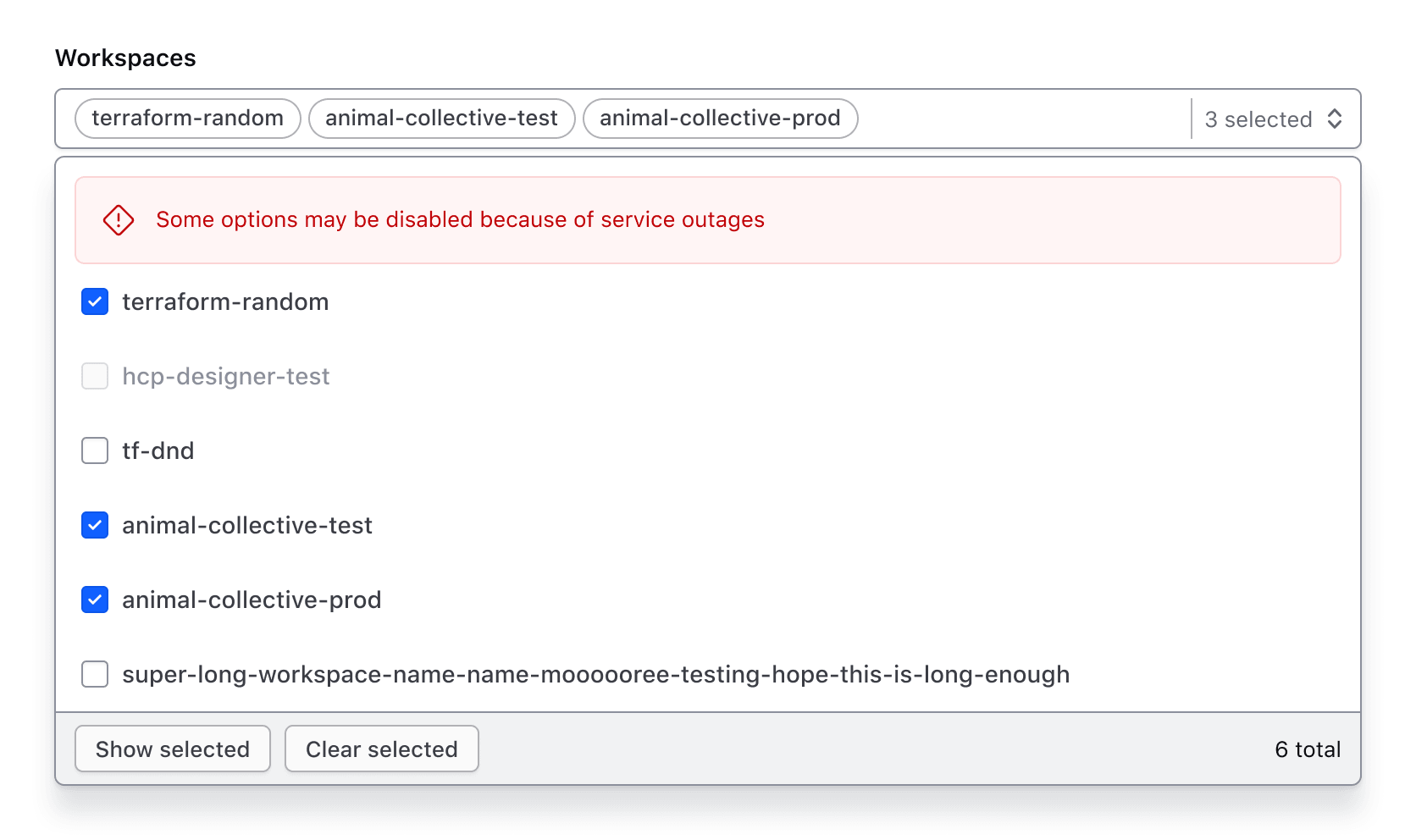
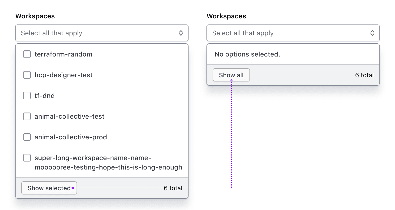
The “Show selected” button displays only the selected options in the list. When toggled, the text changes to “Show all.”
If “Show selected” is toggled when no options have been selected, a message will appear notifying the user.
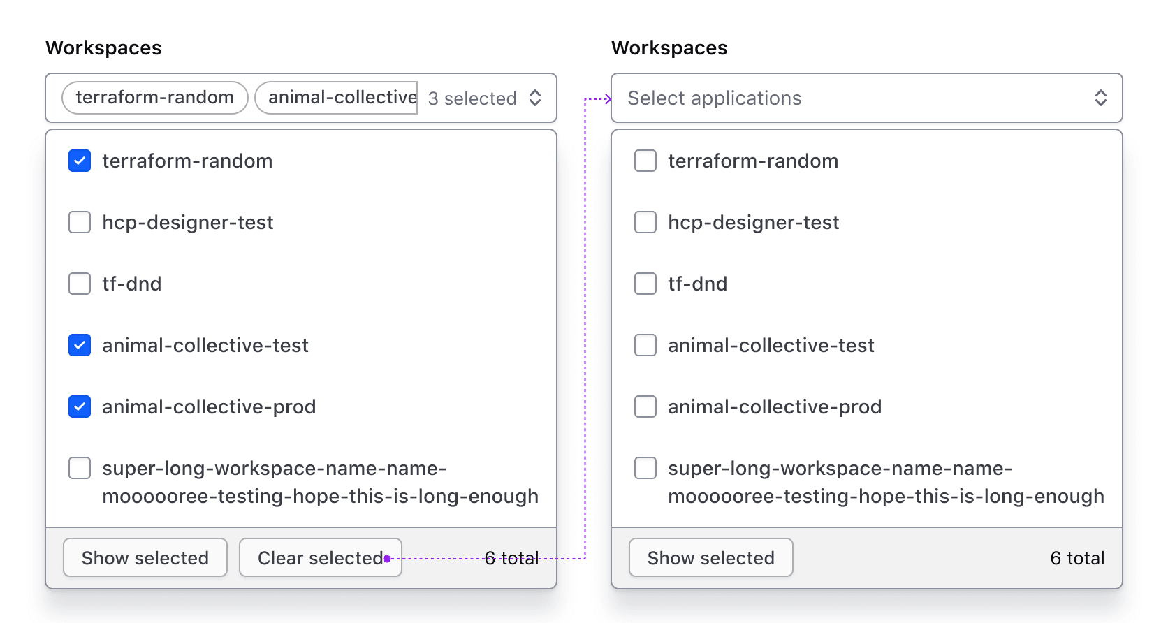
The “Clear selected” button clears all selections and reverts the Super Select to its default/deselected state. This button is hidden if no options are selected.
Footer with generic content
The footer can contain generic content instead of the default content. This is helpful in maintaining the standard appearance of the footer container while allowing for custom usage.
Generic content
If enabled, generic content will occupy this space.
List
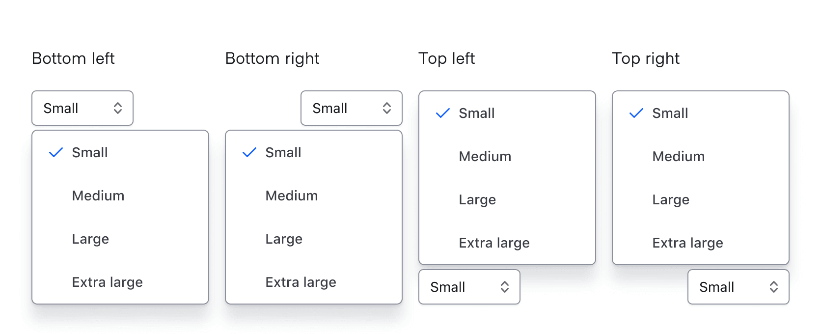
Positioning
Lists can be positioned to the left or right, as well as above or below the trigger as necessary to fit within the UI. These options are only available when matchTriggerWidth is set to false. This effects the ember component only.
Width
By default, the width of the list matches the trigger width.
Auto width
If the list width is set to “auto" it will match the width of the longest list item, which may result in the list being narrower or wider than the trigger width. A max-width can also be defined for the list.
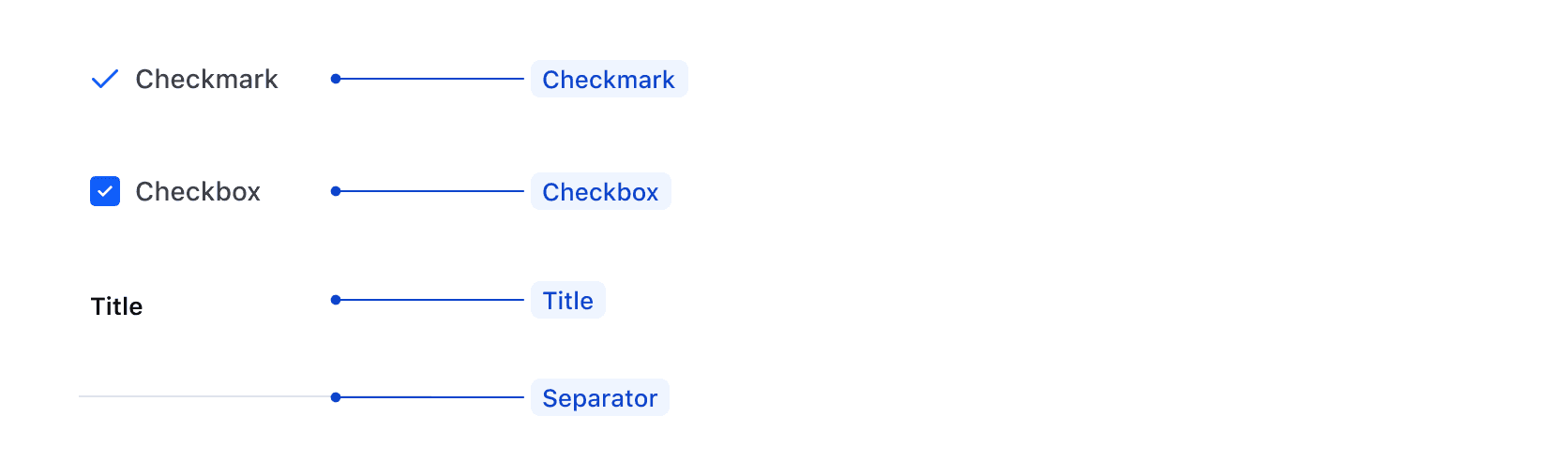
ListItem Types
There are four types of ListItems, two of which are component-specific.
Checkmarkis used in the Single component to indicate a selection has been made.Checkboxis used in the Multiple component to indicate that more than one option can be selected.Titleis used to group ListItems together and help visually organize groups.Separatoris used to create a visual separation between groups.
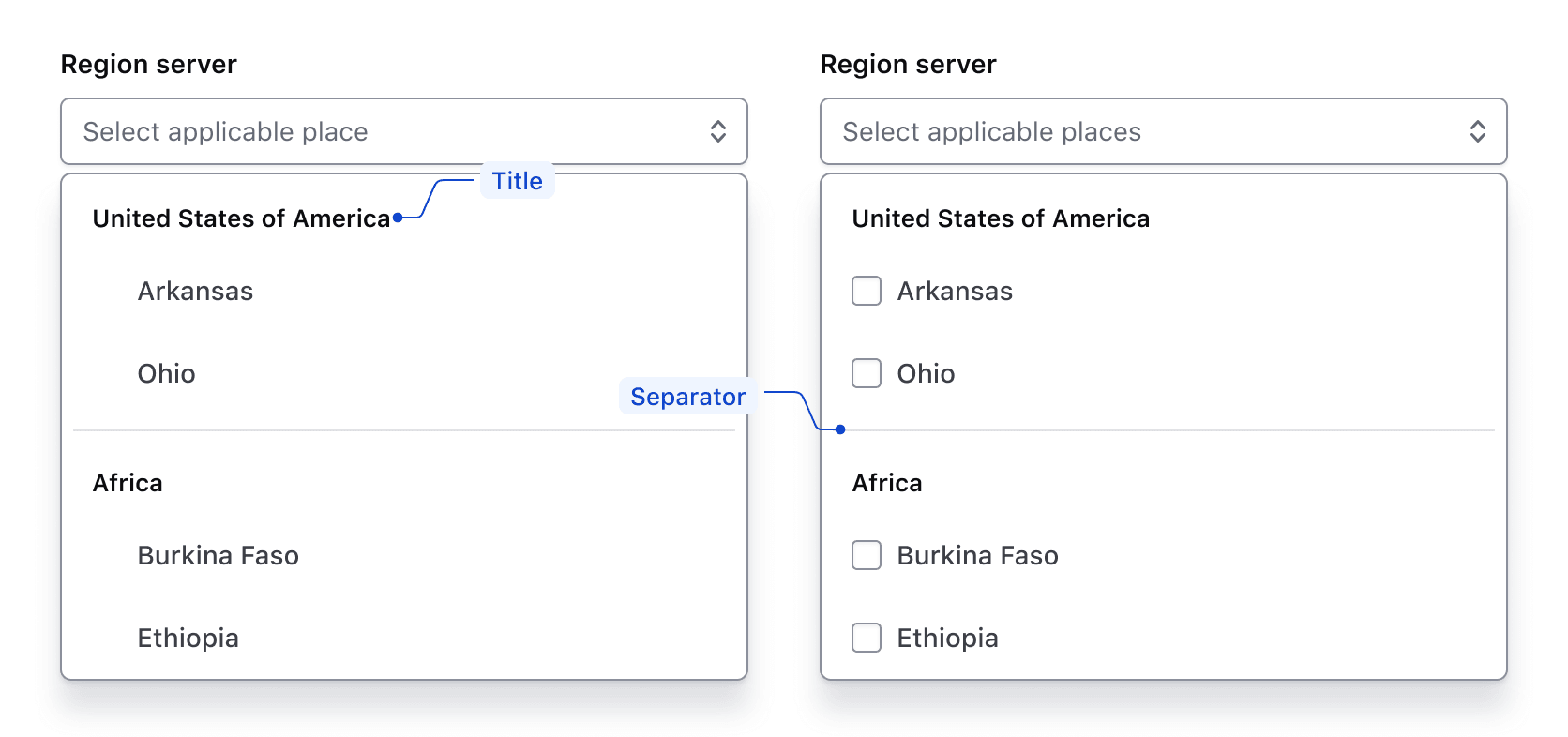
Groups
ListItems can be grouped visually by adding a title and a separator. The last group in the list doesn’t require a separator.
Required and optional
For complex forms, required fields should be indicated. This is the most explicit and transparent method to ensure users don’t have to make assumptions. Read more about best practices for marking required fields in forms.
For shorter, simpler forms (e.g., login/signup and feedback requests), indicate optional fields instead.
Error validation
For error validation recommendations, refer to the Form patterns documentation.
How to use this component
Super Select is a custom select-like component aiming to overcome some limitations of the HTML <select> element.
It’s primarily a wrapper for ember-power-select and uses the 8.2.0 version with specific accessibility and styling choices that best fit our design system.
We provide two main components with similar APIs: Form::SuperSelect::Single and Form::SuperSelect::Multiple.
There are two ways to use each of the Super Select component types:
Form::SuperSelect::Single::BaseorForm::SuperSelect::Multiple::Base—the base component with just the Super Select control. In these instances, you will need to add your own label, helper text, and error messaging.Form::SuperSelect::Single::FieldorForm::SuperSelect::Multiple::Field—the field parent component which includes the Super Select control, label, helper text, and error messaging (in a wrapping container).
We recommend using the Field variation as it provides built-in accessibility functionality. Use the Base variation for custom layouts or special use cases not otherwise covered.
Form::SuperSelect::Single
In cases where the Dropdown or Form Select components are not suitable, use SuperSelect::Single.
<Hds::Form::SuperSelect::Single::Field
  @onChange={{fn (mut this.SELECTED_OPTION)}}
  @selected={{this.SELECTED_OPTION}}
  @options={{this.OPTIONS}}
  @searchEnabled={{true}}
  as |F|
>
  <F.Label>This is the label</F.Label>
  <F.Options>{{F.options}}</F.Options>
</Hds::Form::SuperSelect::Single::Field>
Form::SuperSelect::Multiple
Use SuperSelect::Multiple to allow users to select multiple options.
<Hds::Form::SuperSelect::Multiple::Field
  @onChange={{fn (mut this.SELECTED_OPTIONS)}}
  @selected={{this.SELECTED_OPTIONS}}
  @options={{this.OPTIONS}}
  @searchEnabled={{true}}
  as |F|
>
  <F.Label>This is the label</F.Label>
  <F.Options>{{F.options}}</F.Options>
</Hds::Form::SuperSelect::Multiple::Field>
Pre-selected options
To pre-select an option, declare a value for the selected argument:
<Hds::Form::SuperSelect::Single::Field
  @onChange={{fn (mut this.SELECTED_OPTION)}}
  @selected={{this.SELECTED_OPTION}}
  @options={{this.OPTIONS}}
  @searchEnabled={{true}}
  as |F|
>
  <F.Label>Label</F.Label>
  <F.Options>{{F.options}}</F.Options>
</Hds::Form::SuperSelect::Single::Field>
Placeholder
Placeholder text can be added to provide additional context. However, this information should not be necessary for users to complete a task.
<Hds::Form::SuperSelect::Single::Field
  @onChange={{fn (mut this.SELECTED_OPTION)}}
  @selected={{this.SELECTED_OPTION}}
  @options={{this.OPTIONS}}
  @searchEnabled={{true}}
  @placeholder="Your location"
  as |F|
>
  <F.Label>Select your location of residence</F.Label>
  <F.Options>{{F.options}}</F.Options>
</Hds::Form::SuperSelect::Single::Field>
Grouped options
To group similar sets of options, pass a nested data structure specifying the groupName and associated options.
Note that the options in the JavaScript in this example are stored as a nested array.
<Hds::Form::SuperSelect::Multiple::Field
  @onChange={{fn (mut this.SELECTED_OPTIONS)}}
  @selected={{this.SELECTED_OPTIONS}}
  @options={{this.OPTIONS}}
  as |F|
>
  <F.Label>Grouped options</F.Label>
  <F.Options>{{F.options}}</F.Options>
</Hds::Form::SuperSelect::Multiple::Field>
Rich-content options
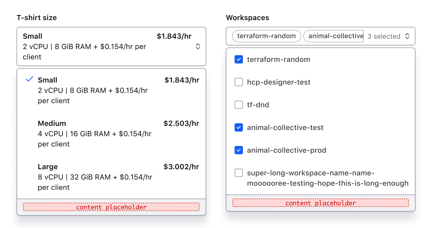
Super Select allows you to add HTML tags within options to lay out and structure content vs. Hds::FormSelect which only allows plain text strings as option content.
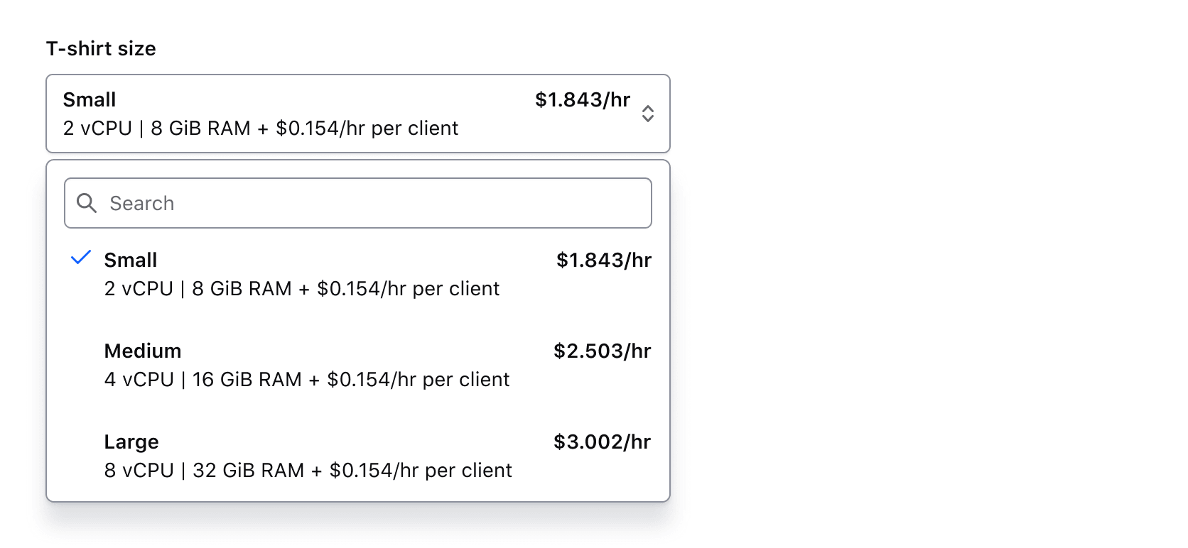
Rich content with default display in SuperSelect::Single
<Hds::Form::SuperSelect::Single::Field
  @onChange={{fn (mut this.SELECTED_OPTION)}}
  @selected={{this.SELECTED_OPTION}}
  @options={{this.OPTIONS}}
  as |F|
>
  <F.Label>Size</F.Label>
  <F.Options>
    {{#let F.options as |option|}}
      <Hds::Text::Body @size="200">
        <div class="doc-super-select-option-rich-header">
          <strong>{{option.size}}</strong>
          <strong>{{option.price}}</strong>
        </div>
        <div>{{option.description}}</div>
      </Hds::Text::Body>
    {{/let}}
  </F.Options>
</Hds::Form::SuperSelect::Single::Field>
Rich content with default display in SuperSelect::Multiple
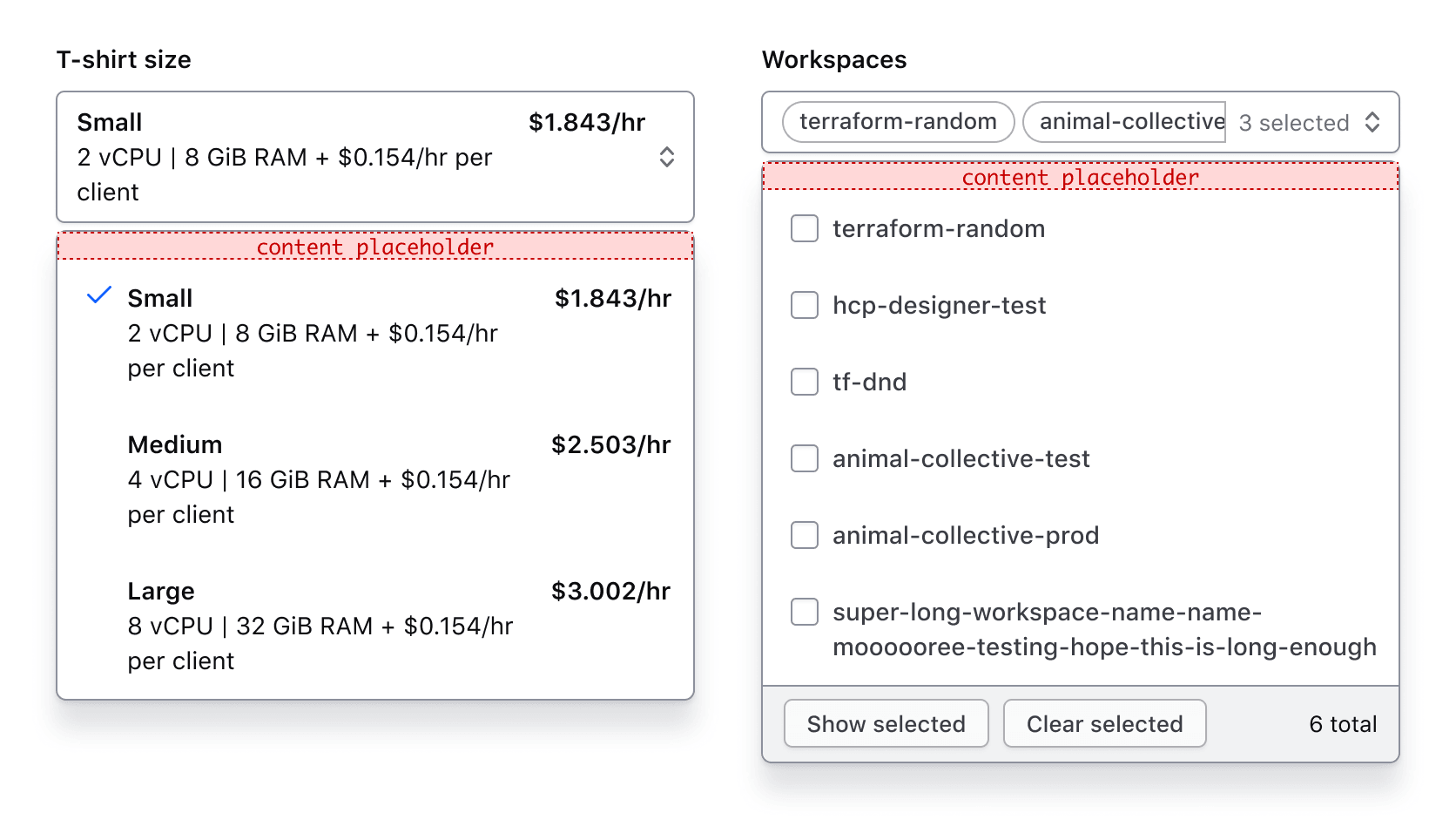
By default, all content of selected options displays in the “trigger”. Visually, this looks ok in SuperSelect::Single. However, in SuperSelect::Multiple the selected items are displayed as pill-shaped “tags” so can look quite busy.
<Hds::Form::SuperSelect::Multiple::Field
  @onChange={{fn (mut this.SELECTED_OPTIONS)}}
  @selected={{this.SELECTED_OPTIONS}}
  @options={{this.OPTIONS}}
  as |F|
>
  <F.Label>Size</F.Label>
  <F.Options>
    {{#let F.options as |option|}}
      <Hds::Text::Body @size="200">
        <div class="doc-super-select-option-rich-header">
          <strong>{{option.size}}</strong>
          <strong>{{option.price}}</strong>
        </div>
        <div>{{option.description}}</div>
      </Hds::Text::Body>
    {{/let}}
  </F.Options>
</Hds::Form::SuperSelect::Multiple::Field>
Selected item component
To simplify the content displayed in the selected options, use @selectedItemComponent to specify a custom component with only the content you wish to display.
An example of a custom selectedItemComponent:
SuperSelect::Multiple invocation with selectedItemComponent specified:
<Hds::Form::SuperSelect::Multiple::Field
  @onChange={{fn (mut this.SELECTED_OPTIONS)}}
  @selected={{this.SELECTED_OPTIONS}}
  @selectedItemComponent={{component "power-select/selected-option-multiple"}}
  @options={{this.OPTIONS}}
  as |F|
>
  <F.Label>Size</F.Label>
  <F.Options>
    {{#let F.options as |option|}}
      <Hds::Text::Body @size="200">
        <div class="doc-super-select-option-rich-header">
          <strong>{{option.size}}</strong>
          <strong>{{option.price}}</strong>
        </div>
        <div>{{option.description}}</div>
      </Hds::Text::Body>
    {{/let}}
  </F.Options>
</Hds::Form::SuperSelect::Multiple::Field>
SuperSelect::Single invocation with selectedItemComponent specified:
<Hds::Form::SuperSelect::Single::Field
  @onChange={{fn (mut this.SELECTED_OPTIONS)}}
  @selected={{this.SELECTED_OPTIONS}}
  @selectedItemComponent={{component "power-select/selected-option-single"}}
  @options={{this.OPTIONS}}
  as |F|
>
  <F.Label>Size</F.Label>
  <F.Options>
    {{#let F.options as |option|}}
      <Hds::Text::Body @size="200">
        <div class="doc-super-select-option-rich-header">
          <strong>{{option.size}}</strong>
          <strong>{{option.price}}</strong>
        </div>
        <div>{{option.description}}</div>
      </Hds::Text::Body>
    {{/let}}
  </F.Options>
</Hds::Form::SuperSelect::Single::Field>
Limiting width
If needed, you can use dropdownMaxWidth to limit the width of the dropdown content. Setting a value for dropdownMaxWidth automatically sets matchTriggerWidth to false meaning that the width of the dropdown content will not necessarily match the list of the toggle or trigger element as it does by default.
<div class="doc-super-select-constrain-width">
  <Hds::Form::SuperSelect::Single::Field
    @onChange={{fn (mut this.SELECTED_OPTION)}}
    @selected="API code"
    @options={{this.OPTIONS}}
    @dropdownMaxWidth="25em"
    as |F|
  >
    <F.Label>Choose one</F.Label>
    <F.Options>{{F.options}}</F.Options>
  </Hds::Form::SuperSelect::Single::Field>
</div>
Helper text
You can add extra information to the field using Helper Text. When helper text is added, the component automatically adds an aria-describedby attribute to the Super Select control, associating it with the automatically generated ID of the helper text element.
<Hds::Form::SuperSelect::Single::Field
  @onChange={{fn (mut this.SELECTED_OPTION)}}
  @selected={{this.SELECTED_OPTION}}
  @options={{this.OPTIONS}}
  as |F|
>
  <F.Label>Target infrastructure</F.Label>
  <F.HelperText>The target infrastructure is where you want to deploy your apps.</F.HelperText>
  <F.Options>{{F.options}}</F.Options>
</Hds::Form::SuperSelect::Single::Field>
Extra content in label and helper text
The Label and HelperText contextual components used in the Field component yield their content. This means you can also pass structured content.
For example:
<Hds::Form::SuperSelect::Single::Field
  @onChange={{fn (mut this.SELECTED_OPTION)}}
  @selected={{this.SELECTED_OPTION}}
  @options={{this.OPTIONS}}
  @ariaLabel="Label"
  as |F|
>
  <F.Label>Target infrastructure <Hds::Badge @size="small" @text="Beta" /></F.Label>
  <F.HelperText>This is an experimental feature (<Hds::Link::Inline @href="#">read more</Hds::Link::Inline>).</F.HelperText>
  <F.Options>{{F.options}}</F.Options>
</Hds::Form::SuperSelect::Single::Field>
Required vs. optional
Use the @isRequired and @isOptional arguments to add a visual indication that the field is "required" or "optional".
<Hds::Form as |FORM|>
  <FORM.Section>
    <Hds::Form::SuperSelect::Single::Field
      @isRequired={{true}}
      @onChange={{fn (mut this.SELECTED_OPTION)}}
      @selected={{this.SELECTED_OPTION}}
      @options={{this.OPTIONS}}
      @searchEnabled={{true}}
      as |F|
    >
      <F.Label>This is the label</F.Label>
      <F.Options>{{F.options}}</F.Options>
    </Hds::Form::SuperSelect::Single::Field>

    <Hds::Form::SuperSelect::Single::Field
      @isOptional={{true}}
      @onChange={{fn (mut this.SELECTED_OPTION)}}
      @selected={{this.SELECTED_OPTION}}
      @options={{this.OPTIONS}}
      @searchEnabled={{true}}
      as |F|
    >
      <F.Label>This is the label</F.Label>
      <F.Options>{{F.options}}</F.Options>
    </Hds::Form::SuperSelect::Single::Field>
  </FORM.Section>
</Hds::Form>
Base components
The Base components are intended for rare cases where the Field components can’t be used and a custom implementation is needed. Most of the details for the Field components also apply to the Base components, but see the Component API for more details.
<Hds::Form::SuperSelect::Multiple::Base
  @onChange={{fn (mut this.SELECTED_OPTIONS)}}
  @selected={{this.SELECTED_OPTIONS}}
  @options={{this.OPTIONS}}
  @searchEnabled={{true}}
  @ariaLabel="Select server preferences"
  as |options|
>
  {{options}}
</Hds::Form::SuperSelect::Multiple::Base>
Component API
Super Select consists of two main components, Form::SuperSelect::Single and Form::SuperSelect::Multiple.
Each of these main components have two different variants with their own APIs:
Form::SuperSelect::Single::BaseorForm::SuperSelect::Multiple::Base—the base component with just the Super Select control.Form::SuperSelect::Single::FieldorForm::SuperSelect::Multiple::Field—the field parent component with the Super Select control, label, helper text, and error messaging (in a wrapping container).
The Single and Multiple base components have nearly identical APIs to the 8.2.0 version of the ember-power-select addon.
While the ember-power-select documentation has the full list of supported options for the base components, we’ve included the most common ones here for your convenience as well as the options for which default values have been overridden.
The default values of some ember-power-select options have been overridden to either resolve accessibility issues or to customize according to our needs:
renderInPlace: Always set astrue. The opener element or “trigger” must be next to dropdown content it hides & reveals.searchFieldPosition: Always set to"before-options". Rendering the search input within the trigger is not compliant because it nests interactive elements within each other.
SuperSelect::Single::Base
Common options from ember-power-select
options
collection
placeholder
string
searchEnabled
boolean
- false (default)
selected
any | array
onChange
function
SuperSelect::Single only options and options with custom values
afterOptionsComponent
string/contextual-component
- component hds/form/super-select/after-options (default)
SuperSelect::Single displays a custom afterOptions component containing a results count by default.
Customization options:
• To turn off rendering of the afterOptions component, set
showAfterOptions to false.• To customize the value of the afterOptions component, specify a value for
afterOptionsContent• To replace the default afterOptions component, set the value of
afterOptionsComponent to point to your own custom component. (Example: component "path/to/component")
showAfterOptions
boolean
- true (default)
afterOptions component is displayed or hidden.
afterOptionsContent
string
- resultCountMessage (default)
afterOptions component overriding the default content.
closeOnSelect
boolean
- true (default)
SuperSelect::Multiple.
placeholderComponent
string or component
- component (default)
optionGroup component to provide visual consistency.
dropdownMaxWidth
string
max-width for the dropdown containing the options list.
If a value for
dropdownMaxWidth is set, matchTriggerWidth is automatically set to false.
matchTriggerWidth
boolean
- true (default)
If a value for
dropdownMaxWidth is set, matchTriggerWidth is automatically set to false.
searchPlaceholder
string
- Search (default)
@searchEnabled is set to true.
groupComponent
component hds/form/super-select/option-group
optgroup element used within native HTML select elements. Requires use of the options property (see grouped options example).
…attributes
...attributes.
SuperSelect::Single::Field
id
string
By default, the ID is automatically generated by the component. Use this argument to pass a custom ID.
extraAriaDescribedBy
string
aria-describedby HTML attribute.
By default, the
aria-describedby attribute is automatically generated by the component, using the IDs of the helper text and errors (if present). Use this argument to pass an extra ID.
isRequired
boolean
- false (default)
Required indicator next to the label text and sets the required attribute on the control when user input is required.
isOptional
boolean
- false (default)
Optional indicator next to the label text when user input is optional.
…attributes
...attributes.
The attributes will be applied to the ember-power-select addon component which
SuperSelect is built on.
Contextual components
Options, Label, HelperText, and Error content are passed to the field as yielded components.
<[F].Options>
yielded component
SuperSelect list.
<[F].Label>
yielded component
<label> element. The content can be a simple string or a more complex/structured string, in which case it inherits the text style. For details about its API, check the Form::Label component.
The
for attribute of the label is automatically generated using the controlId value of the control.
<[F].HelperText>
yielded component
Form::HelperText component.
The
id attribute of the element is automatically generated using the controlId value of the control.
<[F].Error>
yielded component
Form::Error component.
The
id attribute of the Error element is automatically generated.
<[E].Message>
yielded component
Error.Message.
SuperSelect::Multiple::Base
Common options from ember-power-select
options
collection
placeholder
string
searchEnabled
boolean
- false (default)
selected
any or array
onChange
function
SuperSelect::Multiple only options and options with custom values
afterOptionsComponent
string/contextual-component
- component hds/form/super-select/after-options (default)
SuperSelect::Multiple displays a custom afterOptions component containing “Show selected” button, “Clear selected” button, and a selected total count by default.
Customization options:
• To turn off rendering of the afterOptions component, set
showAfterOptions to false.• To customize the value of the afterOptions component, specify a value for
afterOptionsContent• To replace the default afterOptions component, set the value of
afterOptionsComponent to point to your own custom component. (Example: component "path/to/component")
showAfterOptions
boolean
- true (default)
afterOptions component is displayed or hidden.
afterOptionsContent
string
- resultCountMessage (default)
afterOptions component overriding the default content.
resultCountMessage
string
closeOnSelect
boolean
- false (default)
SuperSelect::Single.
placeholderComponent
string or component
- component (default)
optionGroup component to provide visual consistency.
dropdownMaxWidth
string
max-width for the dropdown containing the options list.
If a value for
dropdownMaxWidth is set, matchTriggerWidth is automatically set to false.
matchTriggerWidth
boolean
- true (default)
If a value for
dropdownMaxWidth is set, matchTriggerWidth is automatically set to false.
searchPlaceholder
string
- Search (default)
@searchEnabled is set to true.
Note: Currently not active, awaiting update to ember-power-select.
groupComponent
component hds/form/super-select/option-group
optgroup element used within native HTML select elements. Requires use of the options property (see grouped options example).
…attributes
...attributes.
SuperSelect::Multiple::Field
id
string
By default, the ID is automatically generated by the component. Use this argument to pass a custom ID.
extraAriaDescribedBy
string
aria-describedby HTML attribute.
By default, the
aria-describedby attribute is automatically generated by the component, using the IDs of the helper text and errors (if present). Use this argument to pass an extra ID.
isRequired
boolean
- false (default)
Required indicator next to the label text and sets the required attribute on the control when user input is required.
isOptional
boolean
- false (default)
Optional indicator next to the label text when user input is optional.
…attributes
...attributes.
The attributes will be applied to the ember-power-select addon component which
SuperSelect is built on.
Contextual components
Options, Label, HelperText, and Error content are passed to the field as yielded components.
<[F].Options>
yielded component
SuperSelect list.
<[F].Label>
yielded component
<label> element. The content can be a simple string or a more complex/structured string, in which case it inherits the text style. For details about its API, check the Form::Label component.
The
for attribute of the label is automatically generated using the controlId value of the control.
<[F].HelperText>
yielded component
Form::HelperText component.
The
id attribute of the element is automatically generated using the controlId value of the control.
<[F].Error>
yielded component
Form::Error component.
The
id attribute of the Error element is automatically generated.
<[E].Message>
yielded component
Error.Message.
Anatomy
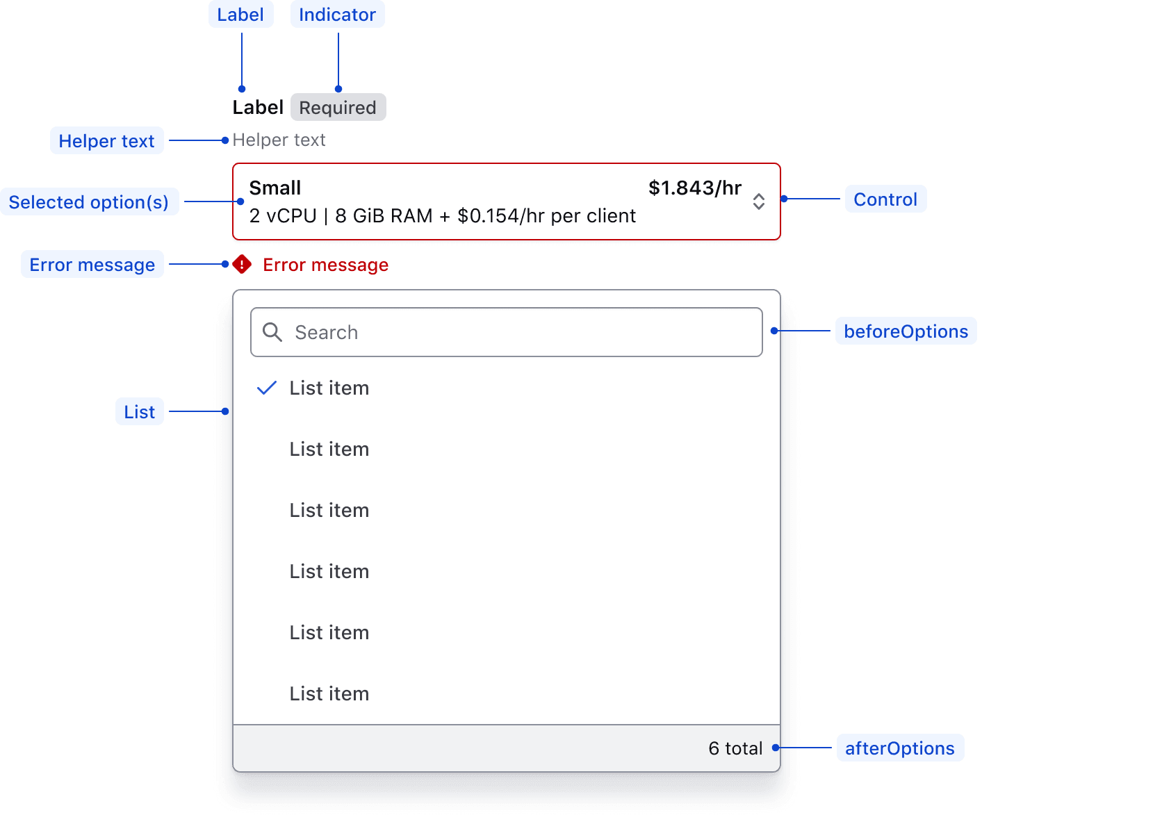
| Element | Usage |
|---|---|
| Label | Required |
| Indicator | Optional |
| Helper text | Optional |
| Selected option(s) | Optional |
| Control | Required |
| Error message | Triggered by system |
| Before options | Optional |
| List | Required |
| After options | Optional |
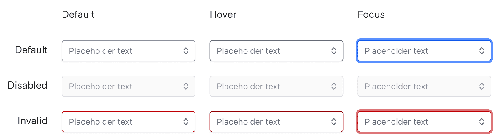
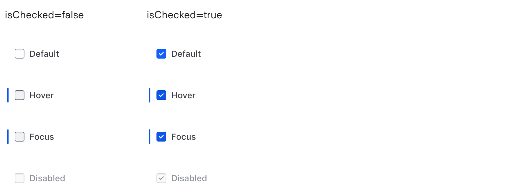
States
Trigger
ListItem
Checkmark
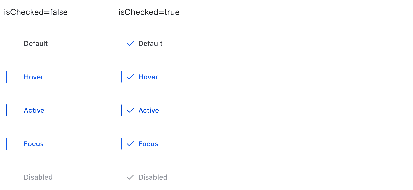
Checkbox
For general content recommendations, refer to the Primitives documentation.
Options list
- Keep option content clear and concise; avoid full sentences.
- Avoid repeating the same word at the beginning of list options.
- Order the options in a logical way based on the use case. For example:
- default or most commonly selected options first
- alphabetically
- numerically
Conformance rating
While many improvements have been made to the underlying library for this component, some variations, such as for multiple selection, are still a work in progress and do not currently pass the relevant WCAG Success Criteria. Please take this into consideration when using this component.
Applicable WCAG Success Criteria
This section is for reference only. This component intends to conform to the following WCAG Success Criteria:
-
1.1.1
Non-text Content (Level A):
All non-text content that is presented to the user has a text alternative that serves the equivalent purpose. -
1.3.1
Info and Relationships (Level A):
Information, structure, and relationships conveyed through presentation can be programmatically determined or are available in text. -
1.3.2
Meaningful Sequence (Level A):
When the sequence in which content is presented affects its meaning, a correct reading sequence can be programmatically determined. -
1.4.1
Use of Color (Level A):
Color is not used as the only visual means of conveying information, indicating an action, prompting a response, or distinguishing a visual element. -
1.4.10
Reflow (Level AA):
Content can be presented without loss of information or functionality, and without requiring scrolling in two dimensions. -
1.4.11
Non-text Contrast (Level AA):
The visual presentation of the following have a contrast ratio of at least 3:1 against adjacent color(s): user interface components; graphical objects. -
1.4.12
Text Spacing (Level AA):
No loss of content or functionality occurs by setting all of the following and by changing no other style property: line height set to 1.5; spacing following paragraphs set to at least 2x the font size; letter-spacing set at least 0.12x of the font size, word spacing set to at least 0.16 times the font size. -
1.4.13
Content on Hover or Focus (Level AA):
Where receiving and then removing pointer hover or keyboard focus triggers additional content to become visible and then hidden, the following are true: dismissible, hoverable, persistent (see link). -
1.4.3
Minimum Contrast (Level AA):
The visual presentation of text and images of text has a contrast ratio of at least 4.5:1 -
1.4.4
Resize Text (Level AA):
Except for captions and images of text, text can be resized without assistive technology up to 200 percent without loss of content or functionality. -
2.1.1
Keyboard (Level A):
All functionality of the content is operable through a keyboard interface. -
2.1.2
No Keyboard Trap (Level A):
If keyboard focus can be moved to a component of the page using a keyboard interface, then focus can be moved away from that component using only a keyboard interface. -
2.4.3
Focus Order (Level A):
If a Web page can be navigated sequentially and the navigation sequences affect meaning or operation, focusable components receive focus in an order that preserves meaning and operability. -
2.4.4
Link Purpose In Context (Level A):
The purpose of each link can be determined from the link text alone or from the link text together with its programmatically determined link context, except where the purpose of the link would be ambiguous to users in general. -
2.4.7
Focus Visible (Level AA):
Any keyboard operable user interface has a mode of operation where the keyboard focus indicator is visible. -
2.4.11
Focus Not Obscured (Minimum) (Level AA):
When a user interface component receives keyboard focus, the component is not entirely hidden due to author-created content. -
2.5.8
Target Size Minimum (Level AA):
The size of the target for pointer inputs is at least 24 by 24 CSS pixels, with a few exceptions. -
3.2.1
On Focus (Level A):
When any user interface component receives focus, it does not initiate a change of context. -
4.1.2
Name, Role, Value (Level A):
For all user interface components, the name and role can be programmatically determined; states, properties, and values that can be set by the user can be programmatically set; and notification of changes to these items is available to user agents, including assistive technologies.
Support
If any accessibility issues have been found within this component, let us know by submitting an issue.
6.1.0
Converted component to gts format.
6.0.0
Updated ember-power-select library to 8.12.0 and replaced usage of PowerSelectMultiple to PowerSelect with @multiple set to true
5.2.0
Removed styling incorrectly adding a checkbox next to the "Loading options…" message for search results
4.24.1
Fixed issue with tabbing to SuperSelectMultiple with search enabled by adding tabindex of "0"
Fixed color style for disabled option items.
4.22.0
Translated template strings
4.21.1
Fixed type for the @resultCountMessage argument so it can accept a string or a function.
4.21.0
Enhanced display of grouped options when only selected options are shown in the SuperSelect::Multiple
4.19.0
Updated the design to improve the experience when many items are selected.
4.16.0
Updated
- Updated
ember-power-selectfrom8.2.0to8.6.0 - Added
searchFieldPosition="before-options"to fix a11y issue inMultiplecomponent
4.15.0
Aligned private class properties to follow a standardized notation
4.13.0
Update the the default state of selected list items to Foreground / Primary to match other list items and the Dropdown
Fixed placeholder style and layout in SuperSelect::Multiple
Added @resultCountMessage argument to enable override in SuperSelect::Multiple
4.10.0
Converted the component to TypeScript.