Usage
The File Input component uses the native HTML input with type="file" under the hood but adds visual styling to match other HDS components.
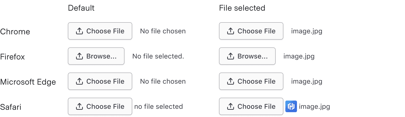
Browser inconsistency
Because the File Input is based on the native HTML input, the content and visual appearance may vary slightly across browsers.
Truncation
Differences between Figma and code
Due to limitations in Figma, truncation will occur at the end of the text, while in the browser, truncation occurs in the middle.
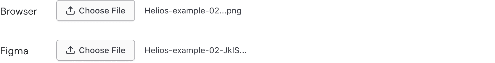
Truncation is built into the native component and uses the width of the container to determine when the text gets truncated. It is not based on a character limit.
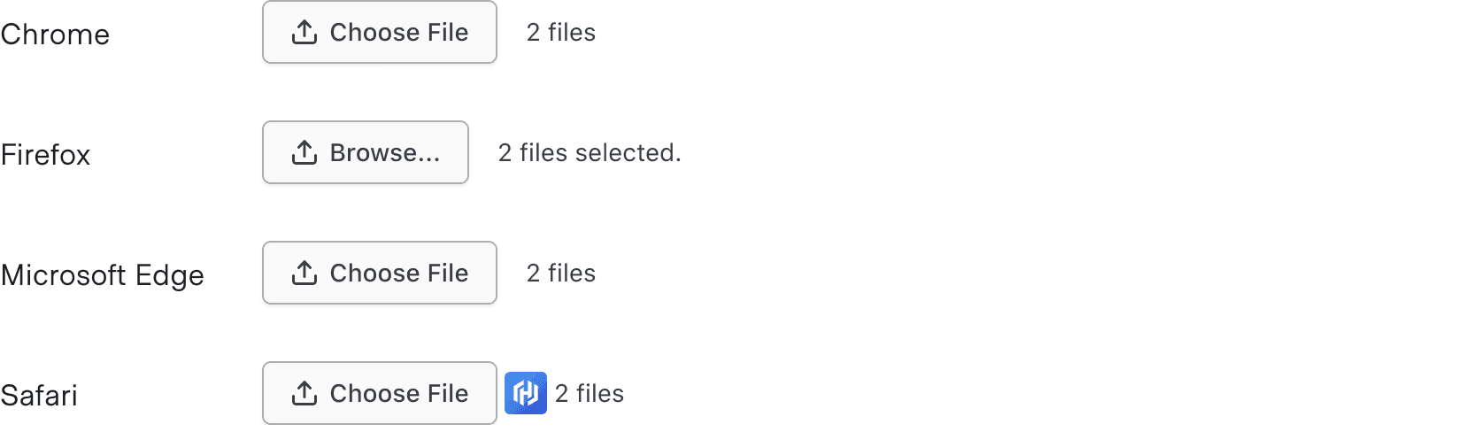
Multiple files
Multiple files can be added at once when the multiple attribute is enabled in code. When more than one file is selected, the text will change to show the number of files you’ve selected, e.g., “2 files”. The exact language used may differ between browsers.
How to use this component
The File Input component uses the native HTML input with type="file" under the hood but adds visual styling to match other HDS components.
There are two ways to use the File Input component:
Form::FileInput::Base—the Base component: just the<input type="file">control.Form::FileInput::Field—the Field component: the<input type="file">control, with label, helper text, and error messaging (in a wrapping container).
We recommend using the Field component as it provides built-in accessibility functionality. Use the Base component if you need to achieve custom layouts or for special use cases not covered by the Field component.
Form::FileInput::Field
<Hds::Form::FileInput::Field name="demo-profile-photo" as |F|>
  <F.Label>Upload a file</F.Label>
</Hds::Form::FileInput::Field>
Helper text
You can add extra information to the field using helper text. When helper text is added, the component automatically adds an aria-describedby attribute to the input control, associating it with the automatically generated ID of the helper text element.
<Hds::Form::FileInput::Field name="demo-profile-photo" as |F|>
  <F.Label>Upload a file</F.Label>
  <F.HelperText>File size should be a maximum of 2 MB.</F.HelperText>
</Hds::Form::FileInput::Field>
Extra content in label and helper text
The Label and HelperText contextual components used in the Field component yield their content. This means you can also pass structured content.
<Hds::Form::FileInput::Field name="demo-profile-photo" as |F|>
  <F.Label>Upload a file <Hds::Badge @size="small" @text="Beta" /></F.Label>
  <F.HelperText>This is an <Hds::Link::Inline @href="#">experimental feature</Hds::Link::Inline>.</F.HelperText>
</Hds::Form::FileInput::Field>
Required vs. optional
Use the @isRequired and @isOptional arguments to add a visual indication that the field is "required" or "optional".
<Hds::Form as |FORM|>
  <FORM.Section>
    <Hds::Form::FileInput::Field @isRequired={{true}} name="demo-profile-photo" as |F|>
      <F.Label>Upload a file</F.Label>
      <F.HelperText>File size should be a maximum of 2 MB.</F.HelperText>
    </Hds::Form::FileInput::Field>

    <Hds::Form::FileInput::Field @isOptional={{true}} name="demo-profile-photo" as |F|>
      <F.Label>Upload a file</F.Label>
      <F.HelperText>File size should be a maximum of 2 MB.</F.HelperText>
    </Hds::Form::FileInput::Field>
  </FORM.Section>
</Hds::Form>
Validation
To indicate a field is invalid, provide an error message using the Error contextual component.
<Hds::Form::FileInput::Field name="demo-profile-photo" as |F|>
  <F.Label>Upload a file</F.Label>
  <F.Error>The provided file format is not valid.</F.Error>
</Hds::Form::FileInput::Field>
Add more than one error message using the more specific Message contextual component.
<Hds::Form::FileInput::Field name="demo-profile-photo" as |F|>
  <F.Label>Upload a file</F.Label>
  <F.Error as |E|>
    <E.Message>File size should be a maximum of 2 MB.</E.Message>
    <E.Message>Dimensions should be a minimum of 100px × 100px.</E.Message>
  </F.Error>
</Hds::Form::FileInput::Field>
Custom control ID
To use a custom ID value instead of the one automatically generated by the component, pass the @id argument to the Field component.
<Hds::Form::FileInput::Field @id="my-control" name="demo-profile-photo" as |F|>
  <F.Label>Upload a file</F.Label>
</Hds::Form::FileInput::Field>
Additional aria-describedby
Pass an @extraAriaDescribedBy argument to the Field component to connect one or more extra elements describing the field to the control. This provides extra ID values to the aria-describedby attribute of the control, in addition to those automatically generated by the component.
<Hds::Form::FileInput::Field @extraAriaDescribedBy="my-extra-element-ID" name="demo-profile-photo" as |F|>
  <F.Label>Upload a file</F.Label>
</Hds::Form::FileInput::Field>
HTML native attributes
This component supports use of ...attributes. This means you can use all the standard HTML attributes of the <input> element. This can be useful in case you want to add specific native behaviors to the Field, that are not exposed directly by the component (e.g., providing a name for the control, or adding min, max, minlength, maxlength, or pattern attributes to it).
<Hds::Form::FileInput::Field name="demo-profile-photo" as |F|>
  <F.Label>Upload a file</F.Label>
</Hds::Form::FileInput::Field>
Form::FileInput::Base
The Base component is intended for rare cases where the Field component can’t be used and a custom implementation is needed. Most of the details for the Field component also apply to the Base component, but see the Component API for more details.
<Hds::Form::FileInput::Base />Component API
The File Input component has two different variants with their own APIs:
Form::FileInput::Base—the base component: the<input type="file">controlForm::FileInput::Field—the field parent component: the<input type="file">control, with label, helper text, and error messaging (in a wrapping container)
Form::FileInput::Base
…attributes
...attributes.
The attributes will be applied to the
<input type="file"> element. This means you can use all the standard HTML attributes of the <input type="file"> element and all the usual Ember techniques for event handling, validation, etc.
Examples of HTML attributes:
id, name, disabled, required. See the whole list of HTML attributes. Examples of Ember modifiers: {{on "input" [do something]}}, {{on "change" [do something]}}, {{on "blur" [do something]}}.
Form::FileInput::Field
id
string
By default, the ID is automatically generated by the component. Use this argument to pass a custom ID.
extraAriaDescribedBy
string
aria-describedby HTML attribute.
By default, the
aria-describedby attribute is automatically generated by the component, using the IDs of the helper text and errors (if present). Use this argument to pass an extra ID.
isRequired
boolean
- false (default)
Required indicator next to the label text when user input is required.
isOptional
boolean
- false (default)
Optional indicator next to the label text when user input is optional.
…attributes
...attributes.
The attributes will be applied to the
<input type="file"> element. This means you can use all the standard HTML attributes of the <input type="file"> element and all the usual Ember techniques for event handling, validation, etc.
Examples of HTML attributes:
id, name, disabled, required. See the whole list of HTML attributes. Examples of Ember modifiers: {{on "input" [do something]}}, {{on "change" [do something]}}, {{on "blur" [do something]}}.
Contextual components
Label, HelperText, and Error content are passed to the field as yielded components.
<[F].Label>
yielded component
<label> element. The content can be a simple string or a more complex/structured string, in which case it inherits the text style. For details about its API, check the Form::Label component.
The
for attribute of the label is automatically generated using the controlId value of the control.
<[F].HelperText>
yielded component
Form::HelperText component.
The
id attribute of the element is automatically generated using the controlId value of the control.
<[F].Error>
yielded component
Form::Error component.
The
id attribute of the Error element is automatically generated.
<[E].Message>
yielded component
Error.Message.
Anatomy
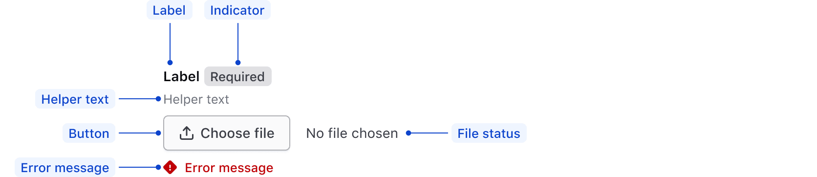
| Element | Usage |
|---|---|
| Label | Required |
| Indicator | Optional |
| Helper text | Optional |
| Button | Required |
| File status | Update triggered by system |
| Error message | Triggered by system |
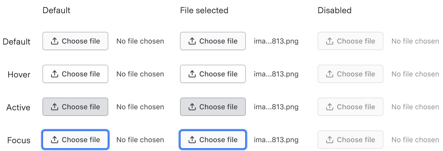
States
Conformance rating
When used as recommended, there should not be any WCAG conformance issues with this component.
Applicable WCAG Success Criteria
This section is for reference only. This component intends to conform to the following WCAG Success Criteria:
-
1.3.1
Info and Relationships (Level A):
Information, structure, and relationships conveyed through presentation can be programmatically determined or are available in text. -
1.3.2
Meaningful Sequence (Level A):
When the sequence in which content is presented affects its meaning, a correct reading sequence can be programmatically determined. -
1.3.4
Orientation (Level AA):
Content does not restrict its view and operation to a single display orientation, such as portrait or landscape. -
1.3.5
Identify Input Purpose (Level AA):
The purpose of each input field collecting information about the user can be programmatically determined when the input field serves a purpose identified in the Input Purposes for User Interface Components section; and the content is implemented using technologies with support for identifying the expected meaning for form input data. -
1.4.1
Use of Color (Level A):
Color is not used as the only visual means of conveying information, indicating an action, prompting a response, or distinguishing a visual element. -
1.4.10
Reflow (Level AA):
Content can be presented without loss of information or functionality, and without requiring scrolling in two dimensions. -
1.4.11
Non-text Contrast (Level AA):
The visual presentation of the following have a contrast ratio of at least 3:1 against adjacent color(s): user interface components; graphical objects. -
1.4.12
Text Spacing (Level AA):
No loss of content or functionality occurs by setting all of the following and by changing no other style property: line height set to 1.5; spacing following paragraphs set to at least 2x the font size; letter-spacing set at least 0.12x of the font size, word spacing set to at least 0.16 times the font size. -
1.4.3
Minimum Contrast (Level AA):
The visual presentation of text and images of text has a contrast ratio of at least 4.5:1 -
1.4.4
Resize Text (Level AA):
Except for captions and images of text, text can be resized without assistive technology up to 200 percent without loss of content or functionality. -
2.4.6
Headings and Labels (Level AA):
Headings and labels describe topic or purpose. -
2.4.7
Focus Visible (Level AA):
Any keyboard operable user interface has a mode of operation where the keyboard focus indicator is visible. -
3.2.1
On Focus (Level A):
When any user interface component receives focus, it does not initiate a change of context. -
3.2.2
On Input (Level A):
Changing the setting of any user interface component does not automatically cause a change of context unless the user has been advised of the behavior before using the component. -
3.2.4
Consistent Identification (Level AA):
Components that have the same functionality within a set of Web pages are identified consistently. -
3.3.1
Error Identification (Level A):
If an input error is automatically detected, the item that is in error is identified and the error is described to the user in text. -
3.3.2
Labels or Instructions (Level A):
Labels or instructions are provided when content requires user input. -
4.1.2
Name, Role, Value (Level A):
For all user interface components, the name and role can be programmatically determined; states, properties, and values that can be set by the user can be programmatically set; and notification of changes to these items is available to user agents, including assistive technologies.
Support
If any accessibility issues have been found within this component, let us know by submitting an issue.
6.1.1
Fixed FileInputField signature element to be HTMLInputElement instead of HTMLElement.
6.1.0
Converted component to gts format.
4.24.1
Added width of 100% to prevent the component from overflowing its container and making it consistent with other Input components
4.23.0
Removed CSS declaration for pseudo element in disabled state that led to invalid CSS (ignored by browsers)
4.21.0
Added @id and @ariaDescribedBy arguments to Form::FileInput::Base.