How to use this component
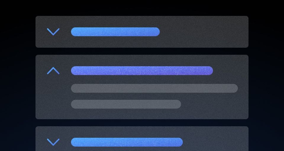
The DisclosurePrimitive component renders an interactive element that triggers a custom event handler provided by the :toggle block (passed via hash by Ember). To comply with accessibility best practices, this element is usually a button or a component that renders a button.
When the content is disclosed, the container can be closed by toggling the button (click or enter/return).
<Hds::DisclosurePrimitive>
  <:toggle as |t|>
    <button type="button" {{on "click" t.onClickToggle}}>Click me</button>
  </:toggle>
  <:content>
    your content here
  </:content>
</Hds::DisclosurePrimitive>
Content positioning
The :content block is not positioned in relation to the :toggle block.
Component API
<:toggle>
named block
A named block that works as "toggle" for the DisclosurePrimitive.
[T].onClickToggle
function
A function to be called by the interactive element to toggle visibility of the content.
[T].isOpen
boolean
Hook into this property to access the state of the internal
isOpen tracked variable.
<:content>
named block
A named block for the content that is shown/hidden upon toggling.
[C].close
function
A function to programmatically close the DisclosurePrimitive.
isOpen
boolean
- false (default)
Toggles the visibility of the content when the toggle button is interacted with. To display content on page load, set the value to true.
onClose
function
A callback function invoked when the DisclosurePrimitive is closed (if provided).
onClickToggle
function
A callback function invoked when the toggle is clicked.
…attributes
This component supports use of
...attributes.
6.1.0
Converted component to gts format.
4.20.1
Changed DOM structure of content section and exposed contentId for a11y improvements with toggled content