Modals are used to request information or feedback from the user, confirm a decision, or less frequently to provide additional context about a function or feature.
Usage
When to use
- When requesting an urgent or immediate response from the user.
- As a confirmation when performing a destructive action or action that will impact other areas of the application.
- For non-frequent tasks that can be interacted with quickly.
When not to use
- When a user action is not immediately required.
- In place of an alert, consider Toast or Alert.
- For complex editing, long forms, and experiences with a high level of detail. In these cases, the task or function should exist at the page level.
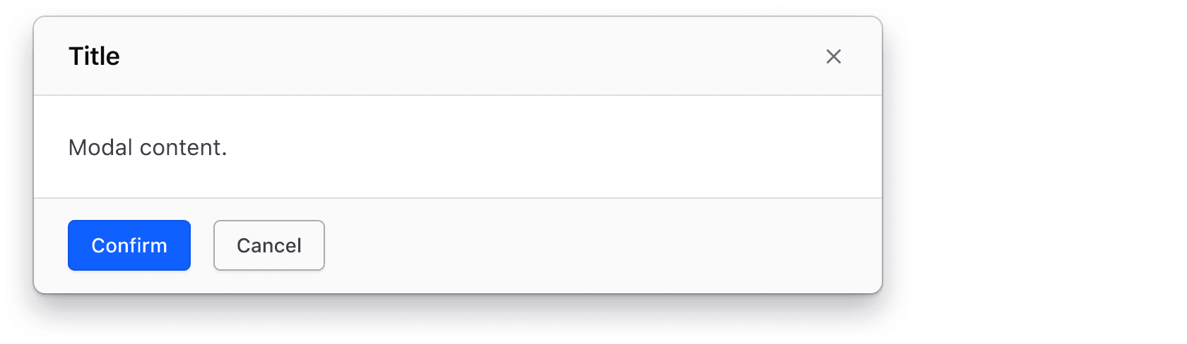
Color
Neutral
Use Neutral for most Modal instances, such as when the outcome of the Modal’s function doesn’t change areas of the application that aren’t directly tied to the user’s current context.
Common examples include:
- Functions for creating, editing, or updating objects.
- Simple requests of information from the user.
- Quick confirmations of actions taken by the user.
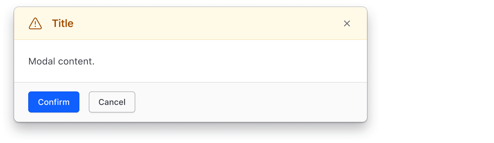
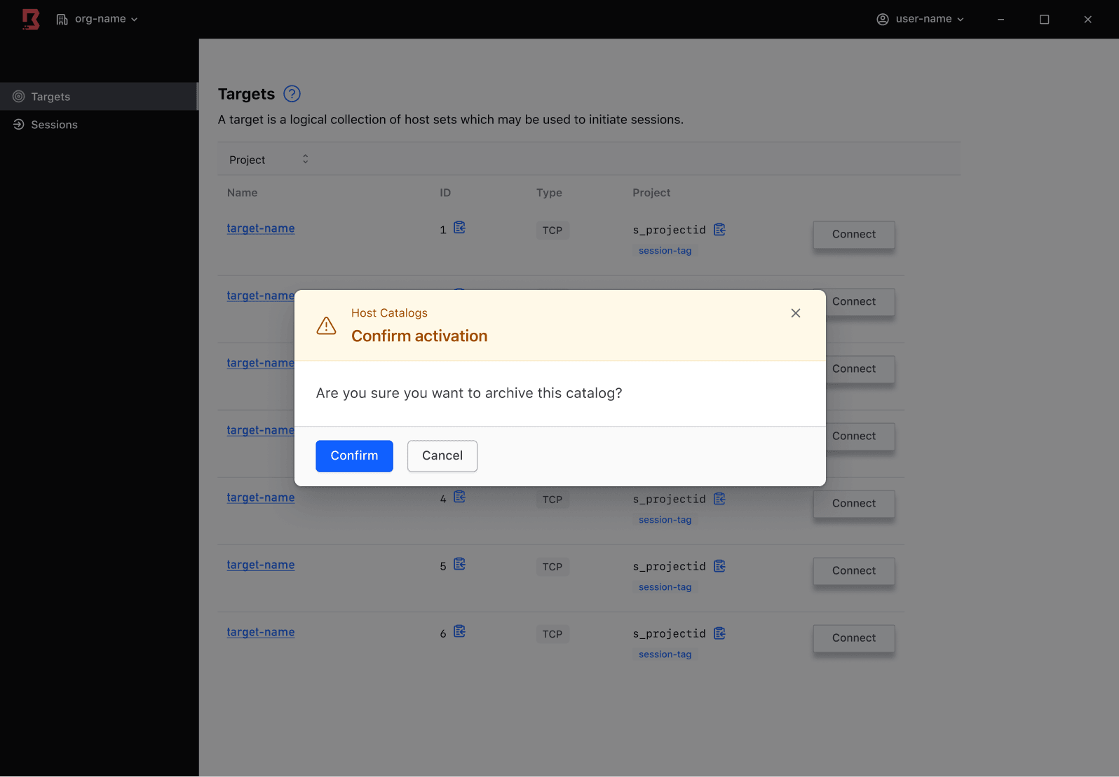
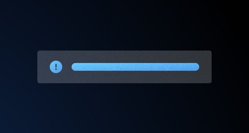
Warning
Use Warning to indicate that the Modal’s action may impact a setting, item, or object. Warning Modals simultaneously alert of the potential impact while confirming the action.
Common examples include:
- Disabling or enabling an application-wide setting or feature.
- Archiving an item that can be recovered.
- Changing a setting that may require the user to re-authenticate or perform an action again.
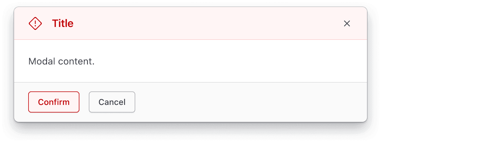
Critical
Use Critical to indicate an irreversible destructive action that will impact other settings, items, or objects within the current feature or in other application areas.
Common examples include:
- Deleting an item or object that cannot be recovered.
- Modifying a setting that cannot be changed or reversed in the future.
- Alerting the user of unsaved changes that will be discarded.
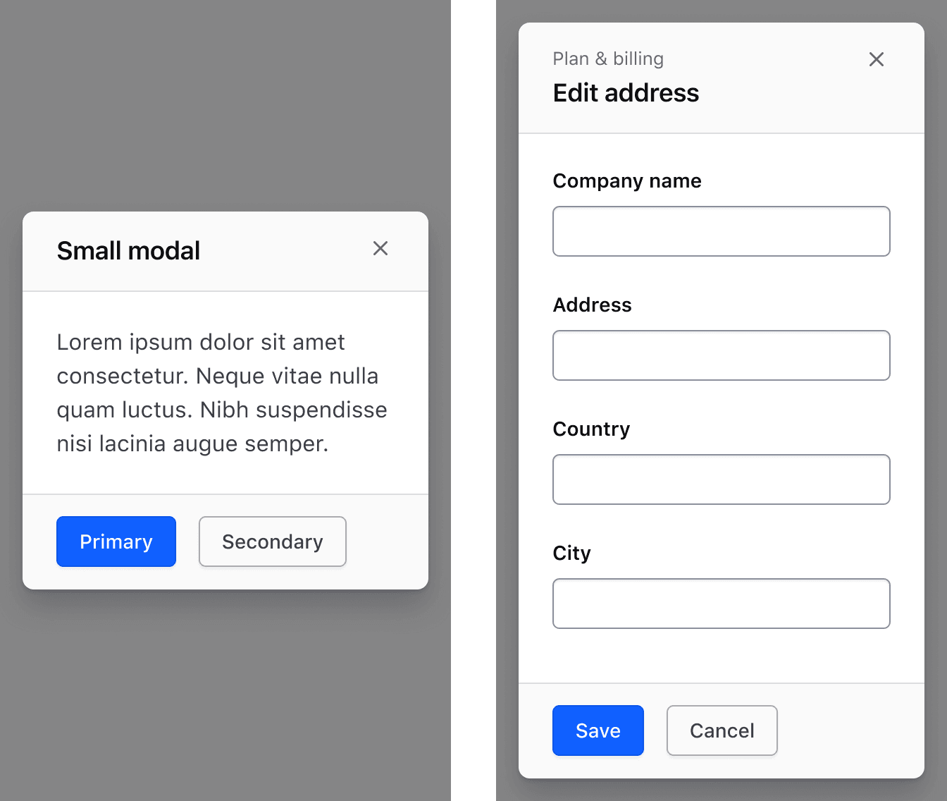
Size
Width
We recommend using the medium size Modal for most scenarios, but use the size that best accounts for the complexity of the content and intended speed of interaction. We do not recommend resizing the Modal manually.
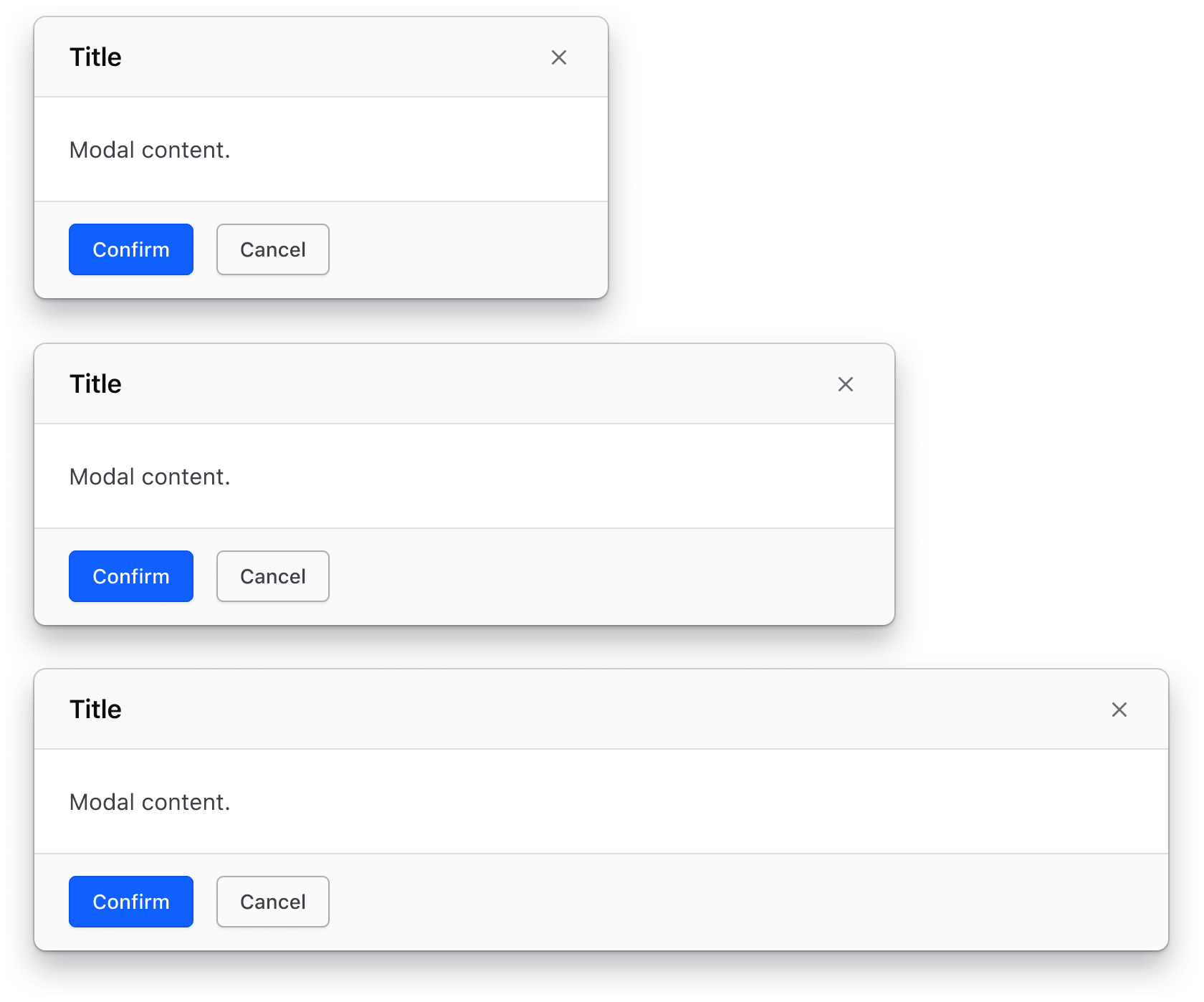
Height
The Modal should hug the body content and expand to a maximum height of 100% of the viewport height minus 16px from the edge. If the body content exceeds the maximum height of the viewport, scroll will be introduced within the Modal body, while the header and footer remain fixed.
Position
Modals should be positioned in the center of the viewport, paired with the overlay component, and on top of all parent page content (including the navigation).
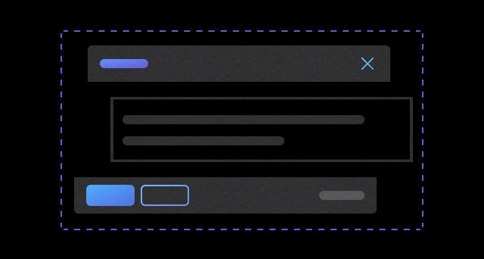
Modal header
Although adding a title icon and tagline can help the user better understand the function and importance of the task they are performing, both elements add visual weight which might not be suitable or necessary for all Modals.
Title icon
The purpose and function of the Modal should not rely solely on an icon, instead the title should be explicit and pragmatic while the icon provides visual support.
With title icon
An icon paired with the title can help reinforce the purpose and function of the Modal while also drawing the eye to the header and title area. Icons can be used to communicate the severity and importance of interacting with a Modal and are especially useful in a warning or critical color Modal.
Without title icon

Tagline
A tagline helps the user maintain the context of the feature, function, or flow the Modal was triggered by. Since a Modal disables and obscures the parent page content, adding a tagline can help the user understand the relationship between the Modal and the parent page content. The tagline should directly reference the page, function, or feature title to reinforce the relationship of the Modal to the parent page content.
With tagline

With tagline and icon
Modal body
Modals can take on many different types of content, from text-based content to simple forms.
Modal footer
Most Modals should have a low to medium level of complexity and promote interaction with a simple “yes/no” or “ok/cancel”. If the complexity of the Modal breaks this pattern, consider moving the function performed by the Modal to the parent page.
Action patterns
One action
We recommend using the Primary Button when only one action is present in the Modal.

Two actions
We recommend using a ButtonSet (Primary Button followed by a Secondary Button) when two actions are present in the Modal.

Three actions
We recommend using a ButtonSet (Primary Button followed by a Secondary Button) plus a Tertiary Button or Standalone Link when three actions are present in the Modal. If a tertiary action is needed, it should not be grouped in the ButtonSet, as functionality should determine button grouping.
Common examples of tertiary actions include:
- Linking to external documentation.
- Linking to another related area or function within the application; best used to help the user better understand or collect the information needed to interact with the Modal.

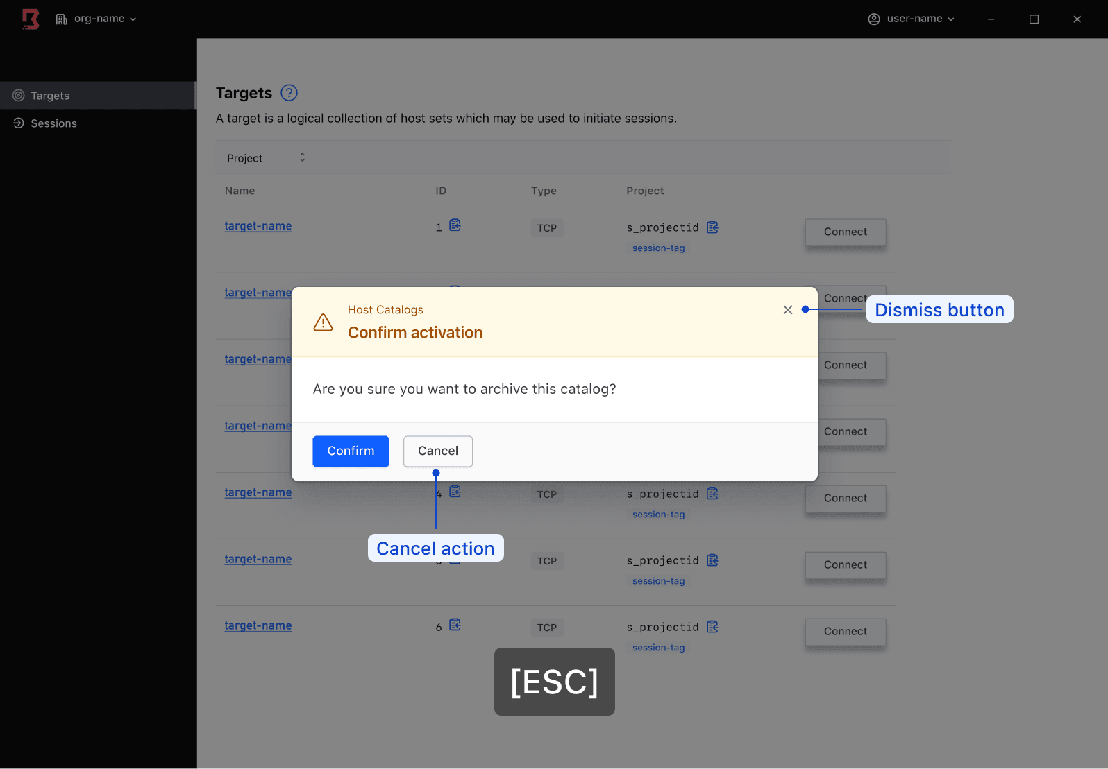
Dismissal
The following actions will dismiss or close the Modal unless isDismissDisabled is set to true:
- Dismiss button in the Modal header
- Clicking outside the Modal on the overlay
- Hitting the escape (
ESC) key on the keyboard - A cancel or close button in the footer can also act as a way to dismiss the Modal, but doesn’t always function in the same way.
In addition to having proper ways for the user to dismiss a Modal, ensure the entry point for a Modal is straightforward enough that if a user accidentally dismisses it, the Modal can be easily triggered again.
Via dismiss button
The most common dismissal method for a Modal is via the dismiss button in the Modal header. This acts as an escape hatch for the user and helps prevent the user from getting stuck.
While we typically don’t recommend removing or hiding the dismiss button, it can be done to elevate the importance of the Modal and lower the possibility of accidental dismissal, in which case, a “cancel” button could be added as an escape hatch.
Via “cancel” button
While certain experiences may only call for a single action button, we recommend adding a “cancel” button as a more explicit method to close the Modal.
Depending on the information being requested, a secondary action that closes or cancels the model may not perform the same function as dismissing the Modal. For example, responding “no” to a “yes/no” question is not the same as dismissing the Modal, the latter of which does not submit a response.
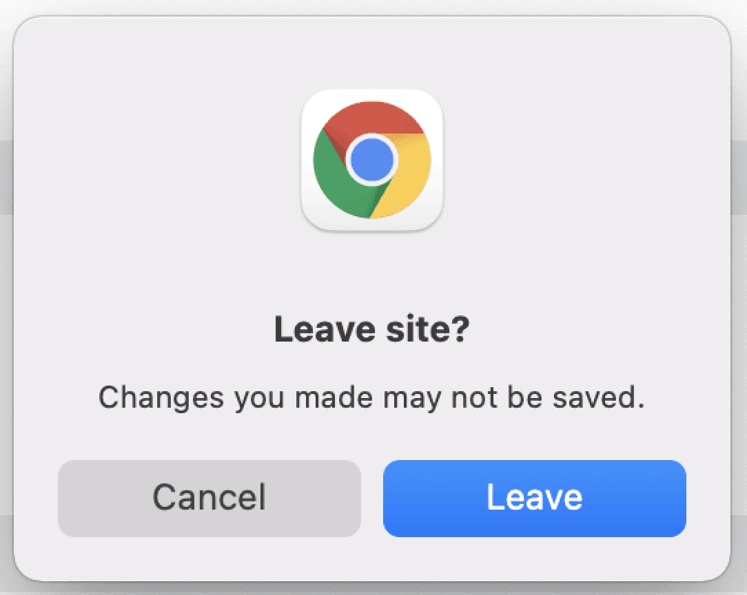
Best practices for avoiding data loss
If a user attempts to dismiss a Modal that contains a partially filled form or other interactive elements, we recommend ensuring that the following criteria are met to promote a positive user experience:
- The default browser notification is being triggered calling attention to a potential misstep.
- Partially filled form data is persisted within the application to prevent duplicative work.
Browser support
The Modal component leverages the <dialog> element which is currently supported by all major browser vendors.
Page scroll
When a Modal is open, the rest of the page becomes inert. The page scrolling is also disabled by applying overflow: hidden to the <body> element, to make it clear to the user that the underlying elements are not interactive and to avoid confusion. Depending on users’ scroll bar settings, opening a Modal may cause slight layout shifts on the horizontal axis.
Positioning
As an overlaying component, the Hds::Modal is rendered on the top layer, meaning it is always placed on top of all other elements in the page.
Focus and focus trap
This component uses ember-focus-trap to prevent the focus from going outside the Modal and to dismiss the Modal when clicking outside the Modal. This Ember modifier requires at least one interactive element to be present within the Modal, which is by default achieved by the dismiss button in the header.
When a Modal is opened with the keyboard, the focus is automatically set to the first focusable element inside the Modal, which is the “Dismiss” button. The action of this button has no effect on the system, so focusing on it helps prevent users from accidentally confirming the Modal.
When the Modal has been closed, the browser automatically returns the focus to the element that initiated the opening. If that element doesn't exist anymore in the DOM (e.g., if the Modal is opened using an Interaction item in a Dropdown) the focus is returned to the <body> element. To avoid this side-effect (that comes with accessibility implications), it's possible to use the @returnFocusTo argument, where the consumer can provide the DOM id attribute of the element where the focus should be returned once the Modal is closed.
How to use this component
<Hds::Button @text="Open basic modal" @color="secondary" {{on "click" this.activateModal}} />

{{#if this.isOpen}}
  <Hds::Modal id="basic-modal" @onClose={{this.deactivateModal}} as |M|>
    <M.Header>
      Modal title
    </M.Header>
    <M.Body>
      <p class="hds-typography-body-300 hds-foreground-primary">Modal content</p>
    </M.Body>
    <M.Footer as |F|>
      <Hds::Button type="button" @text="Confirm" {{on "click" F.close}} />
    </M.Footer>
  </Hds::Modal>
{{/if}}
Form within a Modal dialog
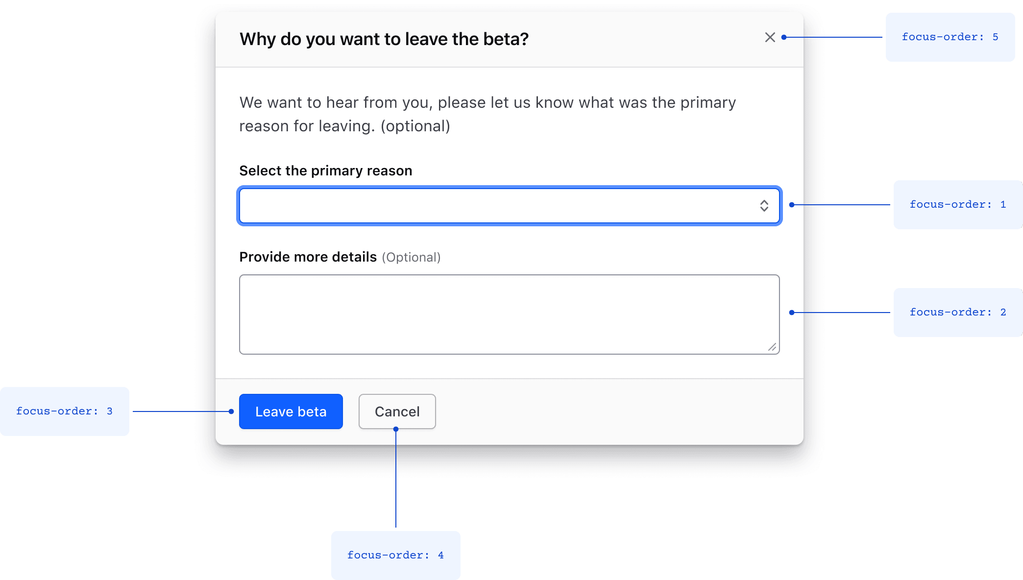
If a Modal dialog presents a form, the initial focus should be set on the first input, as the first focusable element in the form. This can be achieved by setting the autofocus property on the first form input.
The <form> element should be placed in the yielded Body subcomponent. We also recommend associating it with the submit button using the form attribute, as shown below.
When the Modal dialog contains information that might be lost on close, use a confirmation message before discarding it.
<Hds::Button @text="Open form modal" @color="secondary" {{on "click" this.activateModal}} />

{{#if this.isOpen}}
  <Hds::Modal id="form-modal" @onClose={{this.deactivateModal}} as |M|>
    <M.Header>
      Why do you want to leave the beta?
    </M.Header>
    <M.Body>
      <Hds::Form id="leaving-beta-form" {{on "submit" this.submitForm}} as |FORM|>
        <FORM.Section>
          <Hds::Form::Select::Field autofocus @width="100%" as |F|>
            <F.Label>Select the primary reason</F.Label>
            <F.Options>
              <option></option>
            </F.Options>
          </Hds::Form::Select::Field>
          <Hds::Form::Textarea::Field @isOptional={{true}} as |F|>
            <F.Label>Your feedback</F.Label>
          </Hds::Form::Textarea::Field>
        </FORM.Section>
      </Hds::Form>
    </M.Body>
    <M.Footer as |F|>
      <Hds::ButtonSet>
        <Hds::Button type="submit" form="leaving-beta-form" @text="Leave Beta" />
        <Hds::Button type="button" @text="Cancel" @color="secondary" {{on "click" F.close}} />
      </Hds::ButtonSet>
    </M.Footer>
  </Hds::Modal>
{{/if}}
Component API
Modal
<[M].Header>
yielded component
DialogPrimitive::Header yielded as contextual component (see below).
<[M].Body>
yielded component
DialogPrimitive::Body yielded as contextual component (see below).
<[M].Footer>
yielded component
DialogPrimitive::Footer yielded as contextual component (see below).
size
enum
- small
- medium (default)
- large
color
enum
- neutral (default)
- warning
- critical
returnFocusTo
string
id of the element where the focus should be returned once the modal is closed (e.g., if the element that initiated the event is not in the DOM anymore once closed).
onOpen
function
onClose
function
isDismissDisabled
boolean
- false (default)
true if you want to prevent the Modal from being closed (for instance, to avoid accidental data loss in a form that hasn't been submitted). Make sure you communicate to users the reason why the Modal is still open, and what they need to do to resolve the problem that is preventing the Modal from being closed.
…attributes
...attributes.
Contextual components
[M].Header
The DialogPrimitive::Header component, yielded as contextual component.
DialogPrimitive::Header component.
[M].Body
The DialogPrimitive::Body component, yielded as contextual component.
DialogPrimitive::Body component.
[M].Footer
The DialogPrimitive::Footer component, yielded as contextual component.
DialogPrimitive::Footer component.
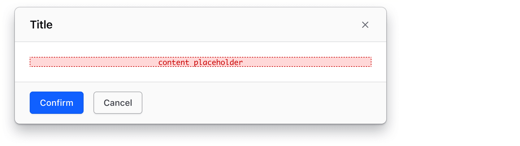
Anatomy
| Element | Usage |
|---|---|
| Header | |
| Title icon | Optional |
| Tagline | Optional |
| Title | Required |
| Description | Optional |
| Dismiss | Required, all modals are dismissible |
| Body | |
| Content | Required; either default (simple text) or custom |
| Footer | |
| Actions | Required; either one, two, or three |
Actions
- Modal actions should be concise and not written as sentences. Most of the time, one or two words are adequate for an action.
- We generally don’t recommend using icons on actions within Modals.
- Buttons in a Modal should follow the same content guidelines as the Button component.


Conformance rating
The Modal component is conformant when used as directed.
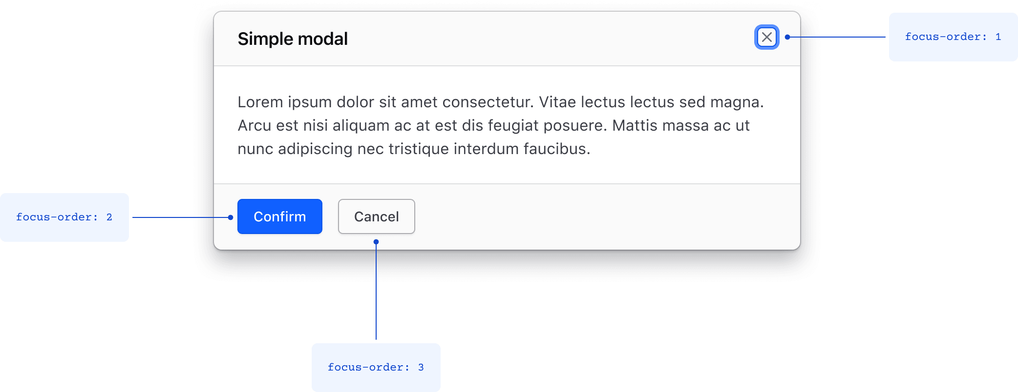
Focus and focus order
- When the modal is open, focus moves to the first interactive element within the modal and is trapped within the component.
- Since a Modal is a complex pattern that can contain any combination of nested components and content, nested elements must adhere to their individual accessibility criteria.
Focus order within a simple Modal
Given the Modal is triggered via a keyboard, the dismiss button is first in the focus order since there isn’t any content within the body that is eligible to receive focus.
Focus order within a complex Modal
If the Modal body contains interactive content, such as input fields, the first element should receive focus first regardless of how the Modal is triggered; either via a mouse click or via the keyboard. This behavior should be implemented by setting the focus on the first element.
Applicable WCAG Success Criteria
This section is for reference only, some descriptions have been truncated for brevity. This component intends to conform to the following WCAG Success Criteria:
-
1.1.1
Non-text Content (Level A):
All non-text content that is presented to the user has a text alternative that serves the equivalent purpose. -
1.3.1
Info and Relationships (Level A):
Information, structure, and relationships conveyed through presentation can be programmatically determined or are available in text. -
1.3.2
Meaningful Sequence (Level A):
When the sequence in which content is presented affects its meaning, a correct reading sequence can be programmatically determined. -
1.3.3
Sensory Characteristics (Level A):
Instructions provided for understanding and operating content do not rely solely on sensory characteristics of components such as shape, color, size, visual location, orientation, or sound. -
1.3.5
Identify Input Purpose (Level AA):
The purpose of each input field collecting information about the user can be programmatically determined when the input field serves a purpose identified in the Input Purposes for User Interface Components section; and the content is implemented using technologies with support for identifying the expected meaning for form input data. -
1.4.1
Use of Color (Level A):
Color is not used as the only visual means of conveying information, indicating an action, prompting a response, or distinguishing a visual element. -
1.4.10
Reflow (Level AA):
Content can be presented without loss of information or functionality, and without requiring scrolling in two dimensions. -
1.4.11
Non-text Contrast (Level AA):
The visual presentation of the following have a contrast ratio of at least 3:1 against adjacent color(s): user interface components; graphical objects. -
1.4.12
Text Spacing (Level AA):
No loss of content or functionality occurs by setting all of the following and by changing no other style property: line height set to 1.5; spacing following paragraphs set to at least 2x the font size; letter-spacing set at least 0.12x of the font size, word spacing set to at least 0.16 times the font size. -
1.4.13
Content on Hover or Focus (Level AA):
Where receiving and then removing pointer hover or keyboard focus triggers additional content to become visible and then hidden, the following are true: dismissible, hoverable, persistent (see link). -
1.4.3
Minimum Contrast (Level AA):
The visual presentation of text and images of text has a contrast ratio of at least 4.5:1 -
1.4.4
Resize Text (Level AA):
Except for captions and images of text, text can be resized without assistive technology up to 200 percent without loss of content or functionality. -
1.4.5
Images of Text (Level AA):
This is old. Don’t do this. Use text. Also a logo is not an image of text, so that’s fine. -
2.1.1
Keyboard (Level A):
All functionality of the content is operable through a keyboard interface. -
2.1.2
No Keyboard Trap (Level A):
If keyboard focus can be moved to a component of the page using a keyboard interface, then focus can be moved away from that component using only a keyboard interface. -
2.1.4
Character Key Shortcuts (Level A):
If a keyboard shortcut is implemented in content using only letter (including upper- and lower-case letters), punctuation, number, or symbol characters, then it should be able to be turned off, remapped, or active only on focus. -
2.4.2
Page Titled (Level A):
Web pages have titles that describe topic or purpose. -
2.4.3
Focus Order (Level A):
If a Web page can be navigated sequentially and the navigation sequences affect meaning or operation, focusable components receive focus in an order that preserves meaning and operability. -
2.4.6
Headings and Labels (Level AA):
Headings and labels describe topic or purpose. -
2.4.7
Focus Visible (Level AA):
Any keyboard operable user interface has a mode of operation where the keyboard focus indicator is visible. -
3.2.1
On Focus (Level A):
When any user interface component receives focus, it does not initiate a change of context. -
3.2.2
On Input (Level A):
Changing the setting of any user interface component does not automatically cause a change of context unless the user has been advised of the behavior before using the component. -
3.3.1
Error Identification (Level A):
If an input error is automatically detected, the item that is in error is identified and the error is described to the user in text. -
3.3.2
Labels or Instructions (Level A):
Labels or instructions are provided when content requires user input. -
3.3.3
Error Suggestion (Level AA):
If an input error is automatically detected and suggestions for correction are known, then the suggestions are provided to the user, unless it would jeopardize the security or purpose of the content. -
3.3.4
Error Prevention (Legal, Financial, Data) (Level AA):
For Web pages that cause legal commitments or financial transactions for the user to occur, that modify or delete user-controllable data in data storage systems, or that submit user test responses, at least one of the following is true: submissions are reversible, data is checked and user is provided an opportunity to correct them, a mechanism is available for reviewing, confirming and correcting the information before finalizing the submission. -
4.1.2
Name, Role, Value (Level A):
For all user interface components, the name and role can be programmatically determined; states, properties, and values that can be set by the user can be programmatically set; and notification of changes to these items is available to user agents, including assistive technologies. -
4.1.3
Status Messages (Level AA):
In content implemented using markup languages, status messages can be programmatically determined through role or properties such that they can be presented to the user by assistive technologies without receiving focus.
Support
If any accessibility issues have been found within this component, let us know by submitting an issue.
6.3.0
Fixed issue causing Modal to close unexpectedly by checking that a click on the Overlay both starts and ends within the Overlay before closing
6.1.0
Converted the component to gts format.
5.0.0
Removed deprecated HdsModalHeader, HdsModalBody, and HdsModalFooter subcomponents.
4.24.1
Refactored the component to not use ember-render-modifiers which fixes issues where the DOM may not be cleaned up when the Modal is closed.
4.20.2
Reverted changes introduced in #2846 and #2902 related to the click behavior outside the modal when dismissing is disabled
4.20.0
Fixed bug with click event listener not properly removed
4.19.0
Fixed issue where conditionally disabling ability to dismiss the Modal breaks click outside to dismiss.
Fixed issue with focus trap when modal is displayed inline.
4.15.0
Aligned private class properties to follow a standardized notation
4.13.0
Added @returnFocusTo argument to control where the browser focus is returned once the modal is closed
Fixed @isDismissDisabled functionality
4.12.0
Fixed issue with box-sizing inheritance due to a all: unset CSS rule applied to the DialogPrimitive subcomponent
4.10.0
Changed the HTML element wrapping the tagline and title from a <div> to a <h1> in Modal.Header. If you have a heading HTML tag inside the header yield block, either remove it or change it to a <span>.
4.7.0
In this version, the Modal sub-components have been deprecated and replaced with the equivalent DialogPrimitive sub-components (shared also with the Flyout component). The deprecated Modal sub-components will be removed in the next major release.
To do the migration, if you use the <Hds::Modal::***> invocation:
| Deprecated: | Replace with: |
|---|---|
Modal::Header |
DialogPrimitive::Header |
Modal::Body |
DialogPrimitive::Body |
Modal::Footer |
DialogPrimitive::Footer |
If instead you use the (component hds/modal/***):
| Deprecated: | Replace with: |
|---|---|
hds/modal/header |
hds/dialogprimitive/header |
hds/modal/body |
hds/dialogprimitive/body |
hds/modal/footer |
hds/dialogprimitive/footer |
In the refactoring, we have been able to maintain existing CSS class names to avoid breaking current tests and CSS overrides in consumers' codebases.
Related
-
Alert
Displays a brief message without interrupting a user’s task.
-

Flyout
Displays additional details and information about an item or object, overlaid on the main page content.
-
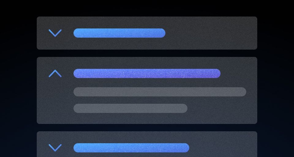
Accordion
A list of toggles that reveal or hide associated content.
-
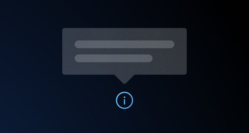
Tooltip
Provides additional information or context for a UI element.
-
DialogPrimitive
The foundational blocks of dialog components.