Toasts deliver messages to communicate an ongoing process or, sometimes, a result of a user action. They typically disappear after a set interval or upon user dismissal, offering a non-intrusive way to provide feedback.
Usage
When to use
- To communicate a background process that has either started or ended, e.g., “Creating cluster”.
- To allow a user to quickly revert a destructive action.
When not to use
- To display contextual associative errors (e.g., form validation) or promotional content, consider Alert.
- As a dialog to confirm an action, consider Modal.
Color
Use color logically:
- Neutral: provide general information to the user about an ongoing process.
- Highlight: use interchangeably with
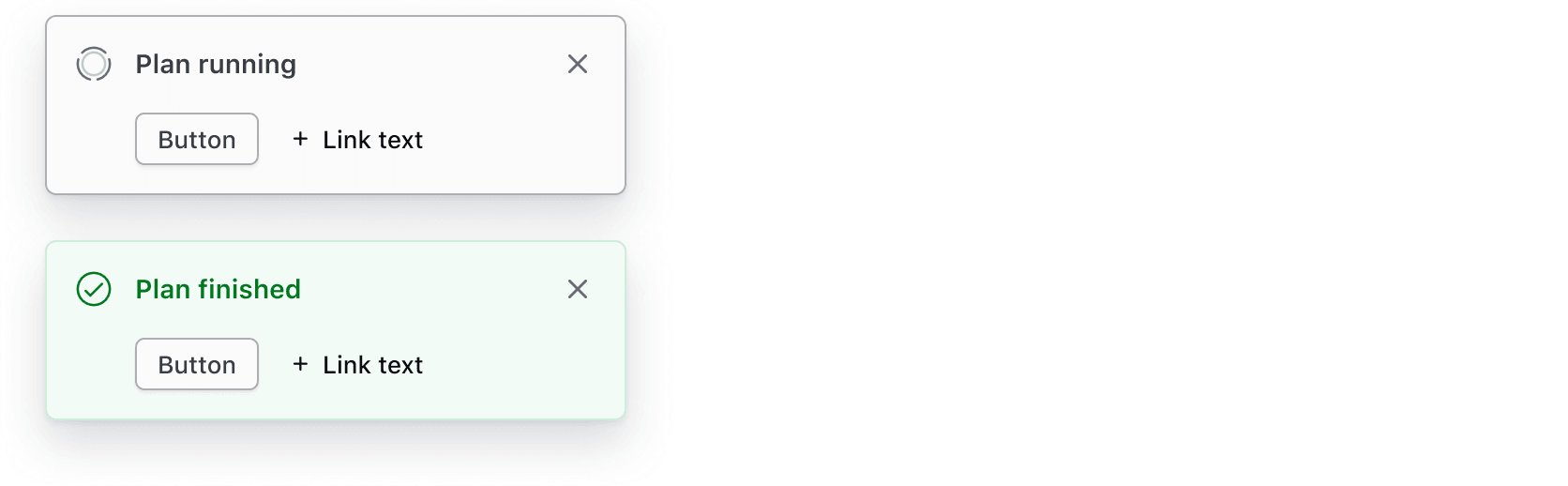
neutralwhen more prominence is needed. Use sparingly. - Success: indicate a successful action was completed.
- Warning: indicate a successful action was completed but may have triggered a related issue. Provide guidance and actions if possible.
- Critical: indicate an error or critical issues resulting from a failed action.
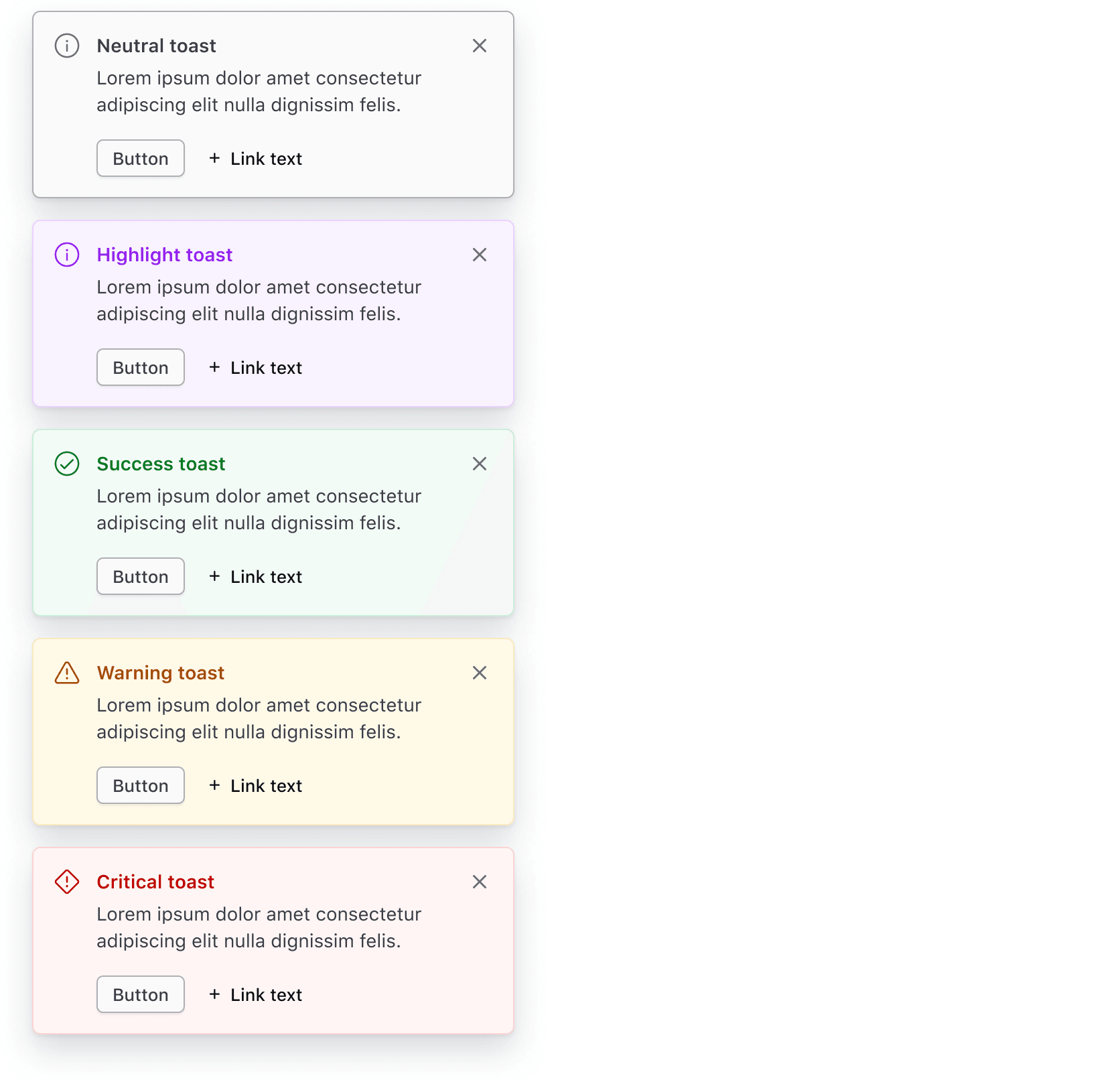
Critical toasts
Critical Toasts often persist (until dismissed) as they hold important information that requires the user's attention. Read more about when a toast should persist or timeout.
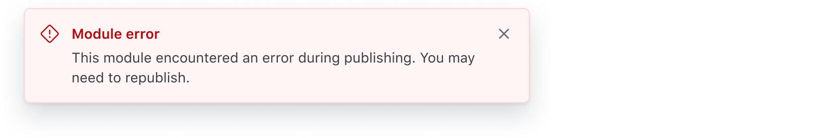
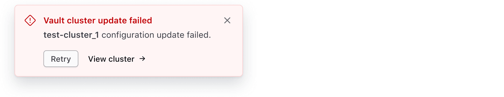
Use the Toast to provide non-intrusive feedback to users about the failure of an ongoing task or request. For example, a failure while deleting a cluster.
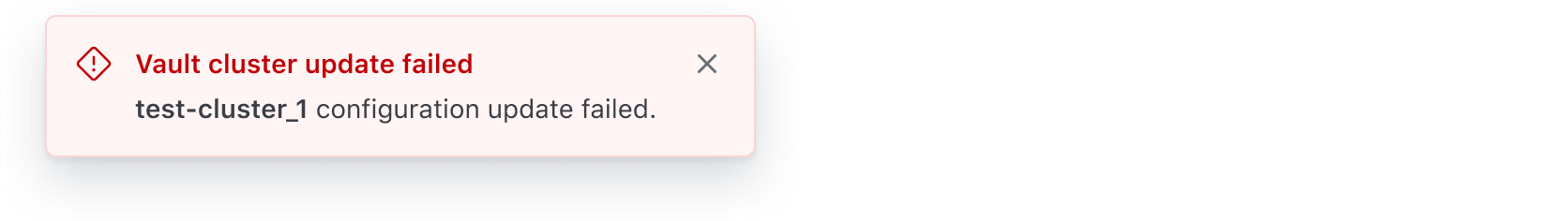
Use the Toast to communicate error messages that are not caused by the user. For example, an unsuccessful Vault cluster creation due to a failure while validating the deployment.
Don't use toasts for intrusive message communication about errors or critical disruptions at an application, page, or section level. Use the Alert instead.
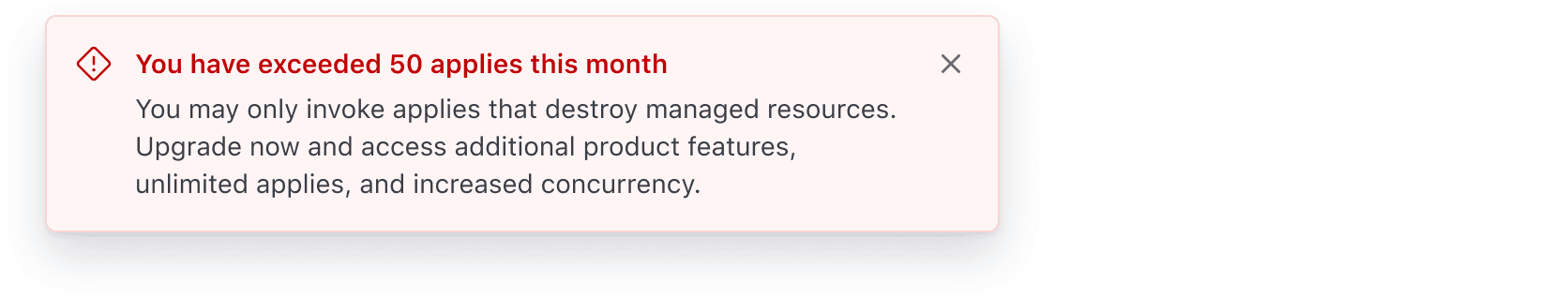
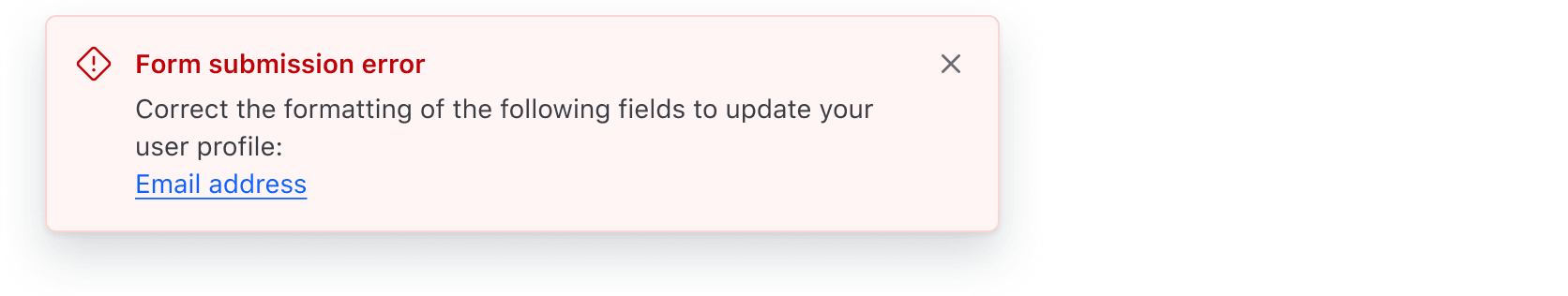
Don't use toasts to communicate validation errors. Use the Alert instead.
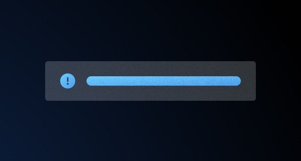
Icons
All Toasts have icons by default that are intentionally tied to the Toast color.
Icons within neutral and highlight Toasts can be replaced with other icons. Change them only when the new icon provides the user with extra value; otherwise, use the default icon provided.
Size
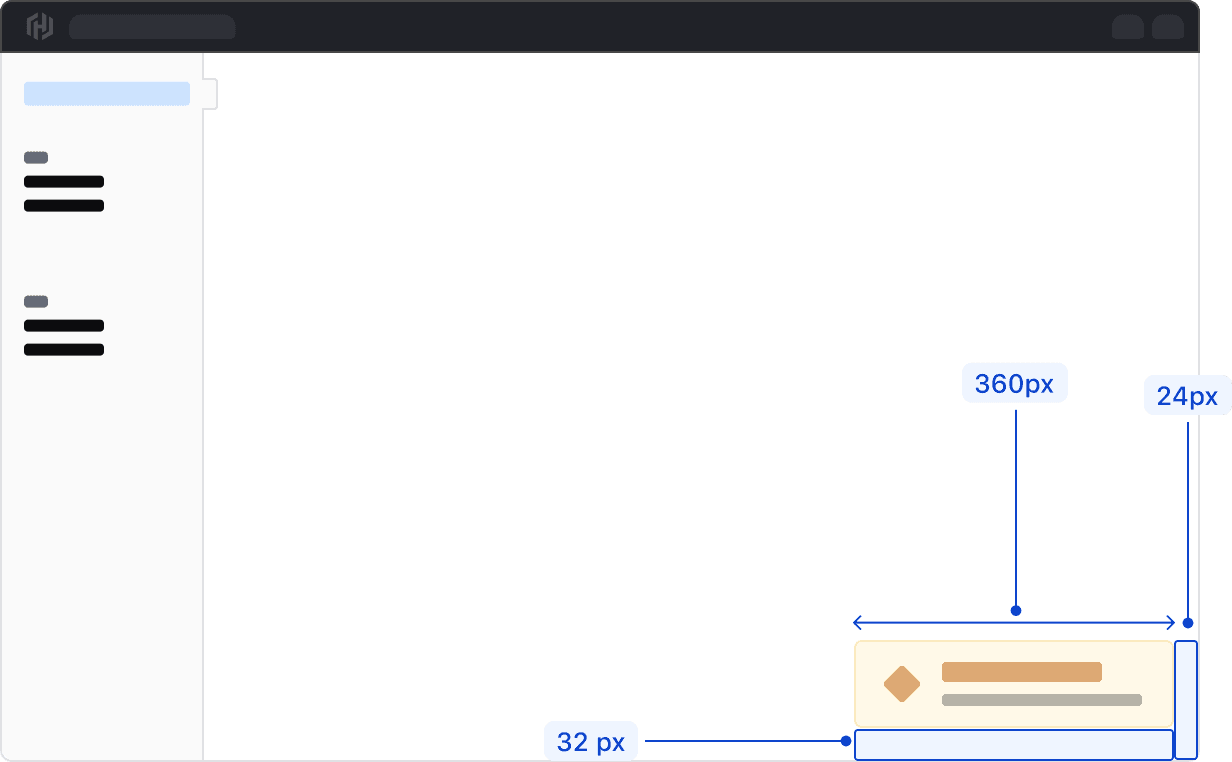
Toasts can be sized between 360px and 500px wide. Anything wider than 500px is considered disruptive to the user experience and may cover important information on the page.
Placement
Toasts appear in the bottom right corner of the viewport with a margin of 32px from the bottom and 24px from the right side of the viewport. If a warning or error is contextual to a specific UI feature, such as a form, directly associate an Alert to that feature instead of using a Toast.
Displaying multiple Toasts
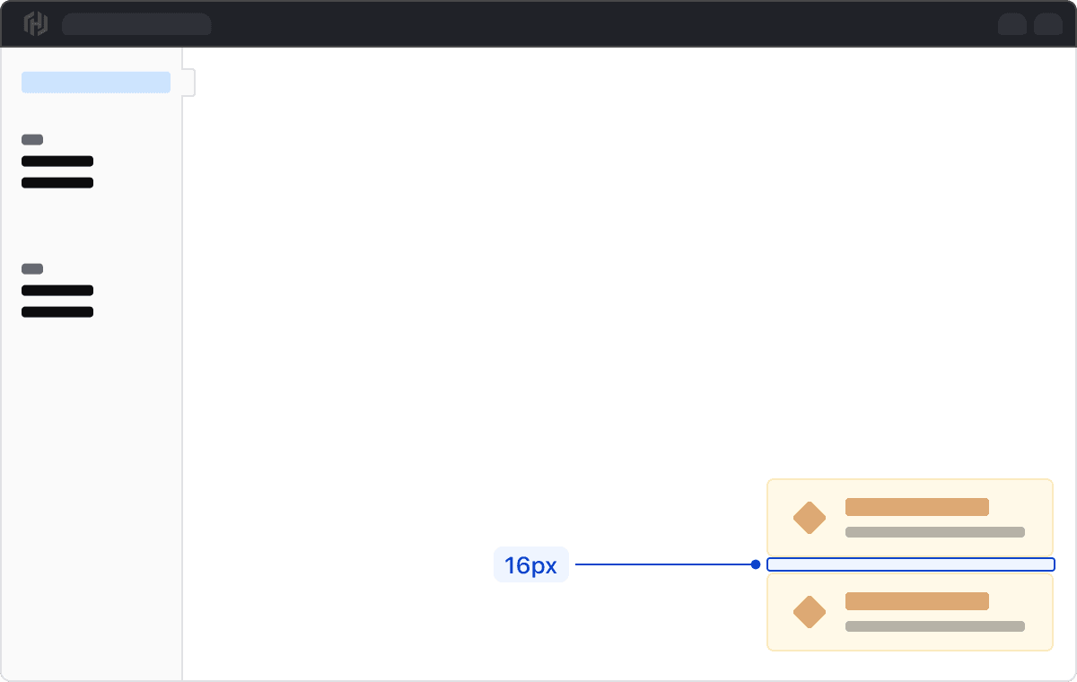
When displaying multiple Toasts, they should stack vertically with a 16px margin between each Toast. For consistency, each stacked Toast should be the same width.
When to persist or timeout
A Toast can either persist until the user dismisses it or be automatically dismissed via a timeout.
If a Toast contains actions or critical information (often associated with a warning or critical toast), it should persist until the user dismisses it. Keep in mind that when a Toast persists, it will remain visible across all pages until dismissed.
Timeout best practices
When a Toast is set to timeout, it should auto dismiss after seven seconds. Content within Toasts that time out should be as concise as possible with only a few words, e.g., “Cluster created,” to allow enough time for a user to notice and read the contents before it auto dismisses.
We recommend setting a timeout for neutral, highlight, or success Toasts only. This ensures that critical information or information that requires immediate attention is not missed.
While we provide visual styling for this component, the product team must implement other features like placement, transitions, and what happens on dismiss (e.g., with an Ember addon).
How to use this component
The basic invocation requires the type argument, an onDismiss callback function, and the title and/or description content. By default a neutral Toast is generated.
<Hds::Toast @onDismiss={{this.yourOnDismissFunction}} as |T|>
  <T.Title>Title here</T.Title>
  <T.Description>Description here</T.Description>
</Hds::Toast>
Title and description
Optionally, you can pass only title or only description.
<Hds::Toast @onDismiss={{this.yourOnDismissFunction}} as |T|>
  <T.Title>Title here</T.Title>
</Hds::Toast>

<br />

<Hds::Toast @onDismiss={{this.yourOnDismissFunction}} as |T|>
  <T.Description>Description here</T.Description>
</Hds::Toast>
Color
A different color can be applied to the Toast using the color argument. This will determine the default icon used in the Toast, unless overwritten.
<Hds::Toast @color="success" @onDismiss={{this.yourOnDismissFunction}} as |T|>
  <T.Title>Title here</T.Title>
  <T.Description>Description here</T.Description>
</Hds::Toast>
Icon
A different icon can be used in the Toast using the icon argument. This accepts any icon name.
<Hds::Toast @color="success" @icon="bulb" @onDismiss={{this.yourOnDismissFunction}} as |T|>
  <T.Title>Title here</T.Title>
  <T.Description>Description here</T.Description>
</Hds::Toast>
If you need to hide the icon, pass false to the icon argument.
<Hds::Toast @color="success" @icon={{false}} @onDismiss={{this.yourOnDismissFunction}} as |T|>
  <T.Title>Title here</T.Title>
  <T.Description>Description here</T.Description>
</Hds::Toast>
Actions
Actions can be passed to the component using one of the suggested Button or LinkStandalone contextual components.
<Hds::Toast @color="critical" @onDismiss={{this.yourOnDismissFunction}} as |T|>
  <T.Title>Title here</T.Title>
  <T.Description>Description here</T.Description>
  <T.Button @text="Your action" @color="secondary" {{on "click" this.yourOnClickFunction}} />
  <T.LinkStandalone @color="secondary" @icon="plus" @text="Another action" @route="components" />
</Hds::Toast>
Structured content
When needed, the Description contextual component can contain logic, rich HTML, or structured content.
We apply styling for a few simple HTML elements (e.g., strong, em, a, code/pre). If using other elements, you’ll need to style them accordingly.
<Hds::Toast @color="success" @onDismiss={{this.yourOnDismissFunction}} as |T|>
  <T.Title>Title here</T.Title>
  <T.Description>
    The description can contain
    {{#if true}}conditional logic{{/if}}, Ember components, and HTML tags, like
    <strong>strong text</strong>,
    <em>emphasized text</em>,
    <code>code</code>,
    <pre>pre</pre>,
    <a href="#">inline</a>
    <LinkTo @route="index">links</LinkTo>.
  </T.Description>
</Hds::Toast>
You can pass more than one D.Description contextual components to have multiple description lines.
<Hds::Toast @color="success" @onDismiss={{this.yourOnDismissFunction}} as |T|>
  <T.Title>Title here</T.Title>
  <T.Description>First line of description.</T.Description>
  <T.Description>Second line of description.</T.Description>
</Hds::Toast>
Generic content
Use the Generic contextual component to insert custom content. Generic content will appear after the title, description, and actions. Product teams will need to implement spacing, layout, and styling for generic content.
<Hds::Toast @onDismiss={{this.yourOnDismissFunction}} as |T|>
  <T.Title>Title here</T.Title>
  <T.Description>Description here</T.Description>
  <T.Generic>
    [your content here]
  </T.Generic>
</Hds::Toast>
Component API
The Hds::Toast component is built out of the Hds::Alert (Inline) component, so it shares the same API. Please refer to the Alert Component API documentation to know more.
Anatomy
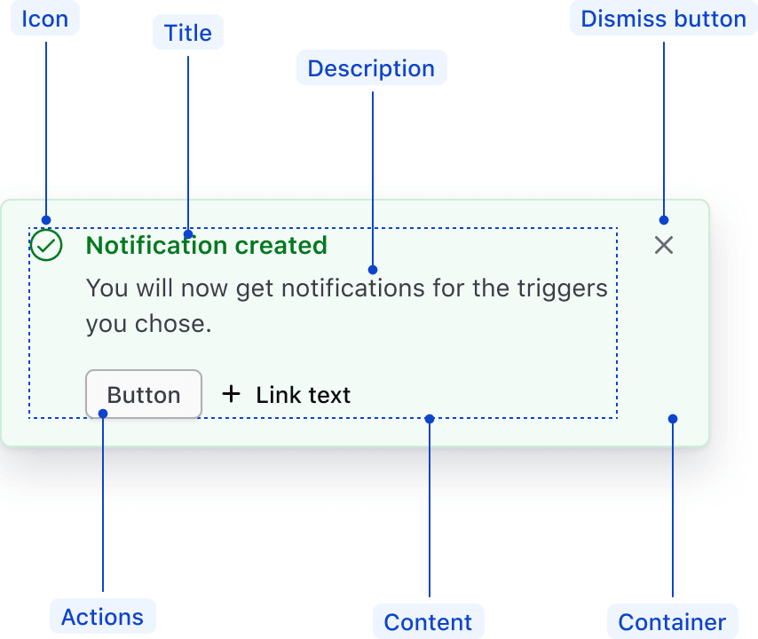
| Element | Usage |
|---|---|
| Icon | Optional, recommended |
| Title | Required, if no description; optional, otherwise |
| Description | Required, if no title; optional, otherwise |
| Actions | Optional |
| Container | Required |
| Dismiss button | Optional |
| Content | Required |
General recommendations
- Keep the title short, as this will be the most prominent element when users scan the Toast.
- Avoid ending the title with a period.
- Toast descriptions should be short but clear enough to explain what’s happening. We recommend keeping messages under 90 characters.
- For warning and critical Toasts, guide the users on how to prevent or fix the issue.
Actions
Use small buttons to avoid competing with other actions on the page. Use more than two actions sparingly.
We recommend using the secondary button variant for primary actions and the tertiary button variant for secondary actions.
For content guidelines on actions, refer to Button and Link documentation.
Usage of critical buttons
Avoid using critical Buttons in Toasts. We handle the prominence and importance via the styling of the Toast container itself. If needing to confirm that the user intended to interact with the action, consider displaying a confirmation Modal.
Links
When linking to internal and external resources in the Toast, default to using a secondary Standalone Link in the actions area. In the Ember component, these elements are passed as contextual components.
Within the Toast description, use the secondary Inline Link as the default link color. A common use case for this is when linking to multiple resources.
Wrap links to multiple related items on the same page in a list, e.g., when highlighting multiple validation errors.
Composition
Toasts can be configured in a variety of ways. For example:
With icon and title
With icon, title, and description
Title and description only
The title or description should contain the Toast color type, e.g., “Warning,” if no icon is present.
With actions
With generic content
A.Generic
contextual component.
Conformance rating
When used as recommended, there should not be any WCAG conformance issues with this component.
Animation
Animations on Toasts will not take place if the user has prefers-reduced-motion enabled in their browser or operating system.
Applicable WCAG Success Criteria
This section is for reference only. This component intends to conform to the following WCAG Success Criteria:
-
1.3.1
Info and Relationships (Level A):
Information, structure, and relationships conveyed through presentation can be programmatically determined or are available in text. -
1.3.2
Meaningful Sequence (Level A):
When the sequence in which content is presented affects its meaning, a correct reading sequence can be programmatically determined. -
1.4.1
Use of Color (Level A):
Color is not used as the only visual means of conveying information, indicating an action, prompting a response, or distinguishing a visual element. -
1.4.10
Reflow (Level AA):
Content can be presented without loss of information or functionality, and without requiring scrolling in two dimensions. -
1.4.11
Non-text Contrast (Level AA):
The visual presentation of the following have a contrast ratio of at least 3:1 against adjacent color(s): user interface components; graphical objects. -
1.4.12
Text Spacing (Level AA):
No loss of content or functionality occurs by setting all of the following and by changing no other style property: line height set to 1.5; spacing following paragraphs set to at least 2x the font size; letter-spacing set at least 0.12x of the font size, word spacing set to at least 0.16 times the font size. -
1.4.3
Minimum Contrast (Level AA):
The visual presentation of text and images of text has a contrast ratio of at least 4.5:1 -
2.1.1
Keyboard (Level A):
All functionality of the content is operable through a keyboard interface. -
2.1.2
No Keyboard Trap (Level A):
If keyboard focus can be moved to a component of the page using a keyboard interface, then focus can be moved away from that component using only a keyboard interface. -
2.2.1
Timing Adjustable (Level A):
If there are time limitations set by the content, one of the following should be true: turn off, adjust, extend, real-time exception, essential exception, 20 hour exception. -
2.5.3
Label in Name (Level A):
For user interface components with labels that include text or images of text, the name contains the text that is presented visually. -
4.1.2
Name, Role, Value (Level A):
For all user interface components, the name and role can be programmatically determined; states, properties, and values that can be set by the user can be programmatically set; and notification of changes to these items is available to user agents, including assistive technologies. -
4.1.3
Status Messages (Level AA):
In content implemented using markup languages, status messages can be programmatically determined through role or properties such that they can be presented to the user by assistive technologies without receiving focus.
Support
If any accessibility issues have been found within this component, let us know by submitting an issue.
6.1.0
Converted component to gts format.