A Select is a form element that provides users with a way to select amongst a set of options.
Usage
When to use
- As a form element that allows the user to make a selection from a pre-defined set of options.
When not to use
- When a user can select more than one option, consider Checkbox.
- When there are fewer than 5 options, consider Radio.
- To display a list of buttons or links in a menu, consider Dropdown.
Required and optional
For complex forms, indicate required fields. This is the most explicit and transparent method and ensures users don’t have to make assumptions. Read more about best practices for marking required fields in forms.
If the field is required, consider adding a default value to help the user avoid an error.
For shorter, simpler forms (e.g., login/signup and feedback requests), indicate optional fields instead.
Error validation
For error validation recommendations, refer to the Form patterns documentation.
How to use this component
There are two ways to use the Select component:
Form::Select::Base- the base component: just the<select>control.Form::Select::Field- the field parent component: the<select>control, with label, helper text, and error messaging (in a wrapping container).
We recommend using the Field component as it provides built-in accessibility functionality. Use the Base component if needing to achieve custom layouts or for special use cases not covered by the Field component.
Form::Select::Field
The basic invocation requires a Label. This creates:
- a
<label>element with aforattribute automatically associated with the selectIDattribute. - a
<select>control with an automatically generatedIDattribute, and theOptionselements yielded as children.
<Hds::Form::Select::Field name="demo-target-infrastructure" as |F|>
  <F.Label>Target infrastructure</F.Label>
  <F.Options>
    <option value="Kubernetes">Kubernetes</option>
    <option value="Other">Other</option>
  </F.Options>
</Hds::Form::Select::Field>
Selected option
Pass the native selected attribute to pre-select one of the options.
<Hds::Form::Select::Field name="demo-target-infrastructure" as |F|>
  <F.Label>Target infrastructure</F.Label>
  <F.Options>
    <option value="Kubernetes">Kubernetes</option>
    <option value="Other" selected>Other</option>
  </F.Options>
</Hds::Form::Select::Field>
Grouped options
To group similar sets of options, use the <optgroup> tag within the Options container.
<Hds::Form::Select::Field name="demo-target-infrastructure" as |F|>
  <F.Label>Target infrastructure</F.Label>
  <F.Options>
    <optgroup label="Most common">
      <option value="Kubernetes">Kubernetes</option>
      <option value="AWS">AWS</option>
    </optgroup>
    <optgroup label="Others">
      <option value="CloudWise" selected>CloudWise</option>
      <option value="SWA">SWA</option>
      <option value="Other">Other</option>
    </optgroup>
  </F.Options>
</Hds::Form::Select::Field>
Helper text
You can add extra information to the field using helper text. When helper text is added, the component automatically adds an aria-describedby attribute to the select control, associating it with the automatically generated ID of the helper text element.
<Hds::Form::Select::Field name="demo-target-infrastructure" as |F|>
  <F.Label>Target infrastructure</F.Label>
  <F.HelperText>The target infrastructure is where you want to deploy your apps.</F.HelperText>
  <F.Options>
    <option value="Kubernetes">Kubernetes</option>
    <option value="Other">Other</option>
  </F.Options>
</Hds::Form::Select::Field>
Extra content in label and helper text
The Label and HelperText contextual components used in the Field component yield their content. This means you can also pass structured content.
For example:
<Hds::Form::Select::Field name="demo-target-infrastructure" as |F|>
  <F.Label>Target infrastructure <Hds::Badge @size="small" @text="Beta" /></F.Label>
  <F.HelperText>This is an experimental feature (<Hds::Link::Inline @href="#">read more</Hds::Link::Inline>).</F.HelperText>
  <F.Options>
    <option value="Kubernetes">Kubernetes</option>
    <option value="Other">Other</option>
  </F.Options>
</Hds::Form::Select::Field>
Required vs. optional
Use the @isRequired and @isOptional arguments to add a visual indication that the field is "required" or "optional".
<Hds::Form as |FORM|>
  <FORM.Section>
    <Hds::Form::Select::Field @isRequired={{true}} name="demo-target-infrastructure" as |F|>
      <F.Label>Target infrastructure</F.Label>
      <F.HelperText>The target infrastructure is where you want to deploy your apps.</F.HelperText>
      <F.Options>
        <option value=""></option>
        <option value="Kubernetes">Kubernetes</option>
        <option value="Other">Other</option>
      </F.Options>
    </Hds::Form::Select::Field>

    <Hds::Form::Select::Field @isOptional={{true}} name="demo-target-infrastructure" as |F|>
      <F.Label>Target infrastructure</F.Label>
      <F.HelperText>The target infrastructure is where you want to deploy your apps.</F.HelperText>
      <F.Options>
        <option value=""></option>
        <option value="Kubernetes">Kubernetes</option>
        <option value="Other">Other</option>
      </F.Options>
    </Hds::Form::Select::Field>
  </FORM.Section>
</Hds::Form>
Validation
To indicate a field is invalid, declare that it’s invalid by using the @isInvalid argument and provide an error message using the Error contextual component.
<Hds::Form::Select::Field @isInvalid={{true}} name="demo-target-infrastructure" as |F|>
  <F.Label>Target infrastructure</F.Label>
  <F.HelperText>The target infrastructure is where you want to deploy your apps.</F.HelperText>
  <F.Options>
    <option value=""></option>
    <option value="Kubernetes">Kubernetes</option>
    <option value="Other">Other</option>
  </F.Options>
  <F.Error>Error: select one of the options.</F.Error>
</Hds::Form::Select::Field>
Custom control ID
If needing a custom ID for the control instead of the one automatically generated by the component, pass the @id argument to the field.
In this case all the internal references (id/for/aria-describedby) between the different parts of the field are still automatically generated and will use the custom ID provided.
<Hds::Form::Select::Field @id="my-control" name="demo-target-infrastructure" as |F|>
  <F.Label>Target infrastructure</F.Label>
  <F.HelperText>The target infrastructure is where you want to deploy your apps.</F.HelperText>
  <F.Options>
    <option value="Kubernetes">Kubernetes</option>
    <option value="Other">Other</option>
  </F.Options>
</Hds::Form::Select::Field>
Additional aria-describedby
Pass an @extraAriaDescribedBy argument to the field to connect one or more extra elements describing the field to the control. This provides extra ID values to the aria-describedby attribute of the control, in addition to those automatically generated by the component.
<Hds::Form::Select::Field @extraAriaDescribedBy="my-extra-element-ID" name="demo-target-infrastructure" as |F|>
  <F.Label>Target infrastructure</F.Label>
  <F.HelperText>The target infrastructure is where you want to deploy your apps.</F.HelperText>
  <F.Options>
    <option value="Kubernetes">Kubernetes</option>
    <option value="Other">Other</option>
  </F.Options>
</Hds::Form::Select::Field>
Native HTML attributes
This component supports use of ...attributes. This means you can use all the standard HTML attributes of the <select> element. This can be useful in case you want to add specific native behaviors to the field, that are not exposed directly by the component (e.g., providing a name for the control, or adding multiple and size attributes to it).
Similarly, you can pass HTML attributes to the <option/optgroup> elements.
<Hds::Form::Select::Field name="demo-infrastructure" multiple size="8" as |F|>
  <F.Label>Target infrastructure</F.Label>
  <F.Options>
    <optgroup label="Most common">
      <option value="Kubernetes">Kubernetes</option>
      <option value="AWS">AWS</option>
      <option value="Azure" disabled>Azure</option>
    </optgroup>
    <optgroup label="Others">
      <option value="Alibaba" selected>Alibaba</option>
      <option value="CloudWise" selected>CloudWise</option>
      <option value="SWA">SWA</option>
      <option value="Other">Other</option>
    </optgroup>
  </F.Options>
</Hds::Form::Select::Field>
Event handling
Because this component supports use of ...attributes, you can use all the usual Ember techniques for event handling (e.g., blur, change), validation, etc.
<Hds::Form::Select::Field {{on "blur" this.yourOnBlurFunction}} name="demo-target-infrastructure" as |F|>
  <F.Label>Target infrastructure</F.Label>
  <F.Options>
    <option value=""></option>
    <option value="Kubernetes">Kubernetes</option>
    <option value="Other">Other</option>
  </F.Options>
</Hds::Form::Select::Field>
Custom width
By default, the select control width is set to fill the parent container.
Pass a custom width for the control using the @width argument.
<Hds::Form::Select::Field @width="200px" name="demo-target-infrastructure" as |F|>
  <F.Label>Target infrastructure</F.Label>
  <F.Options>
    <option value="Kubernetes">Kubernetes</option>
    <option value="Other">Other</option>
  </F.Options>
</Hds::Form::Select::Field>
Form::Select::Base
The Base component is intended for rare cases where the Field component can’t be used and a custom implementation is needed. Most of the details for the Field component also apply to the Base component, but see the Component API for more details.
The Base component creates a <select> control with an automatically generated ID attribute.
<Hds::Form::Select::Base
  aria-label="Target infrastructure"
  required={{true}}
  name="demo-target-infrastructure"
  {{on "blur" this.yourOnBlurFunction}}
  as |S|
>
  <S.Options>
    <option value="Kubernetes">Kubernetes</option>
    <option value="Other">Other</option>
  </S.Options>
</Hds::Form::Select::Base>
Component API
The Select component has two different variants with their own APIs:
Form::Select::Base- the base component: just the<select>control.Form::Select::Field- the field parent component: the<select>control, with label, helper text, and error messaging (in a wrapping container).
Form::Select::Base
isInvalid
boolean
- false (default)
width
string
<select> has an intrinsic width based on its content. If a @width parameter is provided then the control will have a fixed width.
…attributes
...attributes.
The attributes will be applied to the
<select> element. This means you can use all the standard HTML attributes of the <select> element and all the usual Ember techniques for event handling, validation, etc.
Examples of HTML attributes:
id, name, disabled, required, multiple. See the whole list of HTML attributes. Examples of Ember modifiers: {{on "change" [do something]}}, {{on "blur" [do something]}}.
Contextual components
The select options are passed to the field as yielded components, using the Options key.
<[F].Options>
yielded component
<select> element. The content needs to be a set of native HTML <option> and <optgroup> elements. As such, you can also provide them native HTML attributes.
Form::Select::Field
id
string
By default, the ID is automatically generated by the component. Use this argument to pass a custom ID.
isInvalid
boolean
- false (default)
isRequired
boolean
- false (default)
Required indicator next to the label text and sets the required attribute on the control when user input is required.
isOptional
boolean
- false (default)
Optional indicator next to the label text when user input is optional.
width
string
<select> element has an intrinsic width based on its content. If a @width parameter is provided, the control will have a fixed width. This width will only be applied to the control, not the other elements of the field.
extraAriaDescribedBy
string
aria-describedby HTML attribute.
By default, the
aria-describedby attribute is automatically generated by the component, using the IDs of the helper text and errors (if present). Use this argument to pass an extra ID.
…attributes
...attributes.
The attributes will be applied to the
<select> element. This means you can use all the standard HTML attributes of the <select> element and all the usual Ember techniques for event handling, validation, etc.
Examples of HTML attributes:
name, placeholder, disabled, readonly, required. See the whole list of HTML attributes. Examples of Ember modifiers: {{on "input" [do something]}}, {{on "change" [do something]}}, {{on "blur" [do something]}}.
Contextual components
Options, Label, HelperText, and Error content are passed to the field as yielded components.
<[F].Options>
yielded component
<select> element. The content needs to be a set of native HTML <option> and <optgroup> elements.
<[F].Label>
yielded component
<label> element. The content can be a simple string or a more complex/structured string, in which case it inherits the text style. For details about its API, check the Form::Label component.
The
for attribute of the label is automatically generated using the controlId value of the control.
<[F].HelperText>
yielded component
Form::HelperText component.
The
id attribute of the element is automatically generated using the controlId value of the control.
<[F].Error>
yielded component
Form::Error component.
The
id attribute of the Error element is automatically generated.
<[E].Message>
yielded component
Error.Message.
Anatomy
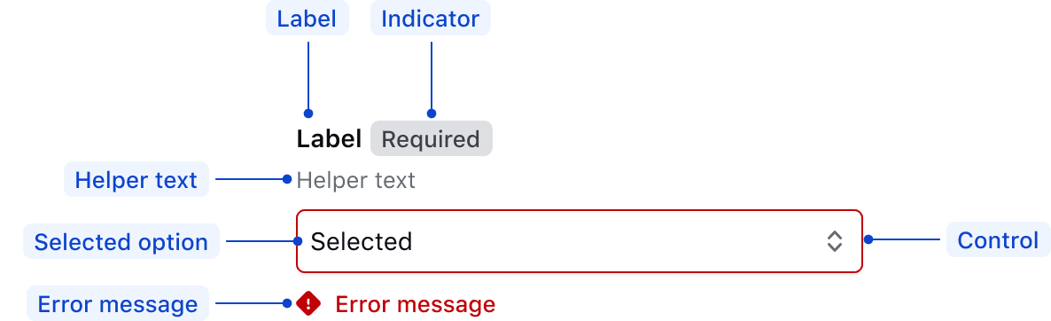
| Element | Usage |
|---|---|
| Label | Required |
| Indicator | Optional |
| Helper text | Optional |
| Selected option | Optional |
| Control | Required |
| Error message | Triggered by system |
States
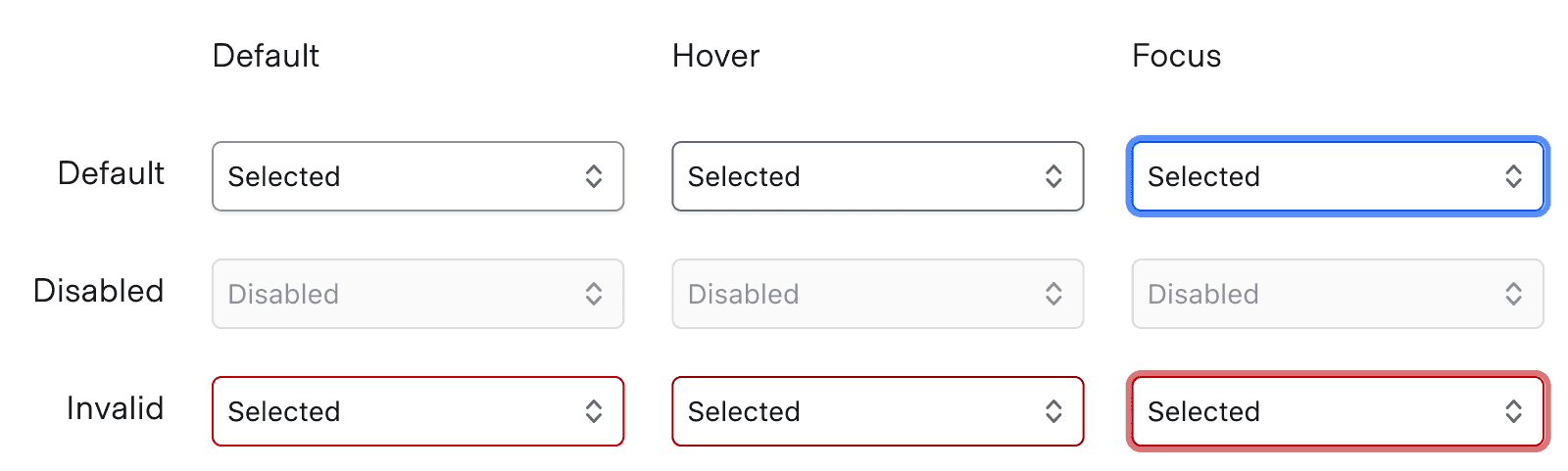
For general content recommendations, refer to the Primitives documentation.
Options list
- Keep option content clear and concise; avoid full sentences.
- Avoid repeating the same word at the beginning of list options.
- Order the options in a logical way based on the use case. For example:
- default or most commonly selected options first
- alphabetically
- numerically
Conformance
Form::Select::Field
Form::Select::Field is conformant when used as directed. For this reason, we recommend using Form::Select::Field by default.
Form::Select::Base
Form::Select::Base is not conformant until it has an accessible name.
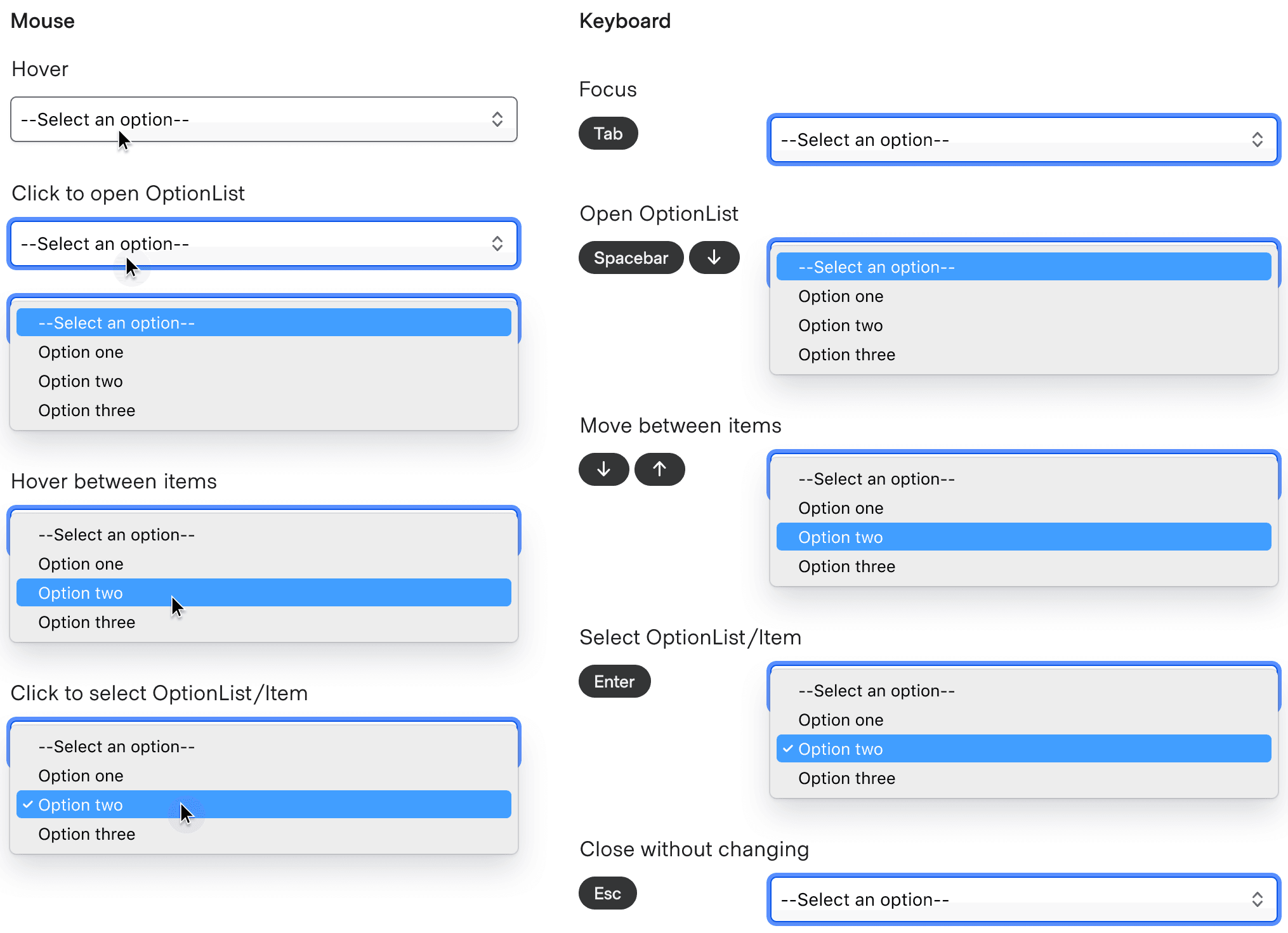
Interactions
Applicable WCAG Success Criteria (Reference)
This section is for reference only, some descriptions have been truncated for brevity. This component intends to conform to the following WCAG Success Criteria:
-
1.3.1
Info and Relationships (Level A):
Information, structure, and relationships conveyed through presentation can be programmatically determined or are available in text. -
1.3.2
Meaningful Sequence (Level A):
When the sequence in which content is presented affects its meaning, a correct reading sequence can be programmatically determined. -
1.3.4
Orientation (Level AA):
Content does not restrict its view and operation to a single display orientation, such as portrait or landscape. -
1.3.5
Identify Input Purpose (Level AA):
The purpose of each input field collecting information about the user can be programmatically determined when the input field serves a purpose identified in the Input Purposes for User Interface Components section; and the content is implemented using technologies with support for identifying the expected meaning for form input data. -
1.4.1
Use of Color (Level A):
Color is not used as the only visual means of conveying information, indicating an action, prompting a response, or distinguishing a visual element. -
1.4.10
Reflow (Level AA):
Content can be presented without loss of information or functionality, and without requiring scrolling in two dimensions. -
1.4.11
Non-text Contrast (Level AA):
The visual presentation of the following have a contrast ratio of at least 3:1 against adjacent color(s): user interface components; graphical objects. -
1.4.12
Text Spacing (Level AA):
No loss of content or functionality occurs by setting all of the following and by changing no other style property: line height set to 1.5; spacing following paragraphs set to at least 2x the font size; letter-spacing set at least 0.12x of the font size, word spacing set to at least 0.16 times the font size. -
1.4.3
Minimum Contrast (Level AA):
The visual presentation of text and images of text has a contrast ratio of at least 4.5:1 -
1.4.4
Resize Text (Level AA):
Except for captions and images of text, text can be resized without assistive technology up to 200 percent without loss of content or functionality. -
2.4.6
Headings and Labels (Level AA):
Headings and labels describe topic or purpose. -
2.4.7
Focus Visible (Level AA):
Any keyboard operable user interface has a mode of operation where the keyboard focus indicator is visible. -
3.2.1
On Focus (Level A):
When any user interface component receives focus, it does not initiate a change of context. -
3.2.2
On Input (Level A):
Changing the setting of any user interface component does not automatically cause a change of context unless the user has been advised of the behavior before using the component. -
3.2.4
Consistent Identification (Level AA):
Components that have the same functionality within a set of Web pages are identified consistently. -
3.3.2
Labels or Instructions (Level A):
Labels or instructions are provided when content requires user input. -
4.1.2
Name, Role, Value (Level A):
For all user interface components, the name and role can be programmatically determined; states, properties, and values that can be set by the user can be programmatically set; and notification of changes to these items is available to user agents, including assistive technologies.
Support
If any accessibility issues have been found within this component, let us know by submitting an issue.
6.1.1
Fixed SelectField signature element to be HTMLInputElement instead of HTMLElement.
6.1.0
Converted component to gts format.
4.21.0
Added @id and @ariaDescribedBy arguments to Form::Select::Base.