The Table component should be used for displaying tabular data; it renders an HTML table element.
Usage
When to use
- To display and organize tabular data.
- When comparing, sorting, and filtering multi-dimensional data and objects.
When not to use
- As a layout mechanism.
- As a replacement for a spreadsheet or similar application.
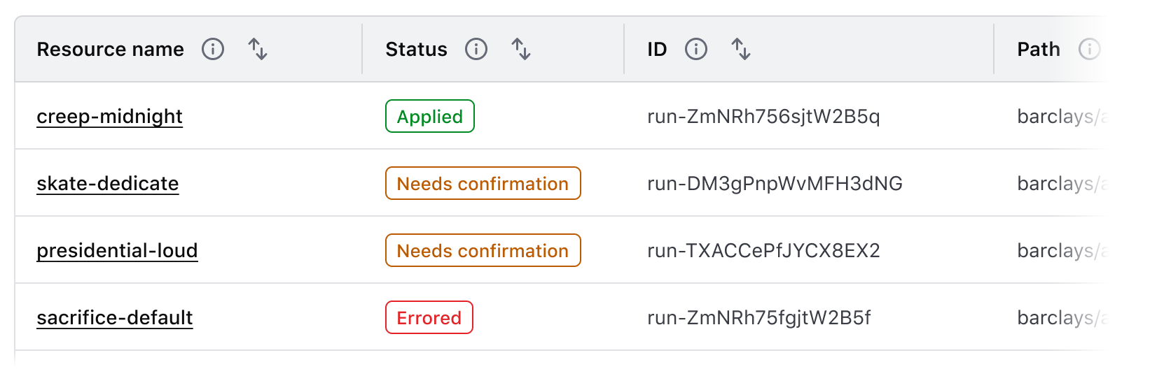
Columns
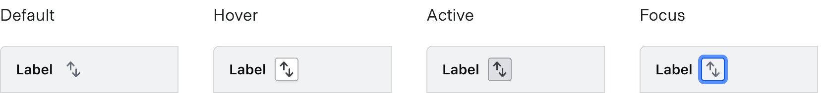
Sorting
- Sorting is not relevant for all content, so consider when to apply sorting thoughtfully.
- Columns that do contain a sortable data type are interactive and therefore have corresponding hover, active, and focus states.
- A Table may only be sorted by a single value at a time.

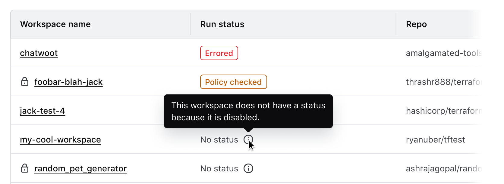
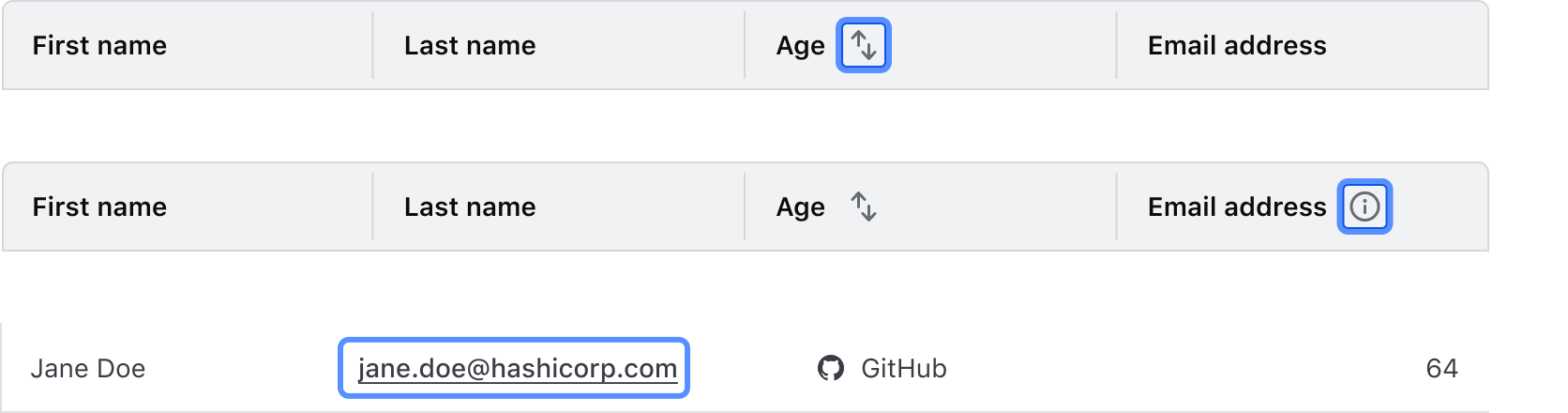
Tooltips
Labels within the Table column should be clear, concise, and straightforward. In the case that more context or details are necessary, a Tooltip can be used in conjunction with the label but should be used sparingly and as a last resort.
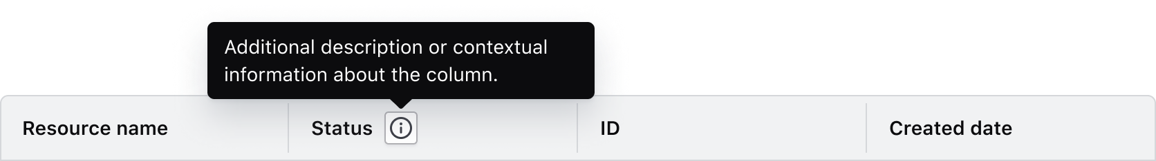
We recommend against using a tooltip in all or most columns in a table as this can add unnecessary visual clutter and increase the cognitive load on the user.
Some common examples where it may be useful to include additional context in a tooltip include:
- When the label contains a product or HashiCorp-specific term.
- When the label refers to a setting that can be changed elsewhere in the application.
Width
Column width is determined by manually resizing the header column and cells within Figma. As a best practice, column width should be adjusted to fit the longest data type within the cell.
Placement
Column placement determines the visual styling based on where the column is placed relative to other columns in the Table.
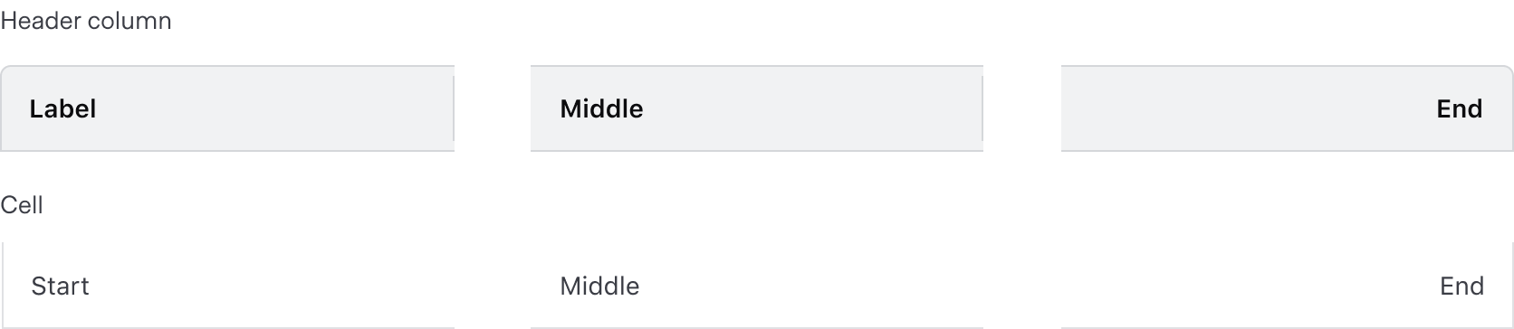
Alignment
The alignment of text and content within a table impacts the readability and speed at which users can effectively parse the information. The chosen alignment method depends on the content within the cell, purpose of the table, and relative position within the table.
Consistent alignment
Use consistent alignment between the header label and the cell content.
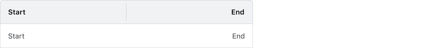
Start alignment
Align content to the start of the cell by default. This ensures readability across different content types, consistency in content of varying lengths, and alignment between the column header label and the content within the cell.
Use start alignment for:
- String and text-based content (unique identifiers or IDs, names and naming conventions, etc).
- Numerical values that do not contain decimals or floating point numbers.
- Numerical values that contain periods or other delimiter characters (IP addresses).
- Nested components that display a string or text value, e.g., a Badge.
End alignment
End alignment can be used when expressing numerical values with decimals as this aligns the decimal places vertically.
Common examples of end alignment include:
- Financial information and currency amounts.
- Fractional and floating point values represented with decimals.
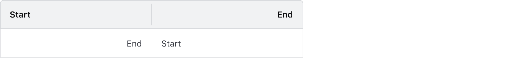
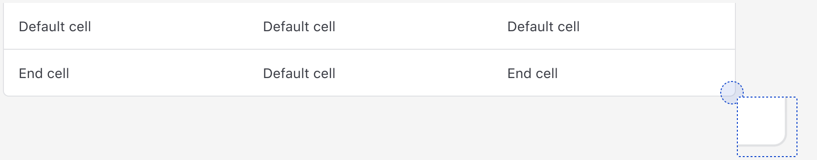
End alignment can also be used in the last column of a table to:
- Highlight a "more options" function pertaining to the content within a row.
- As a means to visually "bookend" the row with content that is of a similar length, e.g., timestamps, TTL (time-to-live) values, dates.
Don’t end align content that is variable in length. This can make the content more difficult to read by forcing an unnatural reading pattern.
Other alignment methods
We don’t recommend center or justified alignment of content within a cell or table. These alignment methods can result in the content being difficult to read, especially if it is variable in length.
Don’t center header labels or cell content within a table.
Rows
Striping
While striping is not required, we recommend it for the added usability benefits.
When using striping in a Table, start with the second row to allow the Table Header to be further differentiated from the the row directly beneath it.
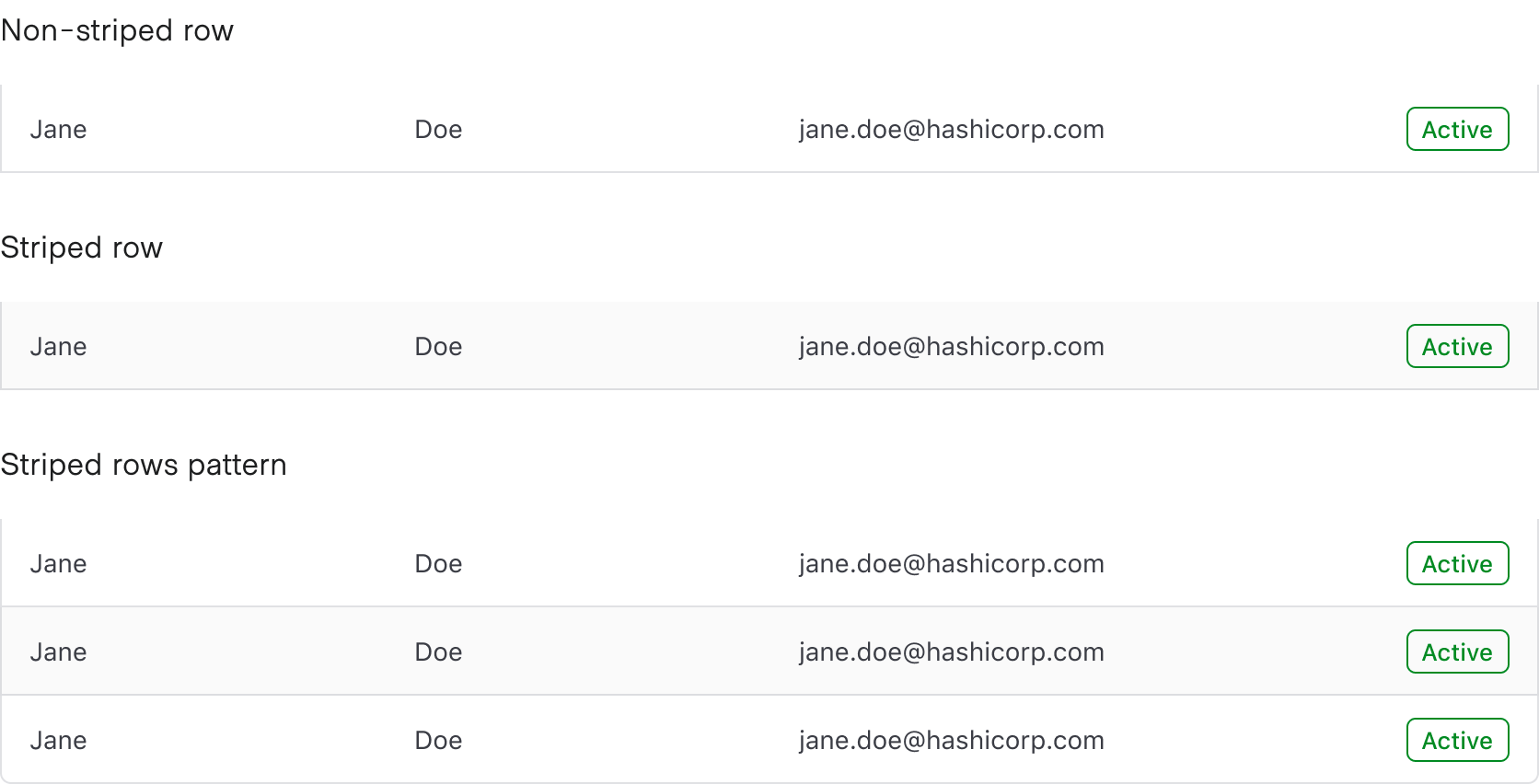
Benefits of striping
- Striping makes data within the Table easier to read by increasing differentiation between rows.
- Striping increases ability to scan, especially for large datasets that result in many rows.
- Striping increases legibility when the type of data is similar between columns; e.g., columns that catalog mostly text or numerical data benefit from more differentiation between rows.
Placement
Row placement determines the visual styling based on where the row is placed relative to other rows within the Table. Only cells with a column placement that is either start or end utilize the row placement property; column position middle does not utilize this property.
Headers
- Headers should be clear, concise, and straightforward.
- The headers should infer clearly what type (string, number, status, etc) of content is contained within the cell.
- Headers should use sentence-case capitalization, not all-caps.
Cells
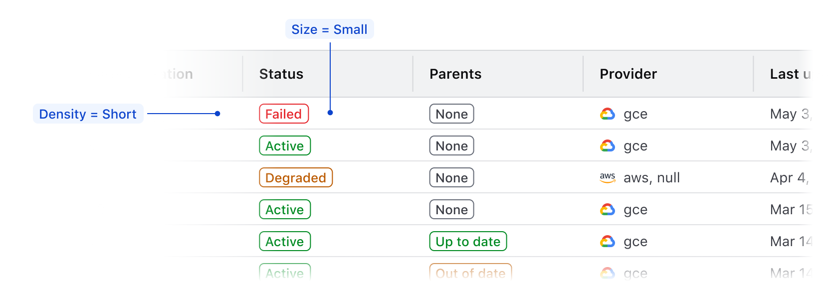
Density
- We recommend using
mediumcell density by default. - If content is complex or a smaller data set (e.g., a Table of basic user data),
tallcell density allows for more breathing room surrounding the content. - If content is largely string/text-based,
shortallows for more content to be displayed within the page. - While denser content allows for more rows to be displayed within a single page, it also makes comprehension and scanning more difficult.

Multi-select
A multi-select table includes checkboxes enabling users to select multiple rows in a table to perform bulk operations. Checking or unchecking the checkbox in the table header either selects or deselects the checkboxes on each row in the table body. Individual checkboxes in the rows can also be selected or deselected.
A multi-select consists of:
- A select all in a table is used in the table's header row. This acts as the parent checkbox, allowing the selection or deselection of all child rows in a single table simultaneously.

- Row level select is used in each table row allowing for the selection of an individual row.
Intended interaction
- When individual rows are selected, the parent checkbox in the Table header changes to display an indeterminate state.
- When no or some rows (but not all) are selected in a single Table, clicking the parent checkbox in the Table header will change to display as checked and all rows on that page will be selected.
- When all rows are selected in a single Table, the parent checkbox in the header appears as checked. Clicking the parent checkbox will deselect all rows on that page.
- An additional action outside of the Table is needed in order to select all rows across a paginated Table.
How to use this component
Table with no model defined
If you want to use the component but have no model defined (e.g., there are only a few pieces of data but it’s still tabular data), you can manually add each row, or use an each to loop over the data (e.g., an array of objects defined in the route) to render the rows.
Manual row implementation
| Column Header One | Column Header Two | Column Header Three |
|---|---|---|
| Cell one A | Cell two A | Cell three A |
| Cell one B | Cell two B | Cell three B |
<Hds::Table @caption="your custom, meaningful caption goes here">
  <:head as |H|>
    <H.Tr>
      <H.Th>Column Header One</H.Th>
      <H.Th>Column Header Two</H.Th>
      <H.Th>Column Header Three</H.Th>
    </H.Tr>
  </:head>
  <:body as |B|>
    <B.Tr>
      <B.Td>Cell one A</B.Td>
      <B.Td>Cell two A</B.Td>
      <B.Td>Cell three A</B.Td>
    </B.Tr>
    <B.Tr>
      <B.Td>Cell one B</B.Td>
      <B.Td>Cell two B</B.Td>
      <B.Td>Cell three B</B.Td>
    </B.Tr>
  </:body>
</Hds::Table>
Using each to loop over records to create rows
| Product | Brand Color | Uses Helios |
|---|---|---|
| Terraform | purple | true |
| Nomad | green | true |
| Vault | yellow | true |
<Hds::Table @caption="Products that use Helios">
  <:head as |H|>
    <H.Tr>
      <H.Th>Product</H.Th>
      <H.Th>Brand Color</H.Th>
      <H.Th>Uses Helios</H.Th>
    </H.Tr>
  </:head>
  <:body as |B|>
    {{#each this.myDataItems as |item|}}
      <B.Tr>
        <B.Td>{{item.product}}</B.Td>
        <B.Td>{{item.brandColor}}</B.Td>
        <B.Td>{{item.usesHelios}}</B.Td>
      </B.Tr>
    {{/each}}
  </:body>
</Hds::Table>
Non-sortable Table with model defined
To use a Table with a model, first define the data model in your route or model:
import Route from '@ember/routing/route';

export default class ComponentsTableRoute extends Route {
  async model() {
    // example of data retrieved:
    //[
    //  {
    //    id: '1',
    //    attributes: {
    //      artist: 'Nick Drake',
    //      album: 'Pink Moon',
    //      year: '1972'
    //    },
    //  },
    //  {
    //    id: '2',
    //    attributes: {
    //      artist: 'The Beatles',
    //      album: 'Abbey Road',
    //      year: '1969'
    //    },
    //  },
    // ...
    let response = await fetch('/api/demo.json');
    let { data } = await response.json();
    return { myDemoData: data };
  }
}
For documentation purposes, we’re imitating fetching data from an API and working with that as data model. Depending on your context and needs, you may want to manipulate and adapt the structure of your data to better suit your needs in the template code.
You can insert your own content into the :body block and the component will take care of looping over the @model provided:
| Artist | Album | Year |
|---|---|---|
| Nick Drake | Pink Moon | 1972 |
| The Beatles | Abbey Road | 1969 |
| Melanie | Candles in the Rain | 1971 |
| Bob Dylan | Bringing It All Back Home | 1965 |
| James Taylor | Sweet Baby James | 1970 |
| Simon and Garfunkel | Bridge Over Troubled Waters | 1970 |
<Hds::Table
  @model={{this.model.myDemoData}}
  @columns={{array (hash label="Artist") (hash label="Album") (hash label="Year")}}
>
  <:body as |B|>
    <B.Tr>
      <B.Td>{{B.data.artist}}</B.Td>
      <B.Td>{{B.data.album}}</B.Td>
      <B.Td>{{B.data.year}}</B.Td>
    </B.Tr>
  </:body>
</Hds::Table>
Sortable table
Add isSortable=true to the hash for each column that should be sortable.
|
Artist
|
Album
|
Release Year |
|---|---|---|
| Nick Drake | Pink Moon | 1972 |
| The Beatles | Abbey Road | 1969 |
| Melanie | Candles in the Rain | 1971 |
| Bob Dylan | Bringing It All Back Home | 1965 |
| James Taylor | Sweet Baby James | 1970 |
| Simon and Garfunkel | Bridge Over Troubled Waters | 1970 |
<Hds::Table
  @model={{this.model.myDemoData}}
  @columns={{array
    (hash key="artist" label="Artist" isSortable=true)
    (hash key="album" label="Album" isSortable=true)
    (hash key="year" label="Release Year")
  }}
>
  <:body as |B|>
    <B.Tr>
      <B.Td>{{B.data.artist}}</B.Td>
      <B.Td>{{B.data.album}}</B.Td>
      <B.Td>{{B.data.year}}</B.Td>
    </B.Tr>
  </:body>
</Hds::Table>
Pre-sorting columns
To indicate that a specific column should be pre-sorted, add @sortBy, where the value is the column’s key.
|
Artist
|
Album
|
Release Year |
|---|---|---|
| Bob Dylan | Bringing It All Back Home | 1965 |
| James Taylor | Sweet Baby James | 1970 |
| Melanie | Candles in the Rain | 1971 |
| Nick Drake | Pink Moon | 1972 |
| Simon and Garfunkel | Bridge Over Troubled Waters | 1970 |
| The Beatles | Abbey Road | 1969 |
<Hds::Table
  @model={{this.model.myDemoData}}
  @columns={{array
    (hash key="artist" label="Artist" isSortable=true)
    (hash key="album" label="Album" isSortable=true)
    (hash key="year" label="Release Year")
  }}
  @sortBy="artist"
>
  <:body as |B|>
    <B.Tr>
      <B.Td>{{B.data.artist}}</B.Td>
      <B.Td>{{B.data.album}}</B.Td>
      <B.Td>{{B.data.year}}</B.Td>
    </B.Tr>
  </:body>
</Hds::Table>
Pre-sorting direction
By default, the sort order is set to ascending. To indicate that the column defined in @sortBy should be pre-sorted in descending order, pass in @sortOrder="desc".
|
Artist
|
Album
|
Release Year |
|---|---|---|
| The Beatles | Abbey Road | 1969 |
| Simon and Garfunkel | Bridge Over Troubled Waters | 1970 |
| Nick Drake | Pink Moon | 1972 |
| Melanie | Candles in the Rain | 1971 |
| James Taylor | Sweet Baby James | 1970 |
| Bob Dylan | Bringing It All Back Home | 1965 |
<Hds::Table
  @model={{this.model.myDemoData}}
  @columns={{array
    (hash key="artist" label="Artist" isSortable=true)
    (hash key="album" label="Album" isSortable=true)
    (hash key="year" label="Release Year")
  }}
  @sortBy="artist"
  @sortOrder="desc"
>
  <:body as |B|>
    <B.Tr>
      <B.Td>{{B.data.artist}}</B.Td>
      <B.Td>{{B.data.album}}</B.Td>
      <B.Td>{{B.data.year}}</B.Td>
    </B.Tr>
  </:body>
</Hds::Table>
Custom sort callback
To implement a custom sort callback on a column:
- add a custom function as the value for
sortingFunctionin the column hash, - include a custom
onSortaction in your Table invocation to track the sorting order and use it in the custom sorting function.
This is useful for cases where the key might not be A-Z or 0-9 sortable by default, e.g., status, and you’re otherwise unable to influence the shape of the data in the model.
The code has been truncated for clarity.
<Hds::Table
  @model={{this.model.myDemoData}}
  @columns={{array
      (hash
        key='status'
        label='Status'
        isSortable=true
        sortingFunction=this.myCustomSortingFunction
      )
      (hash key='album' label='Album')
      (hash key='year' label='Year')
    }}
  @onSort={{this.myCustomOnSort}}
>
  <!-- <:body> here -->
</Hds::Table>
Here’s an example of what a custom sort function could look like. In this example, we are indicating that we want to sort on a status, which takes its order based on the position in the array:
// we use an array to declare the custom sorting order for the "status" column
const customSortingCriteriaArray = [
  'failing',
  'active',
  'establishing',
  'pending',
];

// we track the sorting order, so it can be used in the custom sorting function
@tracked customSortOrderForStatus = 'asc';

// we define a "getter" that returns a custom sorting function ("s1" and "s2" are data records)
get customSortingMethodForStatus() {
  return (s1, s2) => {
    const index1 = customSortingCriteriaArray.indexOf(s1['status']);
    const index2 = customSortingCriteriaArray.indexOf(s2['status']);
    if (index1 < index2) {
      return this.customSortOrderForStatus === 'asc' ? -1 : 1;
    } else if (index1 > index2) {
      return this.customSortOrderForStatus === 'asc' ? 1 : -1;
    } else {
      return 0;
    }
  };
}

// we define a callback function that listens to the `onSort` event in the table,
// and updates the tracked sort order values accordingly
@action
customOnSort(_sortBy, sortOrder) {
  this.customSortOrderForStatus = sortOrder;
}
Custom sorting using the yielded sorting arguments/functions
The Hds::Table exposes (via yielding) some of its internal properties and methods, to allow extremely customized sorting functionalities:
setSortByis the internal function used to set thesortByandsortOrdertracked valuessortByis the "key" of the column used for sorting (when the table is sorted)sortOrderis the sorting direction (ascending or descending)
For more details about these properties refer to the Component API section below.
Below you can see an example of a Table that renders a list of clusters, in which the sorting is based on a custom function that depends on the sorting column (sortBy) and direction (sortOrder):
The code has been simplified for clarity.
<Hds::Table>
  <:head as |H|>
    <H.Tr>
      <H.ThSort @onClickSort={{fn H.setSortBy "peer-name"}} @sortOrder={{if (eq "peer-name" H.sortBy) H.sortOrder}}>Peer Name</H.ThSort>
      <H.ThSort @onClickSort={{fn H.setSortBy "status"}} @sortOrder={{if (eq "status" H.sortBy) H.sortOrder}}>Status</H.ThSort>
      <H.ThSort @onClickSort={{fn H.setSortBy "partition"}} @sortOrder={{if (eq "partition" H.sortBy) H.sortOrder}}>Partition</H.ThSort>
      <H.Th>Description</H.Th>
    </H.Tr>
  </:head>
  <:body as |B|>
    {{#each (call (fn this.myDemoCustomSortingFunction B.sortBy B.sortOrder)) as |cluster|}}
      <B.Tr>
        <B.Td>{{cluster.peer-name}}</B.Td>
        <B.Td><ClusterStatusBadge @status={{cluster.status}} /></B.Td>
        <B.Td>{{cluster.cluster-partition}}</B.Td>
        <B.Td>{{cluster.description}}</B.Td>
      </B.Tr>
    {{/each}}
  </:body>
</Hds::Table>
In the <:head> the setSortBy function is invoked when the <ThSort> element is clicked to set the values of sortBy and sortOrder in the table; in turn these values are then used by the <ThSort> element to assign the sorting icon via the @sortOrder argument.
In the <:body> the values of sortBy and sortOrder are provided instead as arguments to a consumer-side function that takes care of custom sorting the model/data.
Notice: in this case for the example we're using the call helper from @nullvoxpopuli/ember-composable-helpers.
The sorting function in the backing class code will look something like this (the actual implementation will depend on the consumer-side/business-logic context):
The code has been simplified for clarity.
myDemoCustomSortingFunction = (sortBy, sortOrder) => {
  // here goes the logic for the custom sorting of the `model` or `data` array
  // based on the `sortBy/sortOrder` arguments
  if (sortBy === 'peer-name') {
    myDemoDataArray.sort((s1, s2) => {
      // logic for sorting by `peer-name` goes here
    });
  } else if (sortBy === 'status') {
    myDemoDataArray.sort((s1, s2) => {
      // logic for sorting by `status` goes here
    });
  //
  // same for all the other conditions/columns
  // ...
  }
  return myDemoDataArray;
};
Density
To create a condensed or spacious Table, add @density to the Table’s invocation. Note that it only affects the Table body, not the Table header.
|
Artist
|
Album
|
Release Year |
|---|---|---|
| Nick Drake | Pink Moon | 1972 |
| The Beatles | Abbey Road | 1969 |
| Melanie | Candles in the Rain | 1971 |
| Bob Dylan | Bringing It All Back Home | 1965 |
| James Taylor | Sweet Baby James | 1970 |
| Simon and Garfunkel | Bridge Over Troubled Waters | 1970 |
<Hds::Table
  @model={{this.model.myDemoData}}
  @columns={{array
    (hash key="artist" label="Artist" isSortable=true)
    (hash key="album" label="Album" isSortable=true)
    (hash key="year" label="Release Year")
  }}
  @density="short"
>
  <:body as |B|>
    <B.Tr>
      <B.Td>{{B.data.artist}}</B.Td>
      <B.Td>{{B.data.album}}</B.Td>
      <B.Td>{{B.data.year}}</B.Td>
    </B.Tr>
  </:body>
</Hds::Table>
Alignment
Vertical alignment
To indicate that the table’s content should have a middle vertical-align, use @valign in the table’s invocation.
|
Artist
|
Album
|
Release Year |
|---|---|---|
| Nick Drake | Pink Moon | 1972 |
| The Beatles | Abbey Road | 1969 |
| Melanie | Candles in the Rain | 1971 |
| Bob Dylan | Bringing It All Back Home | 1965 |
| James Taylor | Sweet Baby James | 1970 |
| Simon and Garfunkel | Bridge Over Troubled Waters | 1970 |
<Hds::Table
  @model={{this.model.myDemoData}}
  @columns={{array
    (hash key="artist" label="Artist" isSortable=true)
    (hash key="album" label="Album" isSortable=true)
    (hash key="year" label="Release Year")
  }}
  @valign="middle"
>
  <:body as |B|>
    <B.Tr>
      <B.Td>{{B.data.artist}}</B.Td>
      <B.Td>{{B.data.album}}</B.Td>
      <B.Td>{{B.data.year}}</B.Td>
    </B.Tr>
  </:body>
</Hds::Table>
Vertical alignment with additional cell content
|
Artist
|
Album
|
Release Year |
|---|---|---|
|
Nick Drake
|
Pink Moon | 1972 |
|
The Beatles
|
Abbey Road | 1969 |
|
Melanie
|
Candles in the Rain | 1971 |
|
Bob Dylan
|
Bringing It All Back Home | 1965 |
|
James Taylor
|
Sweet Baby James | 1970 |
|
Simon and Garfunkel
|
Bridge Over Troubled Waters | 1970 |
<Hds::Table
  @model={{this.model.myDemoData}}
  @columns={{array
    (hash key="artist" label="Artist" isSortable=true)
    (hash key="album" label="Album" isSortable=true)
    (hash key="year" label="Release Year")
  }}
  @valign="middle"
>
  <:body as |B|>
    <B.Tr>
      <B.Td>
        <div class="doc-table-valign-demo">
          <Hds::Icon @name="headphones" /> {{B.data.artist}}
        </div>
      </B.Td>
      <B.Td>{{B.data.album}}</B.Td>
      <B.Td>{{B.data.year}}</B.Td>
    </B.Tr>
  </:body>
</Hds::Table>
Horizontal alignment
To create a column that has right-aligned content, set @align to right on both the column’s header and cell (the cell’s horizontal content alignment should be the same as the column’s horizontal content alignment).
|
Artist
|
Album
|
Actions |
|---|---|---|
| Nick Drake | Pink Moon |
|
| The Beatles | Abbey Road |
|
| Melanie | Candles in the Rain |
|
| Bob Dylan | Bringing It All Back Home |
|
| James Taylor | Sweet Baby James |
|
| Simon and Garfunkel | Bridge Over Troubled Waters |
|
<Hds::Table
  @model={{this.model.myDemoData}}
  @columns={{array
    (hash key="artist" label="Artist" isSortable=true)
    (hash key="album" label="Album" isSortable=true)
    (hash label="Actions" align="right")
  }}
>
  <:body as |B|>
    <B.Tr>
      <B.Td>{{B.data.artist}}</B.Td>
      <B.Td>{{B.data.album}}</B.Td>
      <B.Td @align="right">
        <Hds::Dropdown @isInline={{true}} as |dd|>
          <dd.ToggleIcon @icon="more-horizontal" @text="Overflow Options" @hasChevron={{false}} @size="small" />
          <dd.Interactive @route="components">Create</dd.Interactive>
          <dd.Interactive @route="components">Read</dd.Interactive>
          <dd.Interactive @route="components">Update</dd.Interactive>
          <dd.Separator />
          <dd.Interactive @route="components" @color="critical" @icon="trash">Delete</dd.Interactive>
        </Hds::Dropdown>
      </B.Td>
    </B.Tr>
  </:body>
</Hds::Table>
Tooltip
Table headers should be clear, concise, and straightforward whenever possible. However, there could be cases where the label is insufficient by itself and extra information is required. In this case, it’s possible to show a tooltip next to the label in the header:
| Artist |
Album
|
Vinyl Cost (USD)
|
|---|---|---|
| Nick Drake | Pink Moon | 29.27 |
| The Beatles | Abbey Road | 25.99 |
| Melanie | Candles in the Rain | 46.49 |
| Bob Dylan | Bringing It All Back Home | 29.00 |
| James Taylor | Sweet Baby James | 16.00 |
| Simon and Garfunkel | Bridge Over Troubled Waters | 20.49 |
<Hds::Table
  @model={{this.model.myDemoData}}
  @columns={{array
    (hash key="artist" label="Artist")
    (hash key="album" label="Album" tooltip="Title of the album (in its first release)")
    (hash key="vinyl-cost" label="Vinyl Cost (USD)" isSortable=true tooltip="Cost of the vinyl (adjusted for inflation)" align="right")
  }}
>
  <:body as |B|>
    <B.Tr>
      <B.Td>{{B.data.artist}}</B.Td>
      <B.Td>{{B.data.album}}</B.Td>
      <B.Td @align="right">{{B.data.vinyl-cost}}</B.Td>
    </B.Tr>
  </:body>
</Hds::Table>
Scrollable table
Consuming a large amount of data in a tabular format can lead to an intense cognitive load for the user. As a general principle, care should be taken to simplify the information within a table as much as possible.
We recommend using functionalities like pagination, sorting, and filtering to reduce this load.
That said, there may be cases when it’s necessary to show a table with a large number of columns and allow the user to scroll horizontally. In this case the consumer can use different approaches, depending on their context, needs and design specs.
Below we show a couple of examples of how a scrollable table could be implemented: use them as starting point (your mileage may vary).
Using a container with overflow: auto
In most cases, wrapping the table with a container that has overflow: auto does the trick.
The default table layout is auto which means the browser will try to optimize the width of the columns to fit their different content. In some cases, this will mean the content may wrap (see the Phone column as an example) in which case you may want to apply a width to suggest to the browser to apply a specific width to a column (see the Biography column).
|
First Name
|
Last Name
|
Age
|
Phone | Biography | Education Degree | Occupation | |
|---|---|---|---|---|---|---|---|
| Judith | Maxene | 43 | j.maxene@randatmail.com | 697-0732-81 | Analyst. Gamer. Friendly explorer. Incurable TV lover. Social media scholar. Amateur web geek. Proud zombie guru. | Upper secondary school | Astronomer |
| Elmira | Aishah | 28 | e.aishah@randatmail.com | 155-6076-27 | Total coffee guru. Food enthusiast. Social media expert. TV aficionada. Extreme music advocate. Zombie fan. | Master in Physics | Actress |
| Chinwendu | Henderson | 62 | c.henderson@randatmail.com | 155-0155-09 | Creator. Internet maven. Coffee practitioner. Troublemaker. Alcohol specialist. | Bachelor in Modern History | Historian |
<!-- this is an element with "overflow: auto" -->
<div class="doc-table-scrollable-wrapper">
  <Hds::Table
    @model={{this.demoDataWithLargeNumberOfColumns}}
    @columns={{array
      (hash key="first_name" label="First Name" isSortable=true)
      (hash key="last_name" label="Last Name" isSortable=true)
      (hash key="age" label="Age" isSortable=true)
      (hash key="email" label="Email")
      (hash key="phone" label="Phone")
      (hash key="bio" label="Biography" width="350px")
      (hash key="education" label="Education Degree")
      (hash key="occupation" label="Occupation")
    }}
  >
    <:body as |B|>
      <B.Tr>
        <B.Td>{{B.data.first_name}}</B.Td>
        <B.Td>{{B.data.last_name}}</B.Td>
        <B.Td>{{B.data.age}}</B.Td>
        <B.Td>{{B.data.email}}</B.Td>
        <B.Td>{{B.data.phone}}</B.Td>
        <B.Td>{{B.data.bio}}</B.Td>
        <B.Td>{{B.data.education}}</B.Td>
        <B.Td>{{B.data.occupation}}</B.Td>
      </B.Tr>
    </:body>
  </Hds::Table>
</div>
Using a container with overflow: auto and a sub-container with width: max-content
If you have specified the width of some of the columns, leaving the others to adapt to their content automatically, and you want to avoid the wrapping of content within the cells, you need to introduce a secondary wrapping element around the table with its width set to max-content.
In this case the table layout is still set to auto (default). If instead you want to set it to fixed (using the @isFixedLayout argument) you will have to specify the width for every column or the table will explode horizontally.
|
First Name
|
Last Name
|
Age
|
Phone | Biography | Education Degree | Occupation | |
|---|---|---|---|---|---|---|---|
| Judith | Maxene | 43 | j.maxene@randatmail.com | 697-0732-81 | Analyst. Gamer. Friendly explorer. Incurable TV lover. Social media scholar. Amateur web geek. Proud zombie guru. | Upper secondary school | Astronomer |
| Elmira | Aishah | 28 | e.aishah@randatmail.com | 155-6076-27 | Total coffee guru. Food enthusiast. Social media expert. TV aficionada. Extreme music advocate. Zombie fan. | Master in Physics | Actress |
| Chinwendu | Henderson | 62 | c.henderson@randatmail.com | 155-0155-09 | Creator. Internet maven. Coffee practitioner. Troublemaker. Alcohol specialist. | Bachelor in Modern History | Historian |
<!-- this is an element with "overflow: auto" -->
<div class="doc-table-scrollable-wrapper">
  <!-- this is an element with "width: max-content" -->
  <div class="doc-table-max-content-width">
    <Hds::Table
      @model={{this.demoDataWithLargeNumberOfColumns}}
      @columns={{array
        (hash key="first_name" label="First Name" isSortable=true width="200px")
        (hash key="last_name" label="Last Name" isSortable=true width="200px")
        (hash key="age" label="Age" isSortable=true)
        (hash key="email" label="Email")
        (hash key="phone" label="Phone")
        (hash key="bio" label="Biography" width="350px")
        (hash key="education" label="Education Degree")
        (hash key="occupation" label="Occupation")
      }}
    >
      <:body as |B|>
        <B.Tr>
          <B.Td>{{B.data.first_name}}</B.Td>
          <B.Td>{{B.data.last_name}}</B.Td>
          <B.Td>{{B.data.age}}</B.Td>
          <B.Td>{{B.data.email}}</B.Td>
          <B.Td>{{B.data.phone}}</B.Td>
          <B.Td>{{B.data.bio}}</B.Td>
          <B.Td>{{B.data.education}}</B.Td>
          <B.Td>{{B.data.occupation}}</B.Td>
        </B.Tr>
      </:body>
    </Hds::Table>
  </div>
</div>
Multi-select table
A multi-select table includes checkboxes enabling users to select multiple rows in a table for purposes of performing bulk operations. Checking or unchecking the checkbox in the table header either selects or deselects the checkboxes on each row in the table body. Individual checkboxes in the rows can also be selected or deselected.
Add isSelectable=true to create a multi-select table. The onSelectionChange argument can be used to pass a callback function to receive selection keys when the selected table rows change. You must also pass a selectionKey to each row which gets passed back through the onSelectionChange callback which maps the row selection on the table to an item in your data model.
Multi-select table using a model
This is a simple example of a table with multi-selection. Notice the @selectionKey argument provided to the rows, used by the @onSelectionChange callback to provide the list of selected/deselected rows as argument(s) for the invoked function.
|
|
Artist | Album | Year |
|---|---|---|---|
|
|
Nick Drake | Pink Moon | 1972 |
|
|
The Beatles | Abbey Road | 1969 |
|
|
Melanie | Candles in the Rain | 1971 |
|
|
Bob Dylan | Bringing It All Back Home | 1965 |
|
|
James Taylor | Sweet Baby James | 1970 |
|
|
Simon and Garfunkel | Bridge Over Troubled Waters | 1970 |
<Hds::Table
  @isSelectable={{true}}
  @onSelectionChange={{this.demoOnSelectionChange}}
  @model={{this.model.myDemoData}}
  @columns={{array
    (hash key="artist" label="Artist")
    (hash key="album" label="Album")
    (hash key="year" label="Year")
  }}
>
  <:body as |B|>
    <B.Tr @selectionKey={{B.data.id}} @selectionAriaLabelSuffix="row {{B.data.artist}} / {{B.data.album}}">
      <B.Td>{{B.data.artist}}</B.Td>
      <B.Td>{{B.data.album}}</B.Td>
      <B.Td>{{B.data.year}}</B.Td>
    </B.Tr>
  </:body>
</Hds::Table>
Here’s an example of what a @onSelectionChange callback function could look like.
@action
demoOnSelectionChange({
  selectionKey, // the `selectionKey` value for the selected row or "all" if the "select all" has been toggled
  selectionCheckboxElement, // the checkbox DOM element toggled by the user
  selectableRowsStates, // an array of objects describing each displayed "row" state (its `selectionKey` value and its `isSelected` state)
  selectedRowsKeys // an array of all the `selectionKey` values of the currently selected rows
}) {
  // here we use the `selectedRowsKeys` to execute some action on each of the data records associated (via the `@selectionKey` argument) to the selected rows
  selectedRowsKeys.forEach((rowSelectionKey) => {
    // do something using the row’s `selectionKey` value
    // ...
    // ...
    // ...
  });
}
For details about the arguments provided to the @onSelectionChange callback function, refer to the Component API section.
Multi-select table using a model with sorting by selection state
To enable sorting by selected rows in a table, you need to set @selectableColumnKey to the key in each row that tracks its selection state. This allows you to sort the table based on whether rows are selected or not.
In the demo below, we set up a multi-select table that can be sorted based on the selection state of its rows.
|
selection state
|
Artist
|
Album
|
Year
|
Selected
|
|---|---|---|---|---|
|
|
Nick Drake | Pink Moon | 1972 | Yes |
|
|
Melanie | Candles in the Rain | 1971 | Yes |
|
|
James Taylor | Sweet Baby James | 1970 | Yes |
|
|
The Beatles | Abbey Road | 1969 | No |
|
|
Bob Dylan | Bringing It All Back Home | 1965 | No |
|
|
Simon and Garfunkel | Bridge Over Troubled Waters | 1970 | No |
<Hds::Table
  @isSelectable={{true}}
  @selectableColumnKey="isSelected"
  @onSelectionChange={{this.demoOnSelectionChangeSortBySelected}}
  @model={{this.demoSortBySelectedData}}
  @columns={{array
    (hash key="artist" label="Artist" isSortable=true)
    (hash key="album" label="Album" isSortable=true)
    (hash key="year" label="Year" isSortable=true)
    (hash key="selection" label="Selected" isSortable=true)
  }}
  @sortBy="isSelected"
  @sortOrder="desc"
>
  <:body as |B|>
    <B.Tr
      @selectionKey={{B.data.id}}
      @isSelected={{B.data.isSelected}}
      @selectionAriaLabelSuffix="row {{B.data.artist}} / {{B.data.album}}"
    >
      <B.Td>{{B.data.artist}}</B.Td>
      <B.Td>{{B.data.album}}</B.Td>
      <B.Td>{{B.data.year}}</B.Td>
      <B.Td>{{if B.data.isSelected "Yes" "No"}}</B.Td>
    </B.Tr>
  </:body>
</Hds::Table>
Multi-select table without a model with sorting by selection state
To enable sorting by selected rows in a table without using a model, you need to manage the data, selection state, and sorting logic. Set @selectableColumnKeyto the key in each row that tracks its selection state. Implement the @onSelectionChange and @onSort actions to handle selection changes and sorting events, updating your data and sorting parameters accordingly.
In the demo below, we set up a multi-select table without a model, where the selection and sorting are controlled externally. This approach allows the table to be sorted based on the selection state of its rows.
|
selection state
|
Artist | Album | Year |
|---|---|---|---|
|
|
The Beatles | Abbey Road | 1969 |
|
|
Bob Dylan | Bringing It All Back Home | 1965 |
|
|
Simon and Garfunkel | Bridge Over Troubled Waters | 1970 |
|
|
Nick Drake | Pink Moon | 1972 |
|
|
Melanie | Candles in the Rain | 1971 |
|
|
James Taylor | Sweet Baby James | 1970 |
<Hds::Table
  @isSelectable={{true}}
  @selectableColumnKey="isSelected"
  @onSelectionChange={{this.demoSortBySelectedControlledOnSelectionChange}}
  @sortBy={{this.demoSortBySelectedControlledSortBy}}
  @sortOrder={{this.demoSortBySelectedControlledSortOrder}}
  @onSort={{this.demoSortBySelectedControlledOnSort}}
>
  <:head as |H|>
    <H.Tr>
      <H.Th>Artist</H.Th>
      <H.Th>Album</H.Th>
      <H.Th>Year</H.Th>
    </H.Tr>
  </:head>
  <:body as |B|>
    {{#each this.demoSortBySelectedControlledSortedData as |data|}}
      <B.Tr
        @selectionKey={{data.id}}
        @isSelected={{data.isSelected}}
        @selectionAriaLabelSuffix="row {{data.artist}} / {{data.album}}"
      >
        <B.Td>{{data.artist}}</B.Td>
        <B.Td>{{data.album}}</B.Td>
        <B.Td>{{data.year}}</B.Td>
      </B.Tr>
    {{/each}}
  </:body>
</Hds::Table>
Multi-select table with pagination and persisted selection status
This is a more complex example, where a table with multi-selection is associated with a Pagination element (a similar use case would apply if a filter is applied to the data used to populate the table). In this case, a subset of rows is displayed on screen.
When a user selects a row, if the displayed rows are replaced with other ones (e.g., when the user clicks on the “next” button or on a different page number) there’s the question of what happens to the previous selection: is it persisted in the data/model underlying the table? Or is it lost?
In the demo below, we are persisting the selection in the data/model, so that when navigating to different pages, the row selections persist across table re-renderings.
|
|
Artist | Album | Year |
|---|---|---|---|
|
|
Nick Drake | Pink Moon | 1972 |
|
|
The Beatles | Abbey Road | 1969 |
<div class="doc-table-multiselect-with-pagination-demo">
  <Hds::Table
    @isSelectable={{true}}
    @onSelectionChange={{this.demoOnSelectionChangeWithPagination}}
    @model={{this.demoPaginatedData}}
    @columns={{array
      (hash key="artist" label="Artist")
      (hash key="album" label="Album")
      (hash key="year" label="Year")
    }}
  >
    <:body as |B|>
      <B.Tr @selectionKey={{B.data.id}} @isSelected={{B.data.isSelected}} @selectionAriaLabelSuffix="row {{B.data.artist}} / {{B.data.album}}">
        <B.Td>{{B.data.artist}}</B.Td>
        <B.Td>{{B.data.album}}</B.Td>
        <B.Td>{{B.data.year}}</B.Td>
      </B.Tr>
    </:body>
  </Hds::Table>
  <Hds::Pagination::Numbered
    @totalItems={{this.demoTotalItems}}
    @currentPage={{this.demoCurrentPage}}
    @pageSizes={{array 2 4}}
    @currentPageSize={{this.demoCurrentPageSize}}
    @onPageChange={{this.demoOnPageChange}}
    @onPageSizeChange={{this.demoOnPageSizeChange}}
    @ariaLabel="Pagination for multi-select table"
  />
</div>
Depending on the expected behavior, you will need to implement the consumer-side logic that handles the persistence (or not) using the @onSelectionChange callback function. For the example above, something like this:
@action
demoOnSelectionChangeWithPagination({ selectableRowsStates }) {
  // we loop over all the displayed table rows (a subset of the dataset)
  selectableRowsStates.forEach((row) => {
    // we find the record in the dataset corresponding to the current row
    const recordToUpdate = this.demoSourceData.find(
      (modelRow) => modelRow.id === row.selectionKey
    );
    if (recordToUpdate) {
      // we update the record `isSelected` state based on the row (checkbox) state
      recordToUpdate.isSelected = row.isSelected;
    }
  });
}
For details about the arguments provided to the @onSelectionChange callback function, refer to the Component API section.
Usability and accessibility considerations
Since the “selected” state of a row is communicated by the checkbox, there are some important considerations to keep in mind when implementing a multi-select table.
If the selection status of the rows is persisted even when a row is not displayed in the UI, consider what the expectations of the user might be: how are they made aware that the action they are going to perform may involve rows that were previously selected but not displayed in the current view?
Even more complex is the case of the “Select all” checkbox in the table header. While the expected behavior might seem straightforward when all rows are displayed in the table, it may not be obvious what the expected behavior is when the table rows are paginated or have been filtered.
Consider the experience of a user intending to select all or a subset of all possible rows:
If a user interacts with a “Select all” function or button, is the expectation that only displayed rows are selected (what happens in the example above), or that all of the rows in the data set/model are selected, even if not displayed in the current view?
In the first scenario, the “Select all” state changes depending on what rows are in view and can be confusing.
In the second scenario it might not be obvious that all of the rows have been selected and may result in the user unintentionally performing a destructive action under the assumption that they have only selected the rows in the current view.
Whatever functionality you decide to implement, be mindful of all these possible subtleties and complexities.
At a bare minimum we recommend clearly communicating to the user if they have selected rows outside of their current view and how many out of the total data set are selected. We're working to document these scenarios as they arise, in the meantime contact the Design Systems Team for assistance.
More examples
Visually hidden table headers
Labels within the table header are intended to provide contextual information about the column’s content to the end user. There may be special cases in which that label is redundant from a visual perspective, because the kind of content can be inferred by looking at it (eg. a contextual dropdown).
In this example we’re visually hiding the label in the last column by passing isVisuallyHidden=true to it:
|
Artist
|
Album
|
Year
|
Select an action from the menu |
|---|---|---|---|
| Nick Drake | Pink Moon | 1972 |
|
| The Beatles | Abbey Road | 1969 |
|
| Melanie | Candles in the Rain | 1971 |
|
| Bob Dylan | Bringing It All Back Home | 1965 |
|
| James Taylor | Sweet Baby James | 1970 |
|
| Simon and Garfunkel | Bridge Over Troubled Waters | 1970 |
|
<Hds::Table
  @model={{this.model.myDemoData}}
  @columns={{array
    (hash key="artist" label="Artist" isSortable=true)
    (hash key="album" label="Album" isSortable=true)
    (hash key="year" label="Year" isSortable=true)
    (hash key="other" label="Select an action from the menu" isVisuallyHidden=true width="60px")
  }}
>
  <:body as |B|>
    <B.Tr>
      <B.Td>{{B.data.artist}}</B.Td>
      <B.Td>{{B.data.album}}</B.Td>
      <B.Td>{{B.data.year}}</B.Td>
      <B.Td>
          <Hds::Dropdown as |D|>
            <D.ToggleIcon
              @icon="more-horizontal"
              @text="Overflow Options"
              @hasChevron={{false}}
              @size="small"
            />
            <D.Interactive
              @href="#"
              @color="critical"
              @icon="trash"
            >Delete</D.Interactive>
          </Hds::Dropdown>
        </B.Td>
    </B.Tr>
  </:body>
</Hds::Table>
Notice: only non-sortable headers can be visually hidden.
Internationalized column headers, overflow menu dropdown
Here’s a Table implementation that uses an array hash with strings for the column headers, indicates which columns should be sortable, and adds an overflow menu.
<Hds::Table
  @model={{this.model.myDemoData}}
  @columns={{array
      (hash key="artist" label=(t "components.table.headers.artist") isSortable=true)
      (hash key="album" label=(t "components.table.headers.album") isSortable=true)
      (hash key="year" label=(t "components.table.headers.year") isSortable=true)
      (hash key="other" label=(t "global.titles.other"))
    }}
>
  <:body as |B|>
    <B.Tr>
      <B.Td>{{B.data.artist}}</B.Td>
      <B.Td>{{B.data.album}}</B.Td>
      <B.Td>{{B.data.year}}</B.Td>
      <B.Td>
          <Hds::Dropdown as |D|>
            <D.ToggleIcon
              @icon="more-horizontal"
              @text="Overflow Options"
              @hasChevron={{false}}
              @size="small"
            />
            <D.Interactive @href="#">Create</D.Interactive>
            <D.Interactive @href="#">Read</D.Interactive>
            <D.Interactive @href="#">Update</D.Interactive>
            <D.Separator />
            <D.Interactive @href="#" @color="critical" @icon="trash">Delete</D.Interactive>
          </Hds::Dropdown>
        </B.Td>
    </B.Tr>
  </:body>
</Hds::Table>
Component API
The Table component itself is where most of the options will be applied. However, the APIs for the child components are also documented here, in case a custom implementation is desired.
Table
<:head>
named block
<thead>) is rendered.
Note: most consumers are unlikely to need to use this named block directly.
[H].setSortBy
function
sortBy and sortOrder tracked values.
[H].sortBy
string
sortBy tracked variable.
[H].sortOrder
string
sortOrder tracked variable.
<:body>
named block
<tbody>) is rendered.
[B].rowIndex
number
@each loop. Available only when the @model/@columns arguments are provided.
[B].sortBy
string
sortBy tracked variable.
[B].sortOrder
string
sortOrder tracked variable.
model
array
columns
array
hash that defines each column with key-value properties that describe each column. Options:
label
string
key
string
isSortable
boolean
- false (default)
true, indicates that a column should be sortable.
align
enum
- left (default)
- center
- right
width
string
isVisuallyHidden
boolean
- false (default)
true, it visually hides the column’s text content (it will still be available to screen readers for accessibility). Only available for non-sortable columns.
sortingFunction
function
tooltip
string
Tooltip for details). May contain basic HTML tags for formatting text such as strong and em tags. Not intended for multi-paragraph text or other more complex content. May not contain interactive content such as links or buttons. The placement and offset are automatically set and can’t be overwritten.
sortBy
string
sortOrder
string
- asc (default)
- desc
sortBy. If defined, indicates which direction the column should be pre-sorted in. If not defined, asc is applied by default.
isSelectable
boolean
- false (default)
true, creates a “multi-select” table which renders checkboxes in the table header and on the table rows enabling bulk interaction. Use in conjunction with onSelectionChange on the Table and selectionKey on each Table::Tr.
onSelectionChange
function
isSelectable to pass a callback function to know the table selection state. Must be used in conjunction with setting a selectionKey on each Table::Tr.
When called, this function receives an object as argument, with different keys corresponding to different information:
selectionKey: the value of the@selectionKeyargument associated with the row selected/deselected by the user orallif the “select all” checkbox has been toggledselectionCheckboxElement: the checkbox (DOM element) that has been toggled by the userselectedRowsKeys: an array containing all the@selectionKeys of the selected rows in the table (an empty array is returned if no row is selected)selectableRowsStates: an array of objects corresponding to all the rows displayed in the table when the user changed a selection; each object contains the@selectionKeyvalue for the associated row and itsisSelectedboolean state (if the checkbox is checked or not)
Important: the order of the rows in the array doesn’t necessarily follow the order of the rows in the table/DOM.
isStriped
boolean
- false (default)
true, even-numbered rows will have a different background color from odd-numbered rows.
isFixedLayout
boolean
- false (default)
true, the table-display(CSS) property will be set to fixed. See MDN reference on table-layout for more details.
density
enum
- short
- medium (default)
- tall
valign
enum
- top (default)
- middle
- baseline
th). See MDN reference on vertical-align for more details.
selectableColumnKey
string
@model item property is used to sort items by selection state. If this argument is not provided, the option to sort by selection state will not be available.
caption
string
identityKey
'@identity'|'none'|string
- @identity (default)
each iterator. If identityKey="none", this is interpreted as an undefined value for the @identity key option.
sortedMessageText
string
- Sorted by (label), (asc/desc)ending (default)
caption element when a sort is performed.
…attributes
...attributes.
onSort
function
sortBy and sortOrder as arguments.
Table::Tr
Note: This component is not eligible to receive interactions (e.g., it cannot have an onClick event handler attached directly to it). Instead, an interactive element should be placed inside of the Th, Td elements.
This component can contain Hds::Table::Th, Hds::Table::ThSort, or Hds::Table::Td components.
yield
<tr> HTML element.
isSelected
boolean
- false (default)
isSelectable on the Table).
selectionKey
string | number
isSelectable on the Table and returned in the onSelectionChange callback arguments). It’s required if isSelectable=true.
selectionAriaLabelSuffix
string
aria-label attribute applied to the checkbox used to select the row (used in conjunction with setting isSelectable on the Table). The component automatically prepends “Select/Deselect” to the string, depending on the selection status. It’s required if isSelectable=true.
…attributes
...attributes.
Table::Th
Note: This component is not eligible to receive interactions (e.g., it cannot have an onClick event handler attached directly to it). Instead, an interactive element should be placed inside of the Th element.
If the Th component is passed as the first cell of a table body row, scope="row" is automatically applied for accessibility purposes.
align
enum
- left (default)
- center
- right
scope
string
- col (default)
- row
scope should be set to row for accessibility purposes. Note: you only need to manually set this if you’re creating a custom table using the child components; if you use the standard invocation for the table, this scope is already provided for you.
width
string
tooltip
string
Tooltip for details). May contain basic HTML tags for formatting text such as strong and em tags. Not intended for multi-paragraph text or other more complex content. May not contain interactive content such as links or buttons. The placement and offset are automatically set and can’t be overwritten.
isVisuallyHidden
boolean
- false (default)
true, it visually hides the column’s text content (it will still be available to screen readers for accessibility).
yield
<th> HTML element.
…attributes
...attributes.
Table::ThSort
This is the component that supports column sorting; use instead of Hds::Table::Th if creating a custom table implementation.
sortOrder
string
- asc
- desc
aria-sort value.
align
enum
- left (default)
- center
- right
width
string
tooltip
string
Tooltip for details). May contain basic HTML tags for formatting text such as strong and em tags. Not intended for multi-paragraph text or other more complex content. May not contain interactive content such as links or buttons. The placement and offset are automatically set and can’t be overwritten.
onClickSort
function
yield
<button> nested in a <th> HTML element. For this reason, you should avoid providing interactive elements as children (interactive controls should never be nested for accessibility reasons).
…attributes
...attributes.
Table::Td
Note: This component is not eligible to receive interactions (e.g., it cannot have an onClick event handler attached directly to it). Instead, an interactive element should be placed inside of the Td element.
align
enum
- left (default)
- center
- right
yield
<td> HTML element.
…attributes
...attributes.
General content
While we are not prescriptive about what goes into a cell, there are some best practices to consider:
- We recommended keeping data within a column to one data type. Using more than one data type makes sorting difficult.
- While changing the text style/color within a cell is possible, we recommend only using Helios font styles and colors.
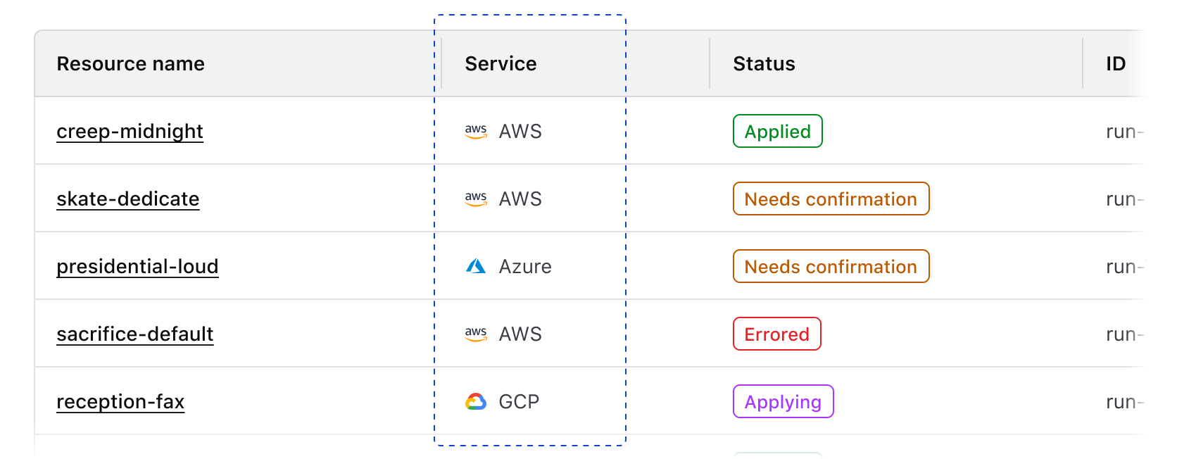
Icon usage
Icons used within cells can help differentiate content, highlight additional metadata, increase the hierarchy of a value, or otherwise enhance the text or value it is paired with. Use the outlined icon style by default and if contrast against other icons is important, use the filled style.
Don’t use an icon as the sole communication method within a cell, even if the icon is explicit, e.g., a brand or service icon.
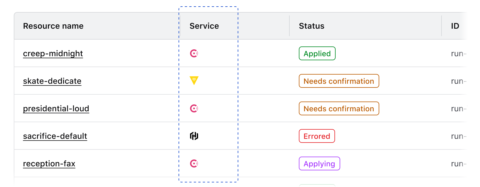
We don’t recommend using an icon to indicate the status of an object, row, or resource. Instead, consider using a Badge.
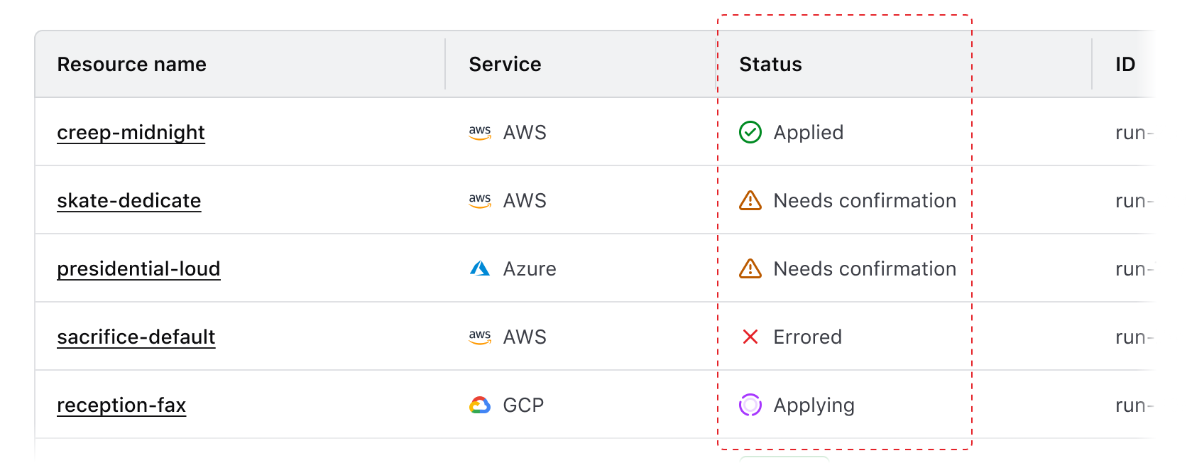
Service icons
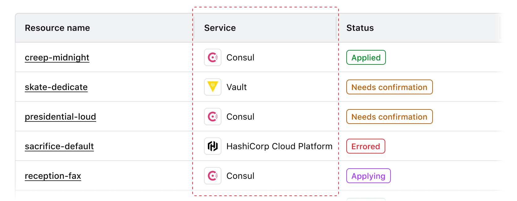
Use service icons within a cell to communicate the source or provider of a service.
Grouping
Use icons to communicate commonalities between values or that a value is part of a larger object or hierarchical structure.
Product branding
Use icons to communicate that a specific item is a HashiCorp product or resource.
Don’t use an Icon Tile in place of an icon within a table cell.
Leading vs. trailing icons
In general, we recommend using leading icons because the text following the icon will remain aligned and thus be easier for the user to scan.
Don’t mix and match different icon positions in the same column.
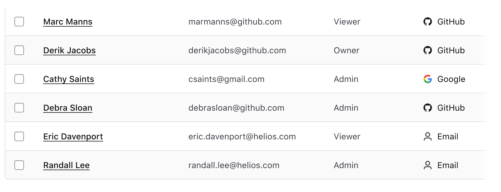
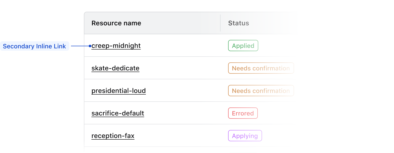
Links within cells
By default, we recommend using secondary Inline Links within a table, to avoid overloading the UI with the actionable blue color. The secondary variant uses the foreground-strong color.
To increase the prominence and further differentiate links from other text content, we recommend using a font-weight of medium. In code, you can use the CSS helper classes hds-typography-body-200 and hds-font-weight-medium. In Figma, you can use the text style Body/200/Link.
Multiple links
If a table contains more than one column of links, consider using a font-weight of medium for the most important links, usually the title of the row or ID. For less important links, use a font-weight of regular.
Links in long-form content
If a cell contains long-form or descriptive content, use the link style that is most appropriate for the hierarchy and frequency of links within the content. If there are a minimal number of links, primary Inline Links may be appropriate, but if there are many links secondary Inline Links may work better.
Badge usage
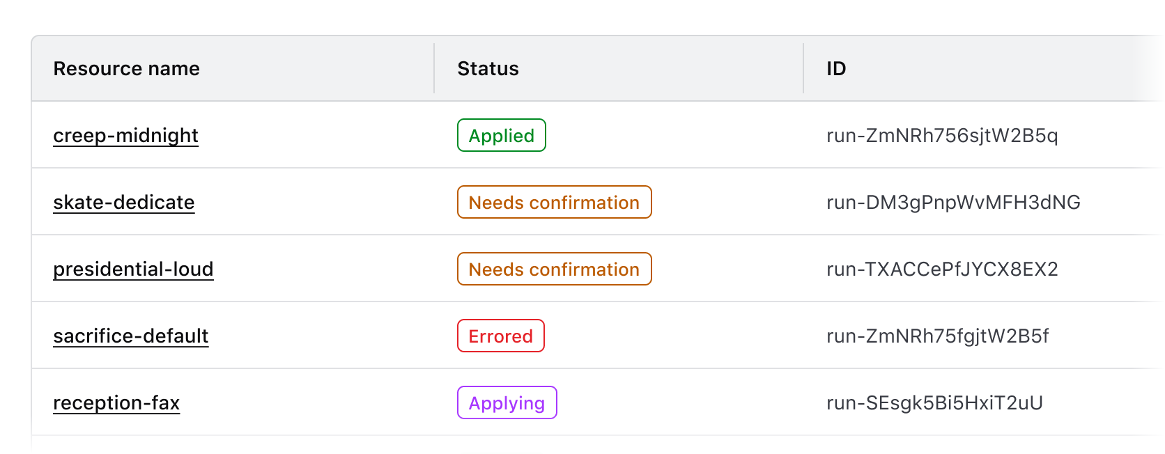
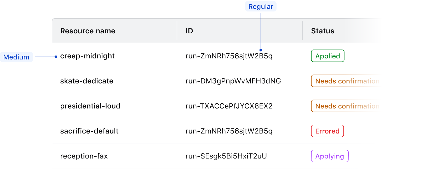
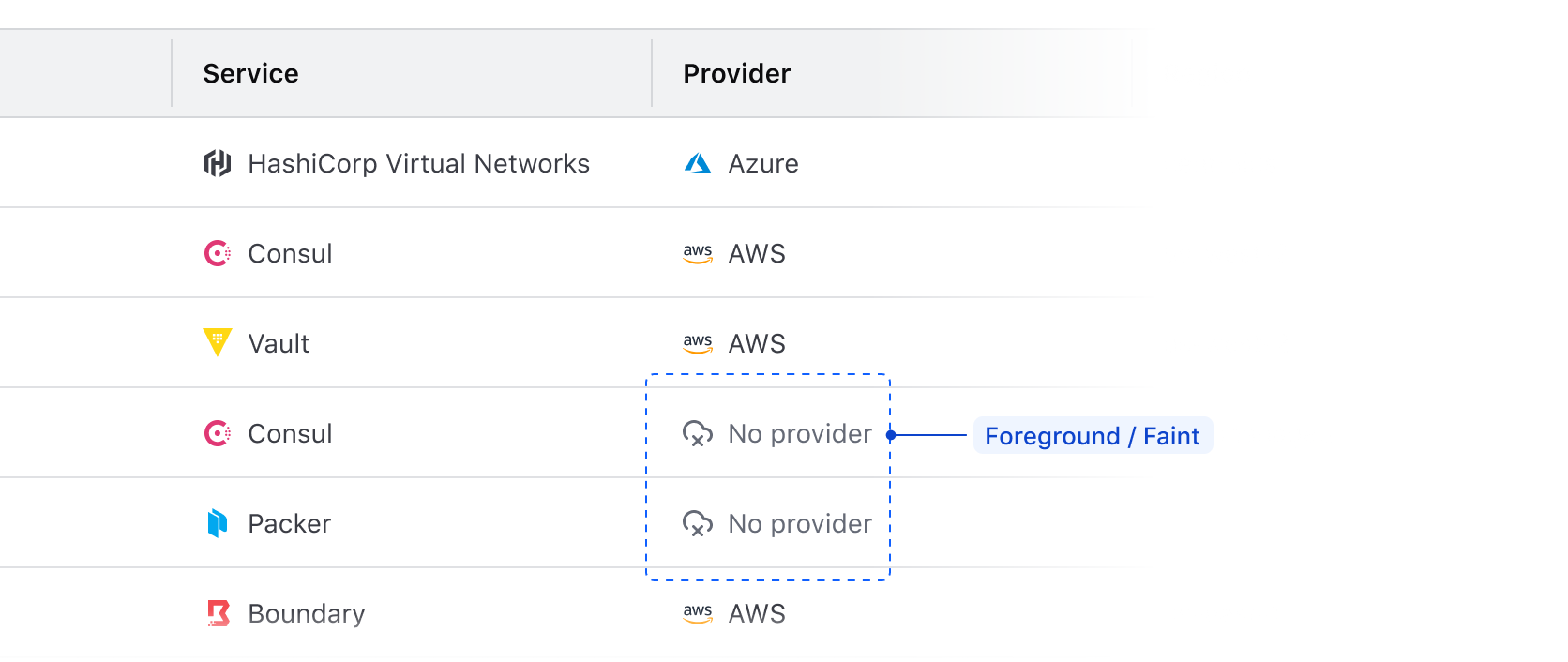
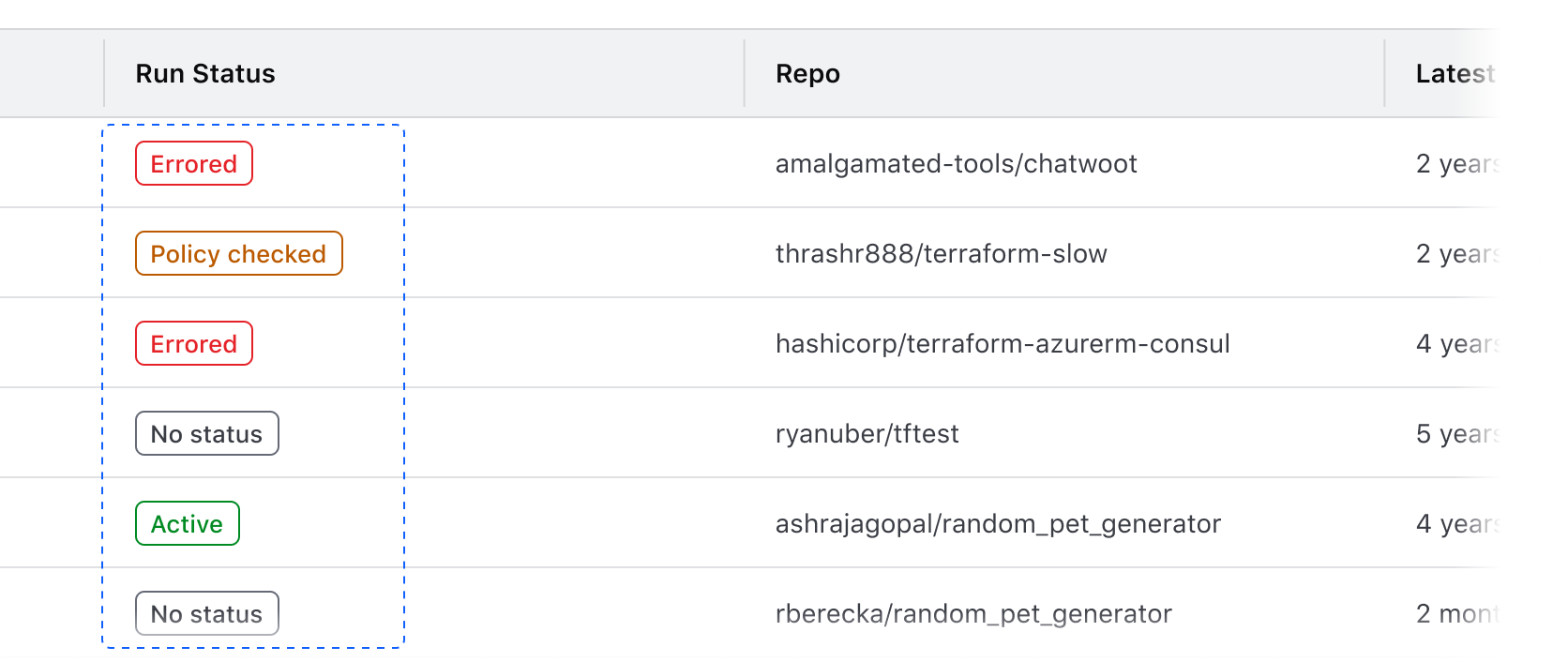
Use Badges to communicate status and high-priority metadata within a Table.
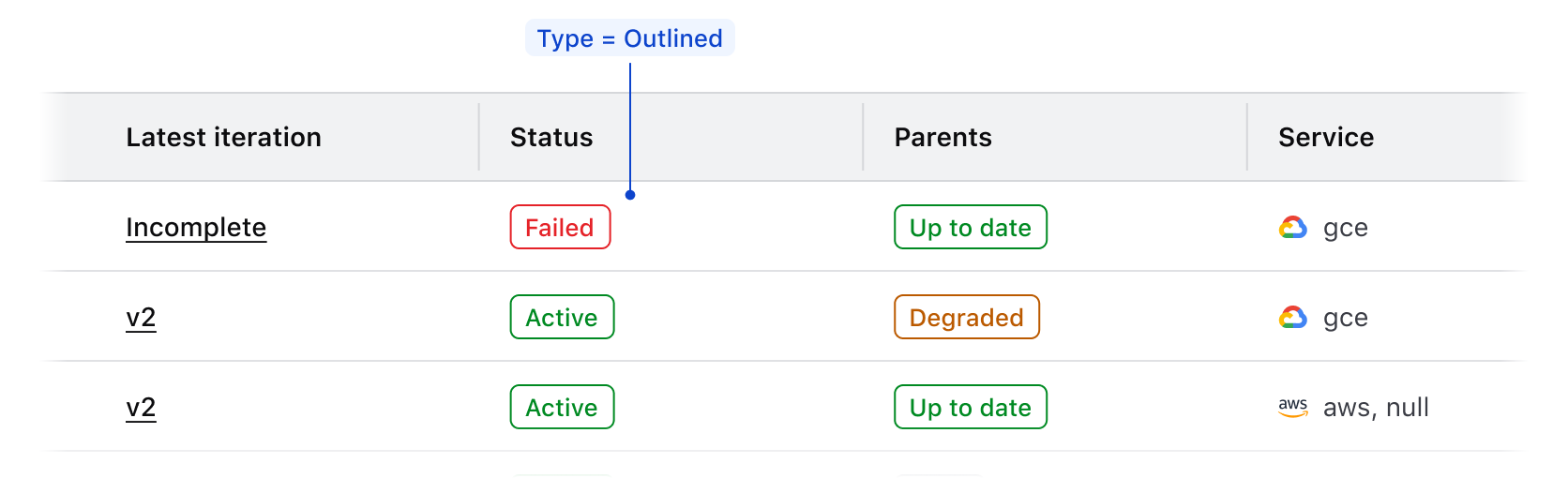
Badge type
We recommend using outlined Badges within Tables. This variant provides enough differentiation between the component, the value in the cell, and the background of the Table row.
Badge color
Use Badge color logically to communicate status within a Table.
Successfor positive communication, e.g., "Active", "Passing", "Up-to-date", etc.Warningfor cautionary communication, e.g., "Out-of-date", "Degraded", etc.Criticalfor negative communication and errors, e.g., "Failing", "Deprecated", "Errored", etc.Highlightfor communicating a dynamic value or a value that indicates a change in state of a record, e.g., "Updating", "In progress", "Starting up", etc.Neutralfor null and empty values, e.g., "None", "No status", etc.
Badge icon usage
Use logical icons when communicating status in a Badge. Some common examples when paired with Badge color include:
checkfor positive communication.alert-trianglefor cautionary communication.xfor negative communication and errors.loadingfor communicating a dynamic value or status and when usingcolor=highlight.
In the case of a null or empty value, use the text-only variant of the Badge.
Badge consistency
Ensure that Badge usage within a Table is consistent across features and within an application holistically. For example, if communicating that a record is "active", use the same combination of text, icon, and color in each instance. This consistency in communication and visual language can make complex information easier to understand and quicker to parse.
Badge size
Use the medium Badge size by default as this creates more visual consistency between the Badge and text values within a Table.
If the Table row density is set to short, use the small Badge size to account for the reduction in vertical spacing and padding.
Don’t use the large Badge size in the Table as this elevates the Badge too prominently in the hierarchy and can create inconsistency between Badges and text.
Don’t use different Badge sizes in the same Table.
Null values
Null cell values
If records within a table contain empty or null values, don’t reflect this literally with an empty cell. While a literal representation of a data set may seem logical when showcasing tabular data, a null value still intrinsically has an attribute of none or empty which should be communicated to user.
An empty cell can impact the user experience negatively by:
- Breaking the natural reading flow within the table and making the data harder to parse.
- Eroding user trust in the validity of the data; an empty cell may indicate an error but doesn’t communicate what the error is or its cause.
- Failing to communicate what value is used when filtering or sorting a data set.
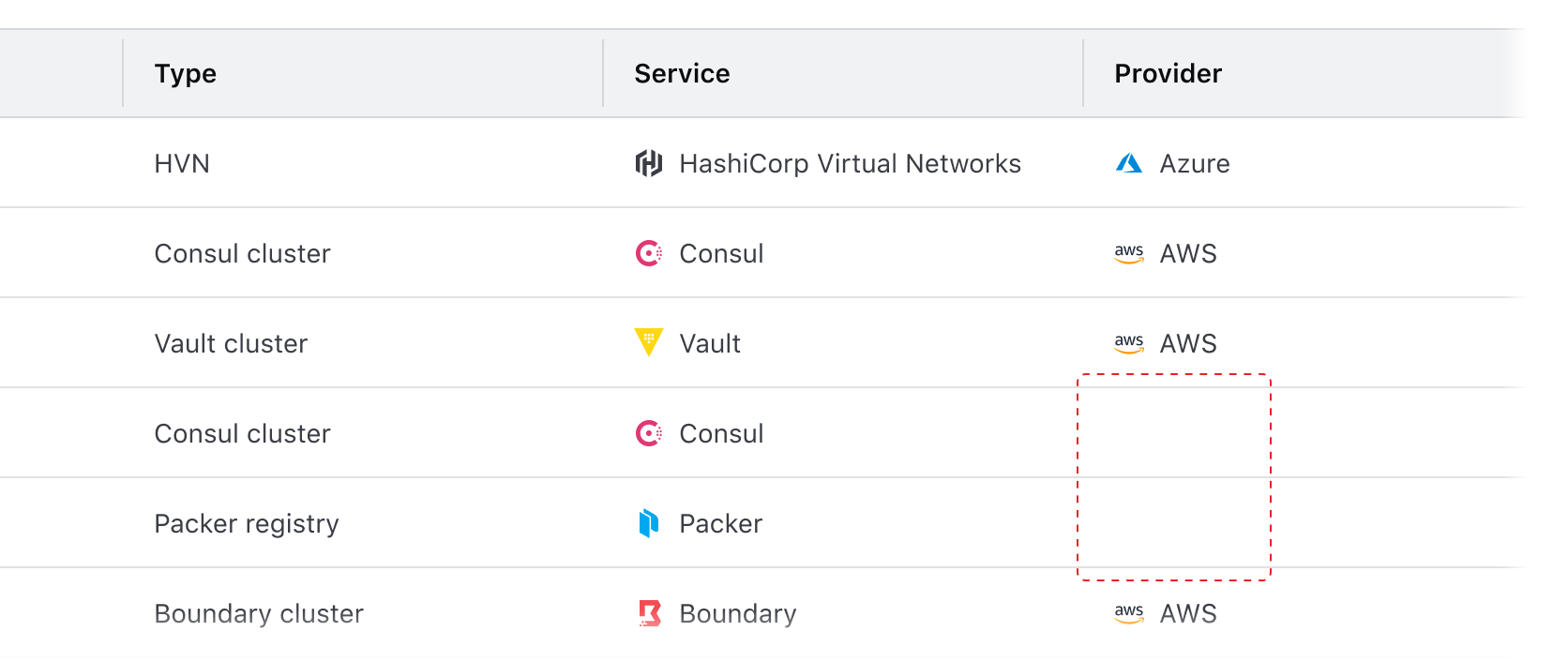
Instead, explicitly communicate null values to the user and represent them with a similar visual treatment as non-null values.
Visually represent null values in an inverse and comparative manner with non-null values.
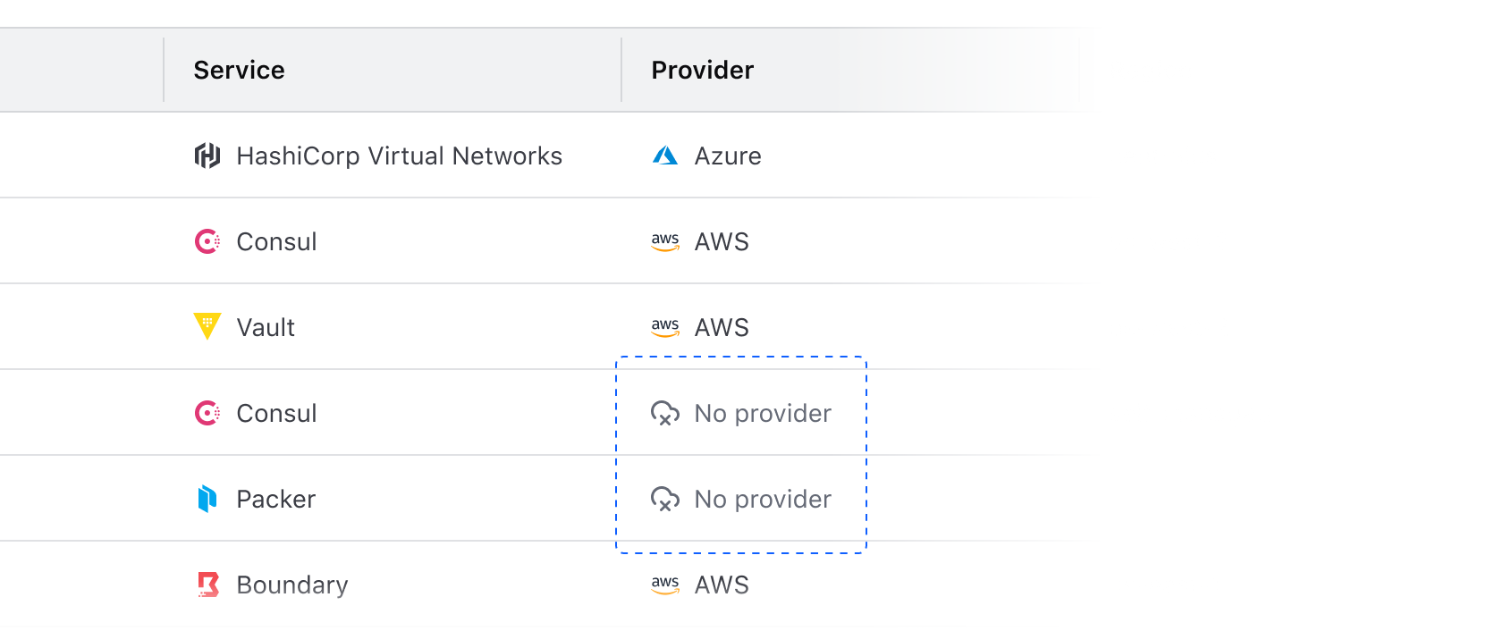
Styling null values
In cells that contain values represented by text, use the same text style as non-null values in the column (in most cases this is Body / 200 / Regular). Consider reducing the prominence of the null values by using Foreground / Faint color instead of Primary or Strong.
Null values with badges
In cells that contain a badge (e.g., status, health, etc), communicate null values by using a neutral color badge to maintain visual consistency with other non-null cells.
Null value fallback
As a fallback, consider using an em dash (—) in place of the null value. This may occur when the content type of a value isn’t able to be determined or if the value is null for an unknown reason.
Communicating why a value is null
Depending on the data set and the type of content it expresses, consider communicating to the user why a value is null by using a Tooltip. This can communicate broader product-specific functions and terminology, but can also highlight errors or issues that need to be corrected.
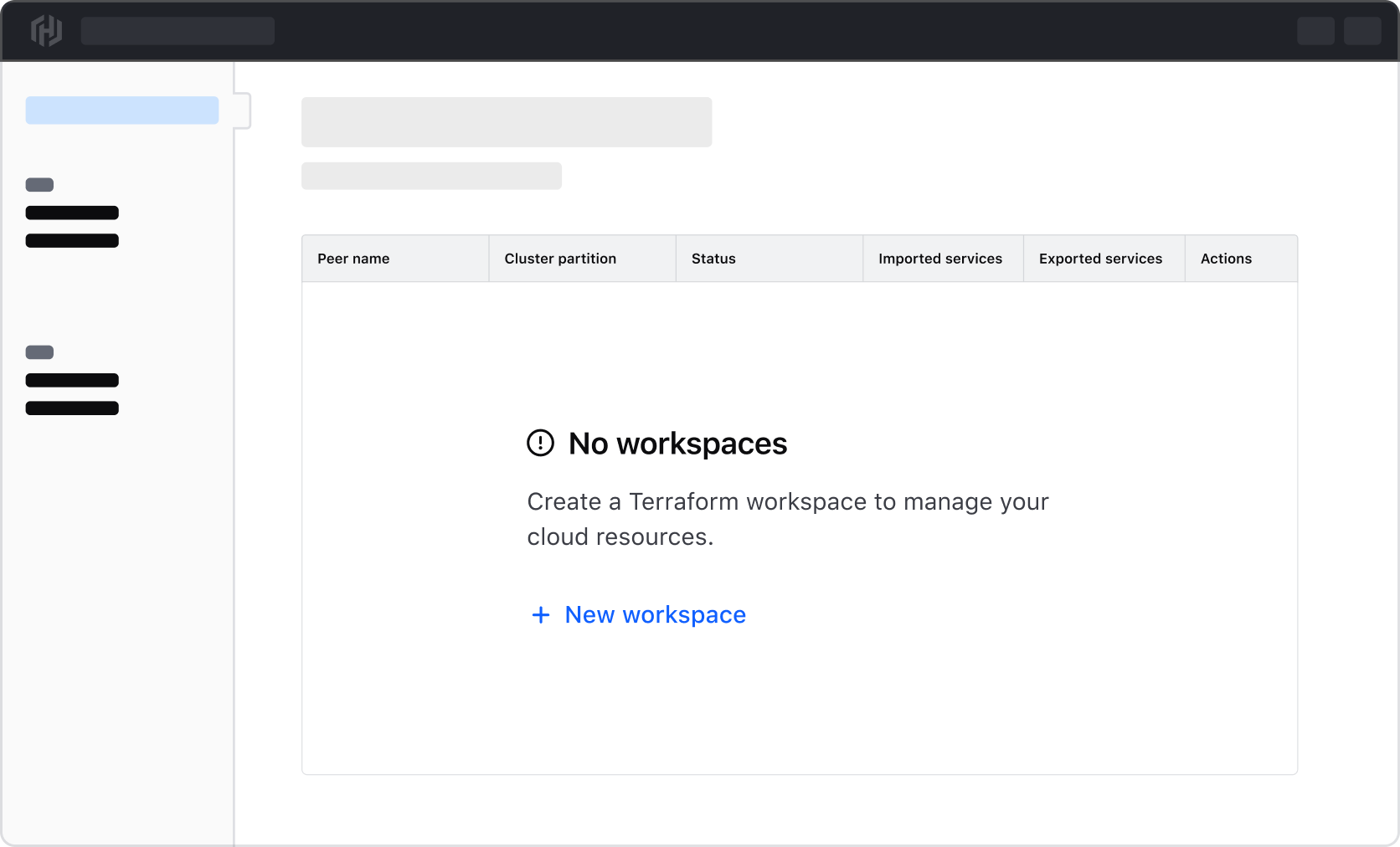
Null or empty table state
In the case of an entire data set returning null or empty, use Application State to communicate this and provide the user with next steps to correct the problem or create a new record in the data set.
Common examples of this include:
- A table expressing a data set that is dependent on user-created records which don’t exist.
- An error occurred when fetching the data for the table.
- A data set has been filtered to the point of not returning any records (see our Filter patterns guidance for more details).
Anatomy
Table headers
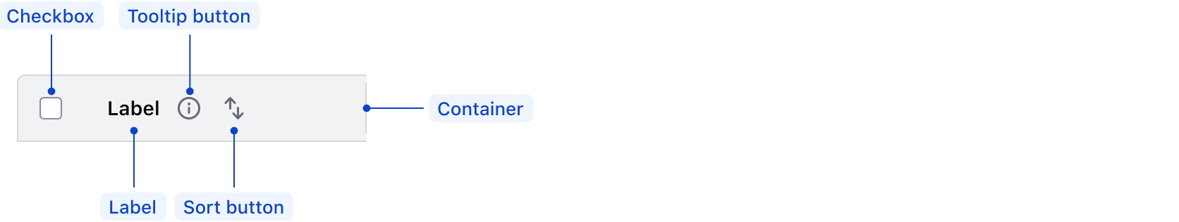
| Element | Usage |
|---|---|
| Checkbox | Optional, but required when cells yield a checkbox |
| Label | Required |
| Tooltip button | Optional |
| Sort button | Options: none, ascending, descending |
| Container | Required |
Table cells
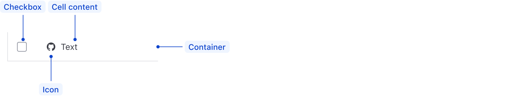
| Element | Usage |
|---|---|
| Checkbox | Optional, but required when the header yields a checkbox |
| Cell content | Required |
| Icon | Optional |
| Container | Required |
States
Sort button
Header column icon buttons, e.g., tooltip and sorting, have interactive states.
Conformance rating
When used as recommended, there should not be any WCAG conformance issues with this component.
Focus in Tables
- Table headers and labels are not eligible to receive focus, rather, focus will move through interactive elements (sort and tooltip buttons) contained within the header sequentially.
- Interactive elements within cells will receive focus, but entire cells and entire rows will not.
Best practices
Interactive rows
The table row element (tr) is not eligible to receive interactions. That is, actions cannot be attached to a table row. If an interactive element is desired, place it within a table cell element (td) within that row (i.e., <td><a href="somelink.html">Some link</a></td>).
For engineers
When providing additional or alternative styles to the table element, do not change the display property in the CSS. This alters how the table is presented to the user with assistive technology; they will no longer be presented with a table.
Applicable WCAG Success Criteria
This section is for reference only. This component intends to conform to the following WCAG Success Criteria:
-
1.3.1
Info and Relationships (Level A):
Information, structure, and relationships conveyed through presentation can be programmatically determined or are available in text. -
1.3.2
Meaningful Sequence (Level A):
When the sequence in which content is presented affects its meaning, a correct reading sequence can be programmatically determined. -
1.4.1
Use of Color (Level A):
Color is not used as the only visual means of conveying information, indicating an action, prompting a response, or distinguishing a visual element. -
1.4.10
Reflow (Level AA):
Content can be presented without loss of information or functionality, and without requiring scrolling in two dimensions. -
1.4.11
Non-text Contrast (Level AA):
The visual presentation of the following have a contrast ratio of at least 3:1 against adjacent color(s): user interface components; graphical objects. -
1.4.12
Text Spacing (Level AA):
No loss of content or functionality occurs by setting all of the following and by changing no other style property: line height set to 1.5; spacing following paragraphs set to at least 2x the font size; letter-spacing set at least 0.12x of the font size, word spacing set to at least 0.16 times the font size. -
1.4.13
Content on Hover or Focus (Level AA):
Where receiving and then removing pointer hover or keyboard focus triggers additional content to become visible and then hidden, the following are true: dismissible, hoverable, persistent (see link). -
1.4.3
Minimum Contrast (Level AA):
The visual presentation of text and images of text has a contrast ratio of at least 4.5:1 -
1.4.4
Resize Text (Level AA):
Except for captions and images of text, text can be resized without assistive technology up to 200 percent without loss of content or functionality. -
2.1.1
Keyboard (Level A):
All functionality of the content is operable through a keyboard interface. -
2.1.2
No Keyboard Trap (Level A):
If keyboard focus can be moved to a component of the page using a keyboard interface, then focus can be moved away from that component using only a keyboard interface. -
2.1.4
Character Key Shortcuts (Level A):
If a keyboard shortcut is implemented in content using only letter (including upper- and lower-case letters), punctuation, number, or symbol characters, then it should be able to be turned off, remapped, or active only on focus. -
2.4.3
Focus Order (Level A):
If a Web page can be navigated sequentially and the navigation sequences affect meaning or operation, focusable components receive focus in an order that preserves meaning and operability. -
2.4.7
Focus Visible (Level AA):
Any keyboard operable user interface has a mode of operation where the keyboard focus indicator is visible. -
4.1.2
Name, Role, Value (Level A):
For all user interface components, the name and role can be programmatically determined; states, properties, and values that can be set by the user can be programmatically set; and notification of changes to these items is available to user agents, including assistive technologies.
Support
If any accessibility issues have been found within this component, let us know by submitting an issue.
4.17.1
Removed unused updateAriaLabel function and event listener
4.16.0
Updated the visual design of Table cells by adding borders, making them more distinguishable when spanning rows or columns.
Fixed the aria-labels for select row and select all checkboxes so they do not change based on the state of the checkbox.
4.15.0
Exposed the index of the @each loop over the @model as rowIndex
4.11.0
Updated
Hds::Table
- Added
@selectableColumnKeyargument which enables sorting by row selection state and specifies the corresponding selection state key.
Hds::Table::Tr
- Added
@selectableColumnKeyargument which enables sorting by row selection state and specifies the corresponding selection state key. - Added
@sortBySelectedOrderargument which determines the state of the sort button in the selected item column. - Added
@onClickSortBySelectedargument which is the callback for the sort button in the selected item column.
Hds::Table::ThSelectable
- Added
@onClickSortBySelectedargument which is the callback for the sort button in the selected item column. - Added
@sortBySelectedOrderargument which determines the state of the sort button in the selected item column.
4.10.0
Converted component and sub-components to TypeScript.
Related
-
Pagination
Used to let users navigate through content broken down into pages.
-
Advanced Table
Used to display complex, structured tabular data with advanced features.
-
Filter patterns
Guidelines and best practices for filtering a data set using Helios components.
-

Table multi-select
Guidelines for selecting and transforming results in a Table.