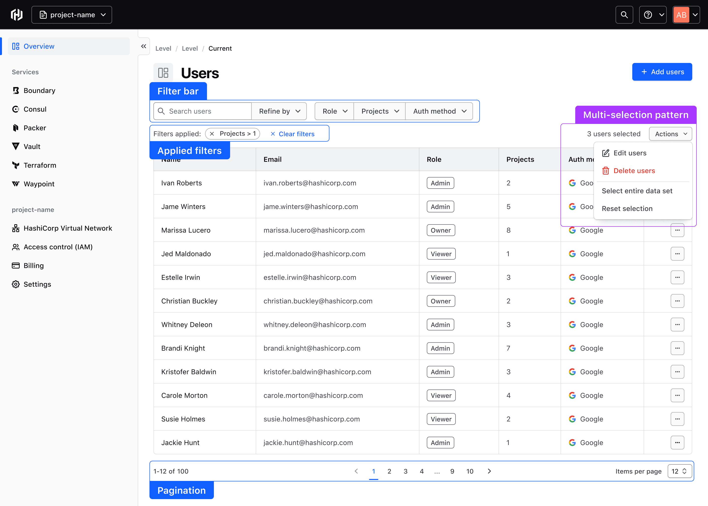
The Helios Table multi-select functionality supports performing bulk actions and selection of one or more rows within a Table.
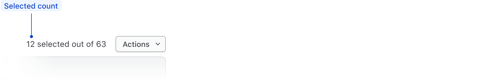
Selected count
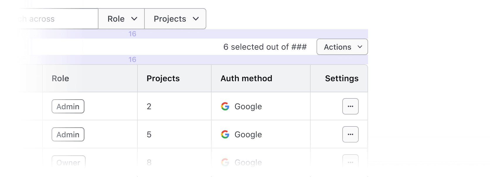
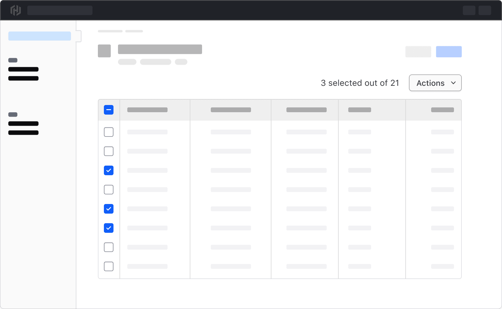
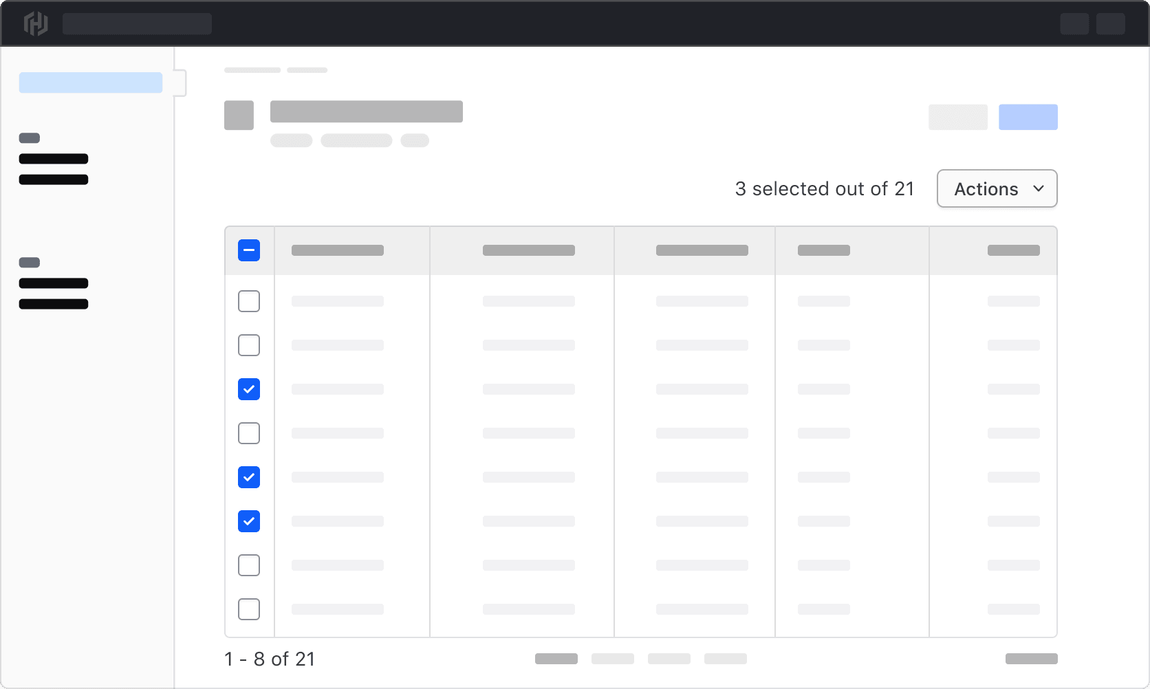
Display the selected count to communicate how many rows or results have been selected in the entire data set. This includes Table rows that are outside of the current view in the Table (e.g., in a different page if using Pagination), and should be represented using a numerical value.
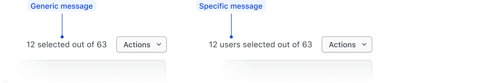
Pair this with a message to clearly communicate that a selection has been made. This can be a simple generic message stating "{selected count} selected", or can be more specific to the type of object in the data set (e.g., a user, cluster, workspace, etc).
Total count
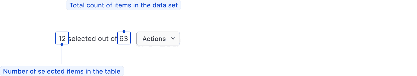
If technically feasible, communicate the selected count as a portion of the total count, or total number of results in the Table. This can give the user a better overall snapshot of what they have selected and how the selection compares to the entire data set. This can also more effectively communicate that there may be results that are selected across multiple pages.
Bulk actions
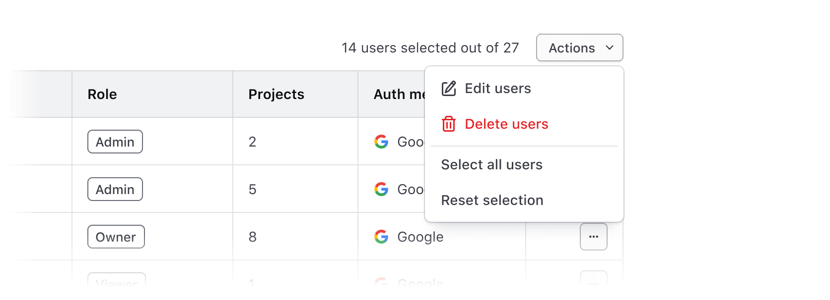
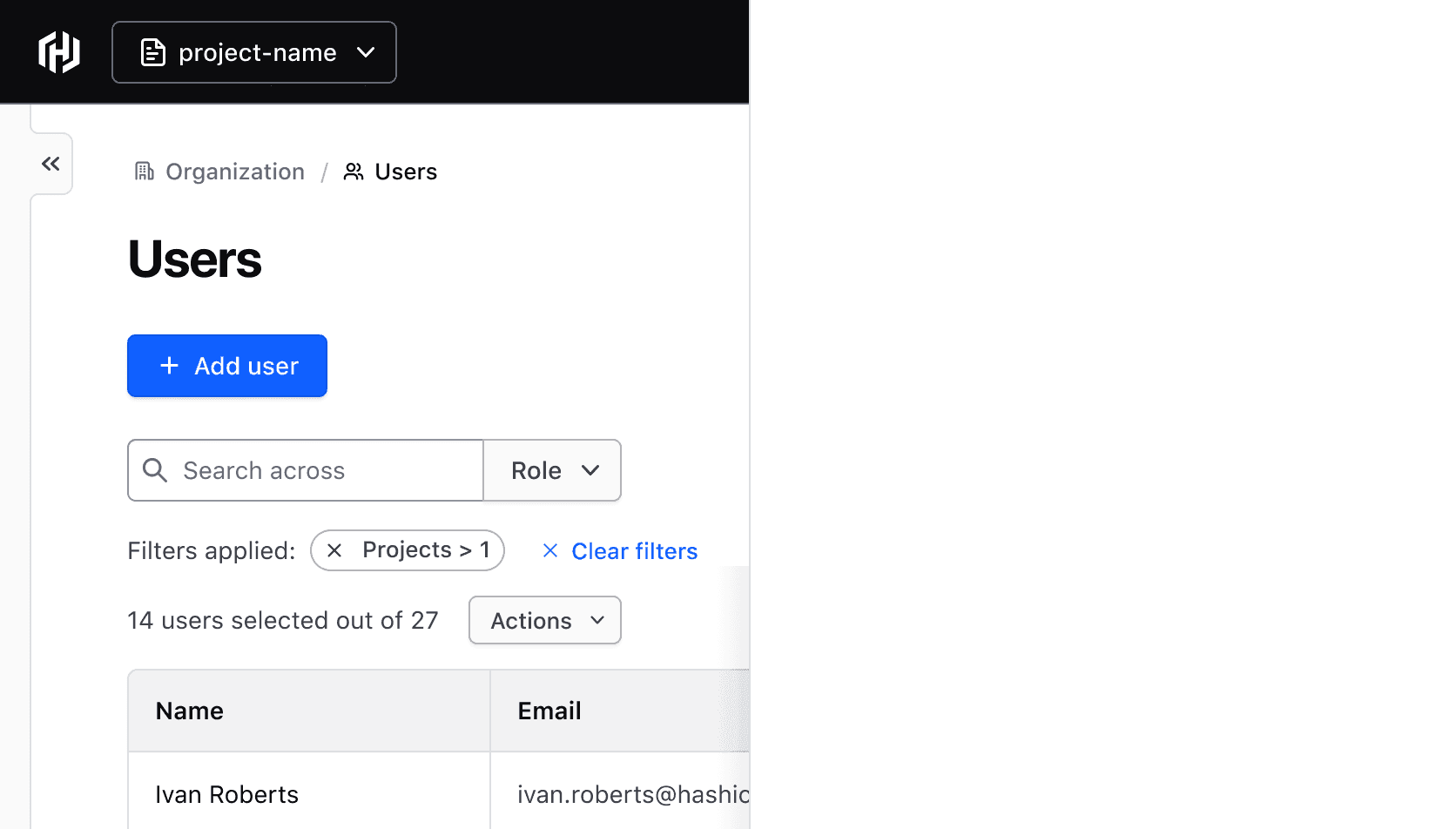
Bulk actions allow the user to edit, delete, or transform one or more results in a Table. Consolidate these actions in a small Dropdown inline with the selected count, message, and total count.

For Table instances requiring a single action (like bulk deletion), use a small Button instead of a Dropdown. We advise using either secondary or critical Buttons, based on the action’s intent.

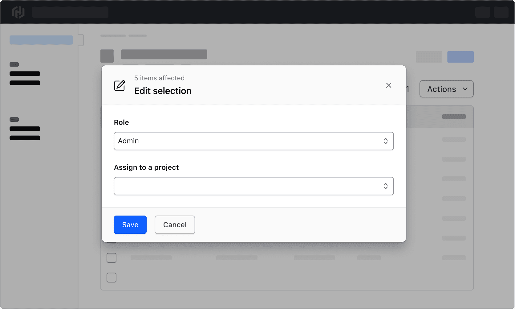
Editing results
With a selection made, consider using a Modal to perform bulk edits or updates to parameters of the selected results. This is generally appropriate for editing five parameters or less; for more complex scenarios, consider shifting the editing experience to a separate page.
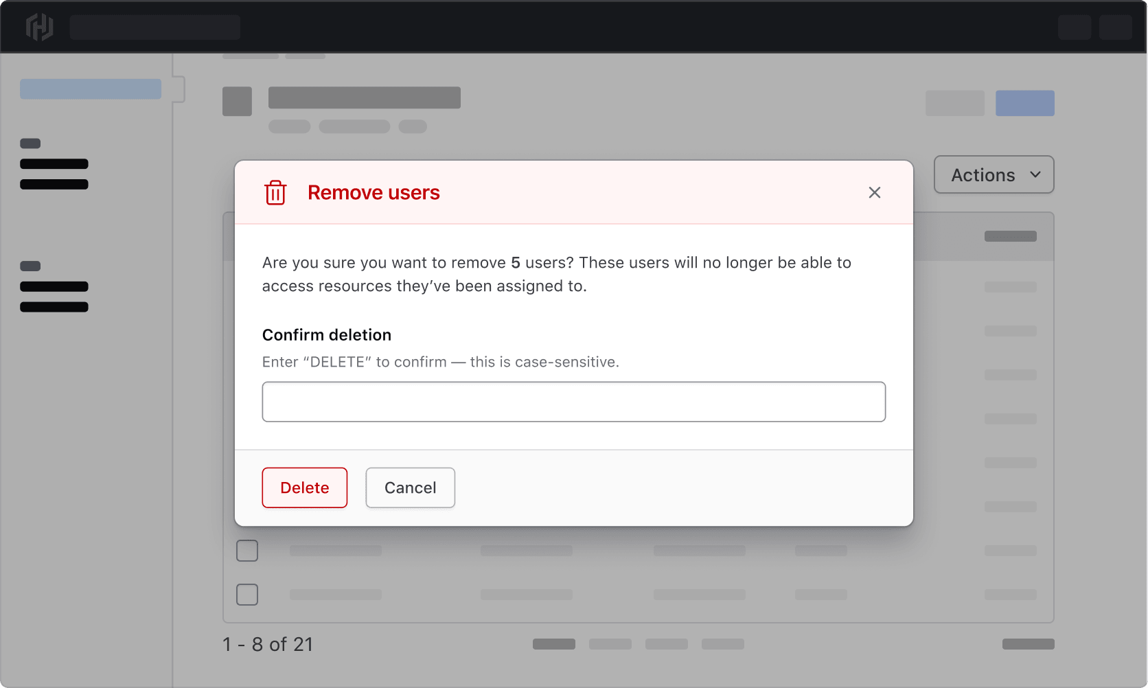
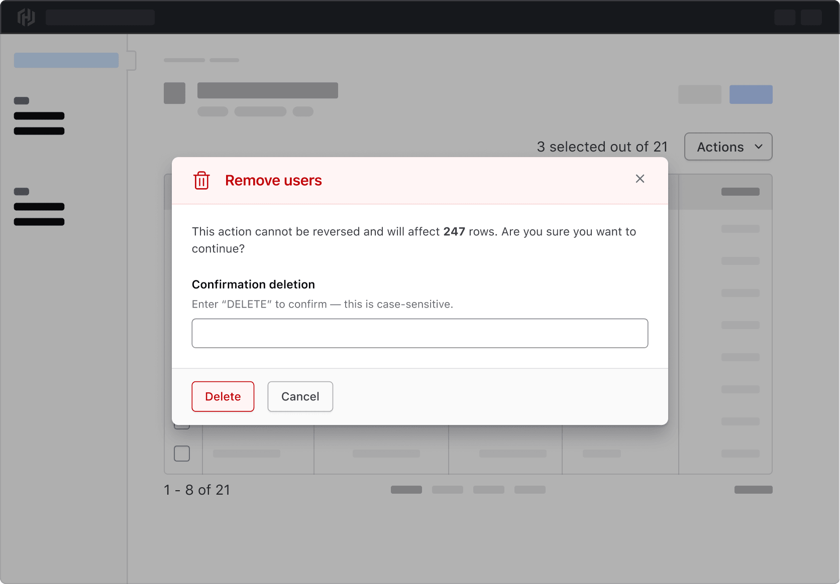
Deleting results
Deleting or performing destructive actions on results should use an additional confirmation to ensure that only the intended results are affected. Use a critical Modal to communicate the number of results affected and what consequences might occur from deletion.
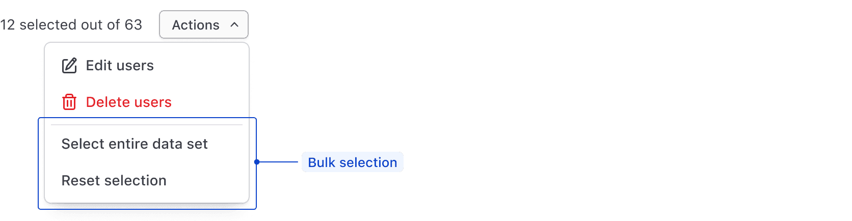
Bulk selection
Bulk selection is global in scope, meaning that all results in the data set are affected, even those outside of the current view. Consolidate these functions in a Dropdown paired with bulk actions.
Note: This type of selection is not a replacement for the selection in the header of the Table. Where the selection is made implies a different scope and is handled by different UI elements.
Examples of bulk selection include:
- Select all: Select all of the results in a data set.
- Reset selection: Take the current selected results and deselect them.
- Select inverse: Deselect the currently selected results; select those that are currently deselected.
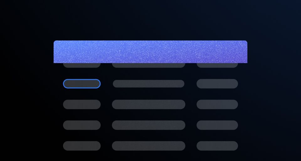
Anatomy
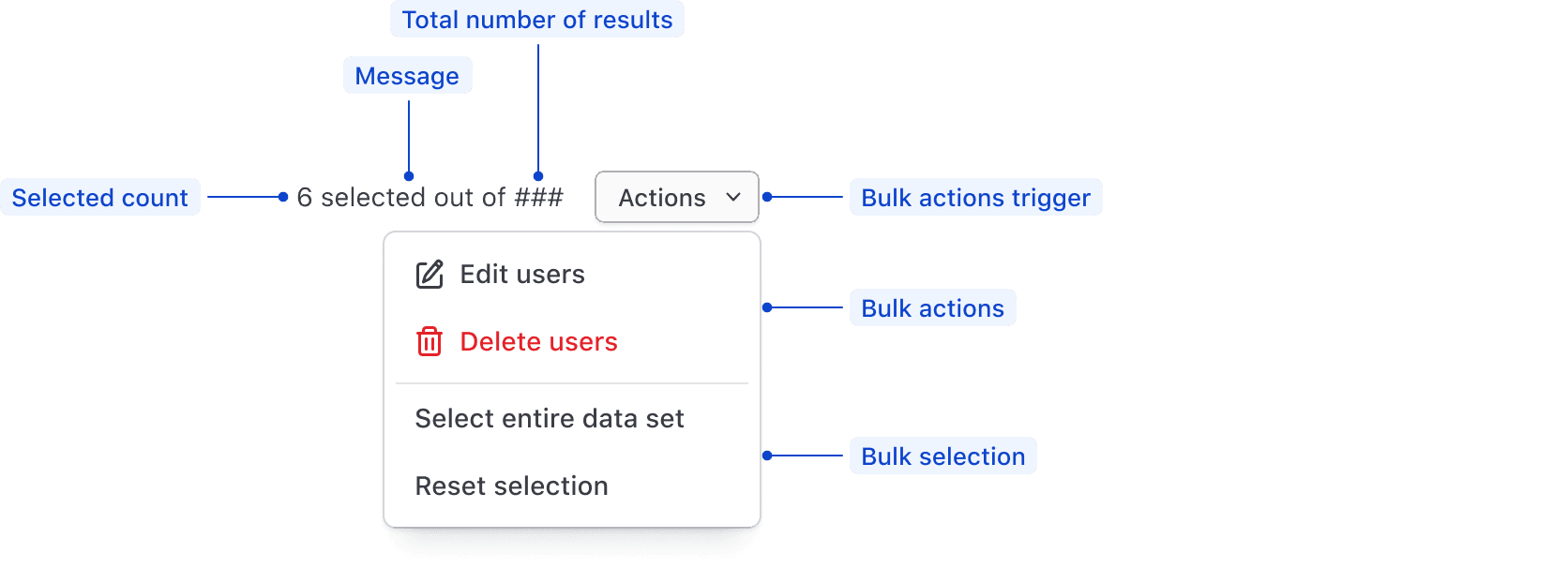
| Element | Usage |
|---|---|
| Selected count | Displays the number of selected items in the table. |
| Selected message | Communicates that results in the table have been selected. |
| Total results | Displays the total number of results in the data set. |
| Actions trigger | Recommended to use either a secondary or critical Button for single actions, or a secondary Dropdown for multiple actions. |
| Bulk actions | Consolidates multiple bulk actions into a single element. |
| Bulk selection | Consolidates multiple selection functions into a single element. |
Spacing
Multi-select pattern
Within the Multi-select pattern itself, use a 16px horizontal gap between the message and the actions.

In context
When combining a Multi-select pattern with filtering and similar functions acting on Table data, use a 16px vertical gap between rows of related elements.
Layout
For a basic Table (e.g., one that doesn’t use filtering), place the selection pattern above the top-right corner of the Table.
Layout with a filter pattern
When composing a Multi-select pattern together with a Filter bar and Applied filters, maintain the same placement.
Putting it all together
Reflow
As the viewport width shrinks, stack the elements around the Table and filter pattern in a single column.
When combining a Multi-select table with filtering, sorting, or pagination, you may encounter complex scenarios regarding how selected results should be persisted across pages and what the user expects when traversing large data sets.
These interaction guidelines are not fully comprehensive. They should instead be considered as conversation starters between design and engineering on how best to optimize the user experience.
Consistent communication
To help prevent unnecessary editing or deleting and to ensure users are interacting with the results they intend to, it is vital to consistently communicate their selections, or the existence of a selection, at all times.
Persisting this communication in the selected count can help to avoid mishaps, but it may also be necessary to confirm with the user prior to making changes that cannot be reversed.
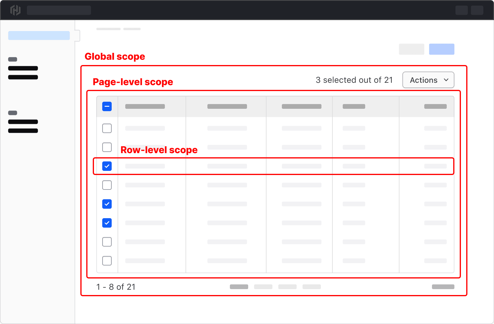
Selection scope
Where a selection is made in the UI can imply differences in how the selection is scoped, and can be broken down into three different levels of hierarchy.
- Global scope: Selection applies to all rows in the table and is made via bulk selection in the Multi-select pattern.
- Page-level scope: Selection applies to all rows in the current page of a paginated table and is made via the Checkbox in the Table header.
- Row-level scope: Selection applies only to a single row, result, or item in a Table, and is made via the checkbox at the start of the row.
Persisting the selection
One of the most common questions around Multi-select patterns stems from when and how selected results are persisted when a user performs different actions on a Table. Consider the following scenario:
A user is viewing a Table displaying a data set consisting of 10,000 results. In order to make changes to specific results, the user may take the following actions:
- Filter the Table to display only a subset of the results.
- Sort the Table by a specific parameter to order the results in a meaningful way.
- Traverse through multiple pages of the Table through Pagination.
If not handled in a clear and logical manner, how the selection is persisted across all of these actions can be confusing and open the user up to making unintended changes if what they have selected is persisted (or not persisted).
Within a paginated Table
If a user makes a selection on one page of a paginated Table and progresses to the next page, persisting this selection can be communicated by the selected count and can be helpful in scenarios where much of the data is similar or overlaps.
When filtering Table results
Filtering a data set is a reductive action that removes results from being displayed within a Table. This impacts multiple areas of the interface while raising a number of considerations around persisting the selection.
- In a Multi-select pattern, should the total count change to reflect a reduction in the number of visible results?
- In Pagination, is the number of results reduced to reflect those excluded by the filter?
- If a selection has been made prior to filtering, is the selected state persisted even if the filtered results are excluded from the data set?
- Are there any parameters in the data set that are variable in nature? E.g., status that is prone to changing if a cluster is starting up or spinning down.
In all of these scenarios, it is important to clearly and consistently communicate what results have been selected and what impact a change will have on them.
Not persisting the selection
Depending on the scenario, it might not make sense or even be possible to persist the selection in a meaningful way, e.g., if filtering the data set results in a new fetch request that resets the state of the application. If this is the case, consider resetting the selection after each alteration to the Table.
Aria role
Due to its dynamic nature, updates to the selected count must be announced to those using assistive technology. This can be done by adding role=status to the element containing the count.
This is a representative example of how this could be accomplished using HDS components and role=status to announce changes in the UI. Test it yourself by enabling VoiceOver and incrementing the selectedCount with the "Add to count" button.
10 selected out of 100
<div class="doc-table-multi-select-role-example">
  <button {{on "click" this.updateSelectedCount}} type="button">
    Add to count
  </button>
  <div class="doc-table-multi-select-pattern-wrapper">
    <Hds::Text::Body role="status" @tag="p" @size="200" @color="foreground-primary">
      {{this.selectedCount}}
      selected out of
      {{this.totalCount}}
    </Hds::Text::Body>
    <Hds::Dropdown as |D|>
      <D.ToggleButton @size="small" @text="Actions" @color="secondary" />
      <D.Interactive @icon="edit">Edit</D.Interactive>
      <D.Interactive @icon="trash" @color="critical">Delete</D.Interactive>
      <D.Separator />
      <D.Interactive>Select all</D.Interactive>
      <D.Interactive>Reset selection</D.Interactive>
    </Hds::Dropdown>
  </div>
</div>
Related
-
Table
Used to display organized, two-dimensional tabular data.
-
Advanced Table
Used to display complex, structured tabular data with advanced features.
-
Filter patterns
Guidelines and best practices for filtering a data set using Helios components.
-
Pagination
Used to let users navigate through content broken down into pages.