The Filter Bar is used to apply and display filters to a data set. It is most often used with the Advanced Table, but is flexible enough to support the standard Table, lists, or a grid of cards.
Usage
When to use
- When displaying filters for a data set.
- As a replacement for the HDS Filter pattern.
When not to use
- For complex query builder features.
- For a search feature that doesn't require filters. Use the Search Input instead.
Type
The Filter Bar supports two visual presentations, attached and standalone, to be used in different contexts and with different types of data sets.
Attached
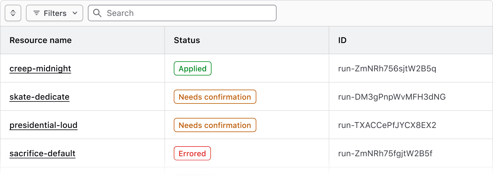
Use the attached variant with the Advanced Table to clearly associate the Filter Bar with the rendered data set and the table.
Standalone
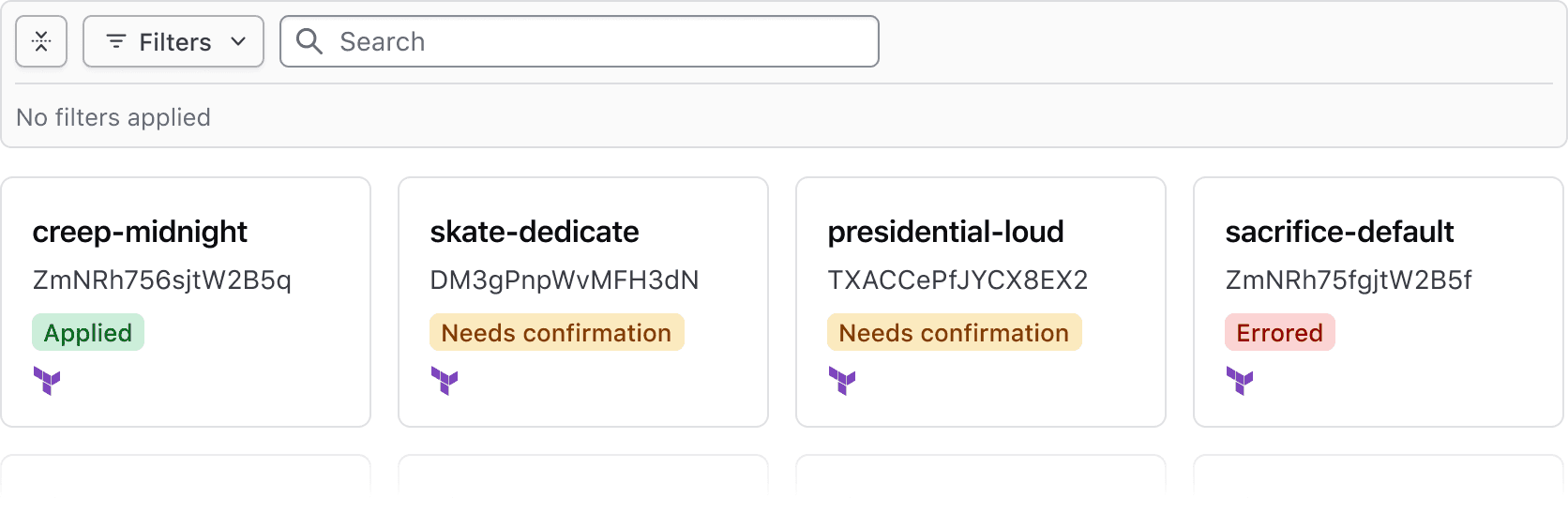
Use the standalone variant when a data set is rendered in formats other than the Advanced Table, e.g., a standard Table, list, or grid of cards.
Applying Filters
Filters can be applied on a per-filter basis or via live filtering.
- Per-filter: filters are applied when the user confirms their selection with the "Apply filters" button in the dropdown. This is the most common method.
- Live filtering: filters are applied immediately upon selection.
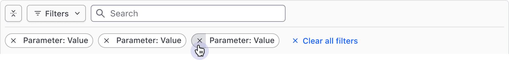
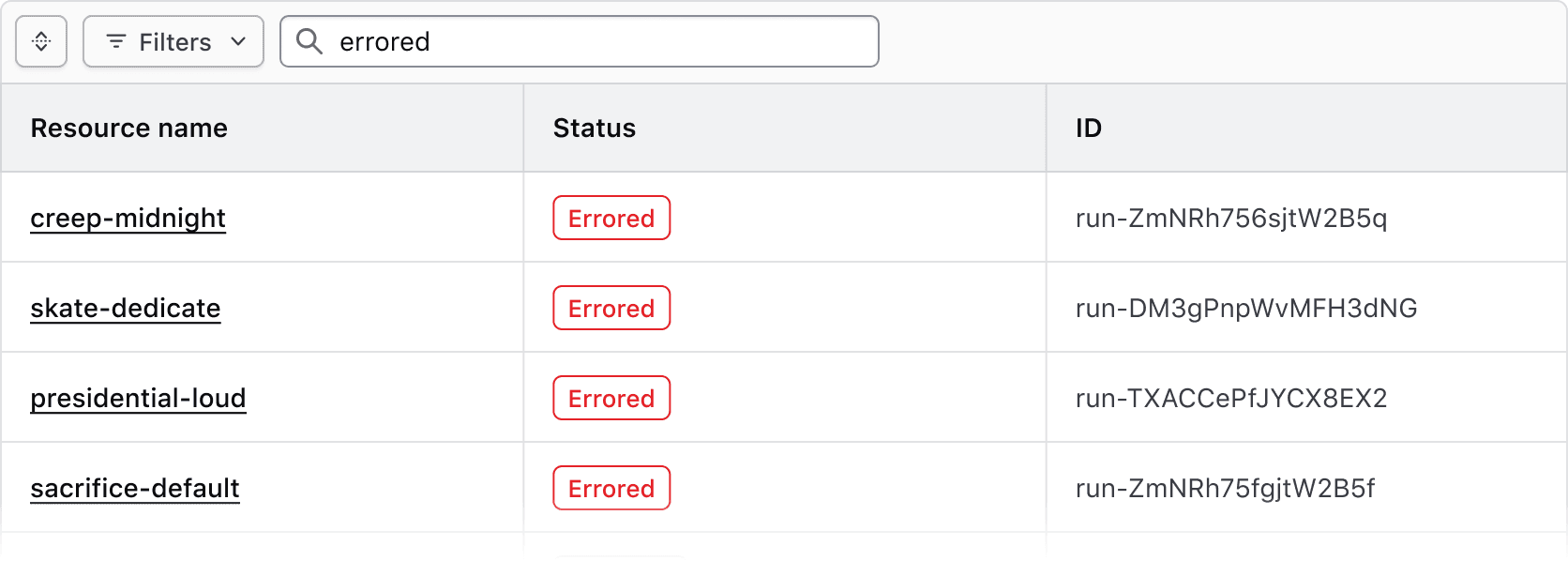
Applied filters
Applied filters are represented by a Tag displaying the filter parameter (the category or column the filter corresponds to) and the filter value (corresponding with the specific cell content).
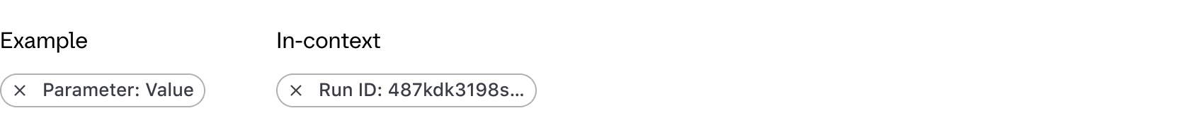
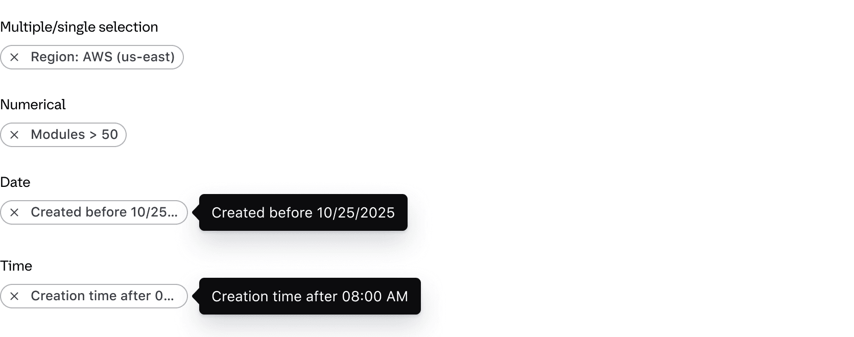
By default, the text rendered within the Tag uses a standardized format depending on the type of filter:
- Single and multiple selection filters group the parameter and value using a colon, e.g., "Region: AWS (us-east)"
- Numerical filters group the parameter and value with an operator symbols, e.g., "Modules > 50"
- Date and time filters group the parameter and value with natural language, e.g., "Created before 12:00 PM"
If necessary, the text can be overridden within the Tag. This can be useful if the parameter label is an irregular plural, if the parameter reads more naturally with certain punctuation or grammar, or for product-specific reasons.
The Tag component truncates at roughly 20 characters.
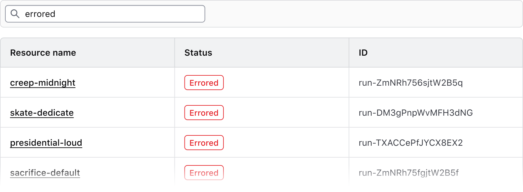
Expand & collapse
The applied filters section can be collapsed to simplify the UI or expanded to bring focus to the data. This is helpful when many filters are applied or when the data set is complex.

When no filters are applied, the applied filters section is collapsed by default and will display an empty state message when expanded.

When one or more filters are applied, the Filter Bar is expanded by default.
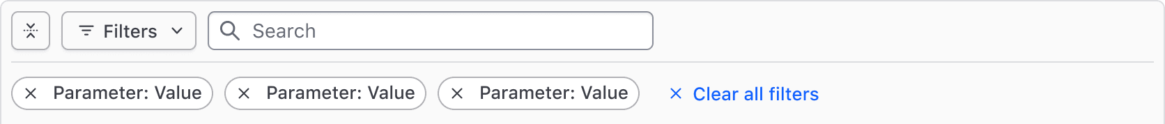
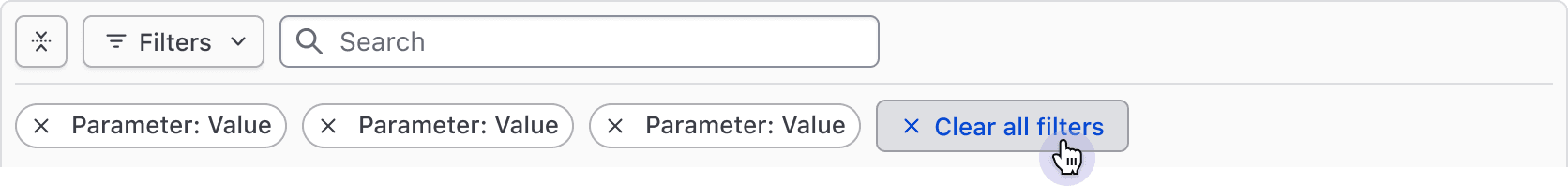
Clearing filters
All filters can be cleared in bulk using the "Clear All" button near the applied filters or in the dropdown footer.
Filters can also be cleared individually via the Tag's dismiss button.
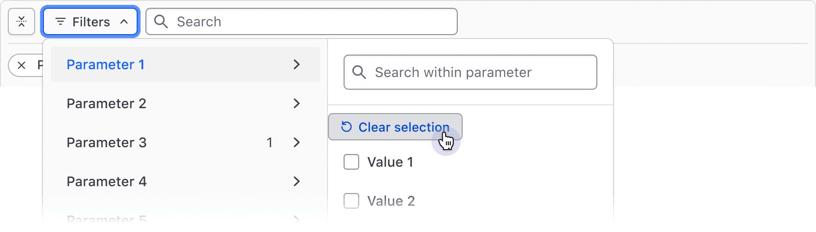
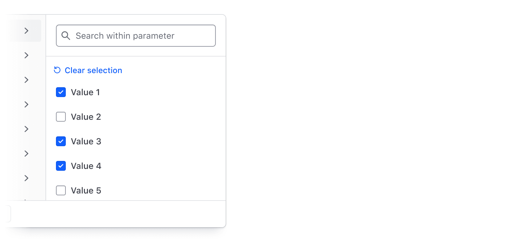
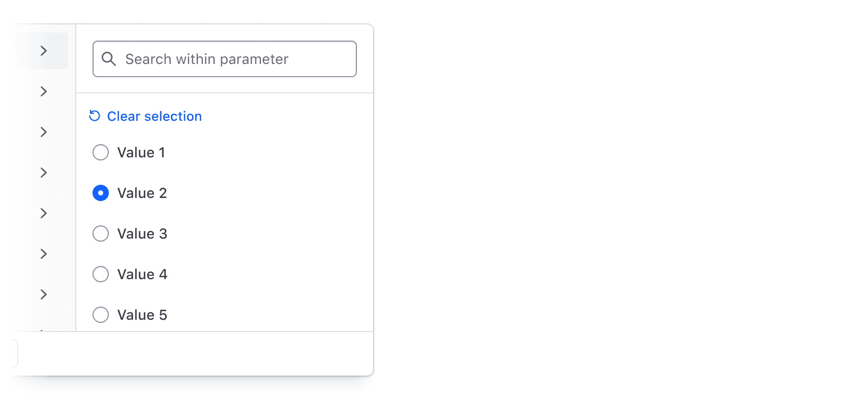
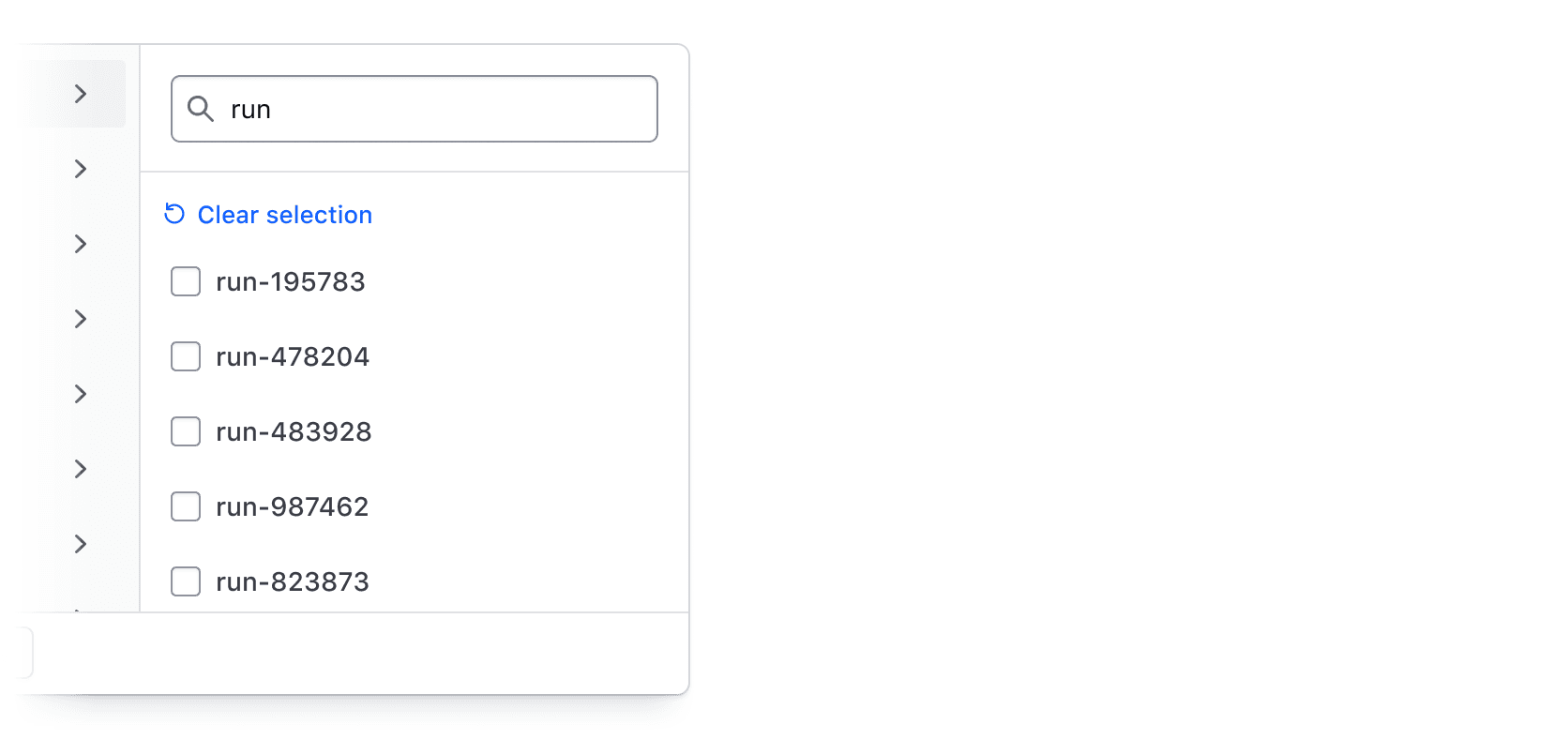
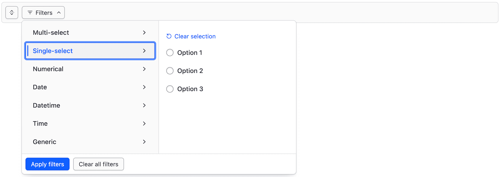
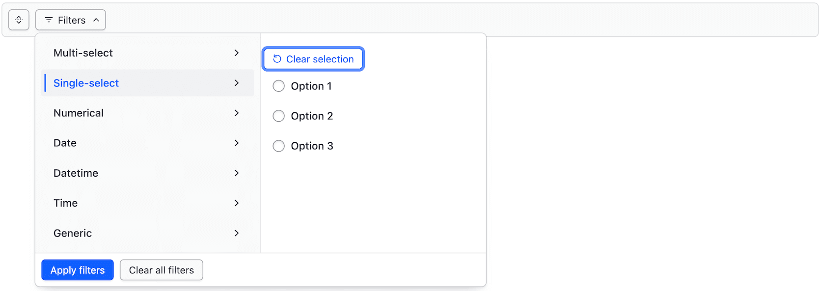
When multiple filter values are selected for a single parameter or input fields define the filter, the "Clear selection" button in the dropdown deselects all values for that parameter.
Integrating search
Search is an important part of a filtering workflow. When search is included in the Filter Bar, it narrows the dataset alongside any active filters, rather than overriding them.
Implement search alongside filters.
Don't implement search inside a Filter Bar without filters.
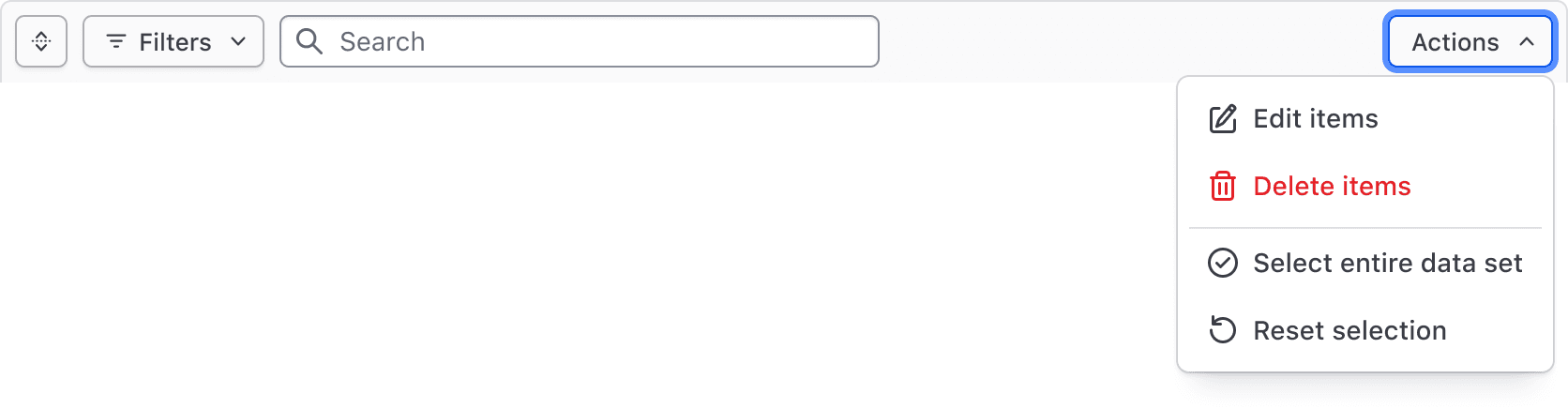
Bulk actions
Bulk actions, corresponding to our recommendations for multi-select, can be used to perform actions across multiple results, such as editing, deleting, and selecting subsets of the data set.
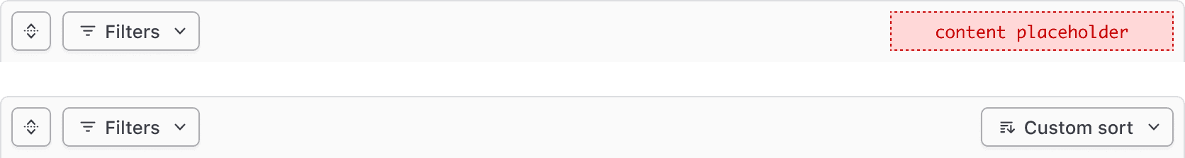
Generic content
Custom functionality can be added to or replace the Bulk action dropdown. We recommend limiting this to actions or information that directly tie back to the data set.
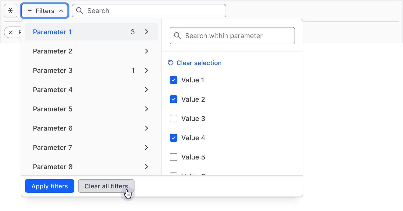
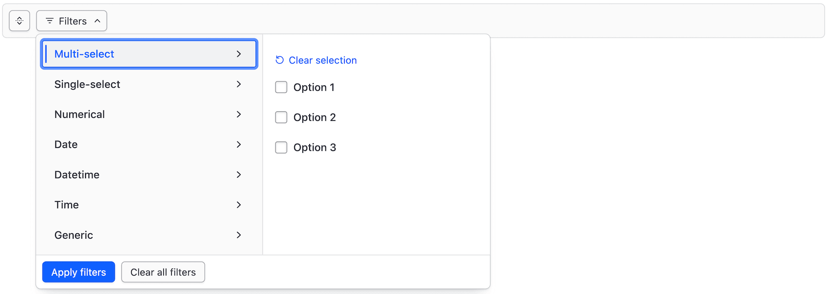
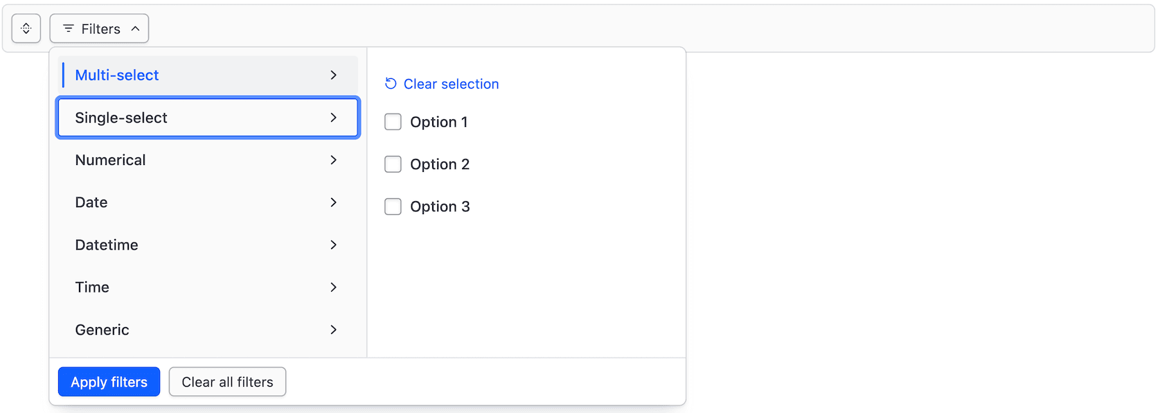
Filter dropdown
The Filter Bar includes a complex dropdown menu that displays available filter parameters, the values within each parameter, support for numerical/date/time values, value ranges, and actions to apply and clear filters.
The Filter Dropdown is responsible for the selection and application of filters and is broken into two "panels":
- The left panel displays the list of parameters (categories) that can be filtered upon.
- The right panel displays a list of options or a group of input fields (for numerical, date, or time values).
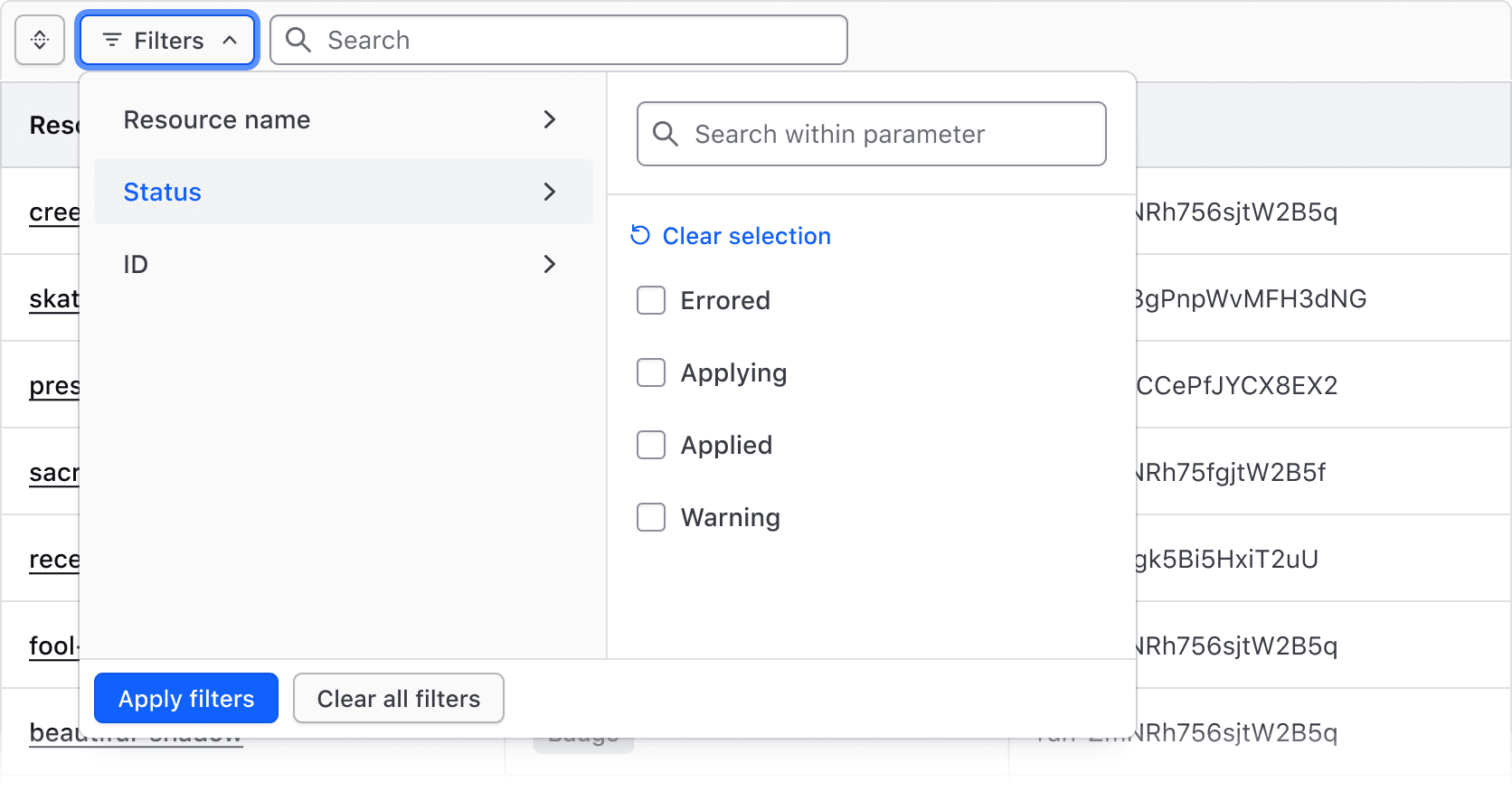
Multi-selection
Selecting multiple values from a list of options is one of the most common filtering methods. It's best suited for categorical data like statuses, but can also be used more generally to filter by a handful of text or string values.
Single-selection
Selecting one value from a list of options is best suited for filter values that cannot be selected simultaneously, helping prevent an empty state.
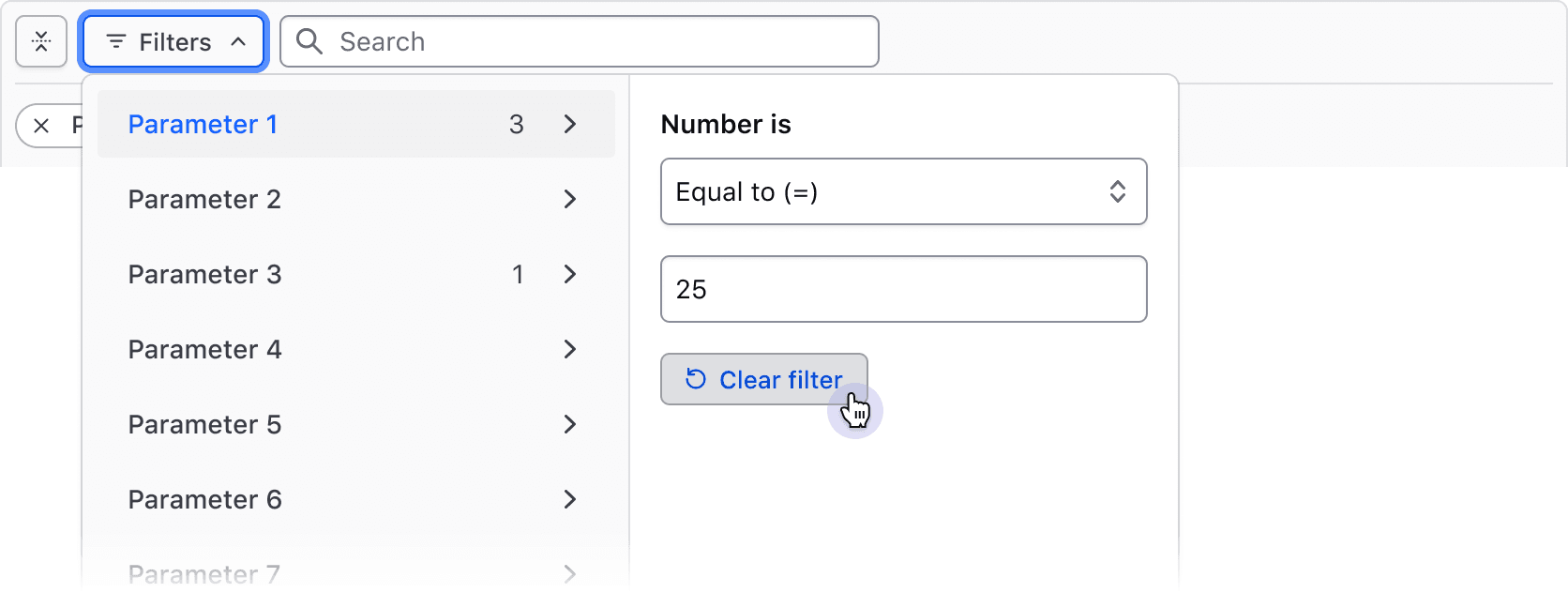
Numbers, dates, times, and datetimes
By combining an operator (greater than, less than, before, etc.) with input fields, filtering by numerical values, dates, times, and datetimes can be handled. This filtering method is best suited for range-based filtering, i.e., filtering based on comparisons of values or ranges of values.
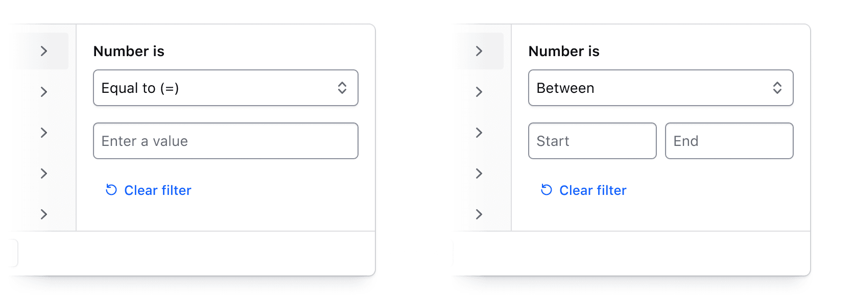
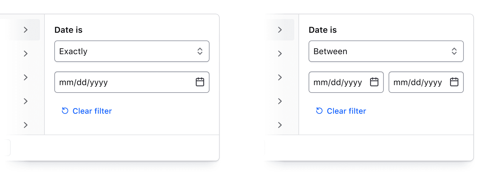
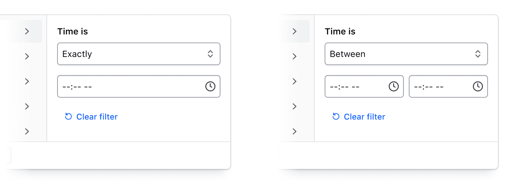
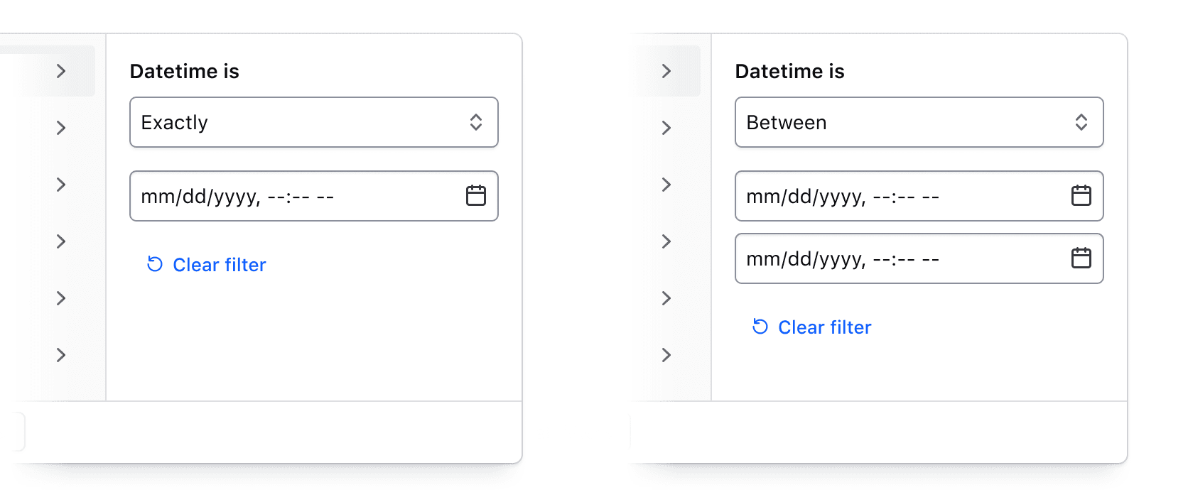
For a full list of supported operators, visit the specifications page.
Custom filtering
While the left panel should always display the list of parameters, the right panel can be customized to meet filtering requirements beyond the out-of-the-box methods.
Search across filter values
Users can search across all values within a selected parameter. While search is relevant only for single- or multi-selection, it can be especially useful when there are many values or when a unique naming convention is used.
How to use this component
The Filter Bar component is used to apply and display filters to a data set. The component does not handle any filtering of the data itself, but provides a way for a user to apply filters, and a means for displaying any filters that have been applied.
To use this component, set the filter options available for a data set using the FiltersDropdown and FilterGroup contextual components. When filters are applied, the @onFilter callback provides a data object of the applied filters. To show which filters have been applied, pass a data object of the same structure to the @filters argument.
The Filter Bar is also available as a contextual component of the Advanced Table.
<Hds::FilterBar @filters={{this.demoFilters}} @onFilter={{this.demoUpdateFilters}} as |F|>
  <F.FiltersDropdown as |D|>
    <D.FilterGroup @key="project" @text="Project" @type="multi-select" as |F|>
      <F.Checkbox @value="project-1" @label="Project 1" />
      <F.Checkbox @value="project-2" @label="Project 2" />
      <F.Checkbox @value="project-3" @label="Project 3" />
    </D.FilterGroup>
    <D.FilterGroup @key="version" @text="Version" @type="single-select" as |F|>
      <F.Radio @value="1.0" @label="1.0" />
      <F.Radio @value="2.0" @label="2.0" />
      <F.Radio @value="3.0" @label="3.0" />
    </D.FilterGroup>
  </F.FiltersDropdown>
</Hds::FilterBar>
Filters Dropdown
All filtering options are available via a dropdown in the Filter Bar. Inside the dropdown, each filter group is represented with its own tab. When a tab is selected, the filtering options available are visible and users can add filters for that group. By clicking the "Apply filters" or "Clear all filters" buttons in the dropdown footer, the user can apply the selected filters, or clear all that have been previously set.
Filtering options are passed to the Filter Bar through the FiltersDropdown and FilterGroup contextual components. In the FilterGroup, the @key, @text, and @type arguments are required.
- The
@keyargument sets the key for that filter group in the data object of theonFiltercallback. - The
@textargument sets the text for tab label. - The
@typeargument specifies the type of filtering available for the group.
View more details on available filter types below.
<Hds::FilterBar @filters={{this.demoEmptyFilters}} @onFilter={{this.demoUpdateEmptyFilters}} as |F|>
  <F.FiltersDropdown as |D|>
    <D.FilterGroup @key="demo-multi-select" @text="Multi-select" @type="multi-select" as |F|>
      <F.Checkbox @value="option-1" @label="Option 1" />
      <F.Checkbox @value="option-2" @label="Option 2" />
      <F.Checkbox @value="option-3" @label="Option 3" />
    </D.FilterGroup>
    <D.FilterGroup @key="demo-single-select" @text="Single-select" @type="single-select" as |F|>
      <F.Radio @value="option-1" @label="Option 1" />
      <F.Radio @value="option-2" @label="Option 2" />
      <F.Radio @value="option-3" @label="Option 3" />
    </D.FilterGroup>
    <D.FilterGroup @key="demo-number" @text="Number" @type="numerical" />
    <D.FilterGroup @key="date" @text="Date" @type="date" />
    <D.FilterGroup @key="demo-time" @text="Time" @type="time" />
    <D.FilterGroup @key="demo-datetime" @text="Datetime" @type="datetime" />
  </F.FiltersDropdown>
</Hds::FilterBar>
Applying filters
A user can apply, update, or clear filters within the dropdown. The @onFilter callback is used to listen for and respond to changes to the filters.
The callback provides a data object of applied filters which come from a user's filter selections. This object can be used to run any filtering operations on a data set, and then be passed back into the @filters argument of the Filter Bar to show the applied filters.
Based on the applied filters passed to the @filters argument, dismissible Tags will be shown for each applied filter. When a Tag is dismissed, the @onFilter callback will be triggered, and that filter will be removed from the object.
<Hds::FilterBar @filters={{this.demoFilters}} @onFilter={{this.demoUpdateFilters}} as |F|>
  <F.FiltersDropdown as |D|>
    <D.FilterGroup @key="project" @text="Project" @type="multi-select" as |F|>
      <F.Checkbox @value="project-1" @label="Project 1" />
      <F.Checkbox @value="project-2" @label="Project 2" />
      <F.Checkbox @value="project-3" @label="Project 3" />
    </D.FilterGroup>
    <D.FilterGroup @key="version" @text="Version" @type="single-select" as |F|>
      <F.Radio @value="1.0" @label="1.0" />
      <F.Radio @value="2.0" @label="2.0" />
      <F.Radio @value="3.0" @label="3.0" />
    </D.FilterGroup>
  </F.FiltersDropdown>
</Hds::FilterBar>
Live filtering
By default, the @onFilter callback is not triggered when a filter is added in the dropdown. Instead, the callback is triggered when the user confirms their filters with the "Apply filters" button, or clears them with the "Clear all filters" button.
If the @isLiveFilter argument is set to true, the @onFilter callback will be triggered as soon as a user adds a filter in the dropdown. If it is a selection-based filter, like a checkbox or radio button, the filtering would occur on selection. If it is an input-based filter, like a date or number, the filter would be applied when both inputs are correctly filled out.
<Hds::FilterBar
  @filters={{this.demoLiveFilters}}
  @isLiveFilter={{true}}
  @onFilter={{this.demoUpdateLiveFilters}}
  as |F|
>
  <F.FiltersDropdown as |D|>
    <D.FilterGroup @key="project" @text="Project" @type="multi-select" as |F|>
      <F.Checkbox @value="project-1" @label="Project 1" />
      <F.Checkbox @value="project-2" @label="Project 2" />
      <F.Checkbox @value="project-3" @label="Project 3" />
    </D.FilterGroup>
    <D.FilterGroup @key="version" @text="Version" @type="single-select" as |F|>
      <F.Radio @value="1.0" @label="1.0" />
      <F.Radio @value="2.0" @label="2.0" />
      <F.Radio @value="3.0" @label="3.0" />
    </D.FilterGroup>
    <D.FilterGroup @key="creation-date" @text="Creation date" @type="date" />
  </F.FiltersDropdown>
</Hds::FilterBar>
Filter types
The Filter Bar includes distinct filter groups to accommodate various data types.
Single-select and Multi-select
The single-select and multi-select filter types are used for filtering a list of items by one or multiple values. The options available for selection can be set using the Radio and Checkbox contextual components inside the FilterGroup.
If the @searchEnabled argument in the FilterGroup is set to true, the list of options can be searched through using a provided search input.
The dismissible filter tag will display the label for a given filter, and if the label is not provided it will display the value.
<Hds::FilterBar @filters={{this.demoSelectionFilters}} @onFilter={{this.demoUpdateSelectionFilters}} as |F|>
  <F.FiltersDropdown as |D|>
    <D.FilterGroup @key="demo-single-select" @text="Single-select" @type="single-select" @searchEnabled={{true}} as |F|>
      <F.Radio @value="option-1" @label="Option 1" />
      <F.Radio @value="option-2" @label="Option 2" />
      <F.Radio @value="option-3" @label="Option 3" />
    </D.FilterGroup>
    <D.FilterGroup @key="demo-multi-select" @text="Multi-select" @type="multi-select" @searchEnabled={{true}} as |F|>
      <F.Checkbox @value="option-1" @label="Option 1" />
      <F.Checkbox @value="option-2" @label="Option 2" />
      <F.Checkbox @value="option-3" @label="Option 3" />
    </D.FilterGroup>
  </F.FiltersDropdown>
</Hds::FilterBar>// example of filter data
const demoSelectionFilters = {
'demo-single-select': {
type: 'single-select',
text: 'Single-select',
data: {
value: 'option-1',
label: 'Option 1',
},
},
'demo-multi-select': {
type: 'multi-select',
text: 'Multi-select',
data: [
{ value: 'option-1', label: 'Option 1' },
{ value: 'option-2', label: 'Option 2' },
],
}
};Numerical
The numerical filter type is used for any data which is numerical in nature. It provides options for all comparison operators including a between selector.
<Hds::FilterBar @filters={{this.demoNumericalFilters}} @onFilter={{this.demoUpdateNumericalFilters}} as |F|>
  <F.FiltersDropdown as |D|>
    <D.FilterGroup @key="demo-numerical-a" @text="Numerical A" @type="numerical" />
    <D.FilterGroup @key="demo-numerical-b" @text="Numerical B" @type="numerical" />
  </F.FiltersDropdown>
</Hds::FilterBar>// example of filter data
const demoNumericalFilters = {
'demo-numerical-a': {
type: 'numerical',
text: 'Numerical A',
data: {
selector: 'less-than',
value: 10,
},
},
'demo-numerical-b': {
type: 'numerical',
text: 'Numerical B',
data: {
selector: 'between',
value: {
start: 10,
end: 20,
}
},
}
};Date & time
There are filter types available for various date and time data through the date, time, and datetime filter types. All three types also support the between selector.
Dates and times are formatted in the applied filter tags using the ember-intl service.
<Hds::FilterBar @filters={{this.demoDateTimeFilters}} @onFilter={{this.demoUpdateDateTimeFilters}} as |F|>
  <F.FiltersDropdown as |D|>
    <D.FilterGroup @key="demo-date" @text="Date" @type="date" />
    <D.FilterGroup @key="demo-time" @text="Time" @type="time" />
    <D.FilterGroup @key="demo-datetime" @text="Datetime" @type="datetime" />
    <D.FilterGroup @key="demo-date-range" @text="Date range" @type="date" />
  </F.FiltersDropdown>
</Hds::FilterBar>// example of filter data
const demoDateTimeFilters = {
'demo-date': {
type: 'date',
text: 'Date',
data: {
selector: 'before',
value: '2025-01-01',
},
},
'demo-time': {
type: 'time',
text: 'Time',
data: {
selector: 'before',
value: '20:00',
},
},
'demo-datetime': {
type: 'datetime',
text: 'Datetime',
data: {
selector: 'before',
value: '2025-01-01T12:00',
},
},
'demo-date-range': {
type: 'date',
text: 'Date range',
data: {
selector: 'between',
value: {
start: '2024-01-01',
end: '2025-01-01',
}
},
}
};Custom filtering
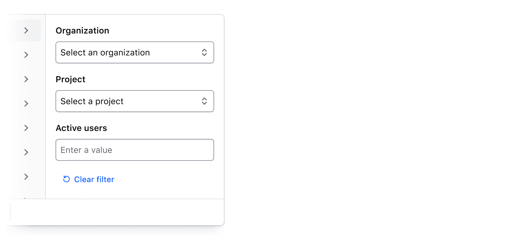
For filtering support outside of the filter types supported above, an option for more customized filtering is available through the generic filter type, and the Generic contextual component inside the FilterGroup. The Generic contextual component provides an updateFilter argument function that can be used to trigger updates to the filter inside the dropdown.
The dismissible filter tag can be customized by setting dismissTagText on the filter. If this is not provided, the dismissible filter tag's text will function similarly to the single-select and multi-select filter types, where the value or label is displayed.
The @onClear callback can be used to listen to the FilterGroup "Clear filter" button, and reset any content inside your filter such as clearing a form input.
<Hds::FilterBar @filters={{this.demoGenericFilters}} @onFilter={{this.demoUpdateGenericFilters}} as |F|>
  <F.FiltersDropdown as |D|>
    <D.FilterGroup @key="demo-generic" @text="Generic" @type="generic" @onClear={{this.onClear}} as |FG|>
      <FG.Generic as |G|>
        <Hds::Form::TextInput::Field
          @value={{this.demoGenericName}}
          {{on "input" (fn this.onGenericNameChange G.updateFilter)}}
          name="name"
          as |FT|
        >
          <FT.Label>Name</FT.Label>
        </Hds::Form::TextInput::Field>
      </FG.Generic>
    </D.FilterGroup>
  </F.FiltersDropdown>
</Hds::FilterBar>// example of filter data
const demoGenericFilters = {
'demo-generic': {
type: 'generic',
text: 'Generic',
dismissTagText: 'equals Name',
data: {
value: 'Name',
},
}
};A generic filter can also contain multiple filters, similar to a multi-select filter. By passing an array of data to the data object each item in the array will be displayed as a distinct filter.
The dismissible filter tag will display the label for a given filter, and if the label is not provided it will display the value. The text can be customized by adding a dismissTagText value.
<Hds::FilterBar @filters={{this.demoGenericArrayFilters}} @onFilter={{this.demoUpdateGenericArrayFilters}} as |F|>
  <F.FiltersDropdown as |D|>
    <D.FilterGroup @key="demo-generic-array" @text="Generic" @type="generic" @onClear={{this.onClear}} as |FG|>
      <FG.Generic as |G|>
        <Hds::Form::TextInput::Field
          @value={{this.demoGenericArrayName1}}
          {{on "input" (fn this.onGenericArrayName1Change G.updateFilter)}}
          name="name-1"
          as |FT|
        >
          <FT.Label>Name 1</FT.Label>
        </Hds::Form::TextInput::Field>
        <Hds::Form::TextInput::Field
          @value={{this.demoGenericArrayName2}}
          {{on "input" (fn this.onGenericArrayName2Change G.updateFilter)}}
          name="name-2"
          as |FT|
        >
          <FT.Label>Name 2</FT.Label>
        </Hds::Form::TextInput::Field>
      </FG.Generic>
    </D.FilterGroup>
  </F.FiltersDropdown>
</Hds::FilterBar>// example of filter data
const demoGenericArrayFilters = {
'demo-generic-array': {
type: 'generic',
text: 'Generic',
data: [
{ value: 'Name 1', label: 'Name 1' },
{ value: 'Name 2', dismissTagText: 'equals Name 2' }
]
}
};Callbacks
The @onClear argument can be added to the FilterGroup to listen for when a user triggers a clear of the filter group. This can be used to reset any inputs present in the filter content.
If your content for inputting filters can change dynamically, it's possible focus can be lost if an element with focus is removed. By default, the FiltersDropdown will close anytime focus leaves, including if it is lost. You can use the @onFocusOut argument to stop the dropdown from closing when this occurs and set focus on another appropriate element.
<Hds::FilterBar @filters={{this.demoGenericFilters}} @onFilter={{this.demoUpdateGenericFilters}} as |F|>
  <F.FiltersDropdown @onFocusOut={{this.onFocusOut}} as |D|>
    <D.FilterGroup @key="demo-generic" @text="Demo generic" @type="generic" @onClear={{this.onClear}} as |F|>
      <F.Generic as |G|>
        <Hds::Form::TextInput::Field
          @value={{this.name}}
          @id="demo-name"
          {{on "input" (fn this.onNameChange G.updateFilter)}}
          name="name"
          as |F|
        >
          <F.Label>Name</F.Label>
        </Hds::Form::TextInput::Field>
        {{#if this.showExtraName}}
          <Hds::Form::TextInput::Field
            @value={{this.nameExtra}}
            {{on "input" (fn this.onNameExtraChange G.updateFilter)}}
            name="name-extra"
            as |F|
          >
            <F.Label>Extra name</F.Label>
          </Hds::Form::TextInput::Field>
          <Hds::Button
            @text="Remove name"
            @color="secondary"
            @size="small"
            id="btn-remove-extra-name"
            {{on "click" this.removeExtraName}}
          />
        {{else}}
          <Hds::Button
            @text="Add name"
            @color="secondary"
            @size="small"
            id="btn-add-extra-name"
            {{on "click" this.addExtraName}}
          />
        {{/if}}
        <Hds::Text::Body @size="100">
          This filter has a dynamic template that changes based on the number of values added. On clear, the filter
          should reset to only showing one input.
        </Hds::Text::Body>
      </F.Generic>
    </D.FilterGroup>
  </F.FiltersDropdown>
</Hds::FilterBar>
Search
The Filter Bar provides a search input, which can be used for searching across multiple areas of a data set. If the @hasSearch argument is set to true, a search input will be shown next to the dropdown.
When the search input's input event is triggered, a filter of type search will be included in the data object in the @onFilter callback.
<Hds::FilterBar
  @filters={{this.demoSearchFilters}}
  @onFilter={{this.demoUpdateSearchFilters}}
  @hasSearch={{true}}
  as |F|
>
  <F.FiltersDropdown as |D|>
    <D.FilterGroup @key="project" @text="Project" @type="multi-select" as |F|>
      <F.Checkbox @value="project-1" @label="Project 1" />
      <F.Checkbox @value="project-2" @label="Project 2" />
      <F.Checkbox @value="project-3" @label="Project 3" />
    </D.FilterGroup>
    <D.FilterGroup @key="version" @text="Version" @type="single-select" as |F|>
      <F.Radio @value="1.0" @label="1.0" />
      <F.Radio @value="2.0" @label="2.0" />
      <F.Radio @value="3.0" @label="3.0" />
    </D.FilterGroup>
  </F.FiltersDropdown>
</Hds::FilterBar>// example of filter data
const demoSearchFilters = {
'search': {
type: 'search',
text: 'Search',
data: {
value: 'Lorem ipsum',
},
}
};The search input's placeholder text is "Search" by default, but can be customized with the @searchPlaceholder argument.
<Hds::FilterBar
  @filters={{this.demoEmptyFilters}}
  @onFilter={{this.demoUpdateEmptyFilters}}
  @hasSearch={{true}}
  @searchPlaceholder="Search projects"
  as |F|
>
  <F.FiltersDropdown as |D|>
    <D.FilterGroup @key="project" @text="Project" @type="multi-select" as |F|>
      <F.Checkbox @value="project-1" @label="Project 1" />
      <F.Checkbox @value="project-2" @label="Project 2" />
      <F.Checkbox @value="project-3" @label="Project 3" />
    </D.FilterGroup>
    <D.FilterGroup @key="version" @text="Version" @type="single-select" as |F|>
      <F.Radio @value="1.0" @label="1.0" />
      <F.Radio @value="2.0" @label="2.0" />
      <F.Radio @value="3.0" @label="3.0" />
    </D.FilterGroup>
  </F.FiltersDropdown>
</Hds::FilterBar>
Bulk actions
The Filter Bar provides an ActionsDropdown contextual component that can be used for bulk actions to perform on a data set, or for other purposes. All contextual components from the Dropdown are yielded to the consumer except for the ToggleButton.
<Hds::FilterBar @filters={{this.demoEmptyFilters}} @onFilter={{this.demoUpdateEmptyFilters}} as |F|>
  <F.FiltersDropdown as |D|>
    <D.FilterGroup @key="project" @text="Project" @type="multi-select" as |F|>
      <F.Checkbox @value="project-1" @label="Project 1" />
      <F.Checkbox @value="project-2" @label="Project 2" />
      <F.Checkbox @value="project-3" @label="Project 3" />
    </D.FilterGroup>
    <D.FilterGroup @key="version" @text="Version" @type="single-select" as |F|>
      <F.Radio @value="1.0" @label="1.0" />
      <F.Radio @value="2.0" @label="2.0" />
      <F.Radio @value="3.0" @label="3.0" />
    </D.FilterGroup>
  </F.FiltersDropdown>
  <F.ActionsDropdown as |D|>
    <D.Interactive @icon="edit">Edit items</D.Interactive>
    <D.Interactive @icon="trash" @color="critical">Delete items</D.Interactive>
    <D.Separator />
    <D.Interactive @icon="check-circle">Select entire data set</D.Interactive>
    <D.Interactive @icon="rotate-ccw">Reset selection</D.Interactive>
  </F.ActionsDropdown>
</Hds::FilterBar>
The text of the ActionsDropdown defaults to "Actions", but can be customized with the @toggleButtonText argument. An icon can also be added with the @toggleButtonIcon argument.
<Hds::FilterBar @filters={{this.demoEmptyFilters}} @onFilter={{this.demoUpdateEmptyFilters}} as |F|>
  <F.FiltersDropdown as |D|>
    <D.FilterGroup @key="project" @text="Project" @type="multi-select" as |F|>
      <F.Checkbox @value="project-1" @label="Project 1" />
      <F.Checkbox @value="project-2" @label="Project 2" />
      <F.Checkbox @value="project-3" @label="Project 3" />
    </D.FilterGroup>
    <D.FilterGroup @key="version" @text="Version" @type="single-select" as |F|>
      <F.Radio @value="1.0" @label="1.0" />
      <F.Radio @value="2.0" @label="2.0" />
      <F.Radio @value="3.0" @label="3.0" />
    </D.FilterGroup>
  </F.FiltersDropdown>
  <F.ActionsDropdown @toggleButtonText="Item actions" @toggleButtonIcon="outline" as |D|>
    <D.Interactive @icon="edit">Edit items</D.Interactive>
    <D.Interactive @icon="trash" @color="critical">Delete items</D.Interactive>
    <D.Separator />
    <D.Interactive @icon="check-circle">Select entire data set</D.Interactive>
    <D.Interactive @icon="rotate-ccw">Reset selection</D.Interactive>
  </F.ActionsDropdown>
</Hds::FilterBar>
Generic content
For more customization of the functionality in the Filter Bar, an ActionsGeneric contextual component is provided that can be used to pass in any other content.
<Hds::FilterBar @filters={{this.demoEmptyFilters}} @onFilter={{this.demoUpdateEmptyFilters}} as |F|>
  <F.FiltersDropdown as |D|>
    <D.FilterGroup @key="project" @text="Project" @type="multi-select" as |F|>
      <F.Checkbox @value="project-1" @label="Project 1" />
      <F.Checkbox @value="project-2" @label="Project 2" />
      <F.Checkbox @value="project-3" @label="Project 3" />
    </D.FilterGroup>
    <D.FilterGroup @key="version" @text="Version" @type="single-select" as |F|>
      <F.Radio @value="1.0" @label="1.0" />
      <F.Radio @value="2.0" @label="2.0" />
      <F.Radio @value="3.0" @label="3.0" />
    </D.FilterGroup>
  </F.FiltersDropdown>
  <F.ActionsGeneric>
    <Doc::Placeholder @height="24" @width="auto" @text="Generic content" @background="#e4e4e4" />
  </F.ActionsGeneric>
</Hds::FilterBar>
Component API
FilterBar
<[F].FiltersDropdown>
yielded component
FilterBar::FiltersDropdown yielded as contextual component (see below).
<[F].ActionsGeneric>
yielded component
FilterBar::ActionsGeneric yielded as contextual component (see below).
<[F].ActionsDropdown>
yielded component
FilterBar::ActionsDropdown yielded as contextual component (see below).
filters
object
string filter key for each entry. Ex: { 'my-filter-key': {...}}.
isLiveFilter
boolean
- false (default)
true, the @onFilter callback is invoked immediately as filters are added in the dropdown (live updates). If false, changes in the dropdown are applied only when the user confirms via the "Apply filters" button, or clears with the "Clear all filters" button.
Note: The behavior of the search input is unaffected by this argument. The search filter is always applied after user submission via the
change event.
hasSearch
boolean
- false (default)
true, a search input is shown in the Filter Bar. Search input values are reported to the @onFilter callback as a filter with the key search.
searchPlaceholder
string
- "Search" (default)
@hasSearch is true.
onFilter
function
HdsFilterBarFilters object.
…attributes
...attributes.
Filter types
The shape of the object for the @filters argument. The shape differs depending on the type provided.
type
enum
- single-select
- multi-select
- numerical
- date
- time
- datetime
- generic
text
string
data
object | array
type requires its own shape of the data property. See below for details.
dismissTagText
string
type is equal to generic.
Single-select
The required structure of the data property when type is equal to single-select.
data
object
value
string
label
string
value text will be used.
Multi-select
The required structure of the data property when type is equal to multi-select.
data
array
value
string
label
string
value text will be used.
Numerical
The required structure of the data property when type is equal to numerical.
data
object
selector
enum
- less-than
- less-than-or-equal-to
- equal-to
- greater-than-or-equal-to
- greater-than
- between
value to determine the range of numbers to filter on.
value
number | object
selector is between, the property is an object with the following properties
start
number
between selector range of values.
end
number
between selector range of values.
Date
The required structure of the data property when type is equal to date.
data
object
selector
enum
- before
- exactly
- after
- between
value to determine the range of dates to filter on.
value
string | object
YYYY-MM-DD. If the selector is between, the property is an object with the following properties
start
string
between selector range of values in the format YYYY-MM-DD.
end
string
between selector range of values in the format YYYY-MM-DD.
Time
The required structure of the data property when type is equal to time.
data
object
selector
enum
- before
- exactly
- after
- between
value to determine the range of times to filter on.
value
string | object
HH:MM in the 24hr format. If the selector is between, the property is an object with the following properties
start
string
between selector range of values in the format HH:MM in 24hr format.
end
string
between selector range of values in the format HH:MM in 24hr format.
Datetime
The required structure of the data property when type is equal to datetime.
data
object
selector
enum
- before
- exactly
- after
- between
value to determine the range of times to filter on.
value
string | object
{YYYY-MM-DD}T{HH:MM} where the time is in the 24hr format. If the selector is between, the property is an object with the following properties
start
string
between selector range of values in the format {YYYY-MM-DD}T{HH:MM} where the time is in the 24hr format.
end
string
between selector range of values in the format {YYYY-MM-DD}T{HH:MM} where the time is in the 24hr format.
Generic
The required structure of the data property when type is equal to generic.
data
object | array
value
string
label
string
dismissTagText is not provided. If empty, the value text will be used.
FilterBar::FiltersDropdown
The FilterBar::FiltersDropdown is yielded as the [F].FiltersDropdown contextual component.
<[F].FilterGroup>
yielded component
FilterBar::FilterGroup yielded as contextual component (see below).
height
string
- 600px (default)
@height parameter is provided then the tabs and tab panels will have a max-height. Can be any valid CSS height (px, rem, etc).
onFocusOut
function
Notice: Focus can be lost if content inside the dropdown is removed dynamically. This callback should be used to set focus to another element if this occurs. Without this callback the dropdown will close automatically when focus is lost.
…attributes
...attributes.
FilterBar::FilterGroup
The FilterBar::FilterGroup is yielded as the [D].FilterGroup contextual component in the FilterBar::FiltersDropdown.
<[F].Checkbox>
yielded component
FilterBar::FilterGroup::Checkbox yielded as contextual component (see below).
<[F].Radio>
yielded component
FilterBar::FilterGroup::Radio yielded as contextual component (see below).
key
string
FilterGroup.
text
string
FilterGroup in the tabs of the FiltersDropdown, and in any applied filter tags for the group.
type
enum
- single-select
- multi-select
- numerical
- date
- time
- datetime
- generic
searchEnabled
boolean
- false (default)
true, a search input is shown in the filter group panel, which can be used to filter the list of available options. Note: This is only applicable to the single-select and multi-select filter types when used in conjunction with the Radio and Checkbox contextual components.
FilterBar::FilterGroup::Radio
The FilterBar::FilterGroup::Radio is yielded as the [F].Radio contextual component in the FilterBar::FilterGroup.
value
string
label
string
FilterBar::FilterGroup::Checkbox
The FilterBar::FilterGroup::Checkbox is yielded as the [F].Checkbox contextual component in the FilterBar::FilterGroup.
value
string
label
string
FilterBar::ActionsGeneric
The FilterBar::ActionsGeneric is yielded as the [F].ActionsGeneric contextual component.
yield
…attributes
...attributes.
FilterBar::ActionsDropdown
The FilterBar::ActionsDropdown is yielded as the [F].ActionsDropdown contextual component.
enableCollisionDetection
boolean
- false (default)
true will automatically flip the list position to remain visible when near the edges of the viewport.
width
string
min-width of 200px and a max-width of 400px, so it adapts to the content size. If a @width parameter is provided then the list will have a fixed width.
We discourage the use of percentage values for this argument. The Dropdown list is a
popover element, so relative units use document as a reference (not the parent element), meaning percentage values act similar to vw.
If @matchToggleWidth is set, @width is overridden.
height
string
@height parameter is provided then the list will have a max-height.
preserveContentInDom
boolean
- false (default)
onClose
function
onFocusOut
function
Notice: Focus can be lost if content inside the dropdown is removed dynamically. This callback should be used to set focus to another element if this occurs. Without this callback the dropdown will close automatically when focus is lost.
toggleButtonText
text
- "Actions" (default)
toggleButtonIcon
string
…attributes
...attributes.
Anatomy
Filter Bar
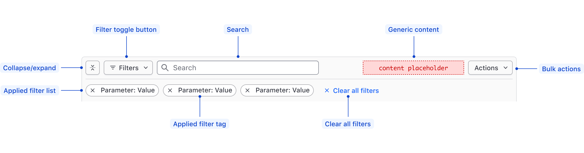
| Element | Usage |
|---|---|
| Collapse/expand | Required; Toggles display of the applied filters. |
| Filter toggle button | Required; Toggles open and closed the Filter Dropdown. |
| Search | Optional; Searches based on string matching across the entire data set. |
| Generic content | Optional |
| Bulk actions | Optional; Supports performing bulk actions on the data set. |
| Applied Filters List | Required; Displays either the filters that have been applied to the data set, or an empty state if there are none. |
| Applied Filter Tag | Required; Displays the filter as Parameter: Value within an HDS Tag. |
| Clear All Filters | Required; Clears all of the applied filters and sets the Filter Bar and the data set back to their default state. |
Filter Dropdown
The Filter Dropdown anatomy is dependent on the filter method:
- Selection: multi-selection using checkboxes or single selection using radios.
- Input: numerical, date, time, datetime values, or a range between a start and end value.
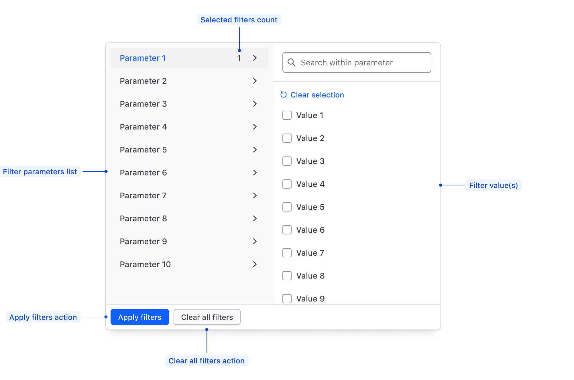
| Element | Usage |
|---|---|
| Parameters list | Required; Displays all of the available filter parameters, generally corresponding with columns in a table. |
| Filter value(s) | Required; Displays available values within a parameter for selection, or allows the input of custom values. |
| Apply Filters action | Required if the filtering method is "per-filter". Applies the filters selected in either the values list or the values input. |
| Clear all filters action | Required; Clears the selection of filters across all parameters. |
| Selected filters count | Displays the number of values selected in a parameter. |
Filter value selection
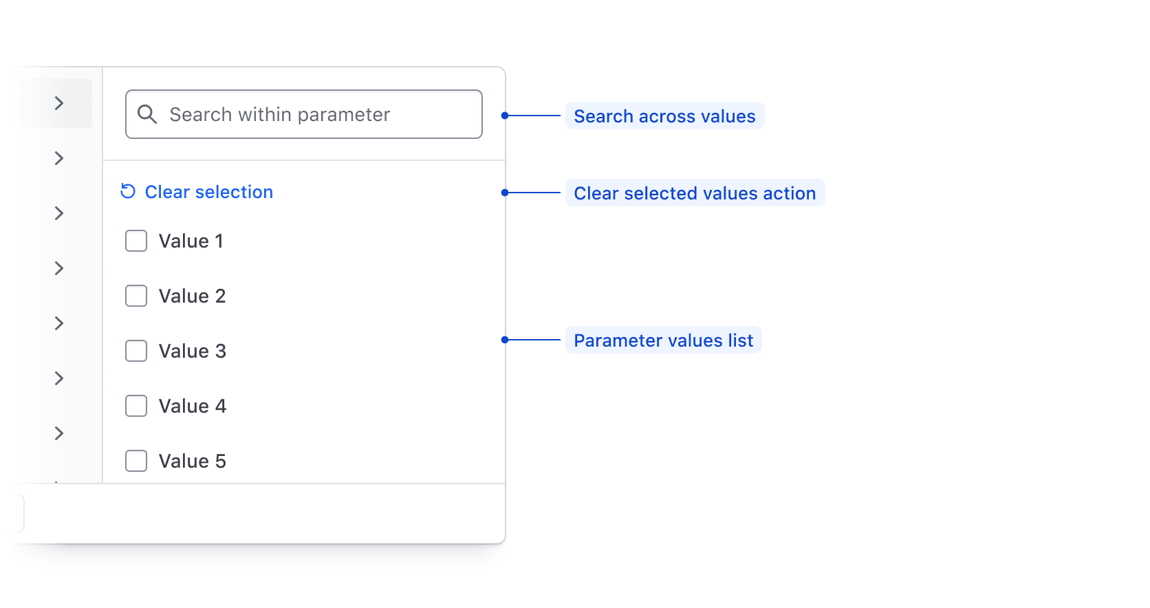
| Element | Usage |
|---|---|
| Search | Optional; Searches across available filter parameter values using string matching. |
| Clear selected values action | Required; De-selects all values in the list. |
| Value input | Required; Supports filtering on numbers, strings, dates, or times. |
Filter value input
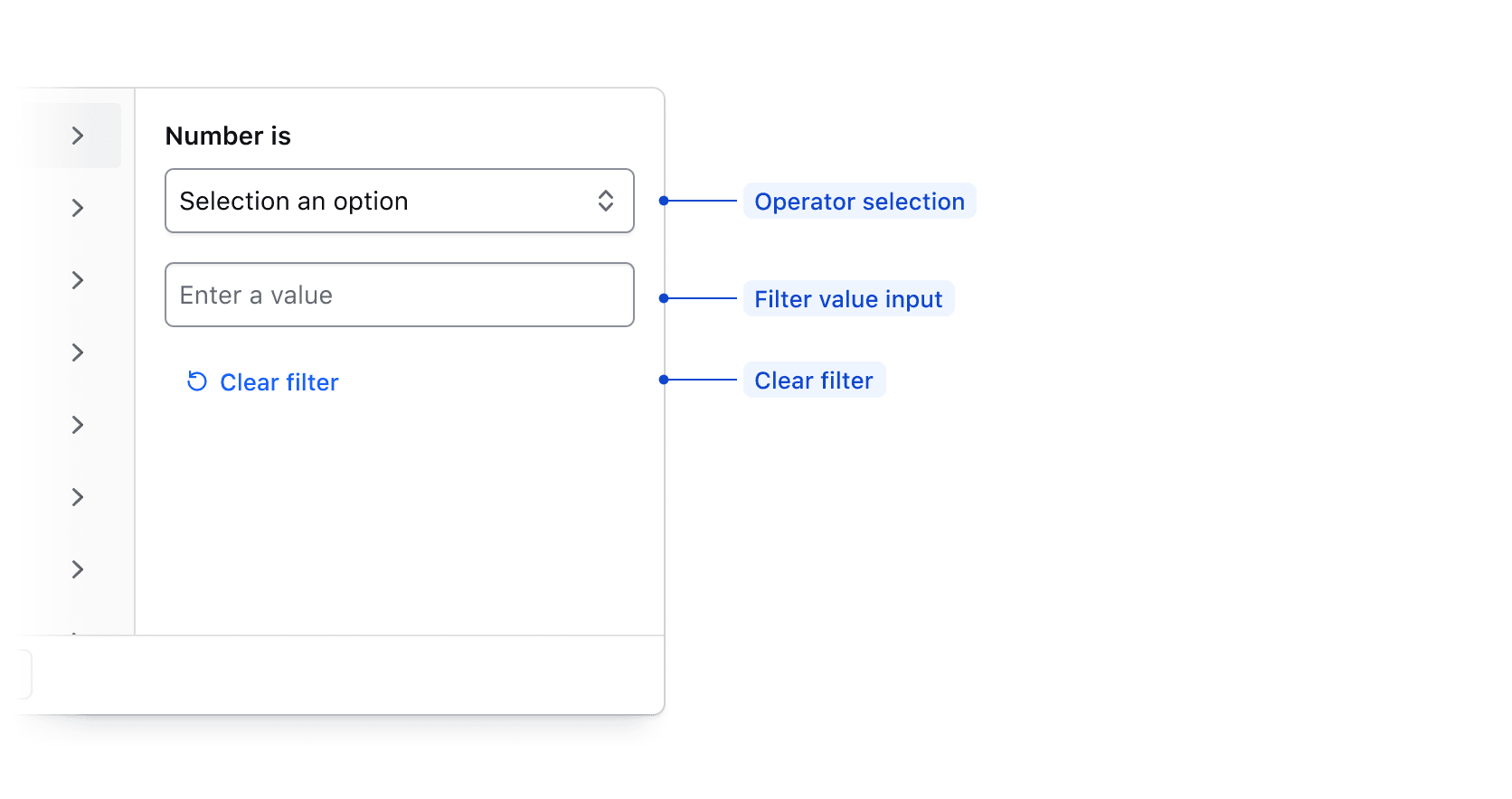
| Element | Usage |
|---|---|
| Operator selection | Required; Allows the user to select how the filter is applied. |
| Value input | Required; Allows the user to input a value to filter upon such as a number, string, date, or time. |
| Clear filter | Required; Clears the filter operator and input fields. |
Filter value range input
When applying a filter value via an input, if Between is selected in the operator list, the input fields will be broken into a start value and an end value.
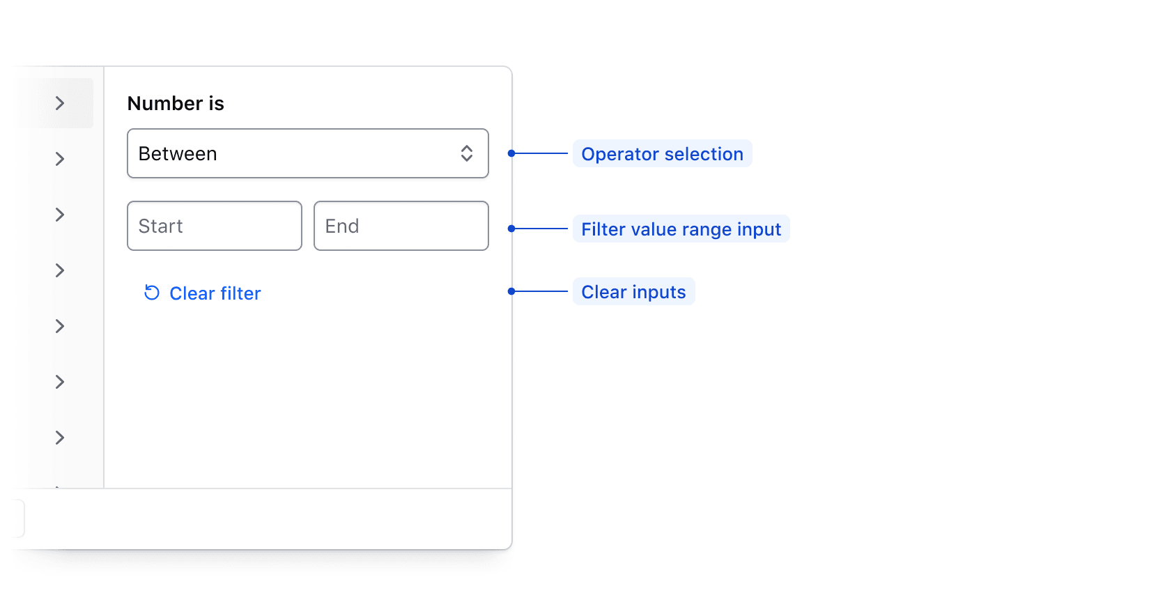
| Element | Usage |
|---|---|
| Operator selection | Required; Allows the user to select how the filter is applied. |
| Value range input | Required; Allows the user to input start and end values to filter upon. |
| Clear filter fields action | Required; Clears the filter input field. |
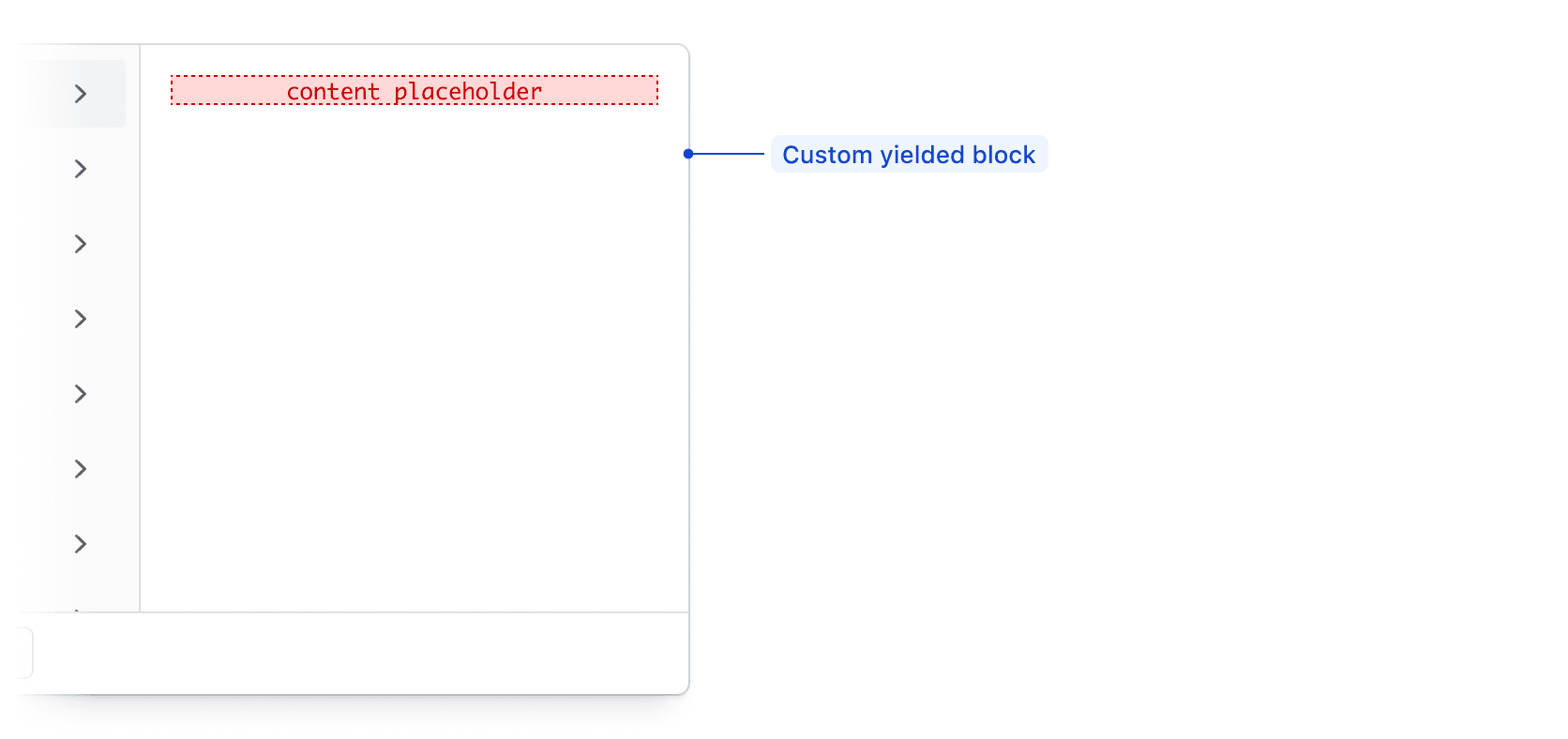
Custom filtering
The Filter Dropdown supports custom filtering by passing elements to a generic yielded block.
Value input operators
Available operators are dependent on the type of data being filtered upon, but are generally either numerical, or date/time based.
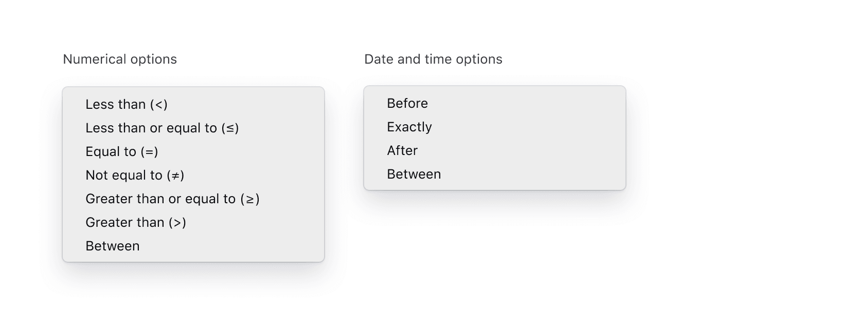
| Type | Options |
|---|---|
| Numerical | Less than (>), Less than or equal to (≤), Equal to (=), Not equal to (≠), Greater than or equal to (≥), Greater than (>), Between |
| Date and time | Before, Exactly, After, Between |
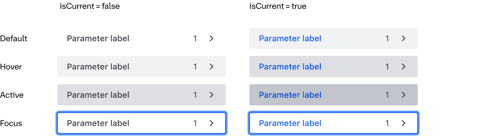
States
Parameter List Item
Conformance Rating
When used as recommended, there should not be any WCAG conformance issues with this component. Consumers are responsible for the conformance of any content in a block yield.
Keyboard navigation
Accessing the dropdown menu
Focus on the dropdown toggle button.

Open the dropdown menu.
Focus on the selected tab.
Move between tabs.
Select a tab.
Move to the selected tab content.
Close the dropdown.
Executing a search
Focus the search input.

Enter a search term into the input.

Execute the search.

Applicable WCAG Success Criteria
This section is for reference only. This component intends to conform to the following WCAG Success Criteria:
-
1.3.1
Info and Relationships (Level A):
Information, structure, and relationships conveyed through presentation can be programmatically determined or are available in text. -
1.3.2
Meaningful Sequence (Level A):
When the sequence in which content is presented affects its meaning, a correct reading sequence can be programmatically determined. -
1.3.5
Identify Input Purpose (Level AA):
The purpose of each input field collecting information about the user can be programmatically determined when the input field serves a purpose identified in the Input Purposes for User Interface Components section; and the content is implemented using technologies with support for identifying the expected meaning for form input data. -
1.4.1
Use of Color (Level A):
Color is not used as the only visual means of conveying information, indicating an action, prompting a response, or distinguishing a visual element. -
1.4.10
Reflow (Level AA):
Content can be presented without loss of information or functionality, and without requiring scrolling in two dimensions. -
1.4.11
Non-text Contrast (Level AA):
The visual presentation of the following have a contrast ratio of at least 3:1 against adjacent color(s): user interface components; graphical objects. -
1.4.12
Text Spacing (Level AA):
No loss of content or functionality occurs by setting all of the following and by changing no other style property: line height set to 1.5; spacing following paragraphs set to at least 2x the font size; letter-spacing set at least 0.12x of the font size, word spacing set to at least 0.16 times the font size. -
1.4.3
Minimum Contrast (Level AA):
The visual presentation of text and images of text has a contrast ratio of at least 4.5:1 -
1.4.4
Resize Text (Level AA):
Except for captions and images of text, text can be resized without assistive technology up to 200 percent without loss of content or functionality. -
2.1.1
Keyboard (Level A):
All functionality of the content is operable through a keyboard interface. -
2.1.2
No Keyboard Trap (Level A):
If keyboard focus can be moved to a component of the page using a keyboard interface, then focus can be moved away from that component using only a keyboard interface. -
2.4.3
Focus Order (Level A):
If a Web page can be navigated sequentially and the navigation sequences affect meaning or operation, focusable components receive focus in an order that preserves meaning and operability. -
2.4.7
Focus Visible (Level AA):
Any keyboard operable user interface has a mode of operation where the keyboard focus indicator is visible. -
3.2.1
On Focus (Level A):
When any user interface component receives focus, it does not initiate a change of context. -
3.2.2
On Input (Level A):
Changing the setting of any user interface component does not automatically cause a change of context unless the user has been advised of the behavior before using the component. -
3.3.2
Labels or Instructions (Level A):
Labels or instructions are provided when content requires user input. -
4.1.2
Name, Role, Value (Level A):
For all user interface components, the name and role can be programmatically determined; states, properties, and values that can be set by the user can be programmatically set; and notification of changes to these items is available to user agents, including assistive technologies.
Support
If any accessibility issues have been found within this component, let us know by submitting an issue.
6.1.0
Added support for an array of values for the generic filter type data
Added @onClear argument to FilterGroup contextual component
Added @onFocusOut argument to the FiltersDropdown to help manage focus for dynamic dropdown content and prevent the dropdown from closing when content changes
Converted component to gts format.
6.0.0
Added FilterBar component and related sub-components