Use Copy Snippets when it speeds up or improves the user’s workflow. Remember that users can still copy content manually, so take care not to overload the UI with them.
Usage
When to use
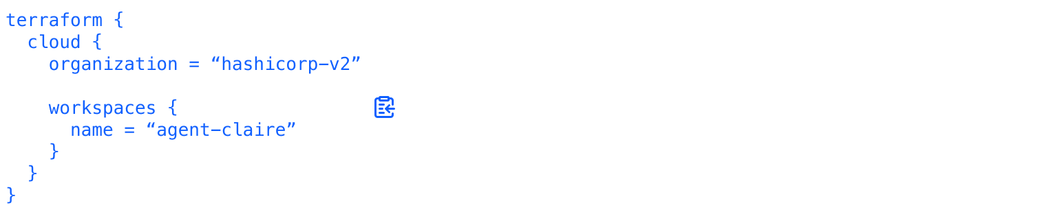
- To enable users to copy code snippets, such as URLs, tokens, IDs, etc.
When not to use
- To copy content outside its container, use Copy Button.
- In a code block, use Copy Button.
Take caution when using for longer code snippets, instead consider using a more prominent code block with a Copy Button.
Color
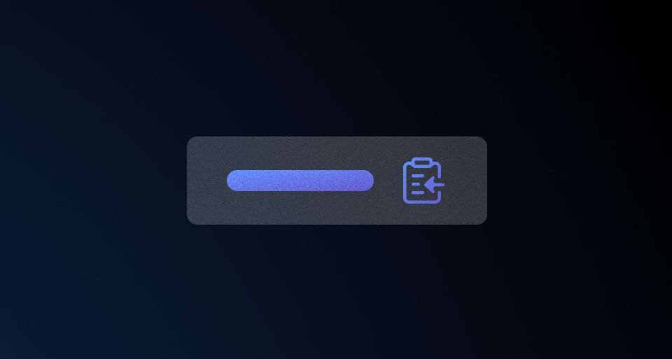
The Copy Snippet comes in two colors: primary and secondary
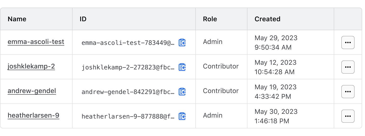
When multiple Copy Snippets are needed in a single page, such as in a Table, consider using the secondary color to reduce the prominence of each Copy Snippet.
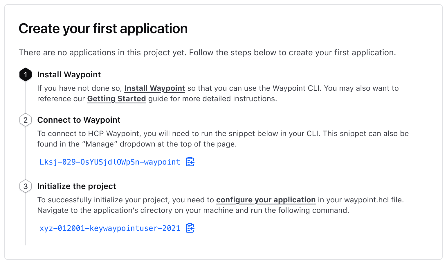
When there are many secondary links on a page, like in a stepper form, it’s important to use the primary color to highlight each Copy Snippet’s importance for completing a task.
Truncation
Truncation should be avoided as there is no current known way to make truncated content available to keyboard-only users. This is a current, known limitation of web technology.
Truncation of the Copy Snippet is optional and can be used when space is limited or when showing the full snippet isn’t necessary. When enabled, the visible content is truncated to fit within the parent container.
Avoid truncating content too soon. For shorter snippets and where space allows, show the full snippet.
How to use this component
The basic invocation requires textToCopy to be passed:
<Hds::Copy::Snippet @textToCopy="e4rt-yg80-39kt" />Color
There are two available colors for the component: primary and secondary. The default is primary.
<Hds::Copy::Snippet @textToCopy="e4rt-yg80-39kt" @color="secondary" />Full-width
This indicates that the component should take up the full-width of the parent container. It’s set to false by default.
<Hds::Copy::Snippet @textToCopy="e4rt-yg80-39kt" @isFullWidth={{true}} />Truncation
When set to true, this constrains text to one-line and truncates it if it does not fit the available space.
Please be aware there are serious accessibility concerns with using this feature.
<div class="doc-copy-snippet-demo-constrain-width">
  <Hds::Copy::Snippet
    @textToCopy="fbrct1ed-fgr35h-tyng89-wed4r with a bunch of other long text that should force truncation if truncation is set to true"
    @isTruncated={{true}}
  />
</div>
Component API
This component uses the Clipboard API under the hood.
Copy::Snippet
color
enum
- primary (default)
- secondary
isFullWidth
boolean
- false (default)
textToCopy
string | number
isTruncated
boolean
- false (default)
Please be aware there are serious accessibility concerns with using this feature.
onSuccess
function
onError
function
ariaMessageText
string
- Copied to clipboard (default)
success.
…attributes
...attributes.
Anatomy
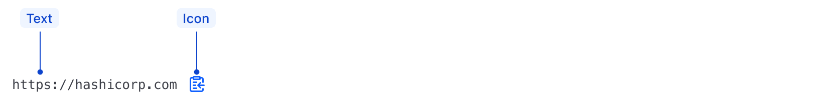
| Element | Usage |
|---|---|
| Icon | Required |
| Text | Required |
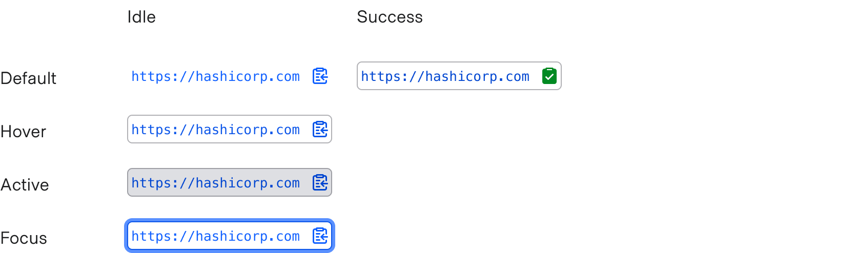
States
Conformance rating
When the default variant of the component is used, there should not be any WCAG conformance issues.
However, the truncation feature is not conformant because a keyboard-only user cannot access the truncated content. Please be aware of this when evaluating whether or not to include truncation in your copy snippet.
Applicable WCAG Success Criteria
This section is for reference only. This component intends to conform to the following WCAG Success Criteria:
-
1.1.1
Non-text Content (Level A):
All non-text content that is presented to the user has a text alternative that serves the equivalent purpose. -
1.3.1
Info and Relationships (Level A):
Information, structure, and relationships conveyed through presentation can be programmatically determined or are available in text. -
1.3.2
Meaningful Sequence (Level A):
When the sequence in which content is presented affects its meaning, a correct reading sequence can be programmatically determined. -
1.4.1
Use of Color (Level A):
Color is not used as the only visual means of conveying information, indicating an action, prompting a response, or distinguishing a visual element. -
1.4.10
Reflow (Level AA):
Content can be presented without loss of information or functionality, and without requiring scrolling in two dimensions. -
1.4.11
Non-text Contrast (Level AA):
The visual presentation of the following have a contrast ratio of at least 3:1 against adjacent color(s): user interface components; graphical objects. -
1.4.12
Text Spacing (Level AA):
No loss of content or functionality occurs by setting all of the following and by changing no other style property: line height set to 1.5; spacing following paragraphs set to at least 2x the font size; letter-spacing set at least 0.12x of the font size, word spacing set to at least 0.16 times the font size. -
1.4.3
Minimum Contrast (Level AA):
The visual presentation of text and images of text has a contrast ratio of at least 4.5:1 -
1.4.4
Resize Text (Level AA):
Except for captions and images of text, text can be resized without assistive technology up to 200 percent without loss of content or functionality. -
2.1.1
Keyboard (Level A):
All functionality of the content is operable through a keyboard interface. -
2.1.2
No Keyboard Trap (Level A):
If keyboard focus can be moved to a component of the page using a keyboard interface, then focus can be moved away from that component using only a keyboard interface. -
2.4.7
Focus Visible (Level AA):
Any keyboard operable user interface has a mode of operation where the keyboard focus indicator is visible. -
4.1.2
Name, Role, Value (Level A):
For all user interface components, the name and role can be programmatically determined; states, properties, and values that can be set by the user can be programmatically set; and notification of changes to these items is available to user agents, including assistive technologies.
Support
If any accessibility issues have been found within this component, let us know by submitting an issue.
6.2.1
Fixed a11y issue by adding @ariaMessageText argument to an aria-live region to announce to screen readers when content has been copied. Added handling for copy to clipboard error state in ariaMessageText
6.2.0
Translated aria-label string for button.
6.1.0
Converted component to gts format.
4.17.1
Fixed issue preventing copying of empty string and zero number values
4.15.0
Aligned private class properties to follow a standardized notation