The language selector provides users with a way to switch the application's language.
Placement
Place the language selector in the App Header's utility section alongside other application-level controls. This ensures the user can switch the language from anywhere within the product without leaving the current page or context.
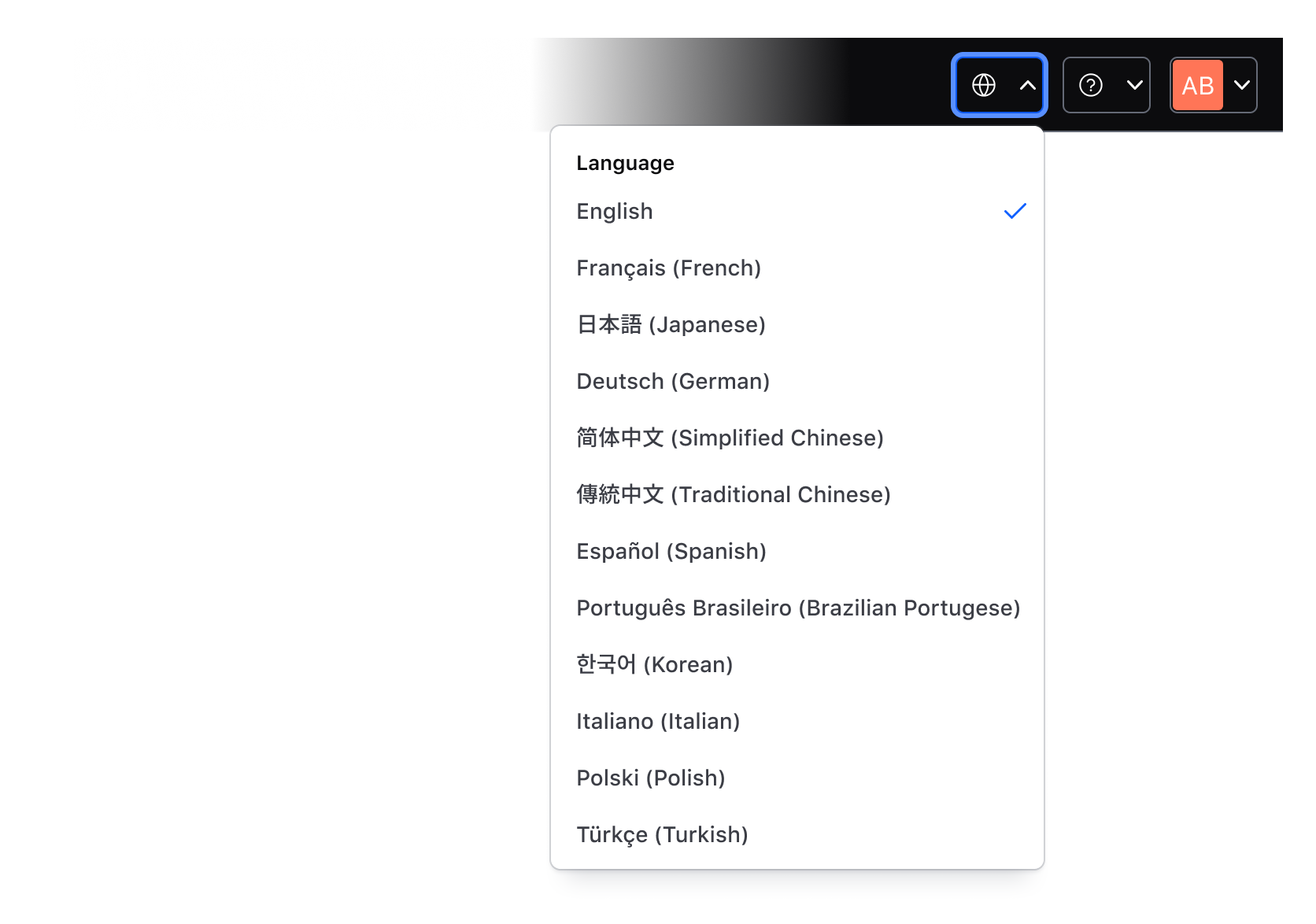
Components
Compose the language selector pattern using the Dropdown and its contextual components:
- Dropdown ToggleIcon (icon only): entry point for selecting a language from a list of options; use the
globeicon to communicate internationalization. - Title List Item: used as a section label within the list with the text set to "Language".
- Checkmark List Item: used to display the list of available languages and highlight the current or active language. Use one instance per supported language. Only one language can be active at a time.
Language list format
Each list item displays the language in two forms (with the exception of English): the native language name first, followed by the English name in parentheses, e.g., "Español (Spanish)" or "日本語 (Japanese)". English is listed simply as "English".
Don't use visual indicators like icons or emojis (flags) in the language label. These visual elements lack formality and are unprofessional for use in enterprise applications.
Default language
The default language should always be set to English. Basing the user's preference on their IP address or geographic region can be unreliable because a user's location does not indicate their language preference, e.g., a user in Germany may prefer English or Japanese.
Persistence
Persisting the user's choice ensures their preferred language is displayed by default whenever they visit the application, reducing friction for future visits.
Basic implementation
Use the Dropdown to create the language selector in the App Header. Connect the selection to your i18n implementation to manage the current language. This example uses ember-intl to set and store the user's preferred language.