These guidelines aid in the decision-making process for organizing buttons and actions. Different alignment, ordering, and grouping of actions result in different outcomes in user experience.
While these guidelines don’t cover every scenario, they are intended to aid in the decision-making process when determining how to organize buttons and actions. Different methods of alignment and ordering will result in different outcomes with pros and cons for each. What is most important is consistency across an application in how actions are aligned, ordered, and grouped.
Alignment
Alignment refers to how buttons and actions are aligned relative to the container or page. When combined with different reading patterns and hierarchy, different alignment methods impact a function's readability, usability, and intended outcome.
When considering internationalization (i18n), start and end are suitable substitutes for left and right alignment to account for languages that are read right-to-left (RTL).
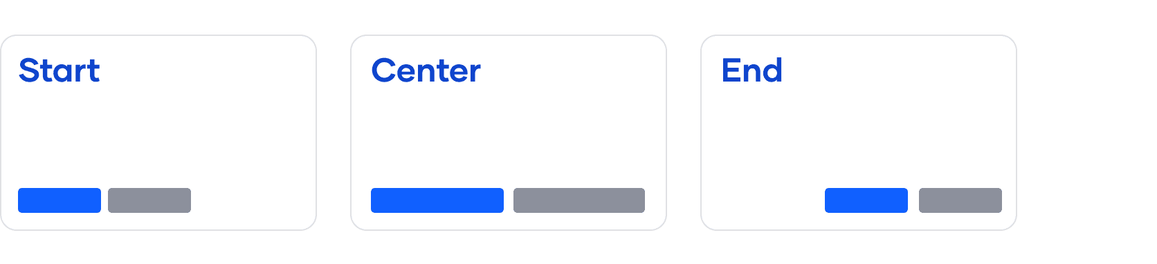
Left alignment
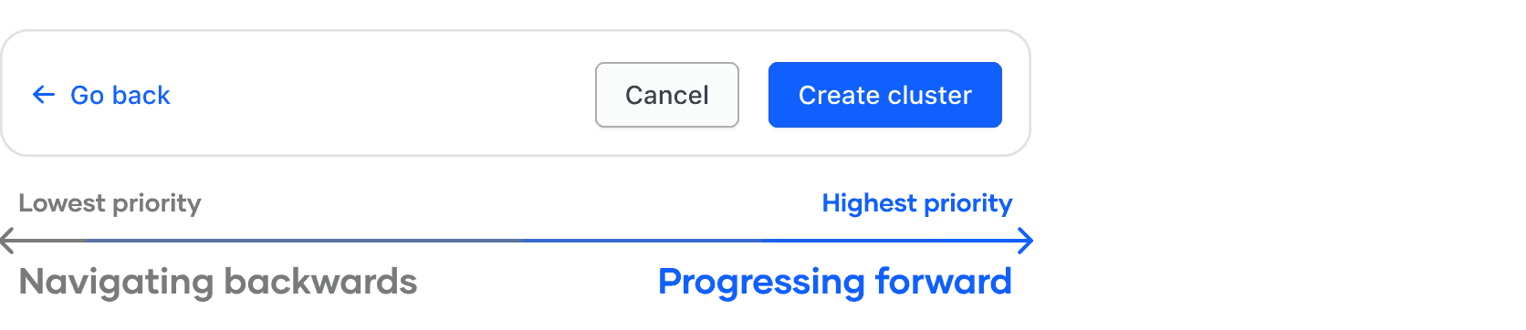
In most scenarios, align buttons to the left side of a container or page. The primary button should be leftmost, followed by secondary, then tertiary.
- This reinforces natural reading patterns and a conversational "dialog-like" messaging strategy.
- When combined with a consistent ordering method, the primary button is prioritized in the reading direction.
- When considering different contexts, opting for a single method helps to create consistency between constrained and unconstrained components and patterns.
A common example of this alignment method is in Modals and page-level forms.
Align buttons to the left side of the container.
Right alignment
In the case of page-level functions or actions that manage elements within the page, align buttons to the right of the page. The primary button should be the farthest right, then secondary, then tertiary.
Center alignment
This alignment method is not recommended in the majority of scenarios.
- Can cause buttons to needlessly fill the horizontal space of the container
- Can cause buttons to appear detached from the content they are paired with, especially if a user has increased zoom settings within their browser

Order
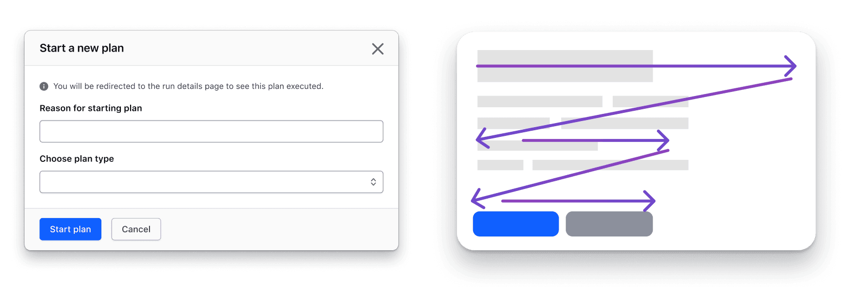
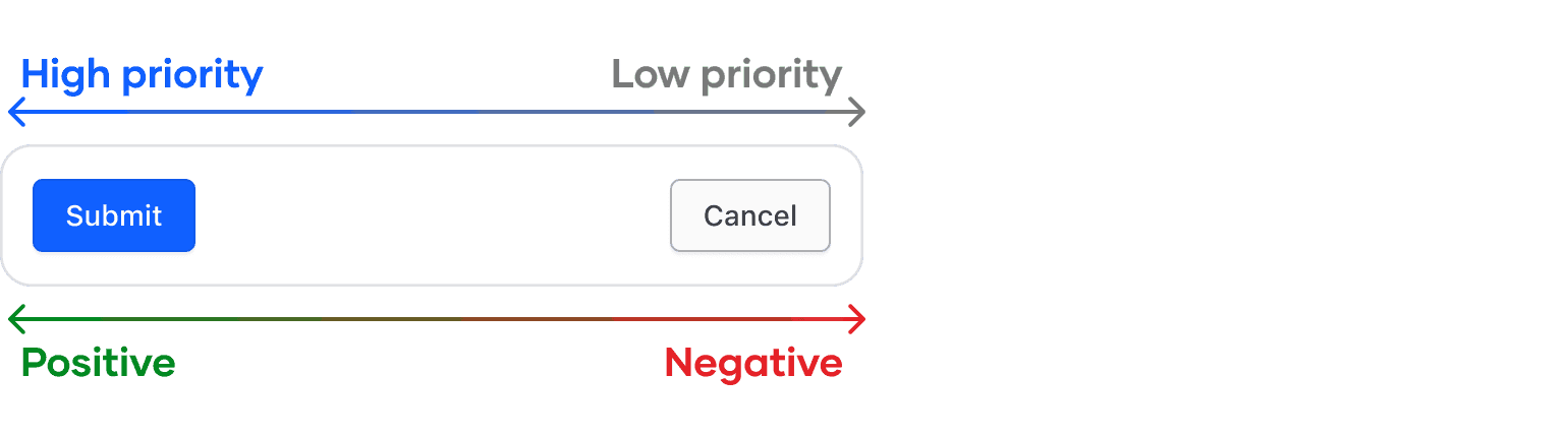
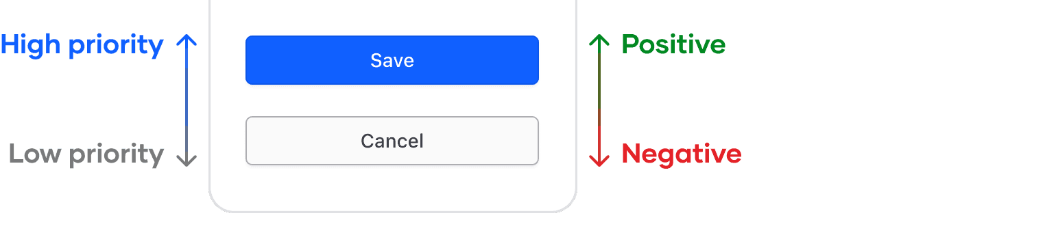
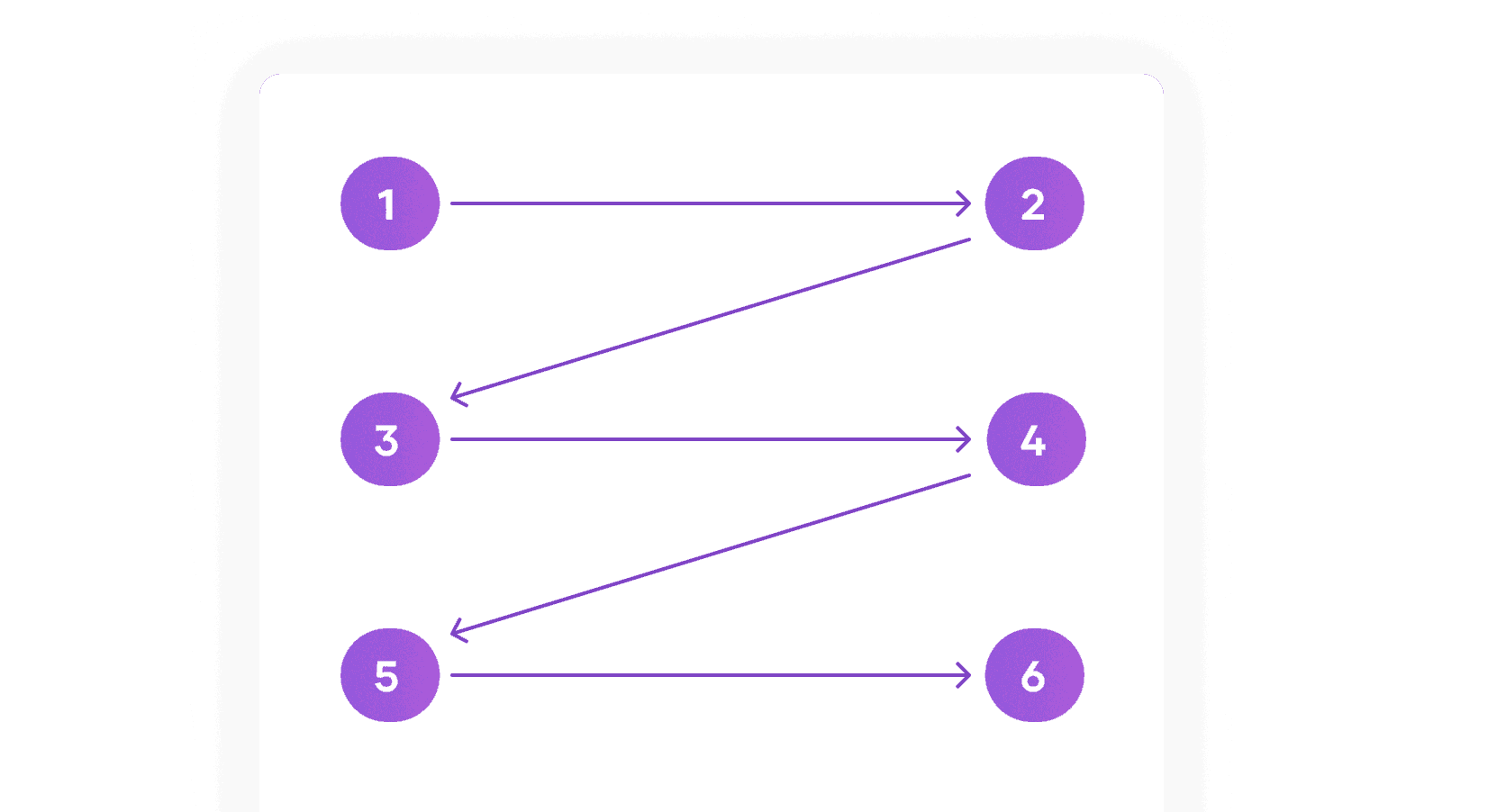
Users generally think from highest to lowest priority and positive to negative when performing an action or function. Therefore, we recommend ordering buttons from the primary (most important) action to the secondary action and, if applicable, the tertiary action (least important).
Order buttons based on priority, from the highest priority action (usually a primary button) to the lowest priority (secondary or tertiary buttons).
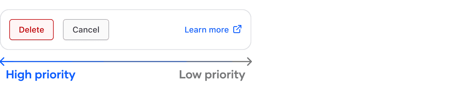
Destructive actions
In the case of a destructive action, replace the primary button with a critical button in the same position. While a destructive action may have a negative connotation, the priority of the action takes precedence over whether the action is positive or negative in this scenario.
Conversational messaging
Users often expect to communicate with machines and applications as if they were humans. These guidelines can reinforce this paradigm by encouraging users through a human-like conversational style.
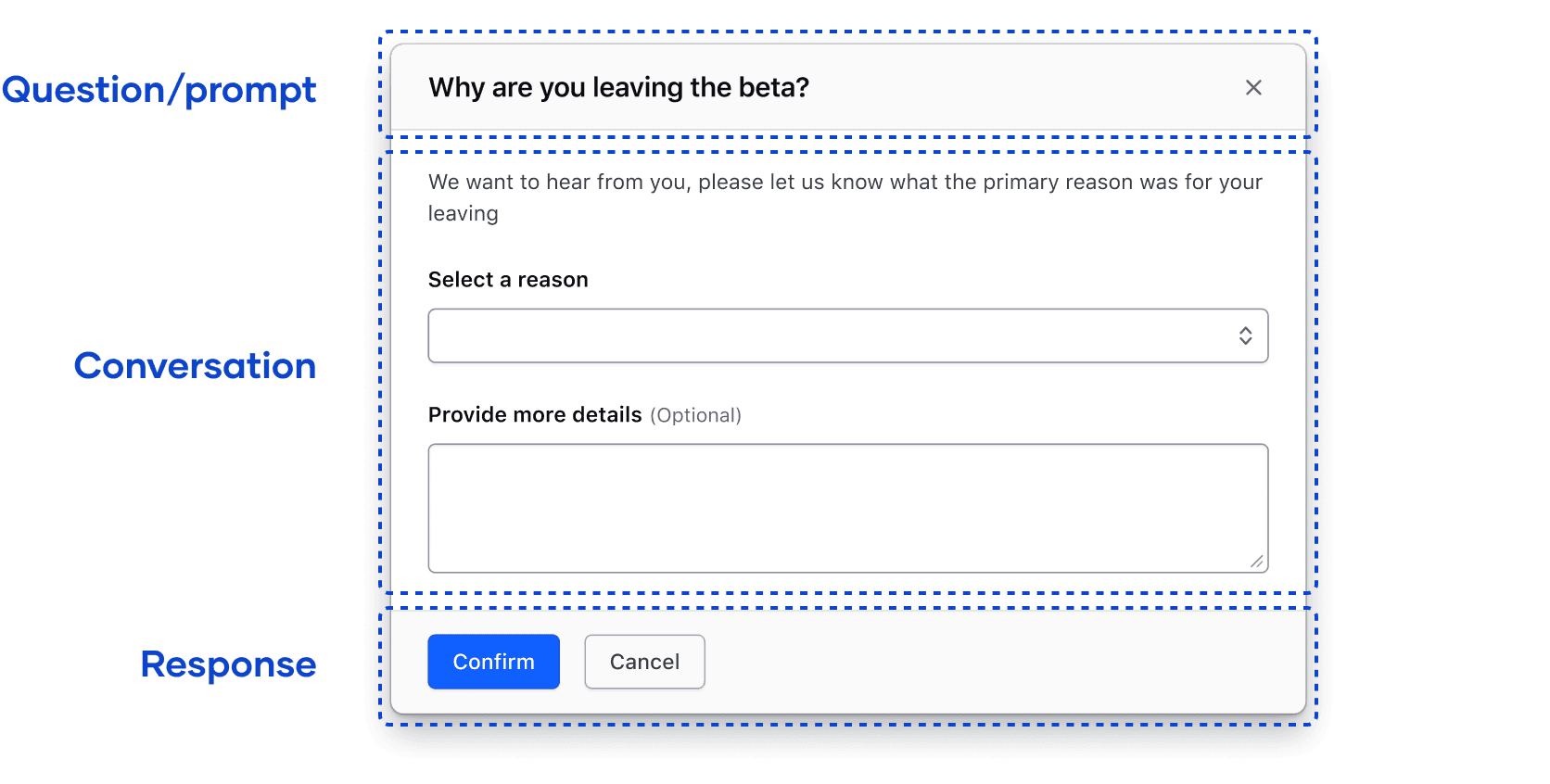
Consider the following scenario:
A user has taken action to edit the settings of a cluster. Approached through a conversational method, the highest priority positive action (Save changes) comes first, with less important and negative actions following.
An often-depicted alternative to this scenario is to end with the most important action. However, when analyzed using a reading pattern, the example is conversationally clunky and forces the user to read through items of lower importance first.
Non-natural conversation based on priority

User edits the settings of a cluster:
- "Would you like to learn more about this action?" "No"
- "Would you like to cancel?" "No"
- "Would you like to save the changes to this cluster?" "Yes, finally, that’s what I was trying to do all along."
Natural conversation based on priority
User edits the settings of a cluster:
- "Would you like to save the changes to this cluster?" "Yes, thank you."
Exceptions
A possible exception to this ordering method is in multi-step and progressive flows in which buttons fulfill both a functional purpose (create or edit something) and a navigational purpose (proceed, go back).
- The directionality and positive outcome of the overall flow are reinforced by the button order and grouping.
- In a multi-step flow, this type of pattern would persist on the page; the repetitiveness acts as a form of consistency scoped to the feature the pattern is used in.
Stacking order
As the viewport size shrinks, buttons should stack vertically in accordance with their order in the DOM (Document Object Model).
- This naturally adheres to our ordering guidelines; button order remains the same, except the container is vertical rather than horizontal.
- This reduces complexity in engineering.
- This ensures our applications meet accessibility conformance in making the DOM order match the visual order.
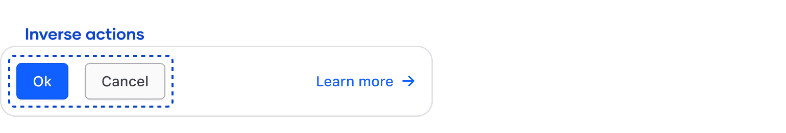
Grouping
How actions are grouped can influence what the user perceives as the primary action. Actions grouped correctly can alleviate decision fatigue and help users better understand the outcome of their actions.
- Group buttons together that perform similar, related, and inverse functions. This generally refers to functions like "yes/no" or "ok/cancel".
- Inverse grouping generally helps users to make decisions quicker as their options are limited.
- As a best practice, tertiary actions should only be used if they help the user make a decision (linking to a different area of the application or documentation).
- Presenting the user with more than one action in this context can be confusing and force the user to question whether they are making the correct decision. Read more about Hick's Law.
Constrained vs. unconstrained
The term constrained refers to a component or pattern that is wrapped within a container element, while unconstrained refers to components that exist at the page level.
- Constrained
- Dialogs and modals
- Toolbars
- Alerts
- Banners
- Unconstrained
- General page content
- In-page forms
- The "window" in a general sense
This differentiation is important because the expectations from the user are different in each context. A constrained component or pattern will often be used in an interstitial or circumstantial experience; i.e. an experience that is triggered by the user or the application and elicits a quick, progressive action.
Unconstrained generally refers to a more "static" experience that isn’t triggered by a user action. This is often tied to a page-level function or a navigational element.
Layout and reading patterns
When users read content, the pattern their eyes follow generally adheres to one or more reading patterns. By identifying and familiarizing ourselves with these patterns we can better understand how the layout within our application, pattern, or component impacts comprehension and interpretation of the content.
The three most common reading patterns are:
- the Gutenberg diagram
- Z-shaped pattern
- F-shaped pattern
Gutenberg diagram
The Gutenberg diagram refers to a pattern the eyes follow when moving or scanning through evenly distributed, homogenous content. This pattern is most relevant in text-heavy scenarios like novels and newspapers, but is relevant in a UX context depending on the complexity of the content.
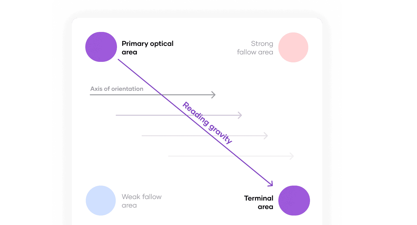
Characteristics
- The users eyes progress through the content on an axis of orientation which moves further away from the start edge on each line or break in the content
- Content falls into strong and weak fallow areas where it receives less attention and lacks comprehension compared to content along the axis of orientation
- This pattern indicates that important content and elements should be placed upon the reading gravity path
- This pattern is most prevalent in content with little to no typographic hierarchy (i.e. long-form paragraphs)
- This pattern is considered "in harmony" with natural reading direction
Z-shaped pattern
A Z-shaped pattern refers to a pattern that follows the shape of the letter Z:
- The user’s eyes start in the top left and move horizontally to the right
- Upon reaching the end (or terminal) of the line, the eyes move diagonally to the next line
- The reader’s eyes end at the bottom right of the content
Characteristics
- There are technically no fallow areas as in the Gutenberg pattern, though this is not always the case in practice.
- This type of pattern is most prevalent in task-based functions or sequences of elements; i.e. a form or series of onboarding steps.
- This pattern assumes that users read through all of the content sequentially.
F-shaped pattern
An F-shaped pattern loosely follows the shape of the letter F, first identified through eye-tracking and heatmap studies by the Nielsen/Norman Group.
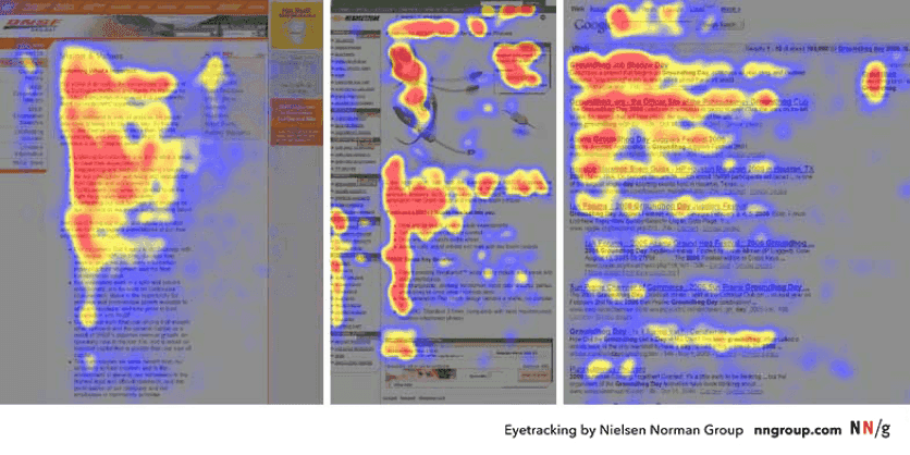
Characteristics
The F-shaped pattern is a prominent example of how users scan through content and how most users don’t read content completely.
- Information at the top will generally have increased comprehension compared to information further down the page.
- This is anecdotally true for all reading and layout patterns, but is best captured in a heatmap analysis.
- Information of lesser importance should be concise, potentially organized in bullet points, and aligned to the left hand side of the page, pattern, or component.
- This layout assumes users only scan content, rather than reading word-for-word.
Reading patterns in practice
All three of these reading patterns are relevant and useful when observed in isolation, however, the reality of how users read, consume, and comprehend content is likely a combination of multiple reading patterns that change and overlap depending on the context. With that in mind, understanding these patterns and how they are relevant to different types of UX content will help to produce the best experience.
Key concepts
- No particular layout or reading pattern is perfect, users will generally shift between different patterns depending on the content.
- Adherence to specific reading pattern is not an excuse for lack of hierarchy within a layout.
- Introducing hierarchical focal points using typography and color in tandem with reading patterns is often the most effective method to communicate the purpose and function of a layout, pattern, or component.
- There is a fair amount of overlap between each pattern.