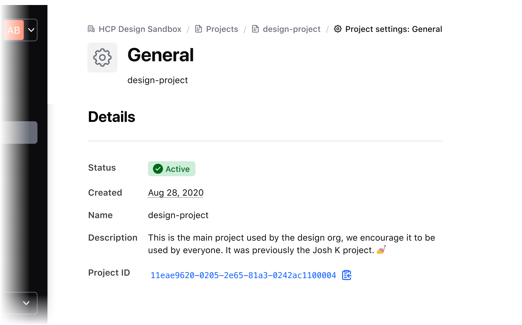
A description list is a group of one or more list items that display related data, helping a user understand key values at a glance.
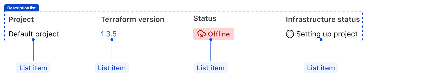
A list item is comprised of a title and a value.
Typography
Title
The title should always use the same styling of Body 200 Semibold with Foreground / Primary, regardless of the orientation or value style.

Value
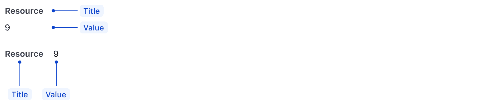
Values have two visual style options: standard or callout.
Standard
Use Body 200 Regular with Foreground / Strong for values when the title and value are of equal importance.

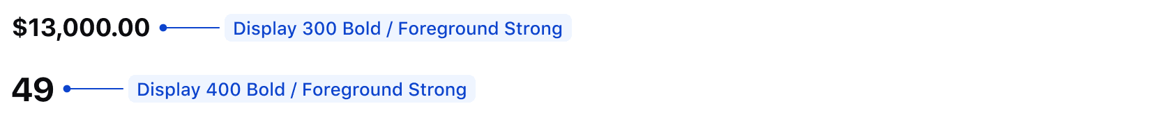
Callout
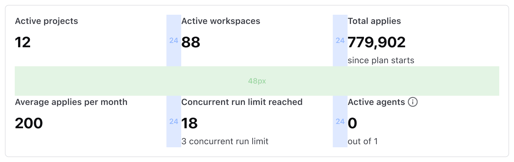
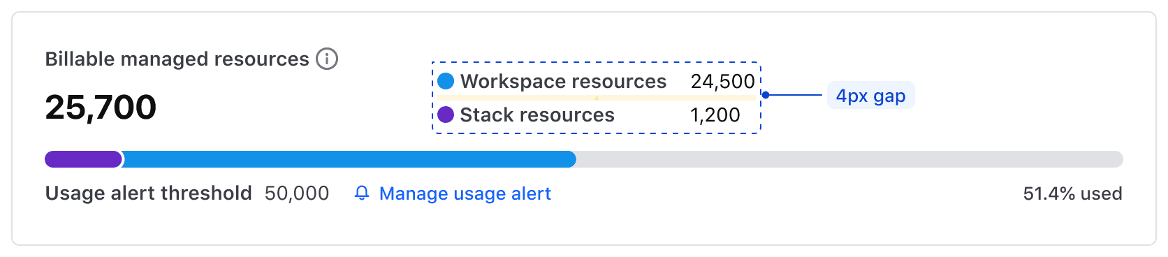
Use Display 300 Bold or Display 400 Bold (depending on existing content hierarchy) with Foreground / Strong when the value should be emphasized over the title. The callout style is often used for numerical content, like resources or financial data.
The callout style should only be used in the vertical orientation.
Don't mix and match visual styles. Ensure visual consistency is maintained by choosing one style in a given description list.
Alignment
We recommend left-aligning content to maintain the natural reading flow.
Orientation
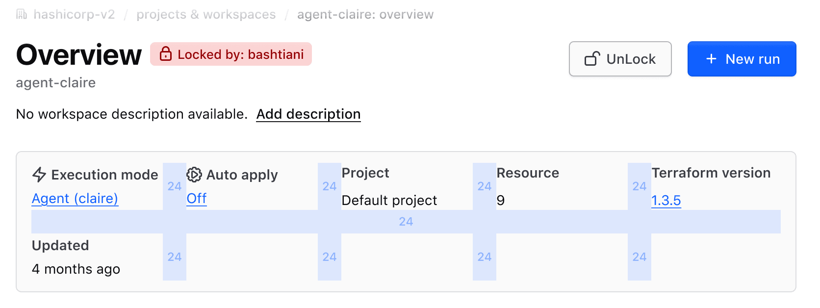
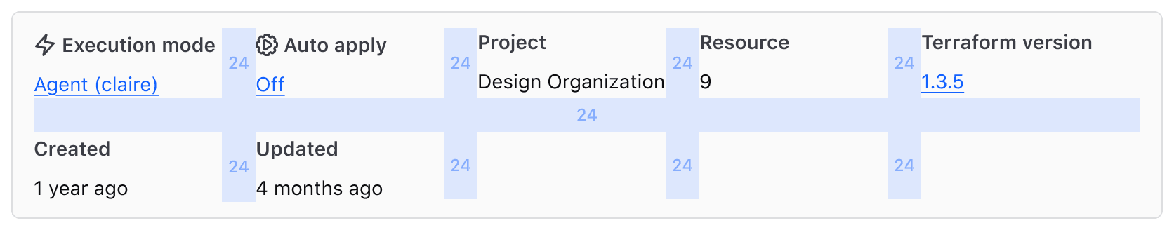
A list item can be oriented either vertically (stacked) or horizontally (side by side). Use one orientation per description list.
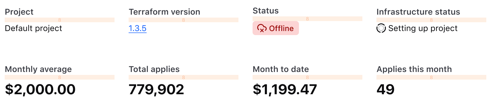
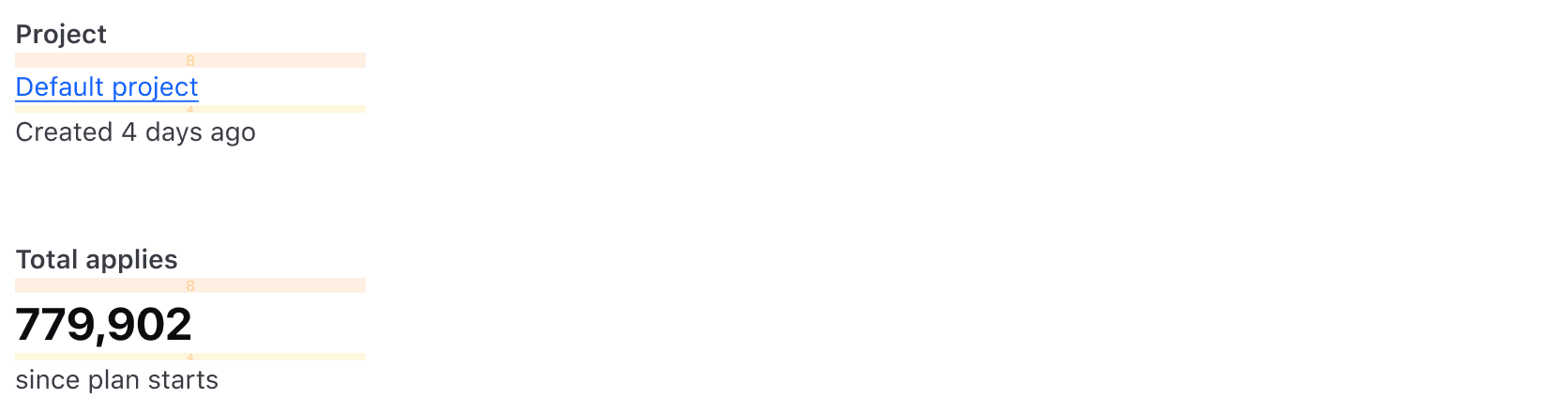
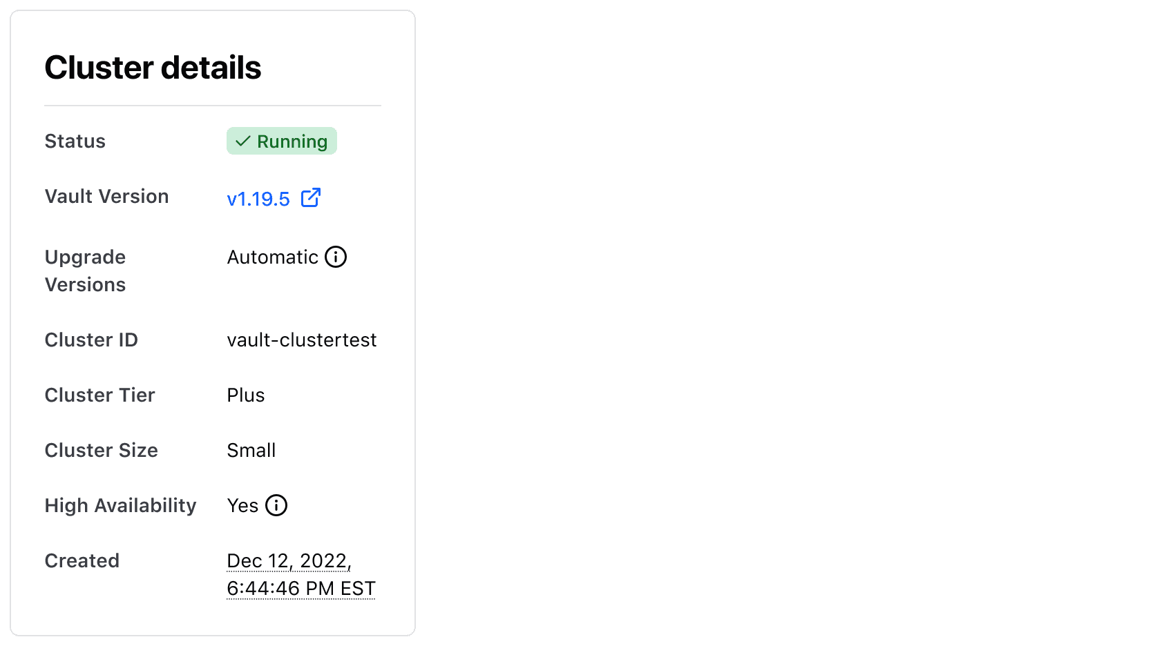
Vertical
Use vertical orientation for designs similar to metadata cards or summary card experiences. With this orientation, the value in the list item can be styled either using the standard or the callout style.
Spacing between the title and value
Use an 8px gap between the title and value.
While text is most common, other elements (like Badge , CopySnippet, links, etc) may also be used for the value. We recommend one element per value to keep things simple and related to the title.
In instances where the value may require additional rows for context, use a 4px gap. When selecting a text style and color, consider the visual hierarchy of the overall description list.
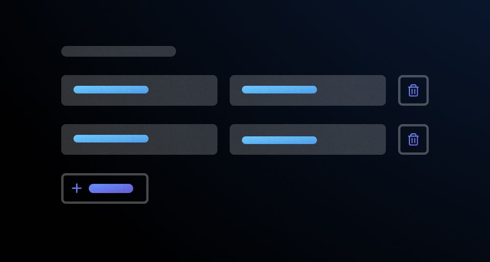
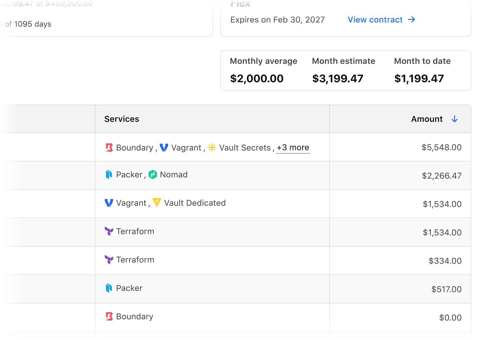
Spacing between list items
When using the standard value style, use a grid with 24px gaps both vertically and horizontally. When placed inside a visible container, we recommend spacing the list items evenly.
When using the callout value style, use a grid with 24px vertical gaps and 48px horizontal gaps. When placed inside a visible container, we recommend spacing the list items evenly.
Wrapping
If content is too condensed, wrap list items to a new row.
Wrap content to ensure readability of each list item.
Avoid forcing list items into a single row, as this can make the items harder to read.
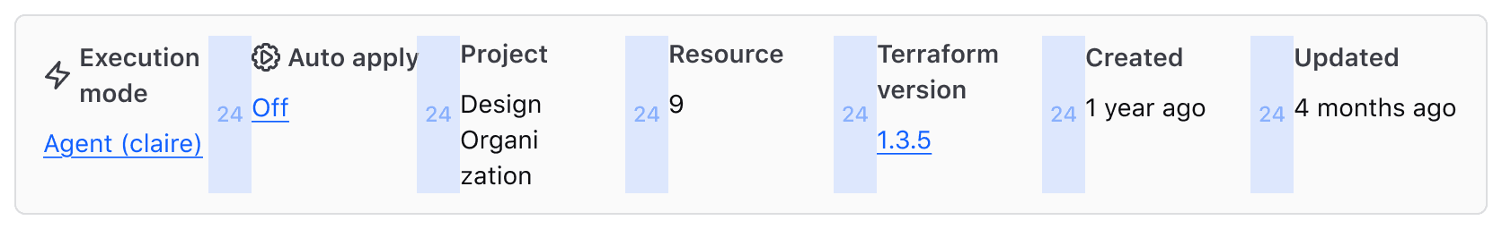
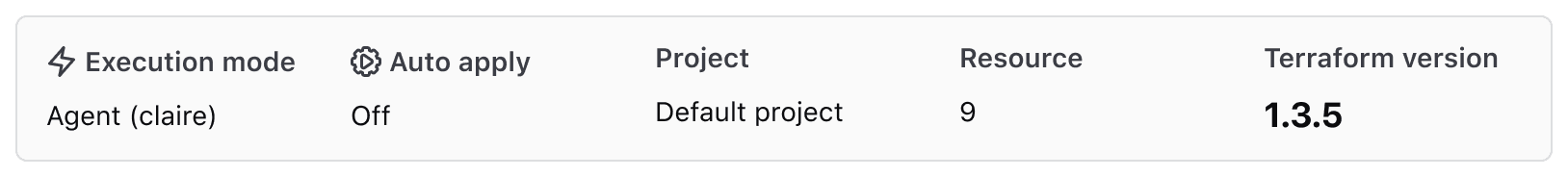
Horizontal
Horizontal orientation should only be used with the standard value styling. Using two sizes in the horizontal orientation throws off the visual balance of the content in a description list.
Spacing
Use 16px gaps between the title and value and each row.
While text is most common, other elements (like Badge , CopySnippet, links, etc) may also be used for the value. We recommend one element per value to keep things simple and related to the title.
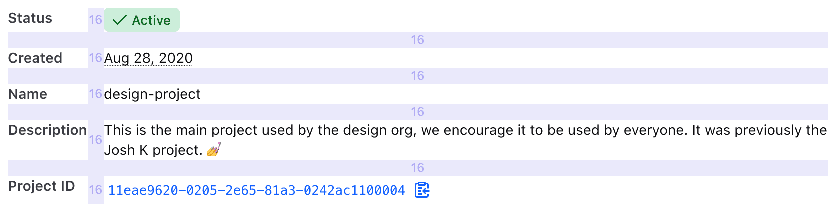
In instances where the value may require additional rows for context, use a 4px gap. When selecting a text style and color, consider the visual hierarchy of the overall description list.

Exceptions
On occasion, the recommended gap size may not be suitable for the layout. For example, when a description list is used as a legend. In this case, a 4px gap could be appropriate as the content is more closely related than in a standard description list.
In horizontal orientations, use your best judgment to adjust the gaps between list items for optimal UI hierarchy.
Column width
When the list item is oriented horizontally and the content length of the title and value is fairly similar, we recommend using equal column widths (50%) to fill the available space.
If the content length of the value is considerably longer than the title, we recommend that the title column width be equal to the longest title content, while the value uses the rest of the available space.