When choosing color values in design, we recommend starting with semantic color tokens — values with clearly defined intent — and relying on color pairings in Helios that are accessible out of the box.
Color tokens
Color-naming syntax and usage can vary depending on context and tooling. Semantic naming conventions within our system allow us to implement consistent standards in our libraries.
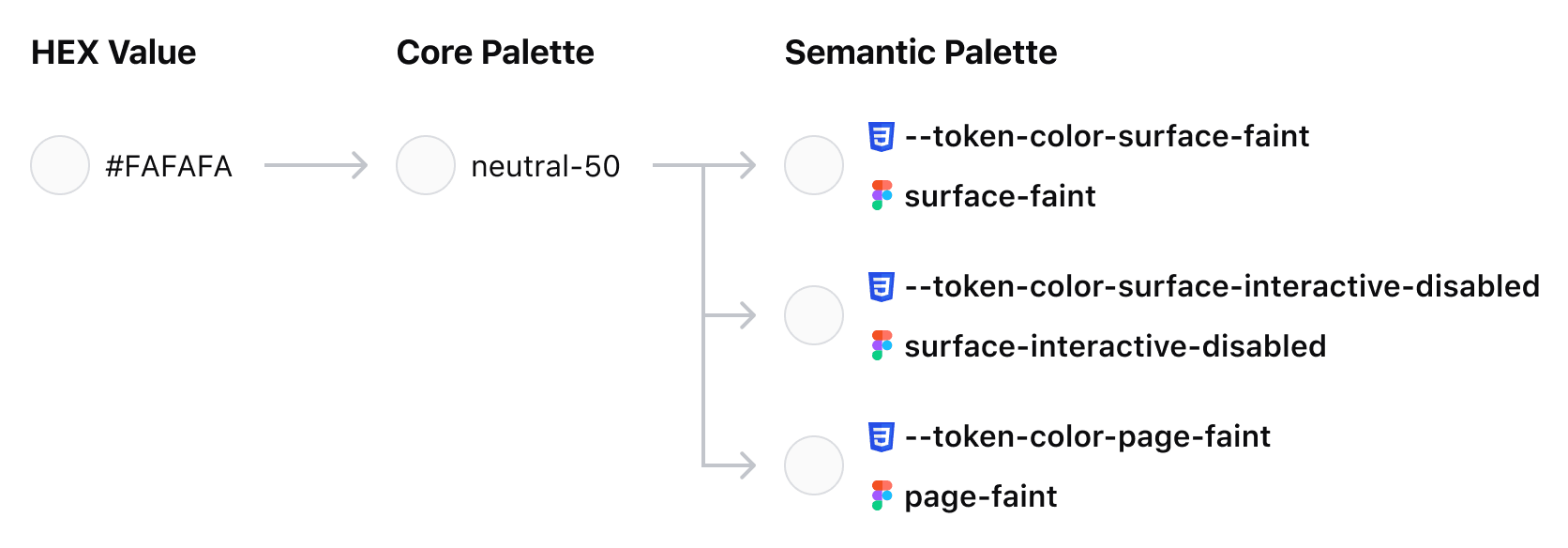
In Figma, we use Variables to define and organize color values. Variables allow us to create palettes that reference (or alias) each other. Our Core Palette is a collection of HEX values and their color ramps (neutral-50, neutral-100,…neutral-700). These values are then connected to Semantic Variables (foreground-primary, surface-faint, border-critical). This alias connection allows us to designate multiple token uses for individual HEX values that lead back to the same Core Palette token.
Tokens in code are generated from platform-agnostic files, in our case JSON, and create atomic colors regardless of what platform or framework is used. Core Palette values are directly referenced in Semantic Palette values in the same way that Figma variables alias one another.
What are semantic colors?
The Semantic Palette embeds meaning into color names, making it easier to select correct consistent values across applications. These colors are designed to meet accessibility standards when used in combination with one another.
- Foreground colors are intended to be used with surface or page colors.
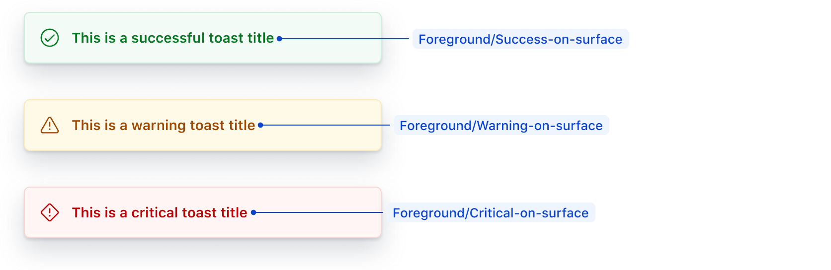
- Status color values consist of "surface," "on-surface," and "high-contrast" options to meet accessibility standards when used together.
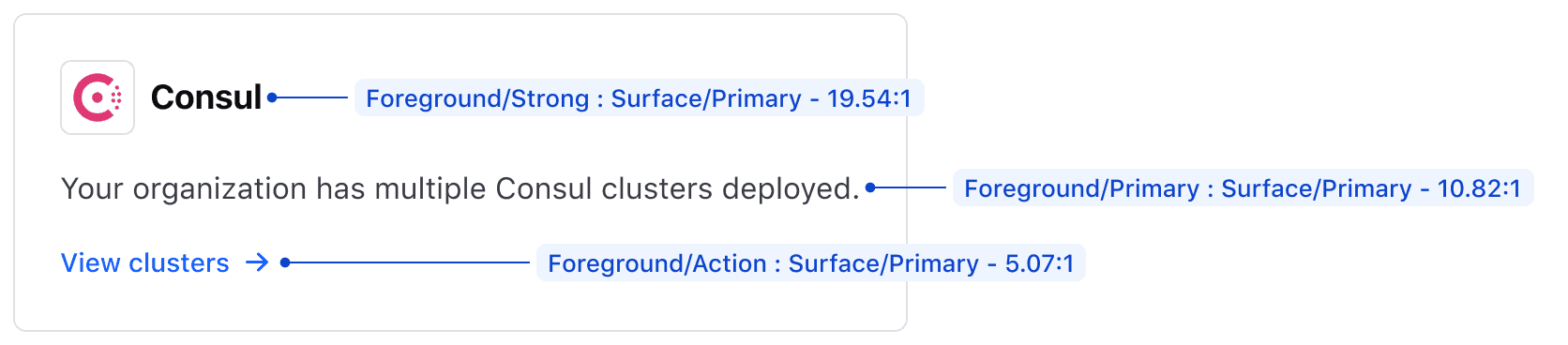
Some examples of semantic color combinations with their respective contrast ratios are:
Foreground/StrongonSurface/Primarynets a ratio of 19.54:1Foreground/PrimaryonSurface/Primarynets a ratio of 10.82:1Foreground/ActiononSurface/Faintnets a ratio of 4.86:1
How are semantic names created?
In semantic token naming, the element and the role are defined to make color decisions easier and more consistent. HDS organizes semantic tokens into element categories with roles appended.
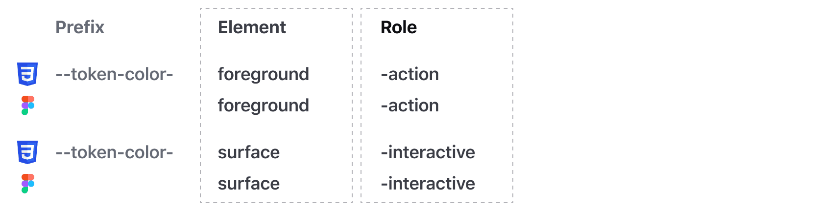
Examples of element naming include:
- Foreground - For text, link, status, and icon elements
- Border - For borders (or strokes) on components, containers, or dividers
- Surface - For the background (or surface) of a component or container
- Page - For page backgrounds
Examples of role in naming include:
- Strong
- Primary
- Faint
- Action (not to be used outside of context)
- Disabled (not to be used outside of context)
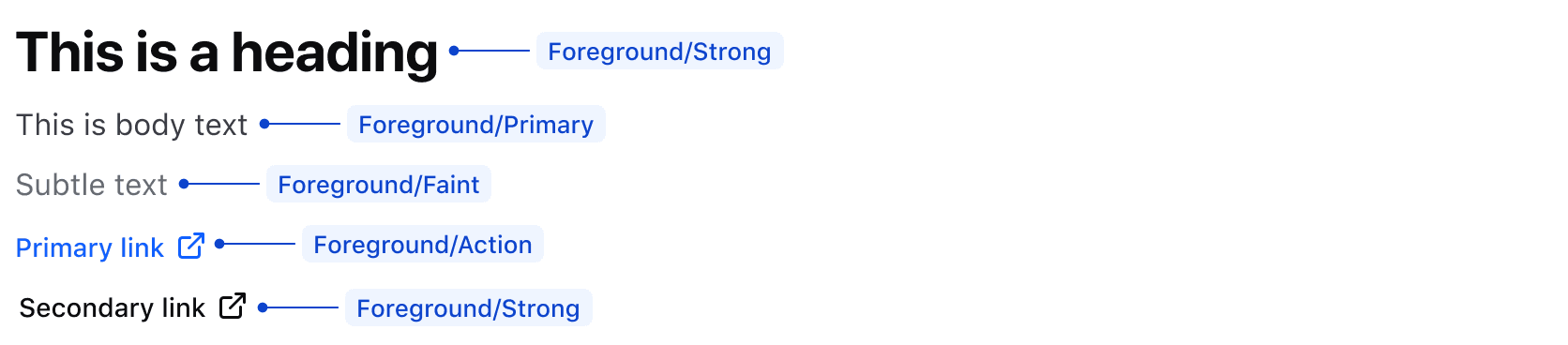
Foreground
Foreground colors are used for informational and decorative elements such as text, links, and icons.
Some common examples of semantic foreground colors include:
Foreground/Strongfor headings and secondary linksForeground/Primaryfor body textForeground/Faintfor less prominent text and UI elementsForeground/Actionfor primary calls to action such as links
Status foreground colors contextualize responses from user actions or indicate status within a UI. These colors should be used sparingly and within the context of specific components, for example:
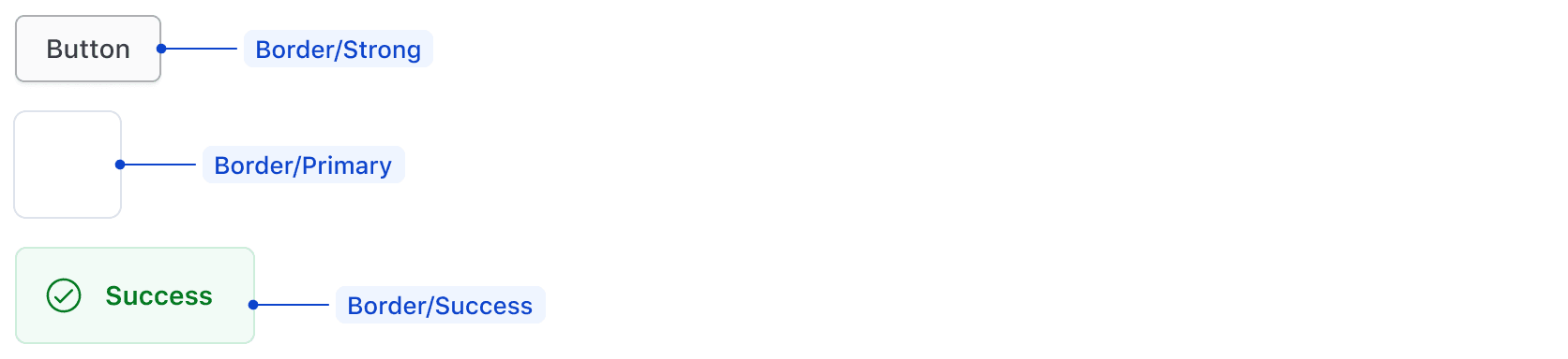
Border
Some examples of border colors include:
Border/Strongfor secondary Button borderBorder/Primaryfor Card border or dividerBorder/{Status color}for Alert borders
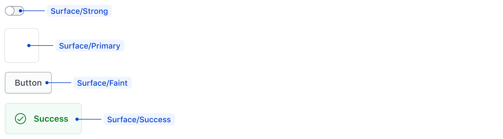
Surface
Surface colors are intended to be used for the background (or surface) of a component or container.
Examples of surface colors include:
Surface/Strongfor the Toggle backgroundSurface/Primaryfor component containersSurface/Faintfor the secondary ButtonSurface/{Status color}for Alert backgrounds
Page
Page colors are used for page backgrounds. HDS components do not use these tokens; however, we recommend Page/Primary for all standard page backgrounds and Page/Faint as a means to create a secondary level on a page if necessary.
Accessible color combinations
We are conformant with WCAG 2.2 Level AA requirements. For color contrast, this means a luminosity ratio of 4.5:1 for normal sized text, and 3:1 for large text (commonly 22px). Further details are outlined on WCAG’s understanding of Contrast (Minimum).
HDS semantic color tokens provide accessible color combinations out of the box when used according to their naming conventions (Surface/{Status color}is compliant in combination with Foreground/{Status color on surface}). Using other color token combinations requires manual validation.
It is important to note that we do not recommend the usage of disabled elements, especially isolating disabled colors out of context, as they are not accessible.
Using palette colors
If Semantic tokens do not meet your needs, the Core Palette is published for general use. These values are usage-agnostic, which can introduce challenges in consistently scaling designs but also allow more freedom and flexibility in color pairing.
When pairing colors from the Core Palette, check that adjacent colors meet accessible contrast ratios. To validate your color combinations, use free tools like the WebAIM contrast checker or Stark’s Figma plugin.
How to use these styles
We offer two ways to apply color to a UI element: CSS helper classes or design tokens.
We currently only provide CSS helpers for the “semantic” colors, so if you need to use the “palette” or “product/brand” colors, use the design tokens as CSS variables instead.
CSS helper classes
- Ensure you’ve imported the relevant CSS file.
- Use one of the predefined CSS helper classes.
<div class="hds-foreground-primary hds-surface-faint hds-border-strong">...</div>
When a “border-color” CSS helper is used on an element a 1px solid border is applied to it. If needing a different border width/style, it’s ok to override it.
Design tokens
Use the color design tokens directly in your CSS definitions.
/**
 * Copyright IBM Corp. 2021, 2026
 * SPDX-License-Identifier: MPL-2.0
 */

.your-selector {
  color: var(--token-color-foreground-primary);
  background: var(--token-color-surface-faint);
  border: (--token-color-border-strong);

  & :hover {
    color: var(--token-color-foreground-high-contrast);
    background: var(--token-color-foreground-action-active);
  }
}
Semantic tokens
Foreground
Use for text and icons.
foreground-strong
- CSS Variable
- CSS Helper
- HEX
foreground-primary
- CSS Variable
- CSS Helper
- HEX
foreground-faint
- CSS Variable
- CSS Helper
- HEX
foreground-high-contrast
- CSS Variable
- CSS Helper
- HEX
foreground-disabled
- CSS Variable
- CSS Helper
- HEX
foreground-action
- CSS Variable
- CSS Helper
- HEX
foreground-action-hover
- CSS Variable
- CSS Helper
- HEX
foreground-action-active
- CSS Variable
- CSS Helper
- HEX
foreground-highlight
- CSS Variable
- CSS Helper
- HEX
foreground-highlight-on-surface
- CSS Variable
- CSS Helper
- HEX
foreground-highlight-high-contrast
- CSS Variable
- CSS Helper
- HEX
foreground-success
- CSS Variable
- CSS Helper
- HEX
foreground-success-on-surface
- CSS Variable
- CSS Helper
- HEX
foreground-success-high-contrast
- CSS Variable
- CSS Helper
- HEX
foreground-warning
- CSS Variable
- CSS Helper
- HEX
foreground-warning-on-surface
- CSS Variable
- CSS Helper
- HEX
foreground-warning-high-contrast
- CSS Variable
- CSS Helper
- HEX
foreground-critical
- CSS Variable
- CSS Helper
- HEX
foreground-critical-on-surface
- CSS Variable
- CSS Helper
- HEX
foreground-critical-high-contrast
- CSS Variable
- CSS Helper
- HEX
Surface
Use for container and component backgrounds.
surface-primary
- CSS Variable
- CSS Helper
- HEX
surface-faint
- CSS Variable
- CSS Helper
- HEX
surface-strong
- CSS Variable
- CSS Helper
- HEX
surface-interactive
- CSS Variable
- CSS Helper
- HEX
surface-interactive-hover
- CSS Variable
- CSS Helper
- HEX
surface-interactive-active
- CSS Variable
- CSS Helper
- HEX
surface-interactive-disabled
- CSS Variable
- CSS Helper
- HEX
surface-action
- CSS Variable
- CSS Helper
- HEX
surface-highlight
- CSS Variable
- CSS Helper
- HEX
surface-success
- CSS Variable
- CSS Helper
- HEX
surface-warning
- CSS Variable
- CSS Helper
- HEX
surface-critical
- CSS Variable
- CSS Helper
- HEX
Border
Use for container and component borders. Neutral values can also be used for horizontal rules.
border-primary
- CSS Variable
- CSS Helper
- HEX
border-faint
- CSS Variable
- CSS Helper
- HEX
border-strong
- CSS Variable
- CSS Helper
- HEX
border-action
- CSS Variable
- CSS Helper
- HEX
border-highlight
- CSS Variable
- CSS Helper
- HEX
border-success
- CSS Variable
- CSS Helper
- HEX
border-warning
- CSS Variable
- CSS Helper
- HEX
border-critical
- CSS Variable
- CSS Helper
- HEX
Focus
Use to indicate an element is in a focused state. Use critical values for critical actions only and action values for everything else.
focus-action-internal
- CSS Variable
- HEX
focus-action-external
- CSS Variable
- HEX
focus-critical-internal
- CSS Variable
- HEX
focus-critical-external
- CSS Variable
- HEX
Page
Use for page backgrounds.
page-primary
- CSS Variable
- CSS Helper
- HEX
page-faint
- CSS Variable
- CSS Helper
- HEX
Brand colors
Hashicorp
hashicorp-brand
- CSS Variable
- HEX
Boundary
boundary-brand
- CSS Variable
- HEX
boundary-foreground
- CSS Variable
- HEX
boundary-surface
- CSS Variable
- HEX
boundary-border
- CSS Variable
- HEX
boundary-gradient-primary-start
- CSS Variable
- HEX
boundary-gradient-primary-stop
- CSS Variable
- HEX
boundary-gradient-faint-start
- CSS Variable
- HEX
boundary-gradient-faint-stop
- CSS Variable
- HEX
Consul
consul-brand
- CSS Variable
- HEX
consul-foreground
- CSS Variable
- HEX
consul-surface
- CSS Variable
- HEX
consul-border
- CSS Variable
- HEX
consul-gradient-primary-start
- CSS Variable
- HEX
consul-gradient-primary-stop
- CSS Variable
- HEX
consul-gradient-faint-start
- CSS Variable
- HEX
consul-gradient-faint-stop
- CSS Variable
- HEX
Hcp
hcp-brand
- CSS Variable
- HEX
Nomad
nomad-brand
- CSS Variable
- HEX
nomad-foreground
- CSS Variable
- HEX
nomad-surface
- CSS Variable
- HEX
nomad-border
- CSS Variable
- HEX
nomad-gradient-primary-start
- CSS Variable
- HEX
nomad-gradient-primary-stop
- CSS Variable
- HEX
nomad-gradient-faint-start
- CSS Variable
- HEX
nomad-gradient-faint-stop
- CSS Variable
- HEX
Packer
packer-brand
- CSS Variable
- HEX
packer-foreground
- CSS Variable
- HEX
packer-surface
- CSS Variable
- HEX
packer-border
- CSS Variable
- HEX
packer-gradient-primary-start
- CSS Variable
- HEX
packer-gradient-primary-stop
- CSS Variable
- HEX
packer-gradient-faint-start
- CSS Variable
- HEX
packer-gradient-faint-stop
- CSS Variable
- HEX
Terraform
terraform-brand
- CSS Variable
- HEX
terraform-brand-on-dark
- CSS Variable
- HEX
terraform-foreground
- CSS Variable
- HEX
terraform-surface
- CSS Variable
- HEX
terraform-border
- CSS Variable
- HEX
terraform-gradient-primary-start
- CSS Variable
- HEX
terraform-gradient-primary-stop
- CSS Variable
- HEX
terraform-gradient-faint-start
- CSS Variable
- HEX
terraform-gradient-faint-stop
- CSS Variable
- HEX
Vagrant
vagrant-brand
- CSS Variable
- HEX
vagrant-foreground
- CSS Variable
- HEX
vagrant-surface
- CSS Variable
- HEX
vagrant-border
- CSS Variable
- HEX
vagrant-gradient-primary-start
- CSS Variable
- HEX
vagrant-gradient-primary-stop
- CSS Variable
- HEX
vagrant-gradient-faint-start
- CSS Variable
- HEX
vagrant-gradient-faint-stop
- CSS Variable
- HEX
Vault-radar
vault-radar-brand
- CSS Variable
- HEX
vault-radar-brand-alt
- CSS Variable
- HEX
vault-radar-foreground
- CSS Variable
- HEX
vault-radar-surface
- CSS Variable
- HEX
vault-radar-border
- CSS Variable
- HEX
vault-radar-gradient-primary-start
- CSS Variable
- HEX
vault-radar-gradient-primary-stop
- CSS Variable
- HEX
vault-radar-gradient-faint-start
- CSS Variable
- HEX
vault-radar-gradient-faint-stop
- CSS Variable
- HEX
Vault-secrets
vault-secrets-brand
- CSS Variable
- HEX
vault-secrets-brand-alt
- CSS Variable
- HEX
vault-secrets-foreground
- CSS Variable
- HEX
vault-secrets-surface
- CSS Variable
- HEX
vault-secrets-border
- CSS Variable
- HEX
vault-secrets-gradient-primary-start
- CSS Variable
- HEX
vault-secrets-gradient-primary-stop
- CSS Variable
- HEX
vault-secrets-gradient-faint-start
- CSS Variable
- HEX
vault-secrets-gradient-faint-stop
- CSS Variable
- HEX
Vault
vault-brand
- CSS Variable
- HEX
vault-brand-alt
- CSS Variable
- HEX
vault-foreground
- CSS Variable
- HEX
vault-surface
- CSS Variable
- HEX
vault-border
- CSS Variable
- HEX
vault-gradient-primary-start
- CSS Variable
- HEX
vault-gradient-primary-stop
- CSS Variable
- HEX
vault-gradient-faint-start
- CSS Variable
- HEX
vault-gradient-faint-stop
- CSS Variable
- HEX
Waypoint
waypoint-brand
- CSS Variable
- HEX
waypoint-foreground
- CSS Variable
- HEX
waypoint-surface
- CSS Variable
- HEX
waypoint-border
- CSS Variable
- HEX
waypoint-gradient-primary-start
- CSS Variable
- HEX
waypoint-gradient-primary-stop
- CSS Variable
- HEX
waypoint-gradient-faint-start
- CSS Variable
- HEX
waypoint-gradient-faint-stop
- CSS Variable
- HEX
Core palette
Core palette colors should be used sparingly and only when the correct semantic mapping isn’t available for the use case.
Blue
blue-500
- CSS Variable
- HEX
blue-400
- CSS Variable
- HEX
blue-300
- CSS Variable
- HEX
blue-200
- CSS Variable
- HEX
blue-100
- CSS Variable
- HEX
blue-50
- CSS Variable
- HEX
Purple
purple-500
- CSS Variable
- HEX
purple-400
- CSS Variable
- HEX
purple-300
- CSS Variable
- HEX
purple-200
- CSS Variable
- HEX
purple-100
- CSS Variable
- HEX
purple-50
- CSS Variable
- HEX
Green
green-500
- CSS Variable
- HEX
green-400
- CSS Variable
- HEX
green-300
- CSS Variable
- HEX
green-200
- CSS Variable
- HEX
green-100
- CSS Variable
- HEX
green-50
- CSS Variable
- HEX
Amber
amber-500
- CSS Variable
- HEX
amber-400
- CSS Variable
- HEX
amber-300
- CSS Variable
- HEX
amber-200
- CSS Variable
- HEX
amber-100
- CSS Variable
- HEX
amber-50
- CSS Variable
- HEX
Red
red-500
- CSS Variable
- HEX
red-400
- CSS Variable
- HEX
red-300
- CSS Variable
- HEX
red-200
- CSS Variable
- HEX
red-100
- CSS Variable
- HEX
red-50
- CSS Variable
- HEX
Neutral
neutral-700
- CSS Variable
- HEX
neutral-600
- CSS Variable
- HEX
neutral-500
- CSS Variable
- HEX
neutral-400
- CSS Variable
- HEX
neutral-300
- CSS Variable
- HEX
neutral-200
- CSS Variable
- HEX
neutral-100
- CSS Variable
- HEX
neutral-50
- CSS Variable
- HEX
neutral-0
- CSS Variable
- HEX
Alpha
alpha-300
- CSS Variable
- HEX
alpha-200
- CSS Variable
- HEX
alpha-100
- CSS Variable
- HEX