Border radius
This is how we use border radius in Helios components.
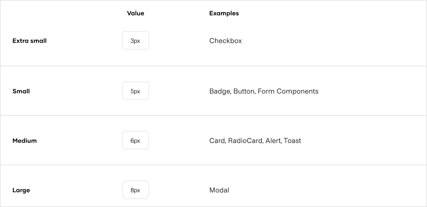
When using these tokens for your own components and patterns, consider the size and prominence of the element relative to the example Helios components.
How to use these styles
You can apply a border radius to a UI element via design tokens.
Design tokens
Use the border radius design tokens directly in your CSS definitions.
/**
 * Copyright IBM Corp. 2021, 2026
 * SPDX-License-Identifier: MPL-2.0
 */

.your-selector {
  border-radius: var(--token-border-radius-medium);
}