This documentation provides best practices for writing tabular content in Table and Advanced Table components.
General recommendations
While we are not prescriptive about what goes into table cells, there are some best practices to consider:
- Keep data within columns to one data type. Sorting on multiple data types adds technical complexity and makes content confusing for assistive technologies.
- While changing the text style/color within a cell is possible, we recommend only using Helios font styles and colors.
Icon usage
Icons used within cells can help differentiate content, highlight metadata, increase text hierarchy, or enhance text. Use the outlined icon style in most cases. However, if contrast with other icons is important, you can use the filled style.
Don’t use an icon as the sole content within a cell, even if the icon is explicit, e.g., a brand or service icon.
Don’t use an icon to indicate the status of an object, row, or resource. Instead, use a Badge.
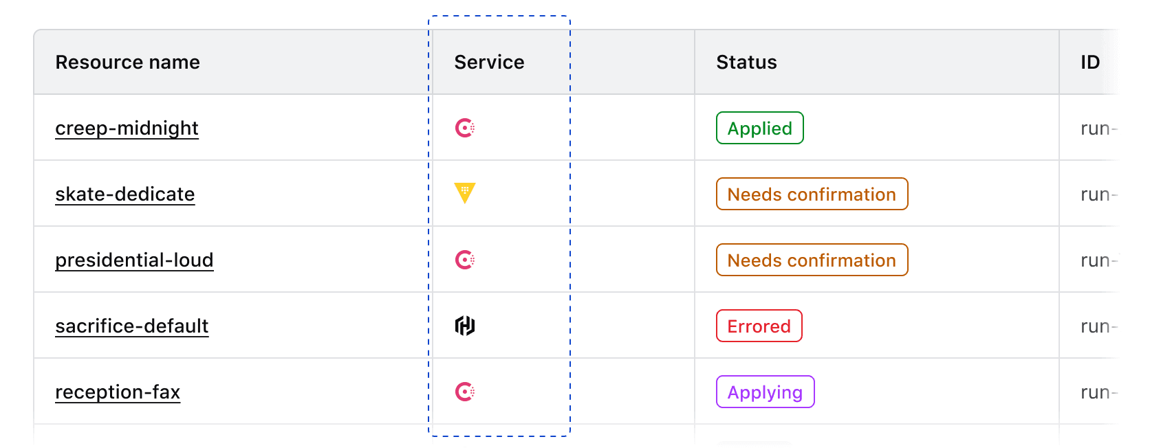
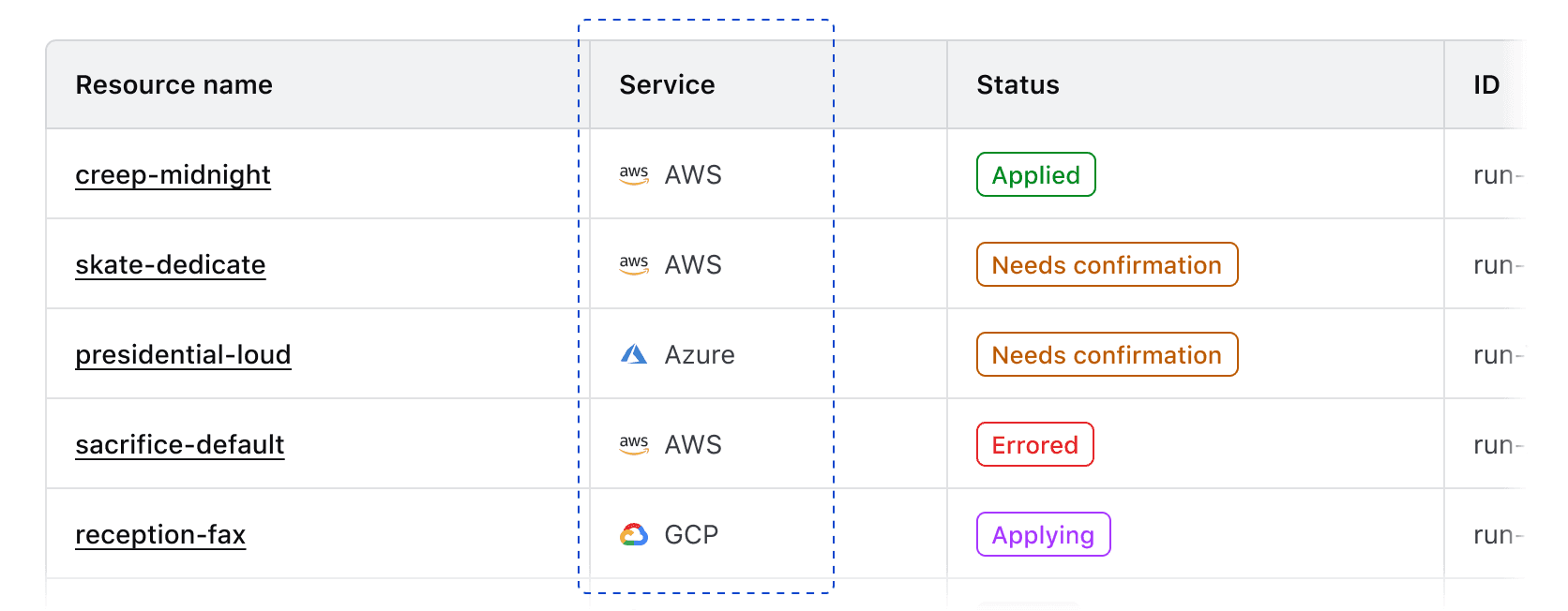
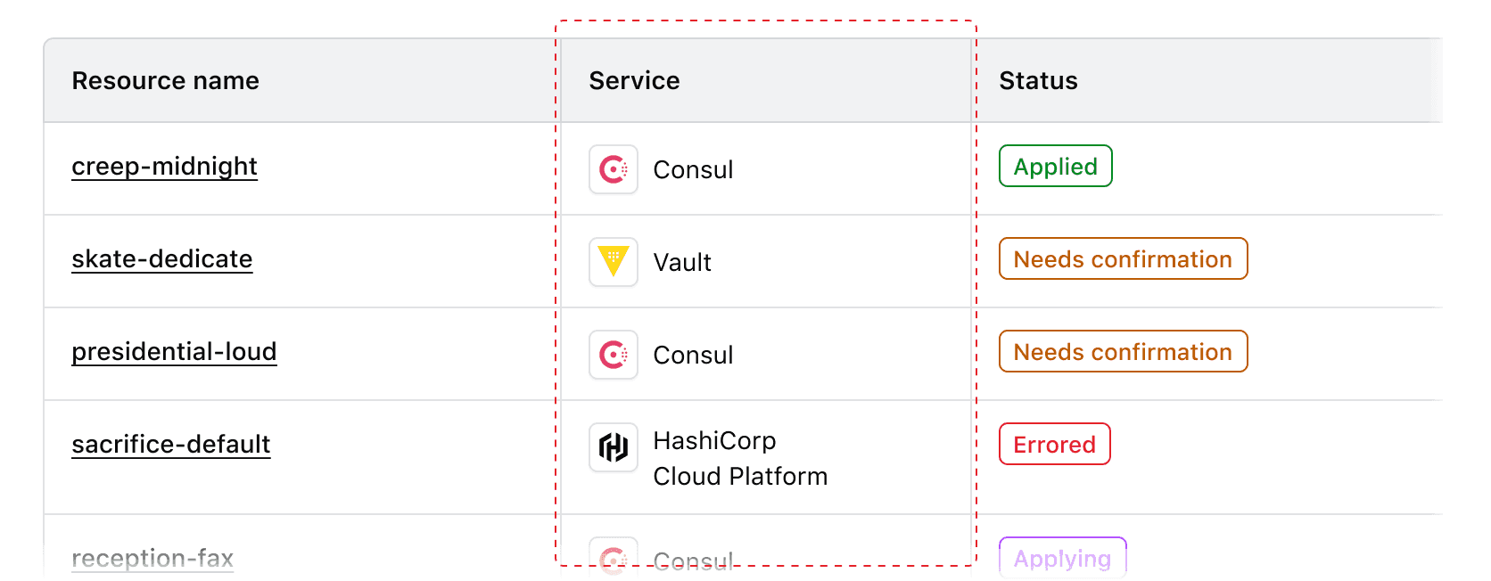
Service icons
Use service icons within a cell to communicate the source or provider of a service.
Grouping
Use icons to communicate commonalities between values or that a value is part of a larger object or hierarchical structure.
Product branding
Use icons to communicate that a specific item is a HashiCorp product or resource.
Don’t use an Icon Tile in place of an icon within a table cell.
Leading vs. trailing icons
We recommend using leading icons so the text following the icon remains aligned down the column for better scannability.
Don’t mix and match different icon positions in the same column.
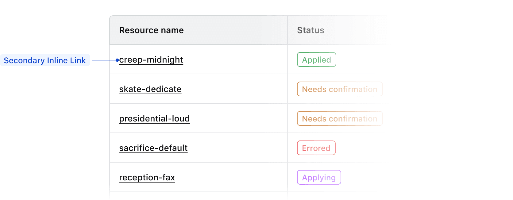
Links within cells
We recommend using secondary Inline Links within tables, to avoid overloading the UI with the actionable blue color used by the primary color variant.
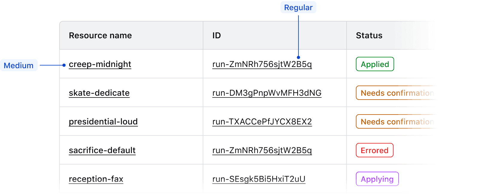
To increase the prominence and further differentiate links from other text content, we recommend using a font-weight of medium. In code, you can use the CSS helper classes hds-typography-body-200 and hds-font-weight-medium. In Figma, you can use the text style Body/200/Link.
Multiple links
If a table contains more than one column of links, consider using a font-weight of medium for only the most important links, usually the title of the row or ID. For the other links, use a font-weight of regular.
Links in long-form content
If a cell contains long-form or descriptive content, use the link style that is most appropriate for the hierarchy and frequency of links within the content. For a minimal number of links, primary Inline Links may be appropriate, but if there are many links within the content secondary Inline Links may work better.
Badge usage
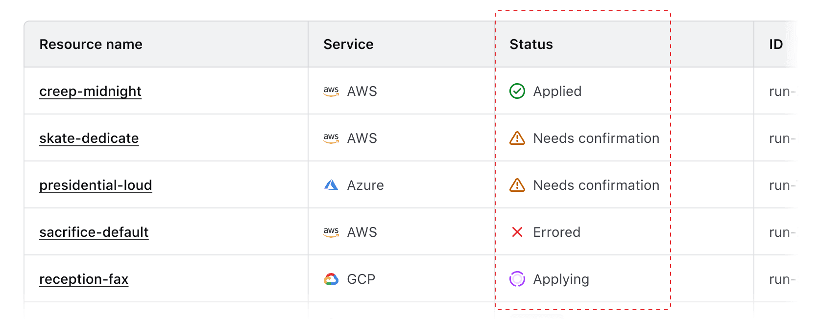
Use Badges to communicate status and high-priority metadata within tables. Ensure that Badge usage within tables is consistent across features and within an application holistically so that it is easier to understand and quicker to parse.
Badge type
We recommend using outlined Badges within tables. This variant provides sufficient differentiation between the component, the value in the cell, and the background of a table row without being too visually heavy.
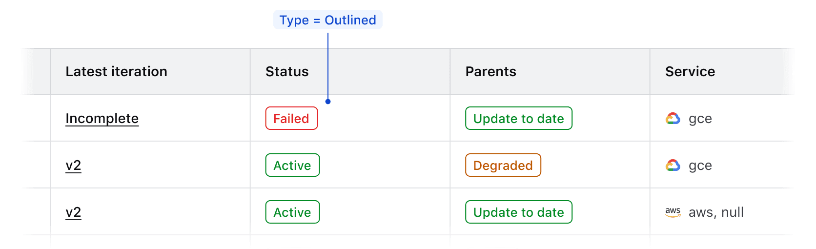
Badge color
Use Badge color logically to communicate status within tables.
Successfor positive communication, e.g., "Active", "Passing", "Up-to-date", etc.Warningfor cautionary communication, e.g., "Out-of-date", "Degraded", etc.Criticalfor negative communication and errors, e.g., "Failing", "Deprecated", "Errored", etc.Highlightfor communicating a dynamic value or a value that indicates a change in state of a record, e.g., "Updating", "In progress", "Starting up", etc.Neutralfor null and empty values, e.g., "None", "No status", etc.
Badge icon usage
Use logical icons when communicating status in a Badge. Some common examples when paired with Badge color include:
checkfor positive communication.alert-trianglefor cautionary communication.xfor negative communication and errors.loadingfor communicating a dynamic value or status and when usingcolor=highlight.
In the case of a null or empty value, use the text-only variant of the Badge.
Badge size
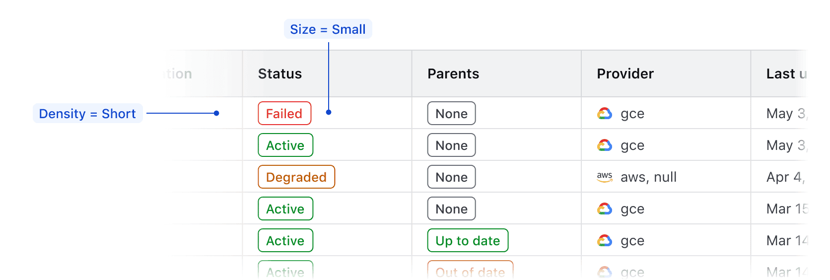
Use the medium Badge size by default as this creates more visual consistency between the Badge and text values within tables.
If the table row density is set to short, use the small Badge size to account for the reduction in vertical spacing and padding.
Don’t use the large Badge size in tables as this elevates the Badge too prominently in the hierarchy and can create inconsistency between Badges and text.
Don’t use different Badge sizes in the same table.
Null values
Null cell values
If records within a table contain empty or null values, don’t reflect this literally with an empty cell. While a literal representation of a data set may seem logical when showcasing tabular data, a null value still intrinsically has an attribute of none or empty which should be communicated to user.
An empty cell can impact the user experience negatively by:
- Breaking the natural reading flow within a table and making the data harder to parse.
- Eroding user trust in the validity of the data; an empty cell may indicate an error but doesn’t communicate what the error is or its cause.
- Failing to communicate what value is used when filtering or sorting a data set.

Instead, explicitly communicate null values to the user and represent them with a similar visual treatment as non-null values.
Visually represent null values in an inverse and comparative manner with non-null values.

Styling null values
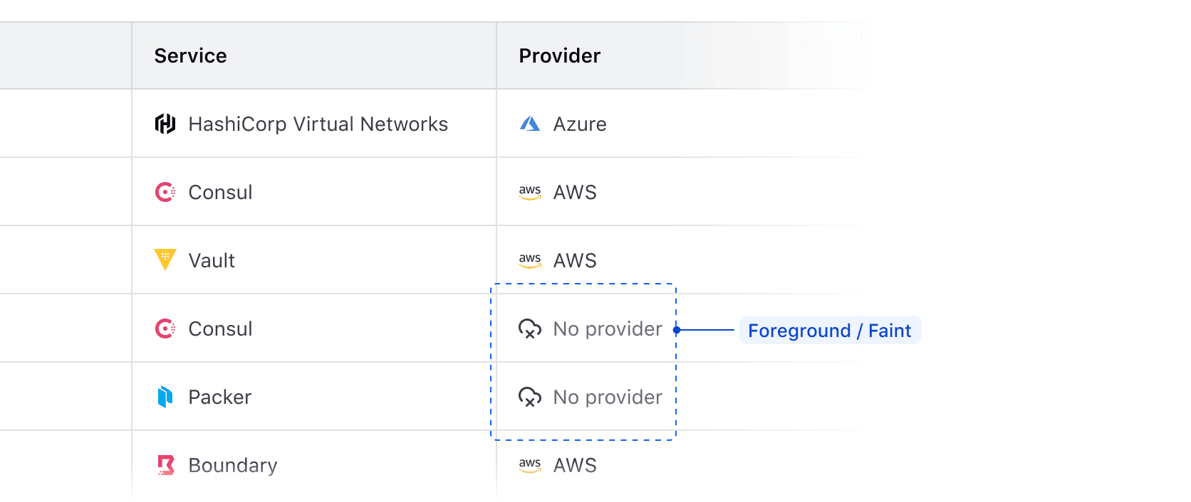
In cells that contain values represented by text, use the same text style as non-null values in the column (in most cases this is Body / 200 / Regular). Consider reducing the prominence of the null values by using Foreground / Faint color instead of Primary or Strong.
Null values with badges
In cells that contain a badge (e.g., status, health, etc), communicate null values by using a neutral color badge to maintain visual consistency with other non-null cells.
Null value fallback
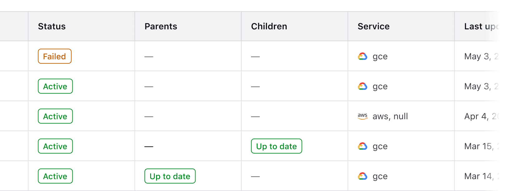
As a fallback, consider using an em dash (—) in place of the null value. This may occur when the content type of a value isn’t able to be determined or if the value is null for an unknown reason.
Communicating why a value is null
Depending on the data set and the type of content it expresses, consider communicating to the user why a value is null by using a Tooltip. This can communicate broader product-specific functions and terminology, but can also highlight errors or issues that need to be corrected.

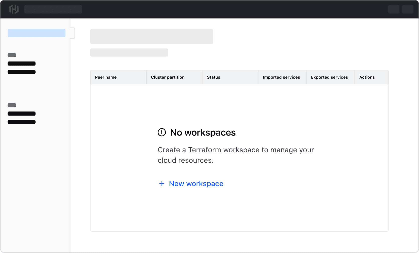
Null or empty table state
In the case of an entire data set returning null or empty, use Application State to communicate this and provide the user with next steps to correct the problem or create a new record in the data set.
Common examples of this include:
- A table expressing a data set that is dependent on user-created records which don’t exist.
- An error occurred when fetching the data for the table.
- A data set has been filtered to the point of not returning any records (see our Filter patterns guidance for more details).